Estate

CTF Estate b6

MangyCarface

Mapper
aa
Feb 26, 2008
1,626
1,325
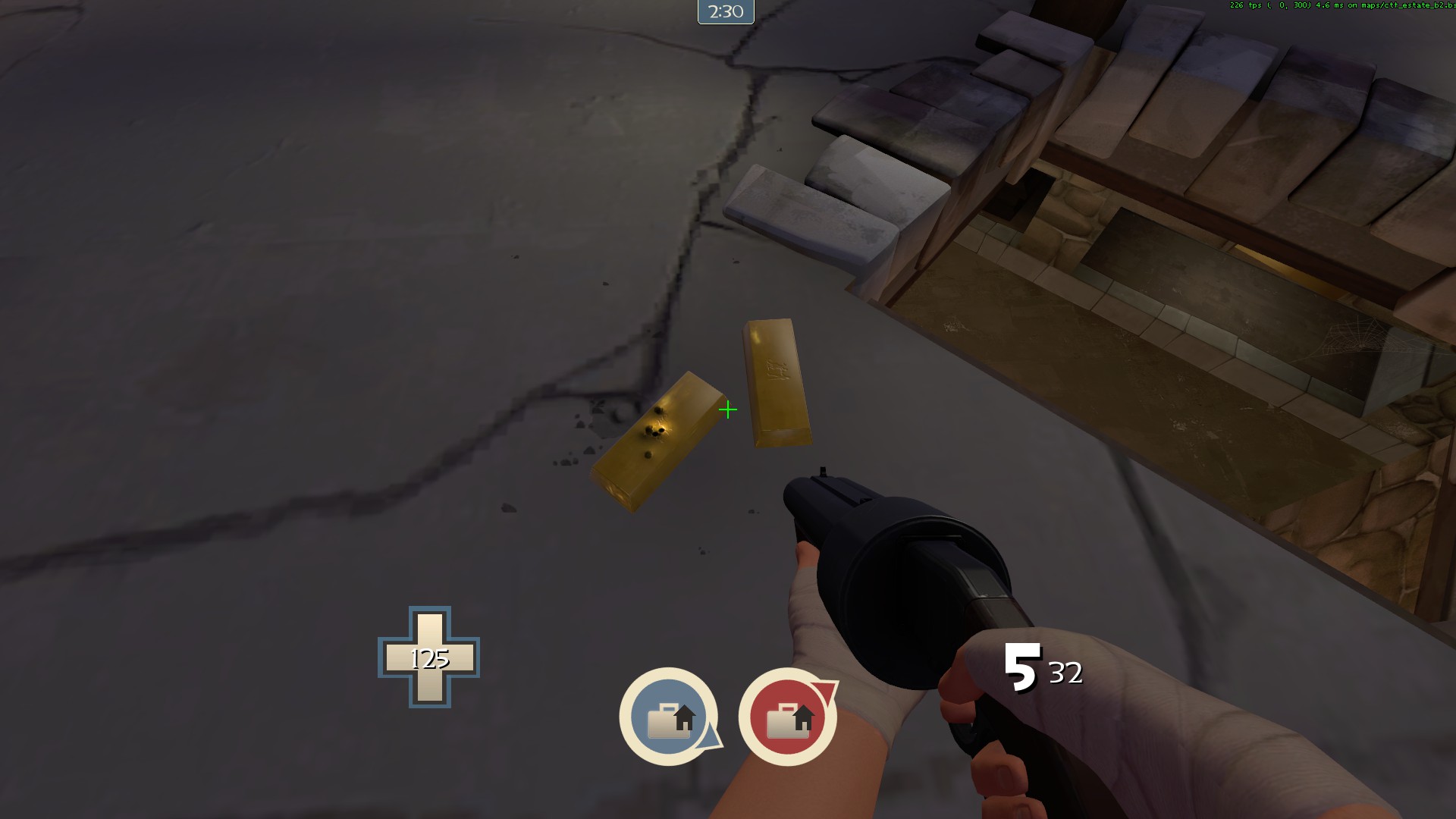
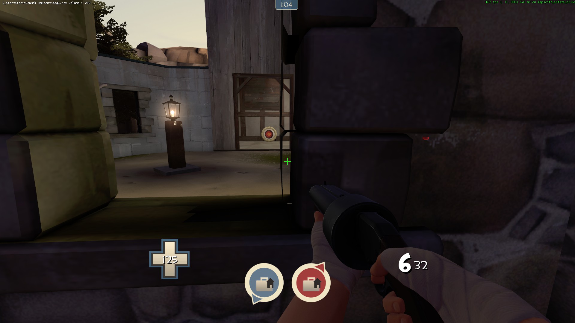
CTF Estate (aka mangy's frankenmap)

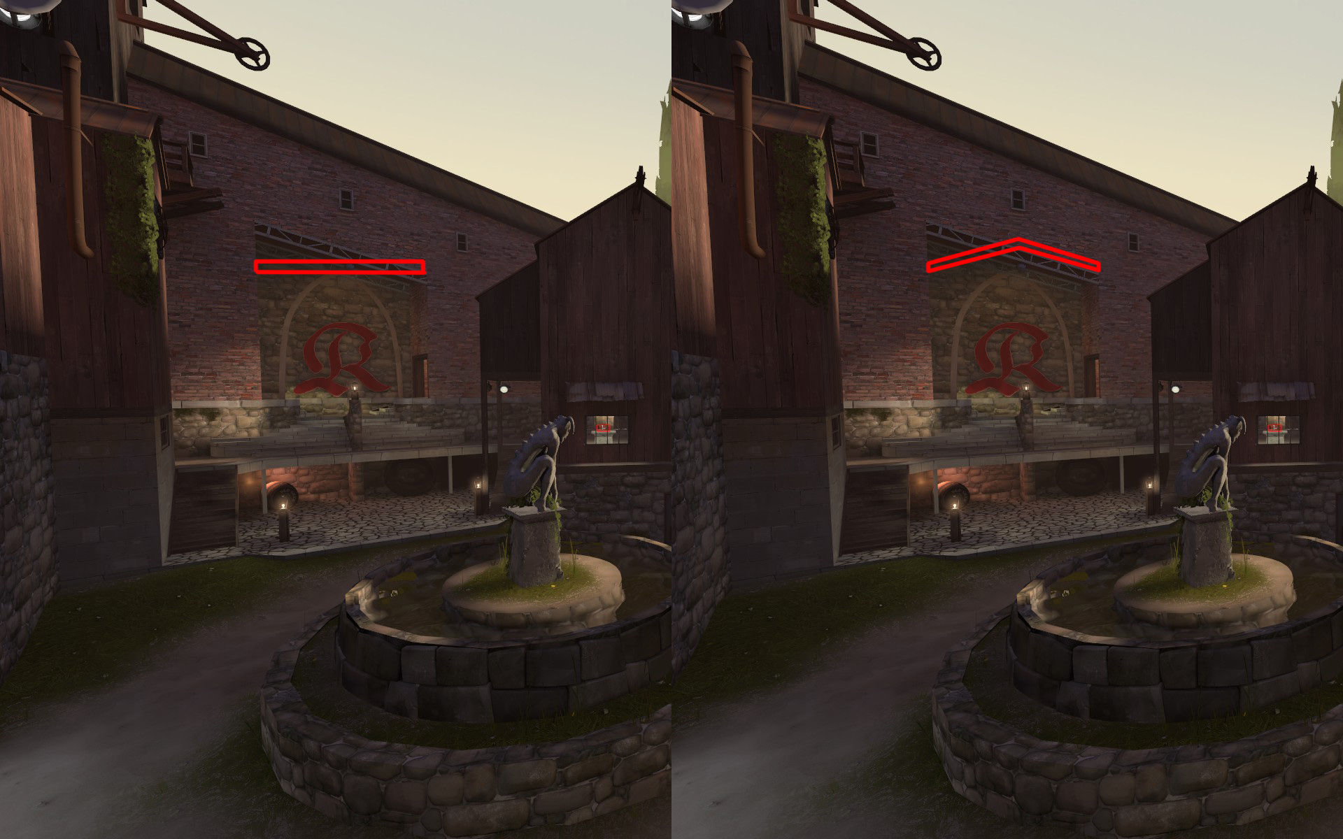
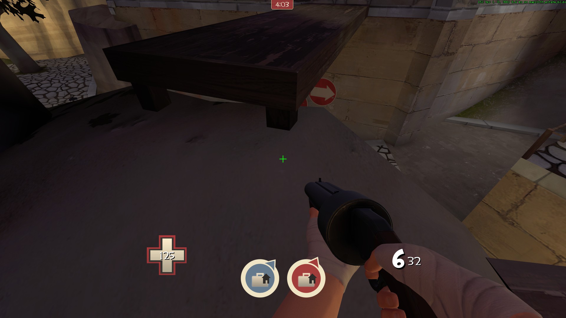
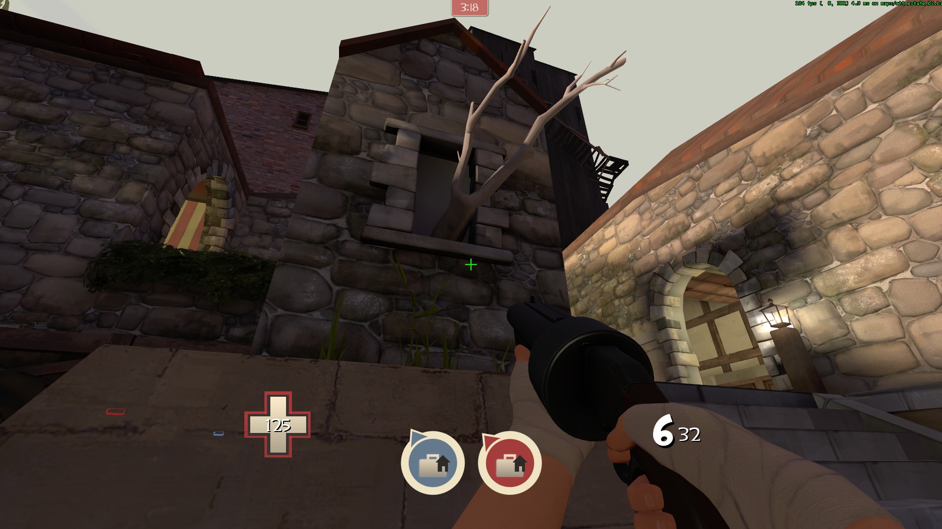
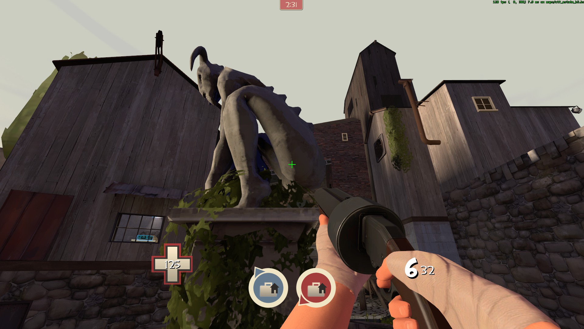
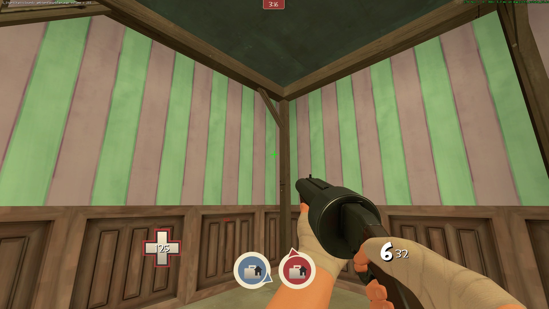
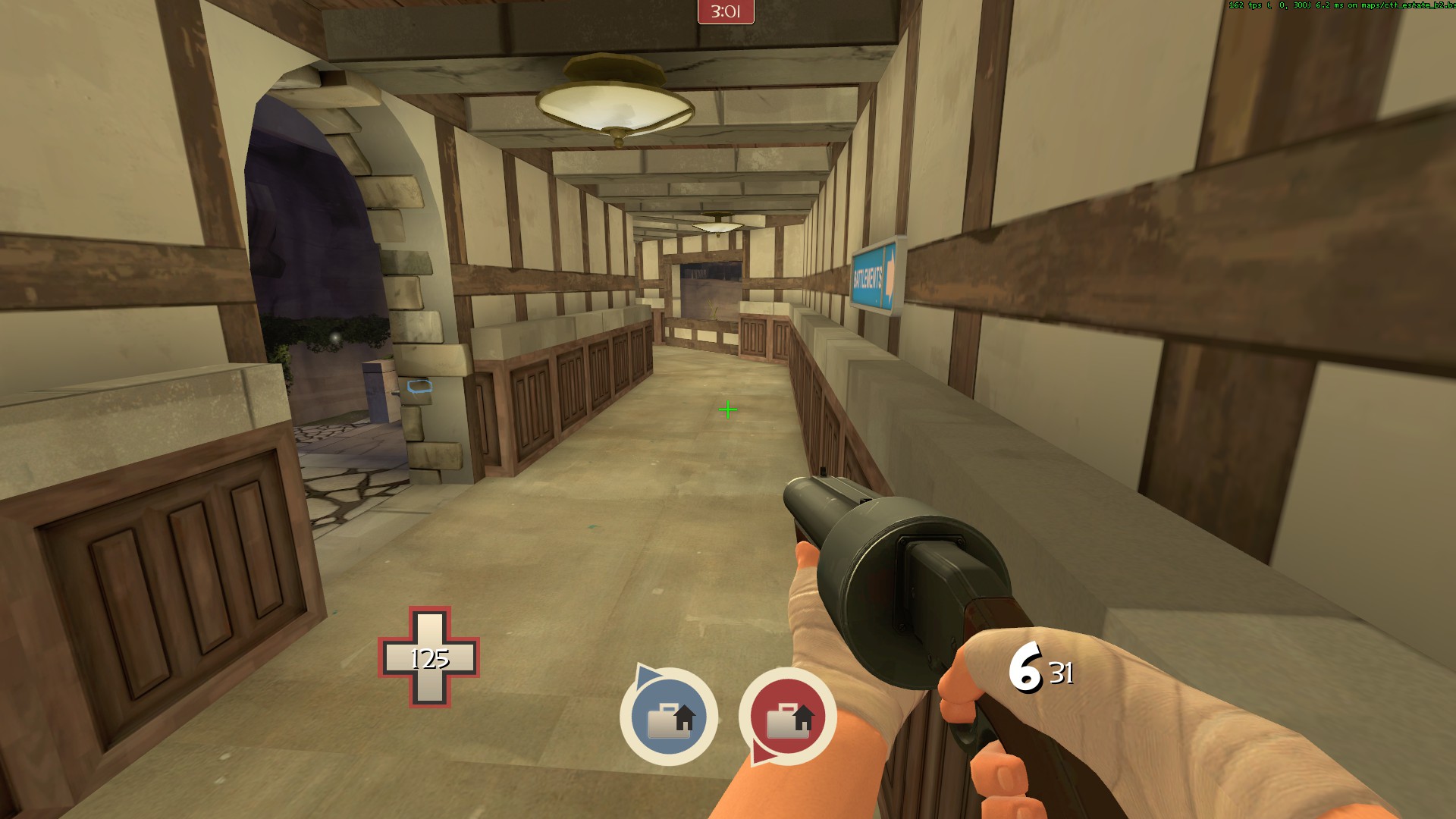
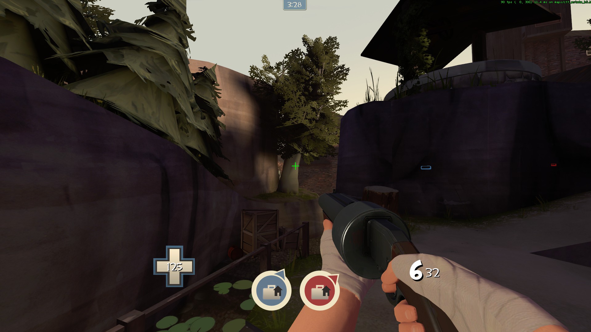
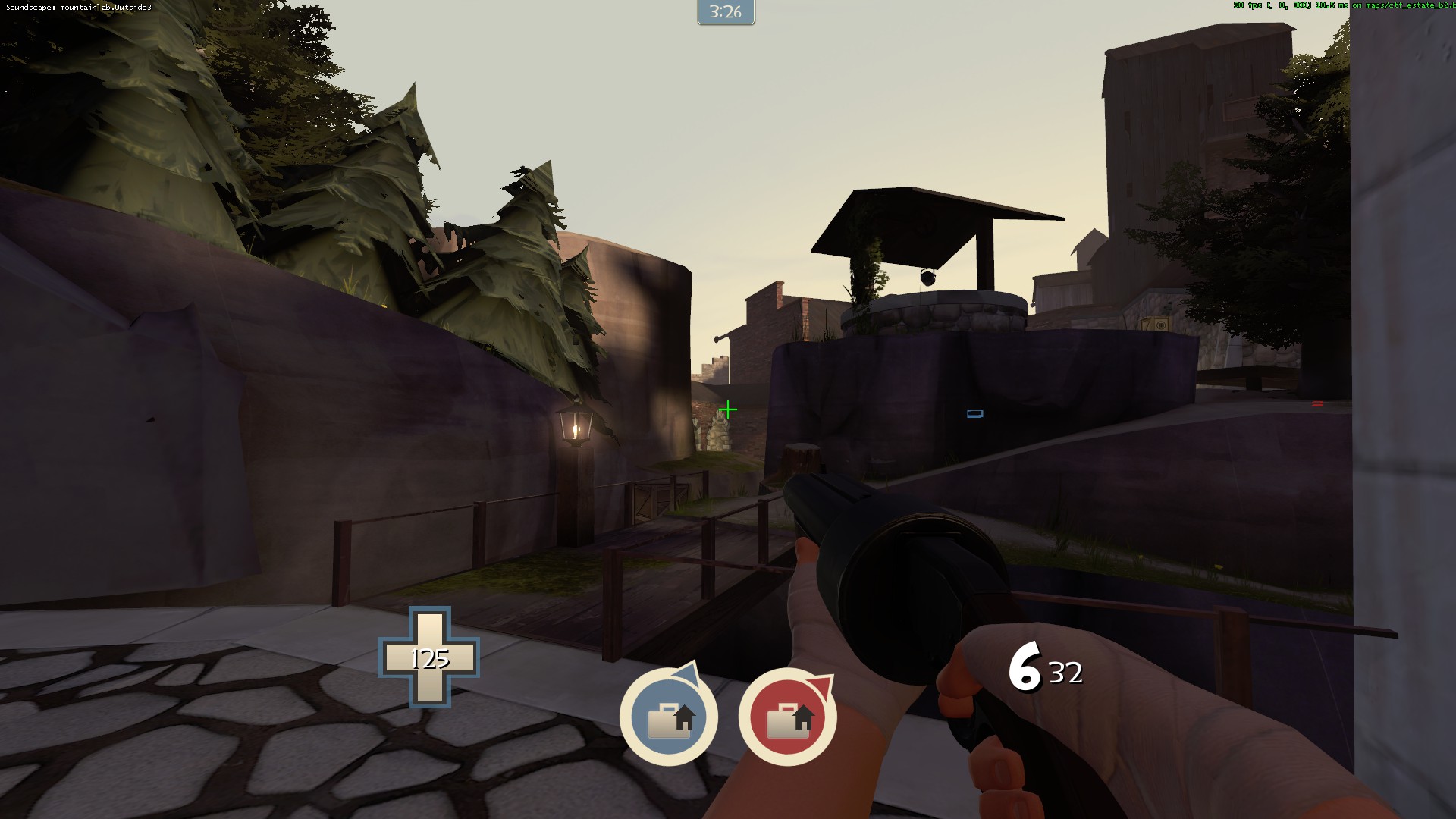
Estate is a bilaterally symmetrical CTF map fought out on one of the many properties the Mann brothers were forced to evenly split between each other. Unlike standard ctf maps, every time an enemy's flag is captured, the flag moves back along one of 4 points and with it that enemy's capture zone. Once a team has captured the flag at all 4 locations, that team wins the round. (Note: after the CTF version has been completed, a 5CP version will be released as well.)

Estate was constructed out of some of my favorite parts of my maps, with the exclusion of Yukon and Frontier.

Credit to:
ABS and penguin for bug help
Acumen and Spud for models
Void for some material work
Icarus for the excellent HUD icons
Rexy
playtesters
 
Last edited:
Jan 20, 2010
1,317
902
Interesting theme you have here, Mangy. I'm assuming this is a competitive based map?
 

tyler

aa
Sep 11, 2013
5,102
4,621
The spawn room below a fireplace looks absolutely ridiculous, but I like the rest of it, especially the fountain. The fountain is incredibly clever.
 
Last edited by a moderator:

evanonline

L420: High Member
Mar 15, 2009
485
273
I'm really eager to see some new usage out of the manor props! I'm surprised this is one of, if not the first map I've seen to use them.
 

tyler

aa
Sep 11, 2013
5,102
4,621
Can you please clip all your stairs?

Also inside the fountain there are a few nodraw faces

On the curved flank just behind the first intel spot, if you double jump, you can see under some displacements

And when I capped the intel the first time it went to a stalemate. Next time it worked fine though.

When trying to get the enemy intel at C, following the arrow sends you in a loop back to the fountain area, which is annoying.

I'm rarely lost on a map (I think I've only been lost on one other non-gimmick TF2 map), but this really feels labyrinthine.

And finally, after capping the intel twice and switching teams, I either couldn't cap the (previously enemy) intel or at least couldn't find where to cap it. The arrow pointed outside the map.
 
Last edited by a moderator:

tyler

aa
Sep 11, 2013
5,102
4,621
whoo double posting

These are self explanatory:
http://i.imgur.com/nIWvl.jpg
http://i.imgur.com/T7e20.jpg

Something weird happens to closed doors:
http://i.imgur.com/lulUj.jpg

I legitimately hate seeing this:
http://i.imgur.com/cvt26.jpg

I find myself wanting a C to pre-A route of some kind. Spawning and facing that slope to the window really sucks because it means I end up going to the slope, realizing my mistake and then circling around towards A instead, which adds 5 or 6 seconds of walk time, or it felt like it anyway, and I was playing Scout. The B to B and C to C walk times are insanely long as Scout and what makes them worse is zero signage (or overwhelming signage in the area just outside of spawn) and the dozens of small loops and switchbacks and dead ends.

The side paths are very natural looking, but all very narrow or else they are narrow at one end, which is frustrating, because as a light class I feel like I have no room to move around and do anything. Even open areas are filled with things, like trees or the fountain or a fence or whatever, eating vertical space or just getting in the way a bit.

As ugly as the HUD was in b1, I missed it. I had no way to know from looking anywhere at my screen how far my team or the enemy team was in terms of caps except by guessing at the general direction and distance to the flags. If there weren't flag outlines I'd have had no idea. Speaking of the HUD (and signs in general), why are you using "_ A B C" instead of "A B C D"? It just makes the pre-A cap hard to talk about, imo.

As it stands I'm not too crazy about this map. You've basically created a new theme (again) which is clever, but the map itself is lacking. I think you're onto something with moving cap points, but the propensity for Engineers to set up at C regardless of where their flag is was a bit disheartening.

Also I can only see that one part of ctf_atrophy in this. Everything else I don't recognize.
 

grazr

Old Man Mutant Ninja Turtle
aa
Mar 4, 2008
5,441
3,814
Yea, the white spawn tiles really contrast against the medi-evil-ish stone/concrete + wood walls. For the sake of definition you should keep either strictly to the typical wash-room theme spawn room (most CTF) or not at all (arena maps/some AD).

http://forums.tf2maps.net/geek/gars/images/6/8/4/ctf_estate_b10000.jpg
http://forums.tf2maps.net/geek/gars/images/6/8/4/ctf_estate_b10002.jpg

These also kinda bother me. The roof over the entrances, this isn't how load bearing supports work. The weight of the building is being applied to the side, when it should be forced down. Wood is light and absorbs sheering forces a lot better, metal structures are similar, but brick and stone buildings don't handle their own weight very well.

ctf_estate_b10000.jpg


You could use the left example for BLU and right for RED to abide by the roof style concepts between the two teams. Or just one of the options for both, or utilise another material that is lighter and handles sheering forces better that would be less jarring to players. Or rework that structure so it's simpler in design, which may make it easier to apply models and decals to break monotony on the wall.
 
Last edited:
Feb 14, 2008
1,051
931
A lot of the screenshots seem to have themes that don't mesh very well together. Like you've got one with manor theme, medieval theme and a spawn room all in one section and it looks kind of messy. It's not entirely obvious what sort of theme it's trying to be.
 

Seba

DR. BIG FUCKER, PHD
aa
Jun 9, 2009
2,364
2,728
ctf_estate_b20000.jpg

Some weird clipping here, it's as if I were walking on a couple of one-unit-tall nodraw brushes.
ctf_estate_b20001.jpg

wat
ctf_estate_b20002.jpg

statue is pooping
ctf_estate_b20003.jpg

these colours make me cry, make something better :c
ctf_estate_b20004.jpg

atrophy
ctf_estate_b20005.jpg

ctf_estate_b20006.jpg

this tree has crazy fade distances
ctf_estate_b20007.jpg

I'd make these nonsolid
ctf_estate_b20008.jpg

Self-explanatory. I also agree with yyler, what the fuck is that area for.
 

grazr

Old Man Mutant Ninja Turtle
aa
Mar 4, 2008
5,441
3,814
I agree with the others, at the moment you havn't really defined a theme for your map, you're using a lot of content that confuses the theme.

I like the idea that this place could be a distillery. Many distillaries use old structures that are heavily stone and wood based because basically people have been getting drunk since before Jesus visited us. As long as you use lots of kegs and consolidate your materials so you don't mix to many other themes in it could work (use less metal). This way you can use materials that include both medi-evil, halloween and farm; as well as Spudd's wine stuff.

If you go with this theme you should remove stuff like the gold bricks and mansion furniture (i never did like the furniture, it got in the way of gameplay in mann manor). Maybe litter the map with beer bottles. What ever you decide, you should consolidate your use of props to the theme you want to convey.

The light is rather mute, if you go with dusk, increase the saturation of yellow/red. Also, create stronger/add more lights within the areas that your tall walls and cliffs block the low env-light angle from illuminating. That, or since you're using a rather early dusk setting, increase your ambient light so the shadows are lighter (less outside light sources would be necassery).
 
Last edited:

PMAvers

L6: Sharp Member
Jan 29, 2008
389
142
Whatever happened with Atrophy, anyway? Is the new version still coming, or are we getting this instead, and Atrophy's getting backpier'd?
 

MangyCarface

Mapper
aa
Feb 26, 2008
1,626
1,325
Whatever happened with Atrophy, anyway? Is the new version still coming, or are we getting this instead, and Atrophy's getting backpier'd?

New version will still come out! I'm waiting on an entity request from Valve atm.

Anyway, based on everyone's feedback here's b3. Upload should finish in 15 mins from the time of this post. Will run later to see how it fares with some flow changes. <3