You are using an out of date browser. It may not display this or other websites correctly.
You should upgrade or use an alternative browser.
You should upgrade or use an alternative browser.
- Jul 10, 2017
- 620
- 555
Wow... four years?! With my attention span I wouldn't even make it through the first! Over all this map is actually pretty good. The outside world could be worked on, but besides that its really good!
Actually, another bit of criticism would be the unusually bright lighting for a nighttime map. Not that making it unnecessarily dark is a good thing,. because it will quickly go from bright Cartoony TF2 to dark depressing Half life.
Still, nice.
Actually, another bit of criticism would be the unusually bright lighting for a nighttime map. Not that making it unnecessarily dark is a good thing,. because it will quickly go from bright Cartoony TF2 to dark depressing Half life.
Still, nice.
- Mar 23, 2017
- 1,339
- 994
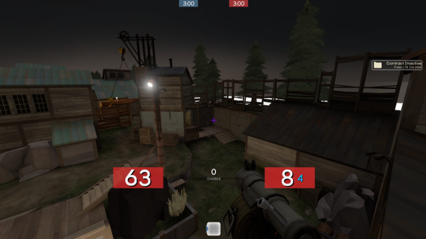
Yes, the lighting feels unusually bright for a nighttime map. The map could definitely benefit from a 3D skybox, both to give the map more realistic surroundings and to cover up the white bottom half of the 2D skybox. Additionally, the rock prop directly next to the control point on Red's side is unusually dark, the one at the center of this image:

Other than that, the map looks visually great. I can't pass too much of a judgement on the gameplay because I haven't had a chance to play it, but the layout is definitely intriguing.
Other than that, the map looks visually great. I can't pass too much of a judgement on the gameplay because I haven't had a chance to play it, but the layout is definitely intriguing.
- Aug 1, 2015
- 78
- 38
Major Changes:
Read the rest of this update entry...
-Removed both under and around flank routes to better focus player attention on the capture point. The side building now has been re-purposed to have a small health and ammo kit with stairs leading to the point.
-Two doors on the lower spawn transition buildings have been enlarged to decrease difficulty in pushing out of spawn.
-Health and ammo kits have been moved slightly to make getting to them easier. It no longer requires a crouch jump and one of them is now behind cover.
-Left upper cliff in the second courtyard has been opened slightly more so players don't get stuck in the cubby where the health and ammo once sat.
-Lighting has been overhauled to make it feel more like night time, and the mid has gotten better spotlights.
-Added ramp to get up to the point from the sides.
Minor changes-Two doors on the lower spawn transition buildings have been enlarged to decrease difficulty in pushing out of spawn.
-Health and ammo kits have been moved slightly to make getting to them easier. It no longer requires a crouch jump and one of them is now behind cover.
-Left upper cliff in the second courtyard has been opened slightly more so players don't get stuck in the cubby where the health and ammo once sat.
-Lighting has been overhauled to make it feel more like night time, and the mid has gotten better spotlights.
-Added ramp to get up to the point from the sides.
-Lights moved for better coverage.
-Clipping fixes
-Displacement sews with alphas changes for a better look.
-New lights added in some places.
-Polished the saw blades.
To those wondering, pictures will be posted soon.-Clipping fixes
-Displacement sews with alphas changes for a better look.
-New lights added in some places.
-Polished the saw blades.
Read the rest of this update entry...
Last edited:
your map needs optimisation, there's no fps drop when i testing it but it laggy as hell, don't wait until release
Edit: it did drop, i just tested again, from ~250 to ~90 fps
Edit: it did drop, i just tested again, from ~250 to ~90 fps
Last edited:
Ved
L1: Registered
- Jan 30, 2018
- 1
- 0
It all looks really great and well thought out, but from what I can see there's not too many places for small ammo and health kits. It may be just from what I can see in the pictures, but if not, the map could benefit from having small packs near to mid or something of the sort. Keep up the fantastic work  .
.
I have noticed frame drops in certain areas, I have been avoiding this for a while. Unfortunately, I can't wait anymore. I will get to work on finalizing the lighting and adding proper portals.
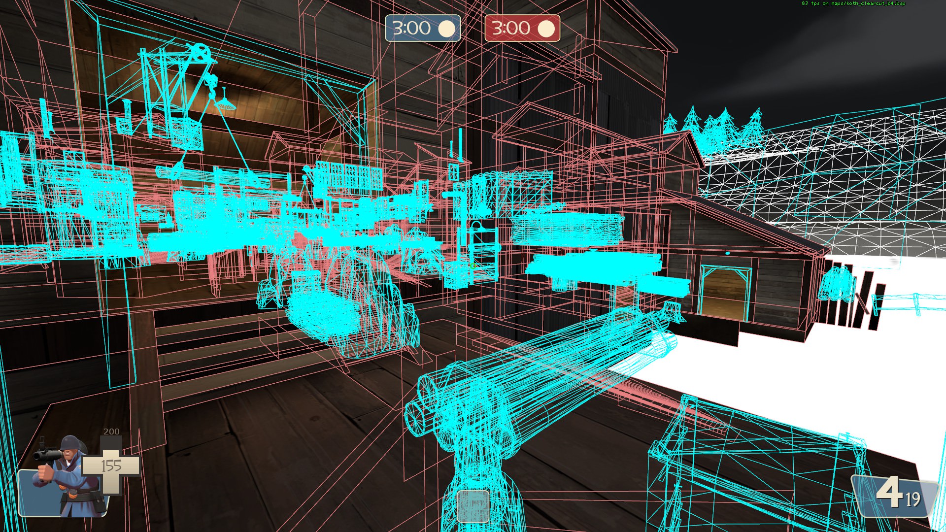
because your whole map is all-time rendered, use these commands: sv_cheat 1; mat_wireframe 3
you'll notice that without Hint or Area portal brush, the game will always draw out the whole map, even if you can only see a part of it
you could cut your map in half with hint brush, as a "hot-fix"
even though those competitive guys have there own config to boost the fps, but i don't think they'd like the huge fps drop
Kore4n
L1: Registered
- Jan 31, 2018
- 3
- 2
Love the map! May want to add another spawn door as the two doors are easily trappable by demomen at top left, though. The many cool places to hide in the ceiling, roofs, and high walls will probably make this a very soldier-oriented map too. This is all coming from a 6s player, but I think the map's just big for both 6s and highlander. Also, adding mid packs in main house and right side saw house wouldn't hurt!

Left is a little too far back from the point and low down so I don't see myself going there too often in 6v6, but other than that I'd enjoy seeing this in the regular UGC map rotation if you can convince them to add it.
Left is a little too far back from the point and low down so I don't see myself going there too often in 6v6, but other than that I'd enjoy seeing this in the regular UGC map rotation if you can convince them to add it.
Beater
L1: Registered
- Nov 25, 2017
- 31
- 174
Just from running through this map I'd say it looks pretty promising. It seems slightly larger than your average 6v6 koth map, but at the same time it's pretty simple, so keeping track of enemy flankers should be doable. I'd love to test this out once you fix the terrible lag that the map has.
- Aug 1, 2015
- 78
- 38
Major Changes:
Read the rest of this update entry...
-Added rocks to right side stairs to provide cover.
-Enlarged main house lower door to compensate for the choke that the rock previously mentioned created.
The Actual Rocky Part:-Enlarged main house lower door to compensate for the choke that the rock previously mentioned created.
The map has frame issues. This isn't surprising to those who have played it recently. Unfortunately this won't be an easy fix, huge chunks of detail may have to be scraped in order to optimize frame rates. Buildings need re-working and this is all because of how I (unconventionally) built the map. This will take some time and the next update is far away from now, but like bungee once said,"It has to be fun before it looks nice."
Read the rest of this update entry...
shotspike3
L1: Registered
- Feb 3, 2018
- 1
- 0
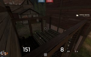
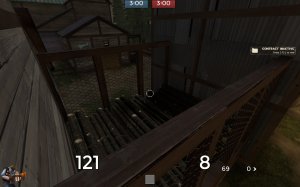
I really like the map and all but the lighting can use a bit of work, also maybe another spawn door would be good, and I think I found a bug. you can basically stand on the bars right there on both sides. But overall its a great map
Attachments
- Aug 1, 2015
- 78
- 38
What's This?:
This is mostly for just feedback on framerate and such, the update is not finished. However, I needed some way to test out framerates and that is why a almost finished version of b4 has been posted.
Some Changes:
Read the rest of this update entry...
This is mostly for just feedback on framerate and such, the update is not finished. However, I needed some way to test out framerates and that is why a almost finished version of b4 has been posted.
Some Changes:
-Added a skybox(unfinished)
-Made Areaportals for all large interior buildings
-Attempted to create a working hint system(No dice)
-Messed around with lighting a bit.
-Made Areaportals for all large interior buildings
-Attempted to create a working hint system(No dice)
-Messed around with lighting a bit.
Read the rest of this update entry...


