Cauldron

Cauldron a10

Shmitz

Old Hat
aa
Nov 12, 2007
1,128
746
ALPHA 3
* Added nobuilds to cauldron area rocks and the upper ledges by the final point.
* Tweaked spawn times a little to encourage more action between points 2 and 3.
* Added gondolas to final points.
* Added railings by the lower approaches the the center point.
* Downgraded lower tunnel health kits to small.


Starting out with minor tweaks to try to get more action between points 2 and 3, and make the final point a little bit less stalemate-prone.
 

Fireman

L4: Comfortable Member
Mar 21, 2008
150
59
Very well made, I love the dynamics of each point. Anyone with knockback can have fun with the middle point's dropoff, and the ability of the teams to drop in on each other means that even the most determined cap attempt can be dislodged with a well placed pyro. :D

I like the distribution of health, you can much go heal no matter where you are on the map, without having it too readily available.

The last cap gave me pause, because at first it felt really difficult to defend, and the ability of the enemy team to attack from 3 sides (left, right, rocket jump) was a bit hard to deal with. Planting a heavy on the point by the end seemed to mostly alleviate that problem, and I think the problem was more on the ability of the massed opposing scouts to run circles around us than it was the point's balance.

Now onto the problems :D

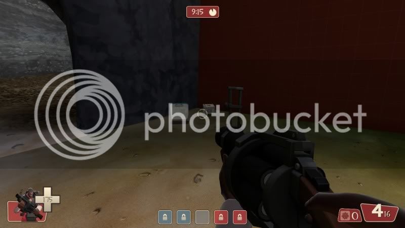
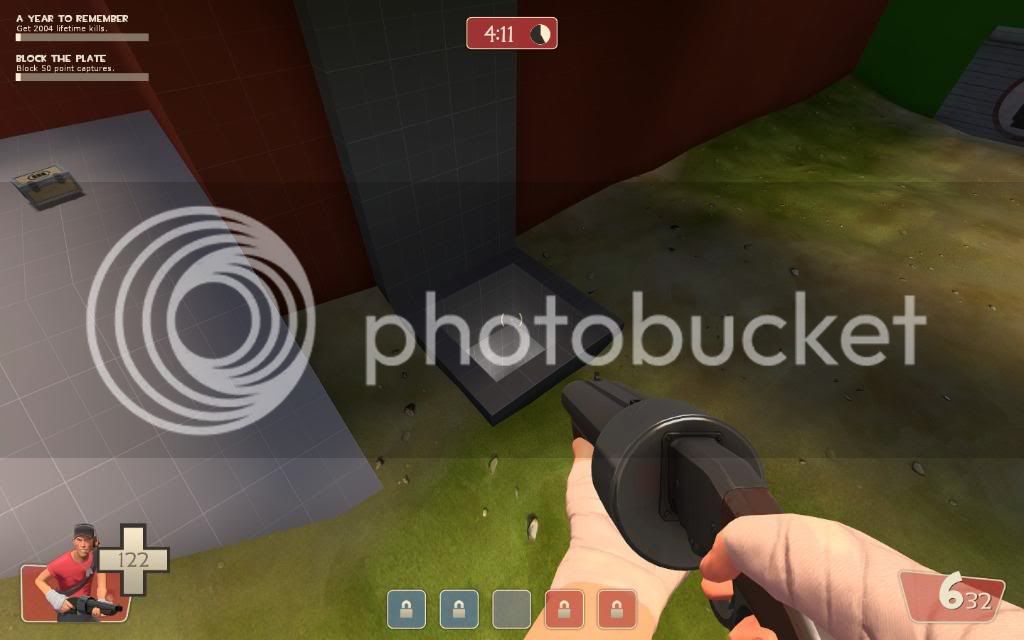
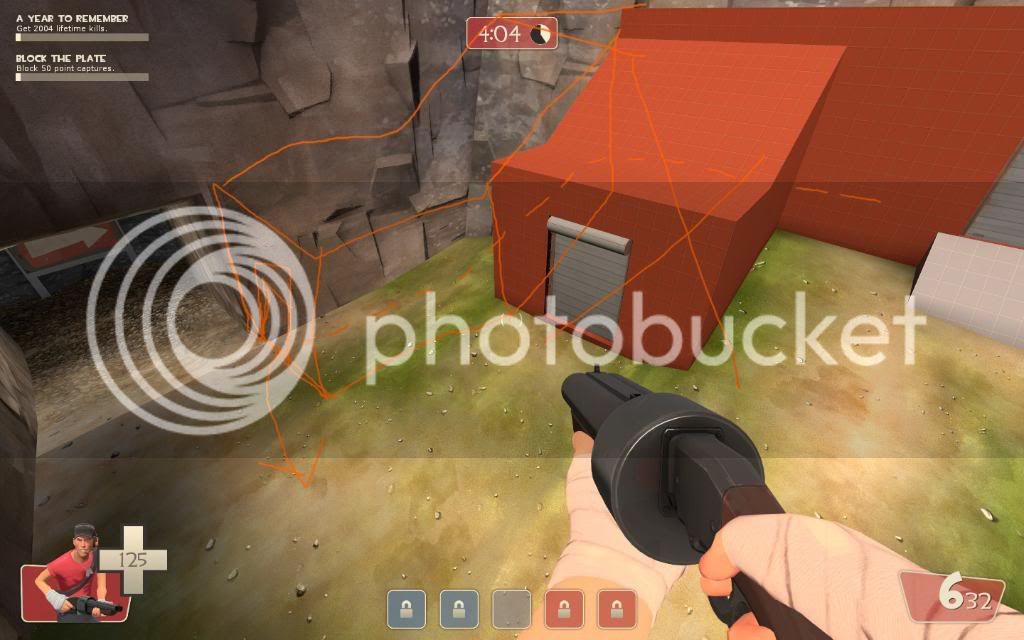
The healthpack in this pic didn't see much use from what I saw. It's rather far away and secluded from most of the action, personally I only ever saw it when I was running out of spawn towards the middle. I don't know if infiltrating classes used this particular path more, but for now it feels like it could probably me moved/removed.

cp_cauldron_a30000.jpg


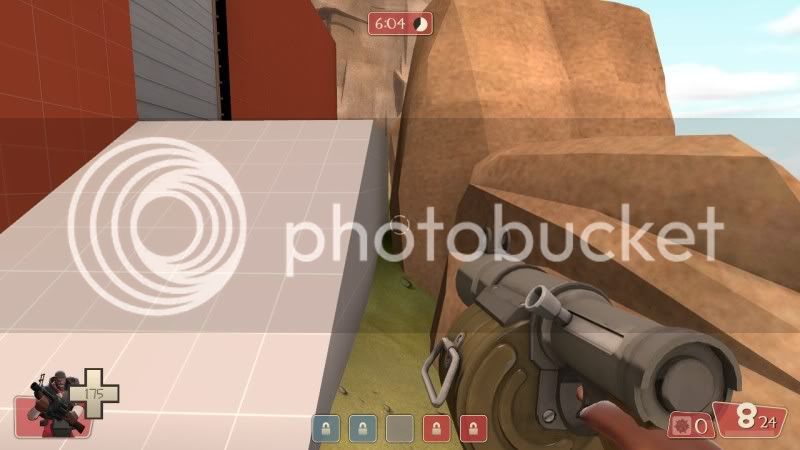
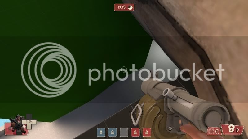
This gap here needs to be clipped. I jumped into it from the spawn ramp, and got temporarily lodged there, and when I tried to get out I slowly slid forward out of the rocks.

cp_cauldron_a30006.jpg


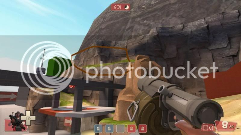
Next up, if you rocket/sticky jump up onto this ledge...

cp_cauldron_a30004mod.jpg


Your nodraw is showing :D

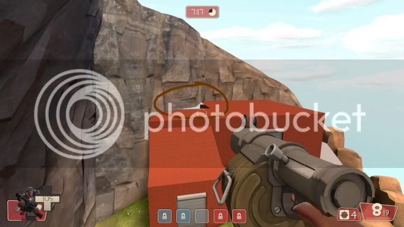
cp_cauldron_a30001mod.jpg


And to your right you can run along until you reach this spot here, perfect for the camping demo, though testing will have to tell whether it becomes a problem.

cp_cauldron_a30002.jpg
 

Ninjilla

L420: High Member
Sep 13, 2008
445
116
From what I played today, I did have a little trouble finding out where I was going as I would go from near the 5th CP to the 3rd, so I had some trouble finding the 4th, but not too long after I was getting around alright. I love the way the 2nd/4th CP plays out, and the middle is very fun too. Didnt get to play on the last points much, scout rushes :p
 

Altaco

L420: High Member
Jul 3, 2008
484
120
Incoming constructive criticism dump.

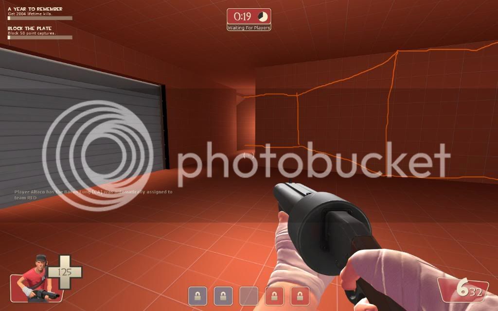
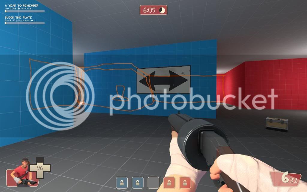
cp_cauldron_a30000.jpg

This path out of the spawn seems to go unnoticed, maybe cut off a chunk of that wall so it's wider and more obvious.

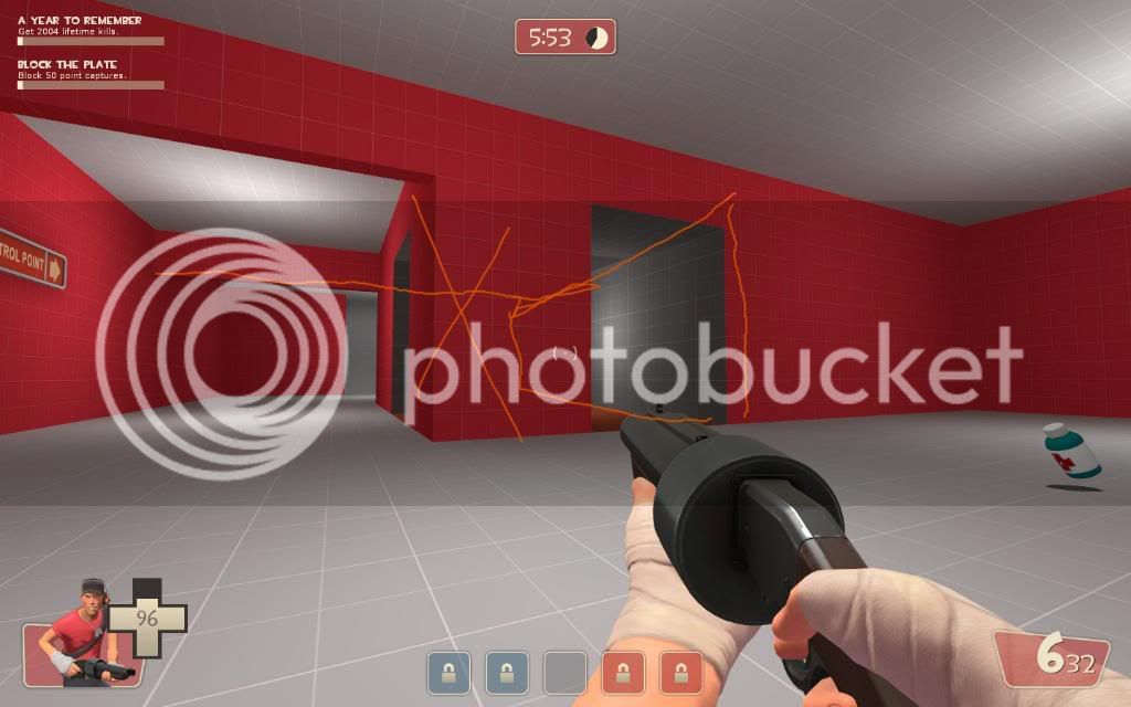
cp_cauldron_a30003.jpg

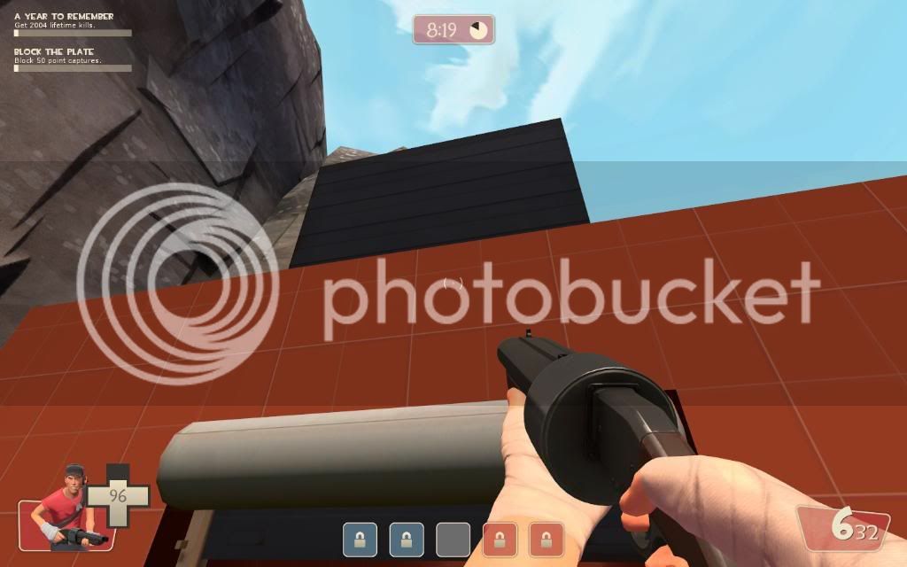
For future reference - this door goes through the roof.

cp_cauldron_a30004.jpg

This is very picky, but if this is intended to look like it could close up, it doesn't match :3

cp_cauldron_a30005.jpg

This space feels quite cramped. You could put something more there to block visibility, but I think if you cut out that block there entirely it could work nicely.

cp_cauldron_a30006.jpg

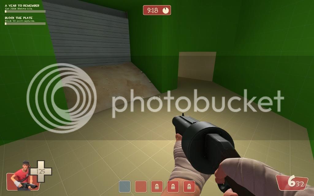
This area could be simplified by cutting out that block there. That tiny corridor in there under the hole is pretty cramped.

cp_cauldron_a30007.jpg

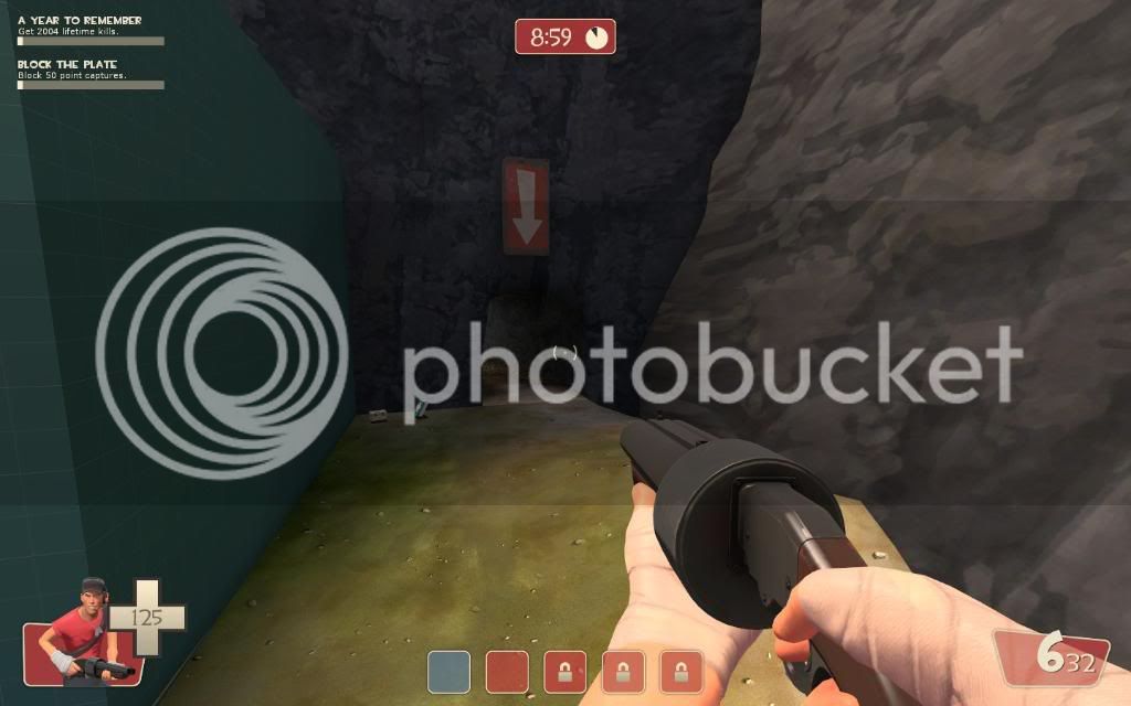
This signage is confusing.

cp_cauldron_a30008.jpg

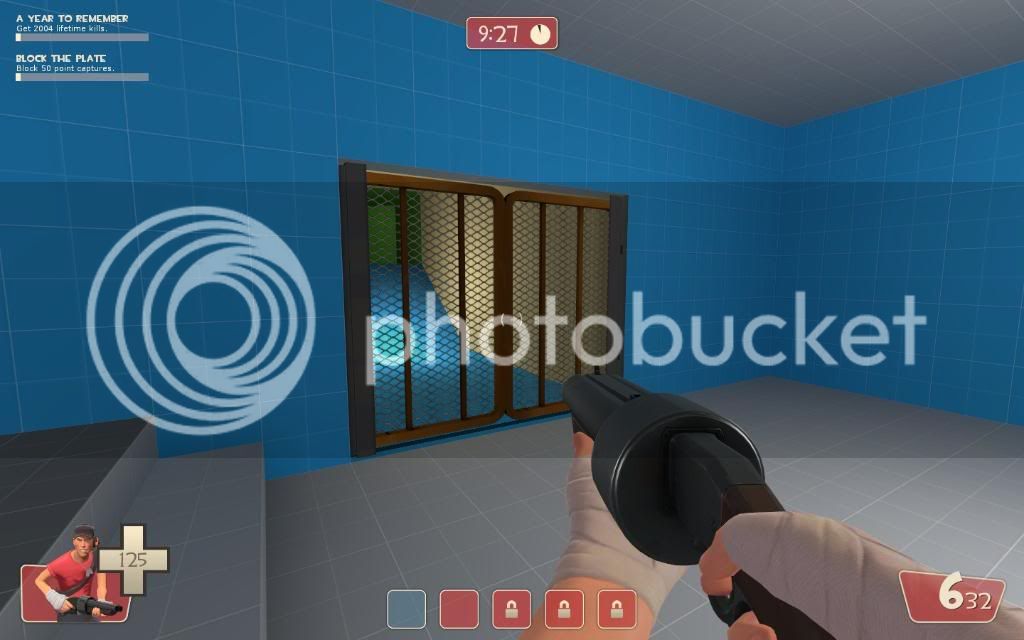
Needs more to draw attention to this hole.

cp_cauldron_a30011.jpg

I think this gate should be replaced with a typical spawnroom door to make it clear that it's not just a gate.

cp_cauldron_a30012.jpg

Again, kinda picky, but when you spawn here you only see the front door (the big one) and so you automatically go there. I think if you changed the angles of the spawnpoints so you can see both of the exits it might encourage players to use the alternate route more.

cp_cauldron_a30013.jpg

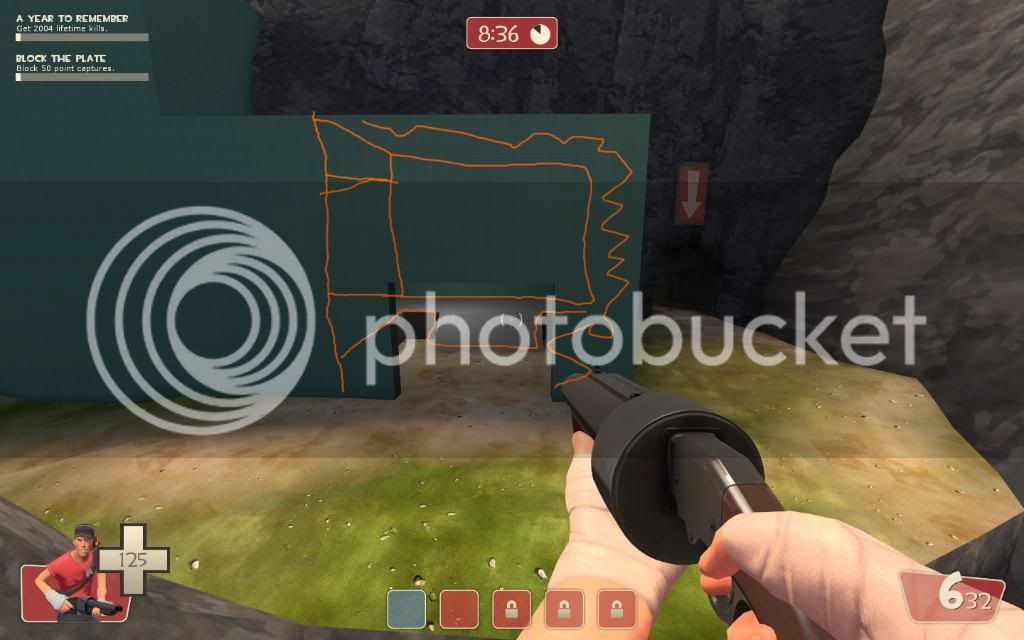
This exit, while a very good strategic route for a team attacking the final point, is very out of the way and not apparent at all. I think you could remedy this by cutting away a portion of the building next to it and leaving it open, at least partially, to allow the attacking team to see that it's a viable route:
cp_cauldron_a30014.jpg


cp_cauldron_a30015.jpg

This side passage ends up spitting the spawning players exactly where the other one does. I think by moving the exit over a bit you could present a somewhat different strategical option by allowing for them to come in a bit behind the attackers.

That's all I have for now, hope it helps.


Also:
Hey look, I found the Great Volcano Spirit living at the bottom of the lake!

great_volcano_spirit.jpg


32zltht.jpg

It's the engineer!
 
Last edited:

Shmitz

Old Hat
aa
Nov 12, 2007
1,128
746
Great feedback guys. :)

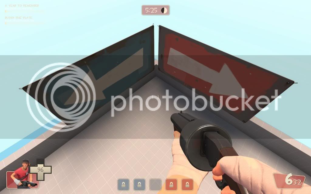
cp_cauldron_a30007.jpg

This signage is confusing.

If I were to get rid of one of the arrows, I would probably be inclined to get rid of the one pointing back towards the final point. Is it really not commonly known that you generally are supposed to follow the arrows that match your team color? I suppose this is one of the pitfalls of being a level designer... these little visual conventions get so ingrained in your head that it's no longer obvious what "normal" players are aware of. :p
 

Altaco

L420: High Member
Jul 3, 2008
484
120
Great feedback guys. :)


If I were to get rid of one of the arrows, I would probably be inclined to get rid of the one pointing back towards the final point. Is it really not commonly known that you generally are supposed to follow the arrows that match your team color? I suppose this is one of the pitfalls of being a level designer... these little visual conventions get so ingrained in your head that it's no longer obvious what "normal" players are aware of. :p

I guess usually you see signs of your team color on their own and so it's more obvious what to follow. However, when there are two arrows right next to each other pointing in opposite directions, it causes the player to stop and think "wait, so is this pointing the direction BLU is supposed to go or to BLU's point?" I think you could even benefit by recompiling that arrow model at 1/3 or 1/4 size so you could hang it from the top of the tunnel exit so people coming out of the tunnel are pointed left, and the people going past it get a direction to go too. Play with arrangements that make it so the direction you're going shows you an arrow but makes the other one somewhat hidden due to the direction you're facing.

Just my thoughts, you could ignore that entirely if you so choose.
 

Shmitz

Old Hat
aa
Nov 12, 2007
1,128
746
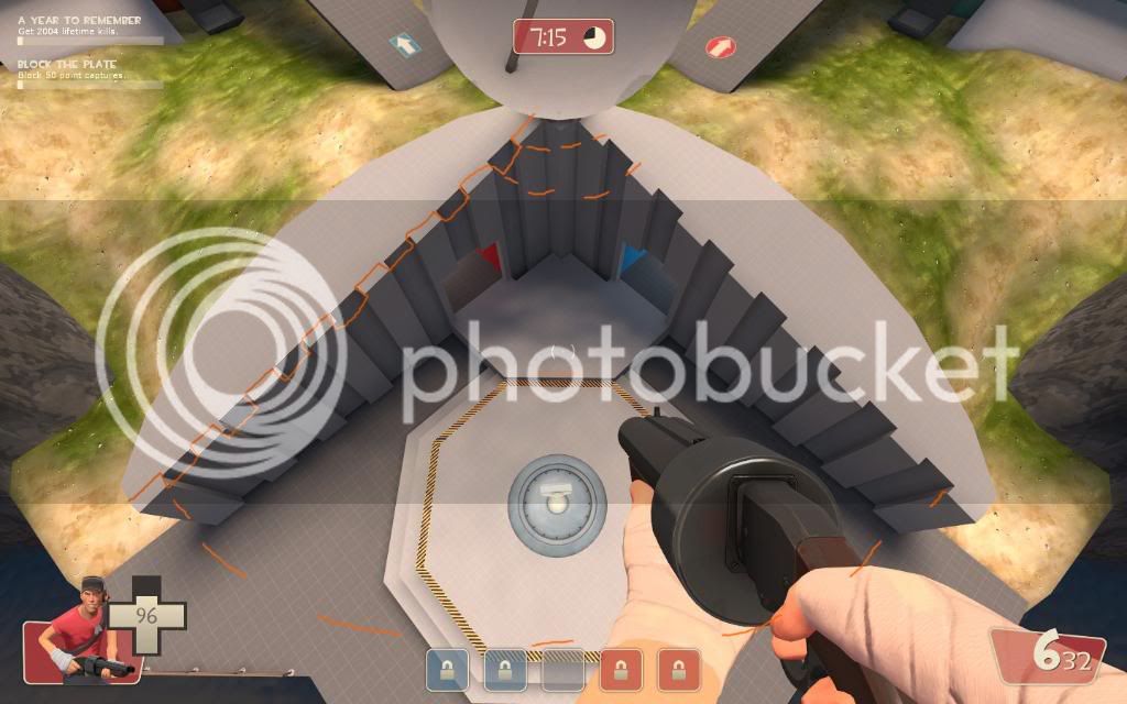
I just reviewed the gameday demo a couple times, and I noticed something about the initial fight over the center point. Pretty much every single round, red rushed everyone straight onto the capture zone to begin taking the point. Blue, on the other hand, waited a heartbeat or two and then started killing them from the ledge above, wiping them out and subsequently taking the point.

Should I try to add some kind of cover for people on the point, or is it better to encourage people to be more clever in their offense, and kill the other team before making the capture?
 

Hellfire

L9: Fashionable Member
Jul 9, 2008
601
142
i think the second one
 

Nineaxis

Quack Doctor
aa
May 19, 2008
1,767
2,820
I like being able to attack from above without obstruction. It means a good team can easily clear the point, and an experienced team is wary about threats from the sky. It requires some strategy, and that's a good thing. If you have an idea to improve the point that doesn't remove the tactical advantages of the higher ledge, go ahead and implement it, but I'm sure most players enjoy the vertical element of the cap.
 

FreeLance_FoX

L6: Sharp Member
Sep 6, 2008
353
173
Personally I love the metagame of the cap as it is, it really has a nice flow and unique flavor that requires a lot of strategy. The only thing I could recommend to improve performance, having played it as much as I have, is that you could add some cover below the point. Where that little peg is now you could put a rock that people would be able to hide behind, thus enabling people who come under to attack to possibly escape, allowing for spies etc to attack middle with a place to uncloak, and encouraging more battles on the point itself (whereas MOST battle will take place with either one or both team above the point).

<333,
FoXy
 
Last edited:

Shmitz

Old Hat
aa
Nov 12, 2007
1,128
746
cp_cauldron_a3dev_01.jpg


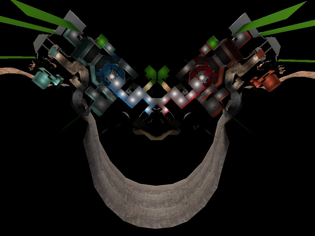
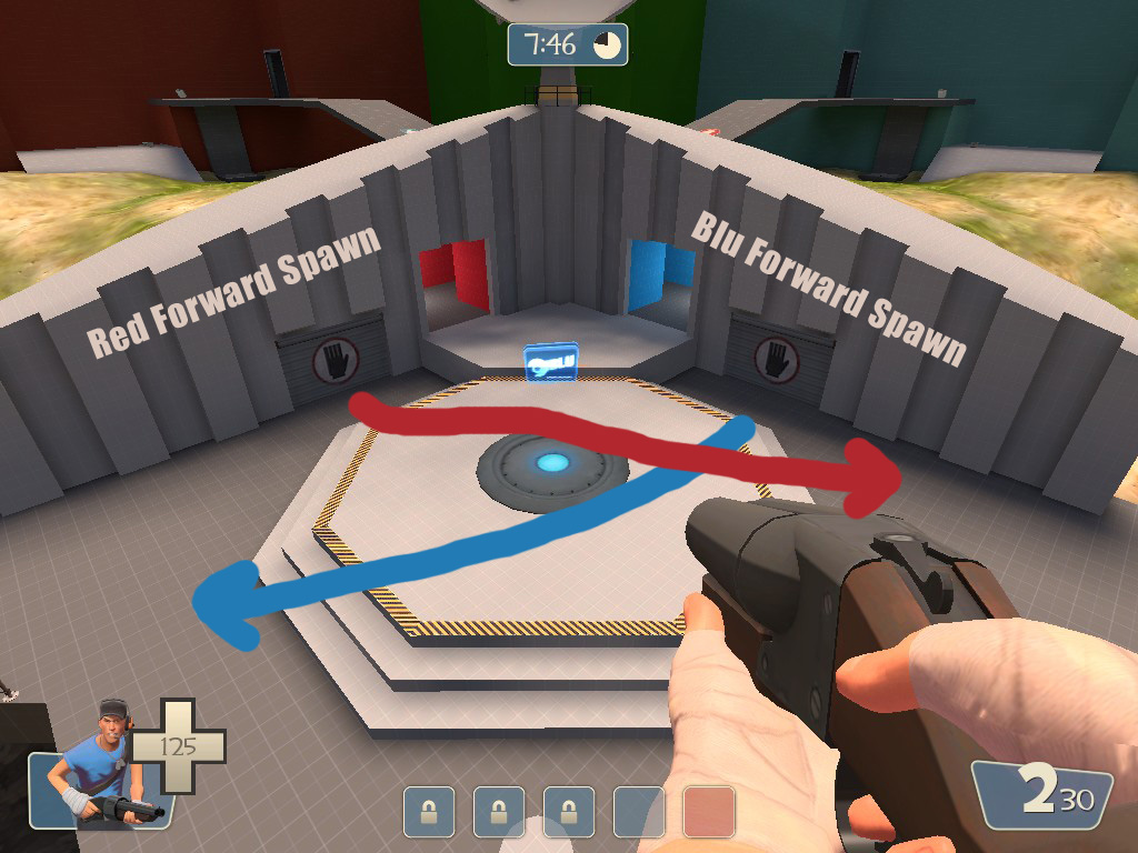
Moved the last forward spawns over to the middle CP. This gives defenders a few more seconds advantage to move in to take back point 2. Also, the obvious path for offense towards point 2 becomes the tunnels, which gives them a bit less a height advantage coming in. And lastly, it makes the side tunnel a little bit more natural for offense to take to assault the final point.

At least, that's what I hope. :)
 

MungoKing

L3: Member
Jul 12, 2008
148
47
Middle cp looks great, the rest of the map is odd and confusing :/


How many rounds have you played, out of curiosity? Personally I found the map quite fluid and easy to maneuver after just 2 rounds.
 

Fireman

L4: Comfortable Member
Mar 21, 2008
150
59
I'm with Mungo, after a round or two on cauldron I got the basic layout down pretty well. Try experimenting with different routes each spawn, it really helps in learning how everything hooks up.
 

Mar

Banned
Feb 12, 2009
607
63
Well It's TF2F so they play it until someone scores 5 points. So 5 rounds.
 

Snipergen

L13: Stunning Member
Nov 16, 2007
1,051
150
I like the design of the middle point Shmitz, it's great for offense gameplay to hang over the ledge and fire away, but the only problem in my eyes, it's hard for defense: no sentry spots and no cover. Ofcourse, that is similar to cp_well that the middle point is more open, and the other points are more defendable , so I will need to play the map a bit more :D

I'm also interested in what you will do with the giant crater later on :)
 

Fireman

L4: Comfortable Member
Mar 21, 2008
150
59
I rather like that the mid is less defendable than the other points, it discourages turtling, and keeps both teams pushing to reach the next capture area.