You are using an out of date browser. It may not display this or other websites correctly.
You should upgrade or use an alternative browser.
You should upgrade or use an alternative browser.
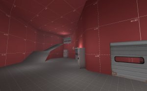
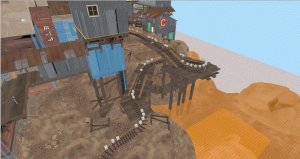
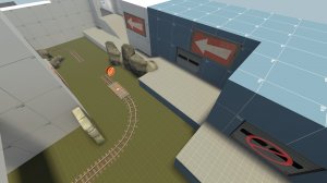
the front picture looks like a putt-putt course. Which is a good thing. I don't know why it reminds me of that though.
Now that you said it, i can never unsee it. I might include an easteregg that emphasises on that
That final look like a REALLLLLLLLY uninteresting version of Upward's final. It's a lot flatter, has less cover, and the deathpit is tiny.
And sidenote, there seem to be a lot of arrows in one area. I don't think players need that many laying around. But then again Badlands does the same thing, so I don't know.
And sidenote, there seem to be a lot of arrows in one area. I don't think players need that many laying around. But then again Badlands does the same thing, so I don't know.
That final look like a REALLLLLLLLY uninteresting version of Upward's final. It's a lot flatter, has less cover, and the deathpit is tiny.
And sidenote, there seem to be a lot of arrows in one area. I don't think players need that many laying around. But then again Badlands does the same thing, so I don't know.
I didn't add cover to last for now because i want to see how it plays out. The main entrance where the cart has to go through is not as wide as Upward last, but the flanks are wider, so for now i'll keep it open and then place it in case a side needs help. My plans also had another flank route which i might implement if i realize that it's too hard to push in. That flank would also add an additional level of height variance (which is the one thing that makes it "a lot flatter.")
I have to say that i planned out last less than the other parts of the map, i was pretty much winging it for now. That also means that it is much more prone for change in the following versions.
About the arrows: Most of these won't be visible at the same time when i get to later versions of the map. For now, i didn't do the necessary I/O work for that to happen (except for one or two arrows within gameplay space.) The layout is still very likely to change, so i wanted to keep it as lightweight as somehow possible for now. That also means that every arrow that describes every gameplay situation is visible at all times.
So, Lambdas Special Imp Feedback time!
First of all, the general things that i got from the test:
1. Last is bad. Like really bad. I will probably remake most of it. What i did like was the way that the blu balcony was balanced by having to walk through a really long sniper sightline. I will also open the flank i mentioned before.
2. I went over-the-top when rescaling the area after first. I panicked after my 7.2h map was dramatically underscaled and widened every area that i considered too small. The width might actually be fine, but it needs to offer more interesting fighting space.
3. BLU spawn area is a bit open. It doesn't need that much change, but there is room for improvement.
4. Spawn times and added time are both off by a bit. That was expected as i ripped it directly from Upward without any changes. I will start to play around with it now that i got some general feeling for it.
Now, !fb feedback time.
@Muddy
"defending seems fairly difficult"
To be honest: While i'll completely redesign last anyway, at the time you defended you had 4 players less on RED than on BLU. In that case, i would expect a roll, even over 2 points.
@KubeKing
"Might want to have a healthpack spawn here once the doors open, I came in here looking for health"
I'll consider it, but i'd probably do it on a delay. The way i'm disabling the forward spawn is "get out there and fall back to the top of the hill, now." If i put a health kit in there when it unlocks, RED might be able to defend from there for a while.
"You could probably lengthen Blu's initial respawn time"
I completely agree, pushing out of first is a bit to fast for my liking anyway, and adding more cover/making the space more interesting to play on will only make that easier.
"Too many signs visible from this spot"
I also agree, but like i said in the previous post, i want them to pop up depending on where the cart is later in development. For now, they'll probably stay.
@manskirt (I have no idea what the forum name is)
"why is there no tracks here?["
Putting down tracks on flat ground is easy. Putting down tracks on slopes is hard and takes a long time. I won't do that until i'm really sure that i want the slopes to stay the way they are.
Everything else was about last, and i'm thankful for your insights which will help me make it as enjoyable as most of the map seemed to be for most testers. Thanks for testing everyone!
Changelog
Starting timers
Time: stays at 330s
BLU respawn: 4s -> 6s
RED respawn: stays at 9s
After A is capped
Time added: 180s -> 150s
BLU respawn: 2s -> 4s
RED respawn: 10s -> 9s
After B is capped
Time added: 300s -> 210s
BLU respawn: 2s -> 4s
RED respawn: 10s -> 8s
After C is capped
Time added: 240s -> 210s
BLU respawn: stays at 2s
RED respawn: 10s -> 8s
Screenshots
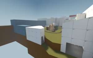
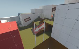
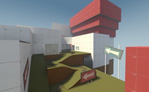
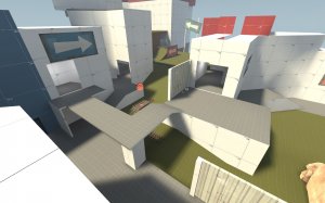
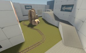
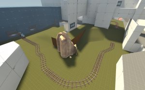
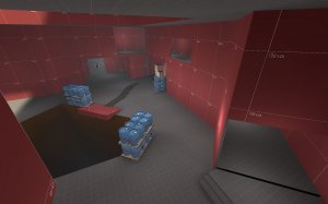
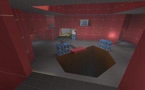
Read the rest of this update entry...
- Completely remade last
- Redesigned building east of C, adding flank into last (opens after C is capped)
- Added some height variation to BLU spawn -> A
- Redesigned first half from A to B
Starting timers
Time: stays at 330s
BLU respawn: 4s -> 6s
RED respawn: stays at 9s
After A is capped
Time added: 180s -> 150s
BLU respawn: 2s -> 4s
RED respawn: 10s -> 9s
After B is capped
Time added: 300s -> 210s
BLU respawn: 2s -> 4s
RED respawn: 10s -> 8s
After C is capped
Time added: 240s -> 210s
BLU respawn: stays at 2s
RED respawn: 10s -> 8s
Screenshots


Read the rest of this update entry...
Changelog
Read the rest of this update entry...
- Removed rollback zone for now
- Raised a building to show that you can't get on top of it
Read the rest of this update entry...
Lambda Imp & Gameday Feedback time!
First, let me get some points out of the way that were exclusively discussed during the demos rather than in the feedback.
@worMatty - You were asking why i removed the rollback zone at last or rather didn't fix it properly. I woke up on friday morning, ready to go on vacation over the weekend when i found out a2 was tested. I took 30 minutes off my morning to check the replays and found out that the rollback was kinda broken. I checked on the map itself, and while it was partially broken because i set wrong flags, it also was partially due to how TF2 handles carts going up a 45° angled slope. I only had a few minutes to fix it before i had to leave, so i just removed it so it could still be played on game day without bigger problems. The map is quite a bit bigger than my other projects in terms of size and combat areas, so there is a lot of stuff to review, and i want to get the versions into as many gamedays and imps as somehow possible.
Now, general things i saw during the two demos:
1. B is a bit chokey, the BLU forward spawn exits are too. I don't think they have to be as chokey as they are right now. I'll redesign some parts of it.
2. Especially during the gameday, the building between BLU spawn and the first part of second was abused to flank around at positions where you weren't supposed to be A LOT. I'll rethink about that.
3. I went a bit overboard overall when increasing BLU respawn timers, although i don't really understand how they can end up with 11 seconds in the first spawn with a set spawn time of 4s.
4. I'll remove the namesake paintbucket + brush from the PL cart in A3. It wasn't a good joke to begin with, and getting stuck on it doesn't really help that.
Individual feedback:
@MeM
"you need to add one way gates on the flank routes"
It looks like the coordinates you wanted to point your feedback at were lost. If able, please let me know which flanks you were talking about.
@EwanLan / @MeM / @Lovres
"you should remove that catwalk above the second point. It provides too good of a sight line."
I agree. It'll be removed or at least lowered by quite a few hu while redesigning the last part of second.
@EwanLan
"this foward spawn is way too close to 2nd, making it a pain to push"
While i kinda agree (and i will consider it when redesigning that part of the map) i also think it should be hard for BLU to cap B, as once they cap B, they'll get the forward spawn that is very close to the point and RED gets pushed all the way back to last. This makes this a bit of a 2-stage map within a single map.
@Junko Enoshima, @Muddy
"right spawn exit seems unneeded and easily camped"
I agree, the line of sight here is really bad. I'll redesign parts of it.
@Junko Enoshima
"seems really small for pl map"
Does it? Track length etc were inspired by Upward. I'll probably will do a comparison anyway, and when i'm done i'll let you know my results, but the size seems reasonable.
@Infernal Tryhard
"this window is missing its texture"
It's missing the cubemaps, not the texture. I'll probaby include cubemaps in A3 because the window is kinda important for visibility.
@JR
"no collision on this prop"
Yep, i forgot that. Probably will have to clip it anyway.
@Anguish
"this sentry spot is perf ty"
Oh, the headache that spot is causing for me right now. I'll leave it in, because it's part of the map's most distinctive feature, but i probably will have to fix when and how you will be able to access and hold it.
@Berry @The Letter Before A
"why is there sky/clip here"
That's kind of a corner case clip. I chose to add it because i didn't want to add another weird sentry-jump spot or similar, but i might play around with it in the future.
@Muddy @Berry and everyone else who made clipping suggestions:
I agree that i didn't clip inside gameplay space a lot in this version. I will do it in parts of the map where i'm pretty sure that they'll stay that way.
Last but not least, there were some bigger gameplay concerns raised by @Wilson, @Psy and @Diva Dan - But i want to do some research and write another post to address them. So, be sure to check it out later. Or don't, y'know, i can't tell you what to do.
To be completely honest about that sentry spot, I can't identify any other decent holds on the map. It creates a situation where one spot is godly and the rest are kinda meh. I'd say keep it in until there are some better spots elsewhere.
I know of at least one, possibly two good sentry spots at last and a few that are good, but spammable at first and second. You can see both of those on last on the 8th screenshot in the A2 release, the more obvious one conveniently highlighted by a large ammo box. I actually was a bit more nervous about them then the one you used.
Brushpush - My Analytical Approach
Preamble: This is a process i usually use at the moment when creating a new map. I usually just don't write it down in this level of detail - Most of the time i just wing it while opening the reference map or maps in the background.
So, in the last Gameday, @Diva Dan, @Psy and @Wilson raised some good points about Brushpush. Most of it, rather than being about some special interaction in one part of the map, were general gameplay critisms. Let me recitate some of them.
Rather than wildly overreacting (Which at some points in the past has been my approach to these kind of critism) i tried to find out why the kind of gameplay happened that caused them to give this kind of feedback.
The first and easy-to-find-out reason was that i completely missed a sentry spot used by @Anguish that could, with some preparation, create a situation in which RED could hold the ramps from B to C in a way more aggressive fashion than i expected them to be able to, which caused pushes to spill over into every flank that was thought to help the attackers, which caused the attackers to be overrun from directions i did not think would be reasonable places to attack back from. Combined with the BLU forward spawn being as small as it is (and clearly doesn't have to be) and the a-bit-too-long respawn times that caused a "we're being attacked from all sides" feeling.
The second one, and one that takes a lot longer, is to take a look at official maps that did similar things. As some of the players (or the guys who read the posts in this thread) already realized, brushpush is at it's core deeply inspired by pl_upward. This is because i still consider Upward to be the gold standard of Payload maps in TF2, maybe even the gold standard of all official TF2 maps.
As i said before, i'm not a big fan of the chokey, long alleyway kind of gameplay of hoodoo, goldrush and similar. While it's easy to set a focus on these kind of maps, personal choice plays a much smaller role in them. I enjoy myself much more on the open, lots-of-flanks gameplay areas of Upward and Borneo, and the perfect or near-perfect mixture between focus and choice is what i try to reach when creating a map.
While the shapes and areas of Brushpush look different (the most obvious thing is that Upward is spiral-shaped and Brushpush is S-shaped,) you still can see a lot of similarities.
First Capture Zone
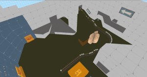
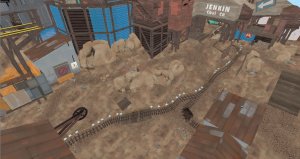
The easiest-to-see similarity is the spawn. While they look different, the exits are within a few HU apart from each other if you copied and pasted them from one map to the other. The biggest difference is that brushpush has two front exits where Upward has one and that the right side exit opens in front of a building rather than to the side.
Upward has two flanks, one on each side. The left one has a small battlement. The right one provides a lot more cover when trying to get to the playground. It has a choke area with the playground (aka another battlement.) It offers direct access to the top of the playground with a few jumps over the rock in front of it.
Brushpush also has two flanks. The left one also has a small battlement. The right one in this case is a low ground which provides a lot of cover from anyone on the big battlement (aka the playground.) It also offers direct access to the top of the playground by walking a few extra steps.
Another important difference is that because of the shape of the map, the tracks on Brushpush don't go right after the curve to the left, but leave the area to the left.
The track length between points is ~2800hu on Upward and ~2400hu on Brushpush.
Directly talking about what @Diva Dan said during the gameday: The chokiest point to move through is 200hu on Upward and 320hu on Brushpush, so i don't think i have to change that. The right flank is between 128 and 192hu wide, and i understand why that could be too small.
A to B
This is easily the most different area in terms of look and gameplay, and also interestingly the most problematic area in A2a. As i plan to redesign most of it for A3, i won't go into detail on that one. Let me just say that while i won't try to replicate Upward A to B, i'll take a good, long look at it before deciding what happens with my new area.
B to C
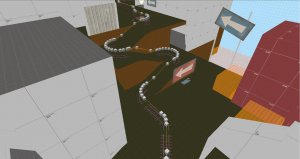
Doesn't look too similar, right? Well, if you define the wooden construction on Upward and the serpentine on Brushpush as a ramp area, you can begin to see the similarities. You spawn on the left and directly go to the left flank route (upper building on Upward, and the building with the big ramp on Brushpush) The flank route on the right is smaller, but also exits at the top of the hill way faster. Both flanks on both maps exit on about the same place.
The left flank also opens up into more flanks for last - I'll write more about that when analysing last.
The main difference: To complete the left flank on Upward, you have to go through the main fighting area. To complete the right flank on Brushpush, you also have to go through the main fighting area - This has been switched around.
Track length: 1600hu "downtime" on Upward (usually not contested) +2560hu, Brushpush has 2600hu. This means that while RED doesn't have as long to set up after they lose B, they'll probably still be close to the ramp area and might have even already set up defense when they lose B. Depending on how A to B will look like after i changed it, this might change and might cause me to change something on this area.
The final push
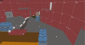
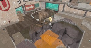
Let's look at the similarities first. There's a main path with a choke before entering the final area. Both of them have about the same width. Both of them have an highground flank which can be accessed from the building that was the left flank on B->C. Both of them have sniper battlements on the red spawn as well as giving slight height advantage to anyone exiting red spawn. Both of them have a "downtime area" in front of the final building which usually shouldn't be heavily contested.
There's quite a few differences here: The left flank on Brushpush also offers a secondary, lower flank route that gives you A REALLY DEEP PENETRATION into the final area. This replaces the low level flank on Upward and also serves as a deep flanking opportunity for RED. The downtime area in front of Brushpush final is less spacey and open, but the left flank is quite a bit larger (and more important,) which should invite BLU engis to set up camp there, which also should give attackers better options. It's harder for RED to get on the attacker high ground because you have to push through left flank rather than getting your own stairs on the right flank. Last but not least, red does not have a sentry platform on Brushpush, but has a sentry position next to the right flank exit in the same vein as Badwater last.
If you combine everything, you still get about the same gameplay elements, except for REDs access to the high ground, which i didn't really realize until i wrote this all down (And this is why doing writing way to many words is helpful sometimes.)
Track length: Upward: 1780hu downtime + 1012hu, Brushpush: 1670hu downtime + 700hu
So, taking all that into account, i have to say that i don't think the problems happened because of the areas i described here in detail (although i found quite a few things to think about and/or change while writing this down) but rather from a combination of problems with the way A->B is set up, which then spilled over into the B->C area. I also realized that the difficulty level isn't yet fine-tuned enough, as B is harder than C and might even be harder than D.
I hope my analysis was enjoyable to read, i know i learned a lot of things by writing it all down. I hope you learned something about my map creation process too and maybe even found an insight into the mad mind of Dr.Lambda
Feel free to let me know about anything that you think is wrong about this post. I didn't expect this to take 90 minutes to write down, but here we are.
Preamble: This is a process i usually use at the moment when creating a new map. I usually just don't write it down in this level of detail - Most of the time i just wing it while opening the reference map or maps in the background.
So, in the last Gameday, @Diva Dan, @Psy and @Wilson raised some good points about Brushpush. Most of it, rather than being about some special interaction in one part of the map, were general gameplay critisms. Let me recitate some of them.
Rather than wildly overreacting (Which at some points in the past has been my approach to these kind of critism) i tried to find out why the kind of gameplay happened that caused them to give this kind of feedback.
The first and easy-to-find-out reason was that i completely missed a sentry spot used by @Anguish that could, with some preparation, create a situation in which RED could hold the ramps from B to C in a way more aggressive fashion than i expected them to be able to, which caused pushes to spill over into every flank that was thought to help the attackers, which caused the attackers to be overrun from directions i did not think would be reasonable places to attack back from. Combined with the BLU forward spawn being as small as it is (and clearly doesn't have to be) and the a-bit-too-long respawn times that caused a "we're being attacked from all sides" feeling.
The second one, and one that takes a lot longer, is to take a look at official maps that did similar things. As some of the players (or the guys who read the posts in this thread) already realized, brushpush is at it's core deeply inspired by pl_upward. This is because i still consider Upward to be the gold standard of Payload maps in TF2, maybe even the gold standard of all official TF2 maps.
As i said before, i'm not a big fan of the chokey, long alleyway kind of gameplay of hoodoo, goldrush and similar. While it's easy to set a focus on these kind of maps, personal choice plays a much smaller role in them. I enjoy myself much more on the open, lots-of-flanks gameplay areas of Upward and Borneo, and the perfect or near-perfect mixture between focus and choice is what i try to reach when creating a map.
While the shapes and areas of Brushpush look different (the most obvious thing is that Upward is spiral-shaped and Brushpush is S-shaped,) you still can see a lot of similarities.
First Capture Zone


The easiest-to-see similarity is the spawn. While they look different, the exits are within a few HU apart from each other if you copied and pasted them from one map to the other. The biggest difference is that brushpush has two front exits where Upward has one and that the right side exit opens in front of a building rather than to the side.
Upward has two flanks, one on each side. The left one has a small battlement. The right one provides a lot more cover when trying to get to the playground. It has a choke area with the playground (aka another battlement.) It offers direct access to the top of the playground with a few jumps over the rock in front of it.
Brushpush also has two flanks. The left one also has a small battlement. The right one in this case is a low ground which provides a lot of cover from anyone on the big battlement (aka the playground.) It also offers direct access to the top of the playground by walking a few extra steps.
Another important difference is that because of the shape of the map, the tracks on Brushpush don't go right after the curve to the left, but leave the area to the left.
The track length between points is ~2800hu on Upward and ~2400hu on Brushpush.
Directly talking about what @Diva Dan said during the gameday: The chokiest point to move through is 200hu on Upward and 320hu on Brushpush, so i don't think i have to change that. The right flank is between 128 and 192hu wide, and i understand why that could be too small.
A to B
This is easily the most different area in terms of look and gameplay, and also interestingly the most problematic area in A2a. As i plan to redesign most of it for A3, i won't go into detail on that one. Let me just say that while i won't try to replicate Upward A to B, i'll take a good, long look at it before deciding what happens with my new area.
B to C


Doesn't look too similar, right? Well, if you define the wooden construction on Upward and the serpentine on Brushpush as a ramp area, you can begin to see the similarities. You spawn on the left and directly go to the left flank route (upper building on Upward, and the building with the big ramp on Brushpush) The flank route on the right is smaller, but also exits at the top of the hill way faster. Both flanks on both maps exit on about the same place.
The left flank also opens up into more flanks for last - I'll write more about that when analysing last.
The main difference: To complete the left flank on Upward, you have to go through the main fighting area. To complete the right flank on Brushpush, you also have to go through the main fighting area - This has been switched around.
Track length: 1600hu "downtime" on Upward (usually not contested) +2560hu, Brushpush has 2600hu. This means that while RED doesn't have as long to set up after they lose B, they'll probably still be close to the ramp area and might have even already set up defense when they lose B. Depending on how A to B will look like after i changed it, this might change and might cause me to change something on this area.
The final push


Let's look at the similarities first. There's a main path with a choke before entering the final area. Both of them have about the same width. Both of them have an highground flank which can be accessed from the building that was the left flank on B->C. Both of them have sniper battlements on the red spawn as well as giving slight height advantage to anyone exiting red spawn. Both of them have a "downtime area" in front of the final building which usually shouldn't be heavily contested.
There's quite a few differences here: The left flank on Brushpush also offers a secondary, lower flank route that gives you A REALLY DEEP PENETRATION into the final area. This replaces the low level flank on Upward and also serves as a deep flanking opportunity for RED. The downtime area in front of Brushpush final is less spacey and open, but the left flank is quite a bit larger (and more important,) which should invite BLU engis to set up camp there, which also should give attackers better options. It's harder for RED to get on the attacker high ground because you have to push through left flank rather than getting your own stairs on the right flank. Last but not least, red does not have a sentry platform on Brushpush, but has a sentry position next to the right flank exit in the same vein as Badwater last.
If you combine everything, you still get about the same gameplay elements, except for REDs access to the high ground, which i didn't really realize until i wrote this all down (And this is why doing writing way to many words is helpful sometimes.)
Track length: Upward: 1780hu downtime + 1012hu, Brushpush: 1670hu downtime + 700hu
So, taking all that into account, i have to say that i don't think the problems happened because of the areas i described here in detail (although i found quite a few things to think about and/or change while writing this down) but rather from a combination of problems with the way A->B is set up, which then spilled over into the B->C area. I also realized that the difficulty level isn't yet fine-tuned enough, as B is harder than C and might even be harder than D.
I hope my analysis was enjoyable to read, i know i learned a lot of things by writing it all down. I hope you learned something about my map creation process too and maybe even found an insight into the mad mind of Dr.Lambda
Feel free to let me know about anything that you think is wrong about this post. I didn't expect this to take 90 minutes to write down, but here we are.
Changelog
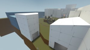
Timer changes
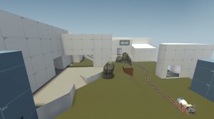
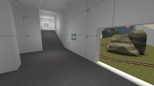
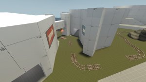
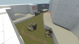
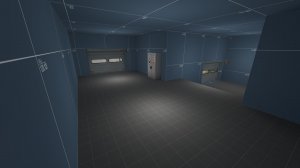
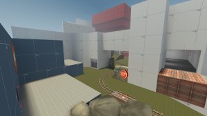
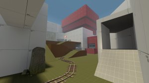
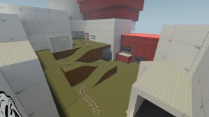
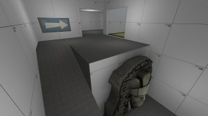
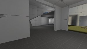
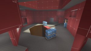
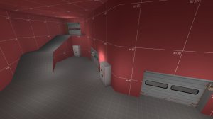
Read the rest of this update entry...
- Clipped a lot
- Moved a resupply at BLU spawn a bit further away from spawn exit
- Changed right BLU spawn exit to not give defenders such a big sightline into spawn
- Resized right flank building at BLU spawn
- Readded rollback zone to last
- Added hazard stripes on rollback zone
- Fixed a few brushes that were off by a couple of hu
- Removed clip on top of structure over A, added nobuild
- Began switching a lot of buildings from 8-16hu wall width to 32hu wall width to prepare for detailing
- Completely remade A->B
- Completely remade forward spawns
- Arrows appear and disappear according to current game state
Timer changes
- BLU First Spawn: 6s -> 4s
- BLU After A: 4s -> 3s
- BLU After B: 4s -> 3s


Read the rest of this update entry...
The Letter Before A
Cool Idiot
- Jul 15, 2016
- 292
- 196
Did you miss a word here? I'm assuming you meant authors who don't listen to feedback.Experiments prove that maps whose authors listen to feedback are slightly less likely to turn out to be of good quality. No wonder those who know about this little trick use it.
The Letter Before A
Cool Idiot
- Jul 15, 2016
- 292
- 196


