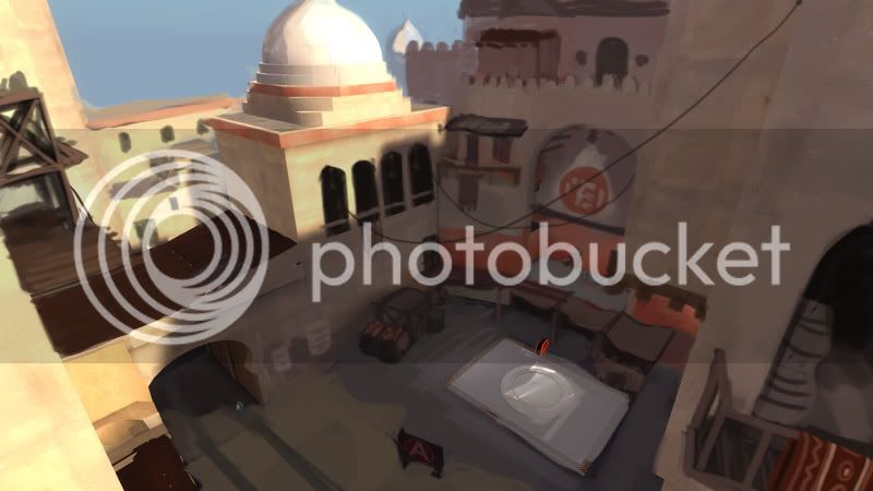
artpass_whark

What gametype should Whark's new map be?

  • CP

    Votes: 14 33.3%
  • CTF

    Votes: 9 21.4%
  • PL

    Votes: 19 45.2%

  • Total voters
    42

Whark

L3: Member
Jul 26, 2010
112
39
Oh right. Well, (whark can correct me if I'm wrong) but I think I know what that is. I made a solid texture for him without the stripe, but we were having problems with it last night and it wasn't displaying properly in the map before I went to bed (he said it was flickering black). So I think he's just using that red striped one temporarily until I can fix the original. That's my guess, anyway.
.

That's right. It would be safe to say that all of the texturing (in the level) is considered to be a WIP at this time. I do like to show it that way though because often you and the others have some cool ideas on how to tackle the problem.:)
 

grazr

Old Man Mutant Ninja Turtle
aa
Mar 4, 2008
5,441
3,814
A lot of your architecture is fairly blocky... and lacks... imagination. You need to be more experimental with the trims of buildings because as it is it's just blocks lumped on that are occasionally bevelled.

The way i typed this sounds kinda rude but it's not meant to be. Anyway, this theme is a good excuse to throw arcs and round corners into your map, things that don't suit the typical TF2 art style. Arabian achitecture is crazy and right now i'm not getting the same feeling of "wow, that's neat" from your architecture.
 

Whark

L3: Member
Jul 26, 2010
112
39
A lot of your architecture is fairly blocky... and lacks... imagination. You need to be more experimental with the trims of buildings because as it is it's just blocks lumped on that are occasionally bevelled.

The way i typed this sounds kinda rude but it's not meant to be. Anyway, this theme is a good excuse to throw arcs and round corners into your map, things that don't suit the typical TF2 art style. Arabian achitecture is crazy and right now i'm not getting the same feeling of "wow, that's neat" from your architecture.

Gotcha. Breaking away from that blocky feeling is constant struggle. I'll work to add more organic shapes and odd angles. As I'm pretty much ripping the entire level apart piece by piece and rebuilding it as it is, that should be achievable. Thanks for the critical feedback.
 

Pocket

Half a Lambert is better than one.
aa
Nov 14, 2009
4,701
2,583
A little note though...
It's far fetched, but I hope that using Alia's yet to be released Fez and Knife in your map won't count towards this rule:
"You are not allowed to advertise anything in your map, so no using those TF2Maps.net posters, Novint ones, or ads for other any communities."

That counts as advertising like putting Swamp Pack stuff in our maps counts as advertising for TF2M. It's just a free prop that, by the time the contest has been judged, will be part of the game itself. Better that than yet another custom prop to add to the assets if you win.
 

Gooba

L2: Junior Member
Jul 24, 2010
72
66
Heres the other one I did of the yard.
skysilcox_artpass_tf2_texturepass_1_yard.jpg
 

Whark

L3: Member
Jul 26, 2010
112
39
Heres the other one I did of the yard.
skysilcox_artpass_tf2_texturepass_1_yard.jpg

Hey hey. Nice take on the yard. Chemical Alia and were talking about how close your paintover of the market matched our vision of the area well as the assets on the to-be-done list. This one is equally similar in spirit but gives some good ideas as to how to make the upper part more interesting, particularly the upper balcony over the CP. Love the tire tracks too.

Thanks for taking the time to give such precise input. :)
 

Gooba

L2: Junior Member
Jul 24, 2010
72
66
Haha, no problem. Your map reminds me of de_dust from counterstrike (in a good way) and I've always been fascinated by middle eastern markets. :D
 

Verno

L2: Junior Member
Jul 17, 2010
80
34
This is definitely one of my favorite Art Pass maps. Also, this may be too Asian, but maybe you could have some auto rickshaws in the map (aka tuk tuks).

autorickshaw.jpg

(full size)
 

Chemical Alia

L2: Junior Member
Jul 22, 2010
98
52
This is definitely one of my favorite Art Pass maps. Also, this may be too Asian, but maybe you could have some auto rickshaws in the map (aka tuk tuks).

That thing looks awesome. There's already a hay cart replacement WIP, so I'm not sure where that would go v:

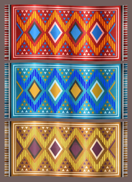
Here's a decal carpet, I still want to make a geometry one that's folded over like it's hanging, and do a different pattern for one of the skins.

d466be567f2805a55c49886dd72cbf486g.jpg
 
Jan 20, 2010
1,317
902
That thing looks awesome. There's already a hay cart replacement WIP, so I'm not sure where that would go v:

Here's a decal carpet, I still want to make a geometry one that's folded over like it's hanging, and do a different pattern for one of the skins.

http://www.mediafire.com/imgbnc.php/d466be567f2805a55c49886dd72cbf486g.jpg[*/IMG][/QUOTE]

Needs more wear and more tf2-style "paint."
 

Chemical Alia

L2: Junior Member
Jul 22, 2010
98
52
Needs more wear and more tf2-style "paint."

I have a "paint" layer in the psd, which is turned way down on the opacity on these, I was a little concerned that they would look too busy with the texture plus the pattern. I'll bump up the strength and see how it looks.

Not sure on extra wear though, since it's supposed to be a new carpet for sale in the market. Though actually, that's a good point. I'll ask whark if he wants some old worn ones for the ground and stuff... Thanks!
 

EArkham

Necromancer
aa
Aug 14, 2009
1,625
2,774
This is definitely one of my favorite Art Pass maps. Also, this may be too Asian, but maybe you could have some auto rickshaws in the map (aka tuk tuks).

autorickshaw.jpg

(full size)

Heh. I'm actually doing a tuk-tuk for my entry. Doesn't look like the one in the pic, however. It's less enclosed.

Kep
 

Pocket

Half a Lambert is better than one.
aa
Nov 14, 2009
4,701
2,583
I have a "paint" layer in the psd, which is turned way down on the opacity on these, I was a little concerned that they would look too busy with the texture plus the pattern. I'll bump up the strength and see how it looks.

Not sure on extra wear though, since it's supposed to be a new carpet for sale in the market. Though actually, that's a good point. I'll ask whark if he wants some old worn ones for the ground and stuff... Thanks!

I think he meant the carpet should sort of look like the pattern itself was painted. That's probably what Valve would do, or at least what they would try. Not sure if it would look any good though.
 

Whark

L3: Member
Jul 26, 2010
112
39
This is definitely one of my favorite Art Pass maps. Also, this may be too Asian, but maybe you could have some auto rickshaws in the map (aka tuk tuks).

autorickshaw.jpg

(full size)

Haha. Love the tuk tuk. That makes me want to do a more Asian themed one after this Art Pass hoopla is over! Actually I just need one to ride around in.
 
Jan 20, 2010
1,317
902
I have a "paint" layer in the psd, which is turned way down on the opacity on these, I was a little concerned that they would look too busy with the texture plus the pattern. I'll bump up the strength and see how it looks.

Not sure on extra wear though, since it's supposed to be a new carpet for sale in the market. Though actually, that's a good point. I'll ask whark if he wants some old worn ones for the ground and stuff... Thanks!

Hah. No problem. :p

It just looks too... shiny to me. Carpets are not shiny... usually.

Edit: Actually, I think it may be better if you made the carpets actually HAVE dimension, even on the ground. Make a flat model like 1-2 hammer units thick. Having it flat on the ground would be odd. Mostly because I can't think of a overlay Valve has right now that is intended for the floor that looks like it should be 3D.

Usually, when something is close like this rug and players will be looking closely at it, the more detail and depth you want. Farther away a decal right might be okay, but up close I think it needs to be a model.
 
Last edited: