artpass_whark

What gametype should Whark's new map be?

  • CP

    Votes: 14 33.3%
  • CTF

    Votes: 9 21.4%
  • PL

    Votes: 19 45.2%

  • Total voters
    42

Chemical Alia

L2: Junior Member
Jul 22, 2010
98
52
Will you release these things to the public even if the map doesn't win?
(No offense meant to your mapping friend :p)

I do wish him the best of luck, but it would be awful to see such fine models go to waste if his entry didn't get picked.

Of course, we were just talking about that last night. We like the idea that it's an expansion on the (rather small) Egypt asset package, and I'm more than happy to share the models/textures with the community.
 

Simski

L2: Junior Member
May 17, 2010
57
11
Of course, we were just talking about that last night. We like the idea that it's an expansion on the (rather small) Egypt asset package, and I'm more than happy to share the models/textures with the community.

I'm glad to hear this, because it will mean that even if this entry doesn't win... its new theme will be an excellent asset to a lot of mappers :p

Whark, are you keeping the truck in your map?
Because if you are, I think it might be a good to replace whatever it is loading with something more fitting your theme.

Ps. I like how you incorporated Alia's Fez and Knife :)
 
Last edited:

Chemical Alia

L2: Junior Member
Jul 22, 2010
98
52
I'm glad to hear this, because it will mean that even if this entry doesn't win... its new theme will be an excellent asset to a lot of mappers :p

Whark, are you keeping the truck in your map?
Because if you are, I think it might be a good to replace whatever it is loading with something more fitting your theme.

Ps. I like how you incorporated Alia's Fez and Knife :)

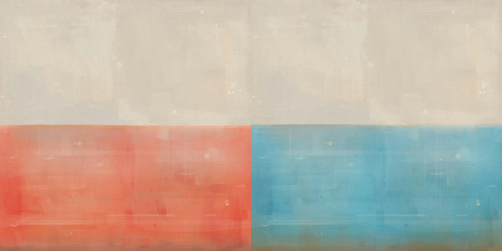
We're replacing the truck with something else, actually. Also, while we wait for some new stuff on the actual map, here's a new texture set I made tonight.

6398aa407192922f51a91a949621b3fd6g.jpg
 

Whark

L3: Member
Jul 26, 2010
112
39
There are definitely plans to share all of these great assets with the community! If anyone feels the urge to make a similarly themed Art Pass map now take that up with Chemical Alia :)

And now for a long overdue update:

skysilcox_artpass_tf2_detailpass_1_backmarket.jpg


Just getting the first detail pass on this back alley area.

skysilcox_artpass_tf2_texturepass_1.1_bluebase.jpg


Did a first detail pass on the Blue base. Relying not only on color but on the shapes of the geometry in general to distinguish what area you are in seems not only a good idea in general but also fitting to TF2's art style.

skysilcox_artpass_tf2_texturepass_1_bluebase.jpg


Just starting a first texture pass. Many more will come but I couldn't have these nice textures sitting around doing nothing.

skysilcox_artpass_tf2_texturepass_1_market.jpg


A little more detail on the Market area and first texture pass. Still not feeling yet..

skysilcox_artpass_tf2_texturepass_1_yard.jpg


A general overview of what the CP A area is looking like these days!

More to come.
 
Last edited:

Gooba

L2: Junior Member
Jul 24, 2010
72
66
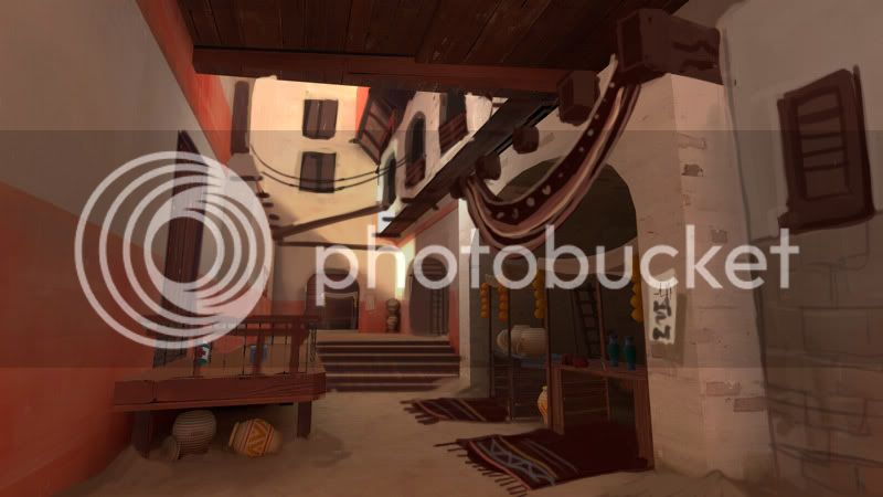
I really like the feel I'm getting from this already. Obviously you're not done with your map yet, but I think you can push the ideas/architecture a little more. I painted this over your screenshot, cause you said you weren't feeling that area. I figured this might help. Take what you want from it, or nothing at all, it was just something for fun.

skysilcox_artpass_tf2_texturepass_1_market.jpg
 

Tinker

aa
Oct 30, 2008
672
334
14:46 - bOEN: the whole point of the propped up cow cutout was because like
14:46 - bOEN: 2forts pretending to be a farm
14:46 - bOEN: is this pretending to be a desert??? that doesnt make sense

Be sure to remember the spytech bits too! While setting it here looks fantastic and is amazingly original, why would RED and BLU want a random market?
 

johndo

L1: Registered
Aug 9, 2010
10
2
Hehe, looks like the level is coming along nicely. The new wall texture is a huge addition.


I really like the feel I'm getting from this already. Obviously you're not done with your map yet, but I think you can push the ideas/architecture a little more. I painted this over your screenshot, cause you said you weren't feeling that area. I figured this might help. Take what you want from it, or nothing at all, it was just something for fun.

skysilcox_artpass_tf2_texturepass_1_market.jpg

And thanks Gooba for the paintover. It's funny that a good portion of the additions you place in are things we will be making or using: hanging wire, square plank jutting out the walls, and rug. The drapery is intriguing, we can squeeze that into our list of stuff to make. And I like that unique vase or urn in the back. Starting to make me think of various objects like incent candle burning using the spy's smoke particle or an open bag of some type of dry seeds.
 

Gooba

L2: Junior Member
Jul 24, 2010
72
66
Glad to help. I have a couple more paintovers of your other screenshots if you want to see those as well. I was using these as practice for my own map. :)
 

Chemical Alia

L2: Junior Member
Jul 22, 2010
98
52
I really like the feel I'm getting from this already. Obviously you're not done with your map yet, but I think you can push the ideas/architecture a little more. I painted this over your screenshot, cause you said you weren't feeling that area. I figured this might help. Take what you want from it, or nothing at all, it was just something for fun.

skysilcox_artpass_tf2_texturepass_1_market.jpg

Wow, thanks for the beautiful paintover, it really captures the atmosphere we have in mind. We have a lot of little props like the rugs/fabric and wood trim on our task list already, so it's great to see some thoughts on how we can use them. And I reallllly like that ladder. If you have others, I'd love to see them.

Also, Whark, that's amazing progress. BSP detail is awesome.
 
Last edited:

Simski

L2: Junior Member
May 17, 2010
57
11
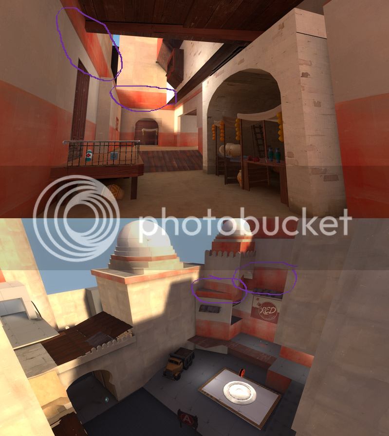
I must sadly admit I think it looks a bit strange with the red walls above the other red wall... (yeah I'm not very good at explaining)
The map looking very cool either way though, and I'm sure you'll do well at keeping my interest at high :p

A little note though...
It's far fetched, but I hope that using Alia's yet to be released Fez and Knife in your map won't count towards this rule:
"You are not allowed to advertise anything in your map, so no using those TF2Maps.net posters, Novint ones, or ads for other any communities."
 

Chemical Alia

L2: Junior Member
Jul 22, 2010
98
52
A little note though...
It's far fetched, but I hope that using Alia's yet to be released Fez and Knife in your map won't count towards this rule:
"You are not allowed to advertise anything in your map, so no using those TF2Maps.net posters, Novint ones, or ads for other any communities."

I dunno, I thought about that briefly as well, but I can't imagine how that could be considered advertising, or what it would even be advertising for. They're going to be part of the main game asset collection soon, and it seems silly not to utilize as many of the thematically-fitting assets as possible in order to add some variety to the market area.

Any other thoughts on it?
 

Simski

L2: Junior Member
May 17, 2010
57
11
I dunno, I thought about that briefly as well, but I can't imagine how that could be considered advertising, or what it would even be advertising for. They're going to be part of the main game asset collection soon, and it seems silly not to utilize as many of the thematically-fitting assets as possible in order to add some variety to the market area.

Any other thoughts on it?
I don't know what much more I can say at the moment, although to clairy my other point further...

I think this looks very strange, but I assume it is something that is temporary >.>
walls.png


I also hope you guys will find something to replace the big RED sign in picture 2, I feel it doesn't quite fit your theme very well.
 

Chemical Alia

L2: Junior Member
Jul 22, 2010
98
52
I don't know what much more I can say at the moment, although to clairy my other point further...

I think this looks very strange, but I assume it is something that is temporary >.>
walls.png

Oh right. Well, (whark can correct me if I'm wrong) but I think I know what that is. I made a solid texture for him without the stripe, but we were having problems with it last night and it wasn't displaying properly in the map before I went to bed (he said it was flickering black). So I think he's just using that red striped one temporarily until I can fix the original. That's my guess, anyway.

Also, about the RED sign, I have to think of some cool ideas for posters, or transparent art decals that look like they're painted onto the walls. Fake ads for products and businesses like they have in the other maps. I'll probably save that kind of stuff for the final polish stage, since I want to get all of the important assets out of the way asap.
 

Draco18s

L9: Fashionable Member
Sep 19, 2009
622
136
Fake ads for products and businesses like they have in the other maps. I'll probably save that kind of stuff for the final polish stage, since I want to get all of the important assets out of the way asap.

I've thought about making an ad that would thematically make sense (for example, "Mann Center Acting") that had a real counterpart (The Mann Center or The Mann Theater) just as a joke.

Sort of how ShadowRun has a German based AAA megacorp* called Saeder-Krupp Heavy Industries. Krupp being a real steel manufacturer in Germany (fictional timeline BMW acquired Krupp and Saeder Munitions sometime between 2011 and 2025). Or Ares Macrotechnology, the top-o-tha-line gun manufacturer. Real world counterpart: ARES Incorporated, a gun manufacturer.

But I wouldn't be able to do it right, because if its too obscure no one will get the joke, and if its too obvious it could be construed as advertising.

*See TV Tropes
 

Whark

L3: Member
Jul 26, 2010
112
39
I really like the feel I'm getting from this already. Obviously you're not done with your map yet, but I think you can push the ideas/architecture a little more. I painted this over your screenshot, cause you said you weren't feeling that area. I figured this might help. Take what you want from it, or nothing at all, it was just something for fun.

skysilcox_artpass_tf2_texturepass_1_market.jpg

Very nice! That is definitely the direction that I want to go with it. Thanks for taking the time to do that. I'll definitely steal from you ;)
 

Whark

L3: Member
Jul 26, 2010
112
39
I must sadly admit I think it looks a bit strange with the red walls above the other red wall... (yeah I'm not very good at explaining)
The map looking very cool either way though, and I'm sure you'll do well at keeping my interest at high :p

Yea I haven't fully fleshed out the upper detail just yet but your concerns are valid! That certainly is something that will be addressed.

A little note though...
It's far fetched, but I hope that using Alia's yet to be released Fez and Knife in your map won't count towards this rule:
"You are not allowed to advertise anything in your map, so no using those TF2Maps.net posters, Novint ones, or ads for other any communities."

We talked about this a little and decided that technically it's not advertising. But, that's a valid point. If others have concerns maybe we'll have to remove them :)
 

Whark

L3: Member
Jul 26, 2010
112
39
I think this looks very strange, but I assume it is something that is temporary >.>

It is temporary. I wanted to at least have some rough info on team color on the walls this time around. The way I usually work is very iterative. I usually change textures and details on multiple passes instead of trying to one-off everything on the first pass. The up side is that you're end result (when the level is done) is usually cohesive as you get feedback alot along the way. I like to benefit from others ideas. Like yours!

walls.png


I also hope you guys will find something to replace the big RED sign in picture 2, I feel it doesn't quite fit your theme very well.

Its funny that the more the map takes on its theme the more that bothers me. Glad you pointed it out so that I now know its not just me!