artpass_whark
- Thread starter Whark
- Start date
You are using an out of date browser. It may not display this or other websites correctly.
You should upgrade or use an alternative browser.
You should upgrade or use an alternative browser.
- Jul 26, 2010
- 112
- 39
Edit: Actually, I think it may be better if you made the carpets actually HAVE dimension, even on the ground. Make a flat model like 1-2 hammer units thick. Having it flat on the ground would be odd. Mostly because I can't think of a overlay Valve has right now that is intended for the floor that looks like it should be 3D.
Ah. We talked about that and my only concern about that was performance. I remember seeing in HL2 that rugs and such were often overlays. A particularly small but densely populated level I made for it once had some tricky optimization issues which I assumed ( partially) had to do with too much mesh. But if performance wouldn't be hurt by geometry thats even better because it will look better! I tend to be overly gung ho when it concerns performance, especially for MP levels, so I may need to be slapped back to my senses periodically
Leminnes
aa
- Jan 20, 2010
- 1,317
- 903
Ah. We talked about that and my only concern about that was performance. I remember seeing in HL2 that rugs and such were often overlays. A particularly small but densely populated level I made for it once had some tricky optimization issues which I assumed ( partially) had to do with too much mesh. But if performance wouldn't be hurt by geometry thats even better because it will look better! I tend to be overly gung ho when it concerns performance, especially for MP levels, so I may need to be slapped back to my senses periodically
I think it may be okay. And HL2 aesthetics are quite a bit different than TF2's. However, in HL2 I think Overlay rugs are ugly (I know which one you're talking about) but a flat rug shouldn't be any worse than a detail prop.
Chemical Alia
L2: Junior Member
- Jul 22, 2010
- 98
- 52
I think it may be okay. And HL2 aesthetics are quite a bit different than TF2's. However, in HL2 I think Overlay rugs are ugly (I know which one you're talking about) but a flat rug shouldn't be any worse than a detail prop.
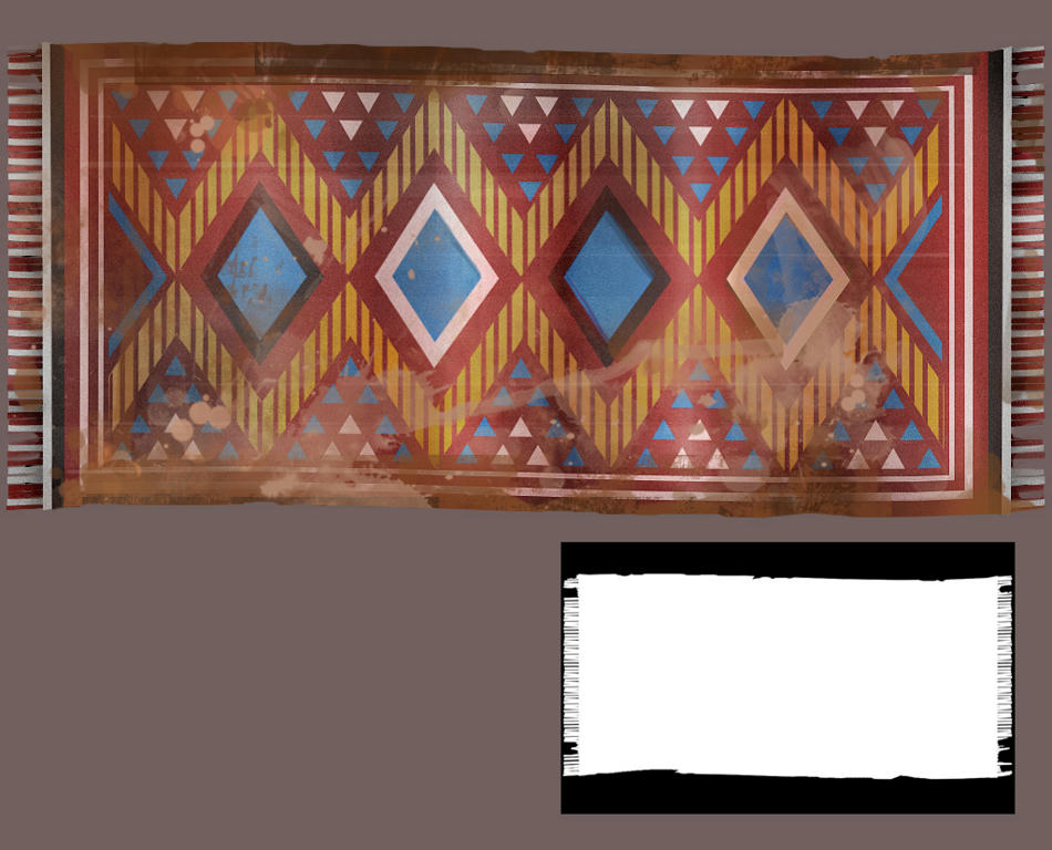
I'm up for whatever whark thinks is best, as long as it's not expensive. I'll be building a rug mesh next anyway and then folding it to be hung, so I'll be easy to try out a flat one with geometry. Here's a filthy rug.

Tinker
aa
- Oct 30, 2008
- 672
- 334
I agree on the rugs looking a little shiny. Rugs are made of hair, which means they look rather fuzzy, without many actual straight lines running through. They seem fine if you use them from a distance, but from close up it's going to look slightly off.

The design itself is good though, really mathematical like a lot of the Arabian world has it.
EDIT: artghraghra ninja'd

The design itself is good though, really mathematical like a lot of the Arabian world has it.
EDIT: artghraghra ninja'd
Chemical Alia
L2: Junior Member
- Jul 22, 2010
- 98
- 52
I'm up for whatever whark thinks is best, as long as it's not expensive. I'll be building a rug mesh next anyway and then folding it to be hung, so I'll be easy to try out a flat one with geometry. I also like that example rug pattern, and I'll take down the contrast on the other ones. I don't want to make the lines too wavy though, because if I end up making them 512, the detail will start to get blurry. It really depends on how big they will be in the game. Here's a filthy rug.

I agree that the shadows on the window meshes look a little strange, like they're really soft for the time of day. Someone suggested you can turn them off, that might work, or maybe you could set them in a little more?
Stink Horse
L2: Junior Member
- Aug 1, 2009
- 73
- 23
Hmm, I think your rug might be a bit too noisy actually. the alternating triangle patterns in the middle is just information overload. Consider reducing down the variety of visual elements, such as the variety of colors, number of internal strokes on the diamonds, and the vertical lines in the background pattern to help reduce it's visual footprint.
Also the level is ostensibly owned by the RED team. I don't think that having elements of blue in the rug really fit. Maybe orange or brown? Making even that little change could help make the rug better fit the TF2 style immediately and effectively.
Also the level is ostensibly owned by the RED team. I don't think that having elements of blue in the rug really fit. Maybe orange or brown? Making even that little change could help make the rug better fit the TF2 style immediately and effectively.
- Jul 26, 2010
- 112
- 39
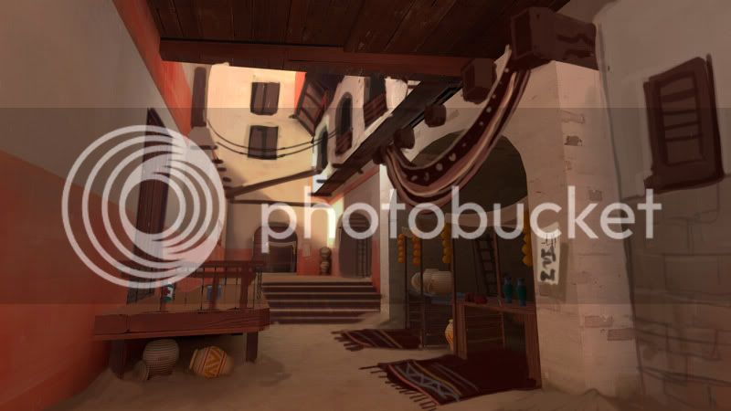
You need to noshadow those windows or build them into the wall.
Yea, now that you mention it I do. I was too lazy last night. I'm on it.
- Jul 26, 2010
- 112
- 39
Tinker
aa
- Oct 30, 2008
- 672
- 334
Remember that TF2 is a very mobile game as well - demomen, scouts and soldiers jumping all over the place. Make sure that your ceilings aren't too low or areas too restricted - I can imagine it being a danger when your theme is the (fairly close areas of) a middle eastern market.
Chemical Alia
L2: Junior Member
- Jul 22, 2010
- 98
- 52
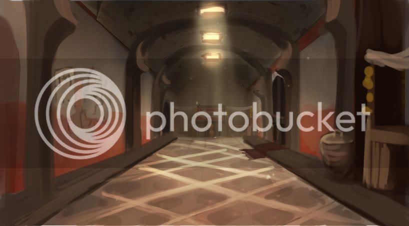
Maybe you could break up the ceiling arch in the hallway with an open space of some sort? I like the extra room it provides in the original, and its asymmetry. I'd say to google some interiors or even courtyard roofs, maybe there's some neat curved shape you can use that still allows for openness.
The right wall would have more visual interest if it was cut in in some places, maybe like there was a brick wall, which was overlayed by a plaster one over time and the shape became a little irregular. Of even if ther was an archway there at some point, and it was covered up with a new wall, but there's still a few inches of it visibly inset. I wonder what you have in mind for that part, but these are just some thoughts.
I'm still waiting on that one art test, and will probably start the other one tomorrow, so if you'd like I can do some draw-overs when I get off work.
Leminnes
aa
- Jan 20, 2010
- 1,317
- 903
The hallway doesn't need to be big and open. It COULD, but it doesn't need to be. The original is no taller than his detailed version, so I don't see the issue.
On another note, I'm really interested in what the CPs are going to look like on this. Don't forget to make the the visual points of interest.
On another note, I'm really interested in what the CPs are going to look like on this. Don't forget to make the the visual points of interest.
Chemical Alia
L2: Junior Member
- Jul 22, 2010
- 98
- 52
The hallway doesn't need to be big and open. It COULD, but it doesn't need to be. The original is no taller than his detailed version, so I don't see the issue.
Maybe I'm looking at it wrong, but on the left side the ceiling seems to rise up pretty high. It looks like just an aesthetic thing, so I don't think it really matters for gameplay, but it definitely seems like a cool thing to explore for visual interest.
Leminnes
aa
- Jan 20, 2010
- 1,317
- 903
Maybe I'm looking at it wrong, but on the left side the ceiling seems to rise up pretty high. It looks like just an aesthetic thing, so I don't think it really matters for gameplay, but it definitely seems like a cool thing to explore for visual interest.
It's certainly Whark's choice if he'd like. I was mostly referring to Tinker's post. He said that areas need to be open, I was saying that's not necessarily the case.
Chemical Alia
L2: Junior Member
- Jul 22, 2010
- 98
- 52
It's certainly Whark's choice if he'd like. I was mostly referring to Tinker's post. He said that areas need to be open, I was saying that's not necessarily the case.
Gotcha. But yeah, I agree that it's not necessary in this area. He probably has something in mind already, too v:
- Apr 19, 2009
- 4,460
- 1,724
- Jul 26, 2010
- 112
- 39
It's certainly Whark's choice if he'd like. I was mostly referring to Tinker's post. He said that areas need to be open, I was saying that's not necessarily the case.
Actually, there IS a player clip over that "open" area so it is, in fact, not traversable by players.


