- Jul 24, 2015
- 43
- 14
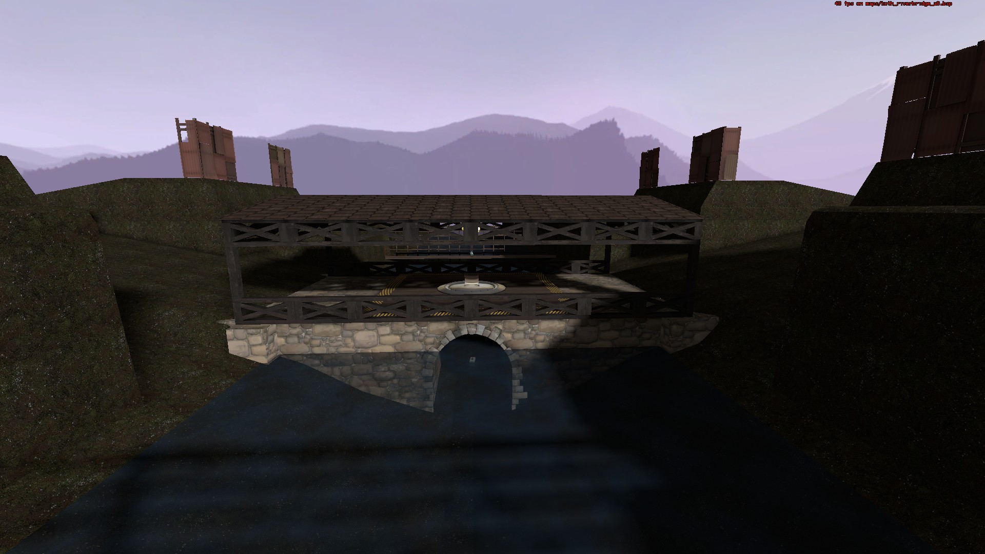
So before I ever joined TF2 Maps, I played around with the hammer editor and came up with detailed design ideas on graph paper. One of those designs was a stone bridge with wooden railings and a wooden roof. It looked pretty good. But when I tried to make a map around it. It didn't go so well.
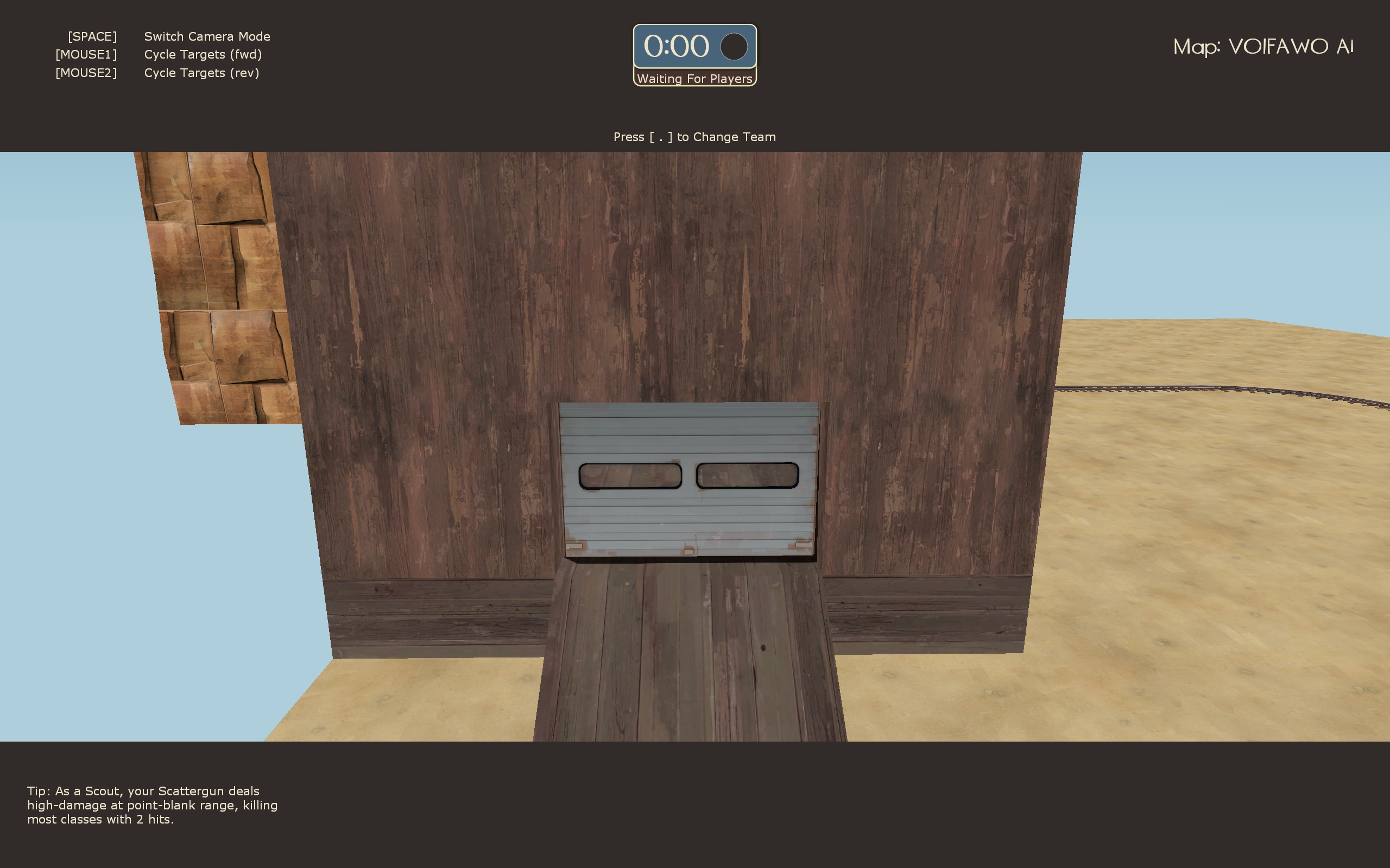
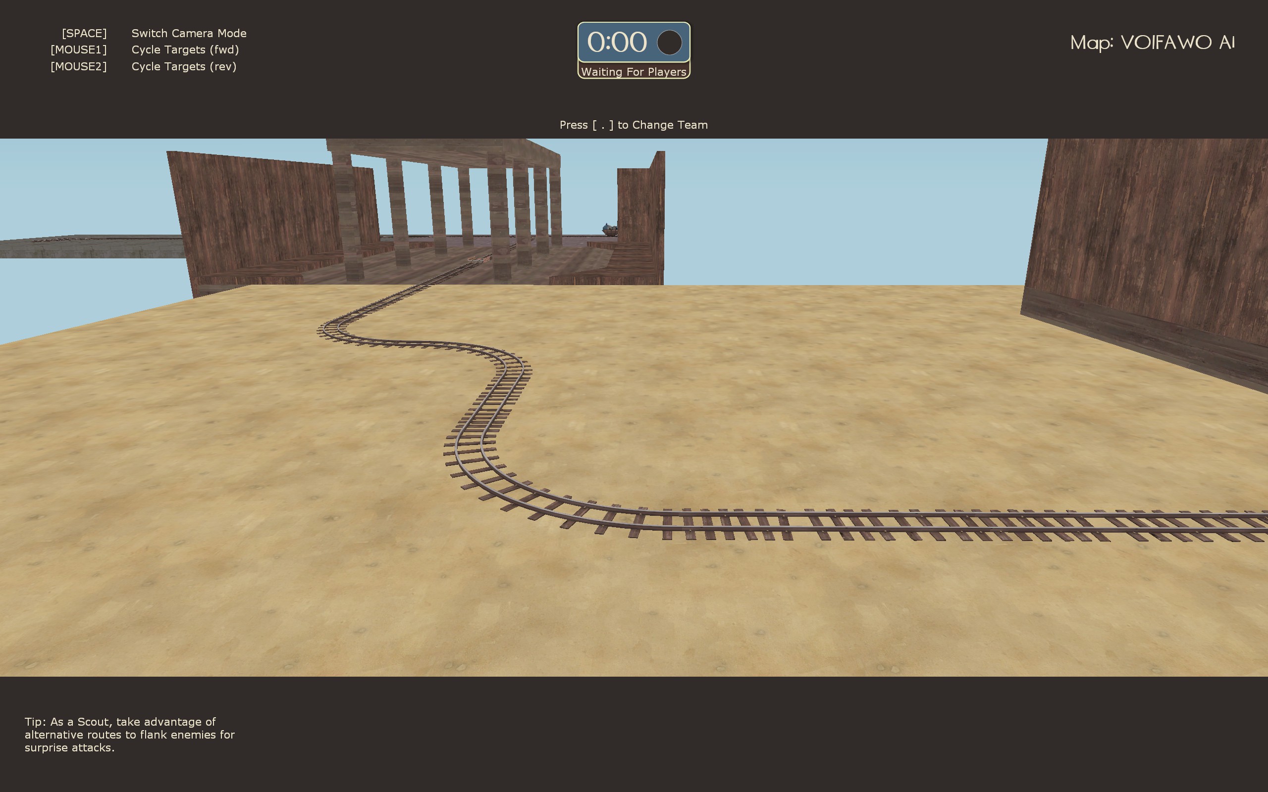
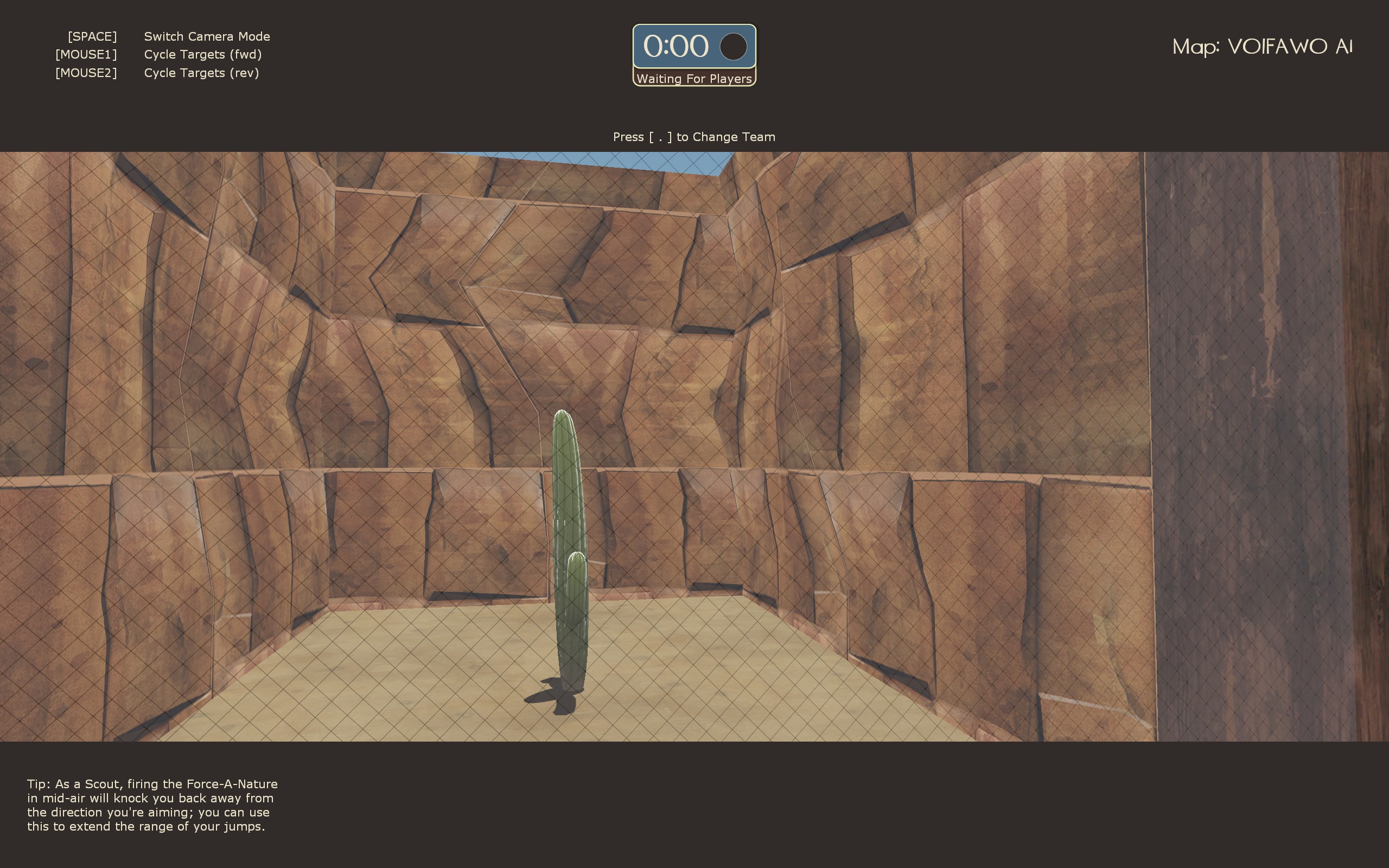
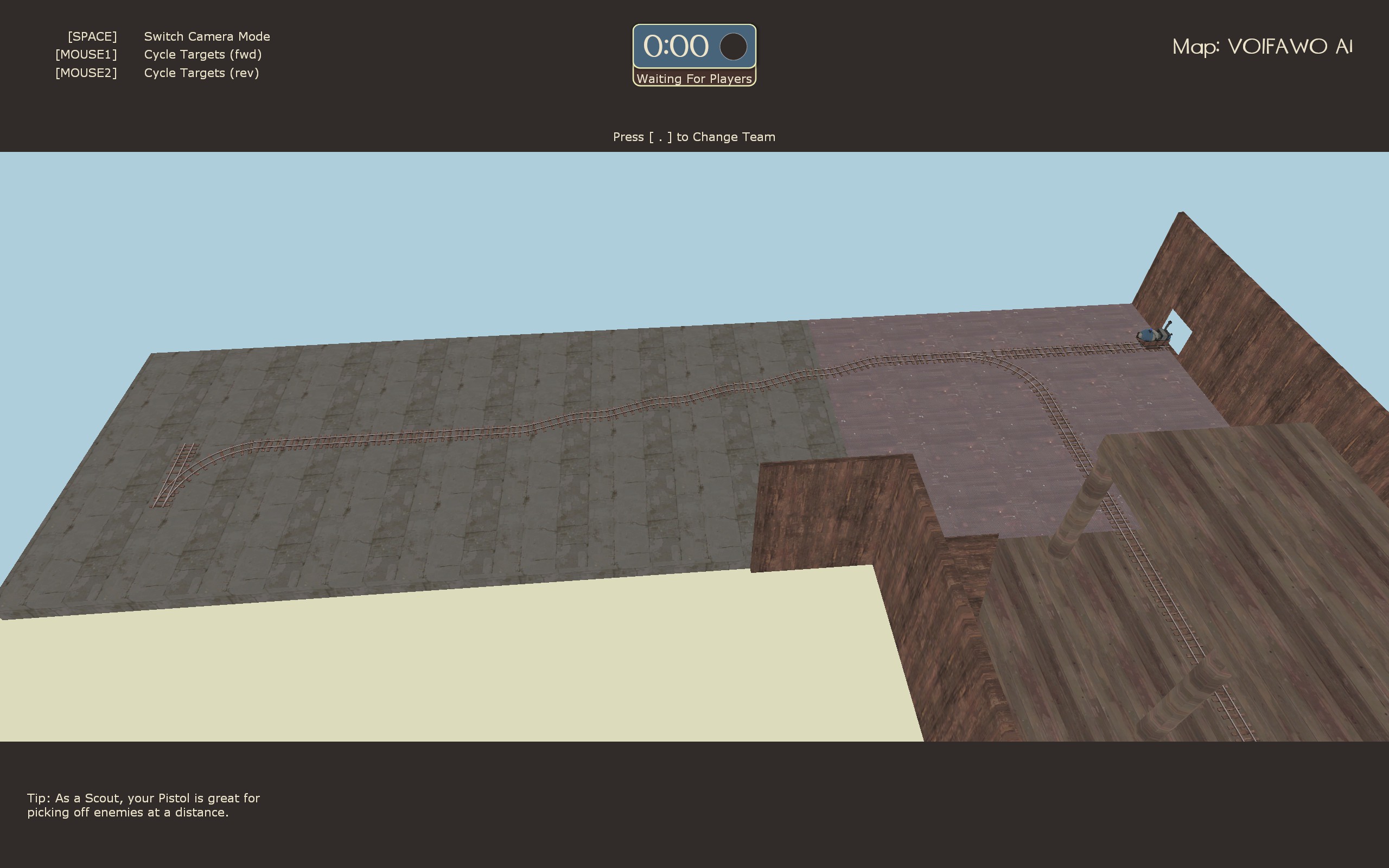
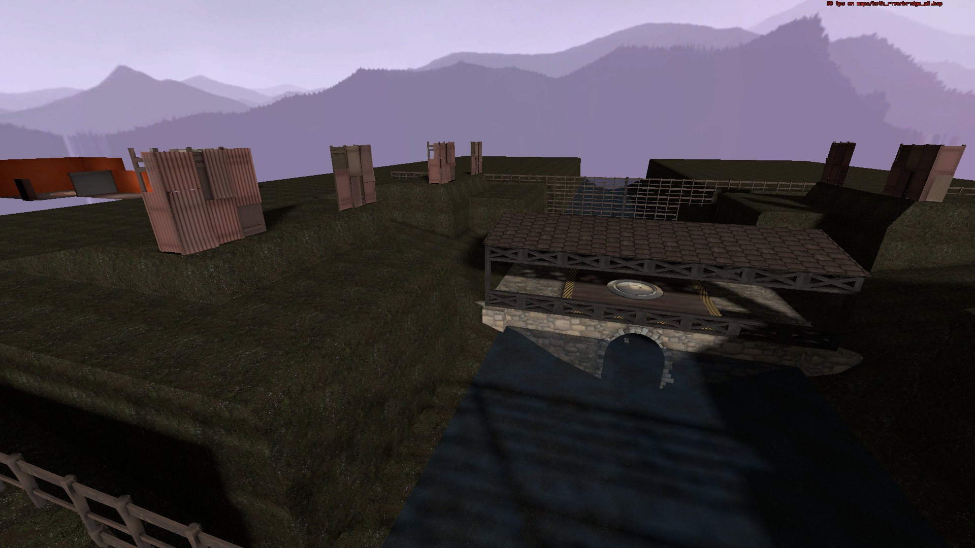
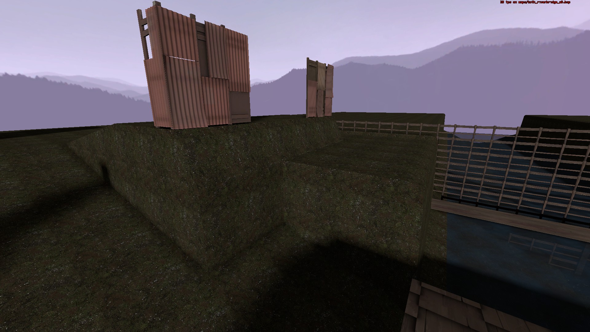
These are screenshots of the last version of my very first map that I made in mid-2013. koth_riverbridge. Before you look at these, here are some things to know:
At least now I know how to make a playable map.
Why am I showing you guys a cringe-worthy map? Well, honestly the only thing I remotely liked about it was the bridge. I still like it and might add a much better version in a future map.
Does anyone else have an early map you've made that makes you cringe or physically ill when you look at it?
These are screenshots of the last version of my very first map that I made in mid-2013. koth_riverbridge. Before you look at these, here are some things to know:
- I had no idea how to make displacements without crashing hammer at the time. So I just used carved brushes as scenery.
- I didn't know about func_detail. So every little wooden beam on the bridge is cutting visleaves.


At least now I know how to make a playable map.
Why am I showing you guys a cringe-worthy map? Well, honestly the only thing I remotely liked about it was the bridge. I still like it and might add a much better version in a future map.
Does anyone else have an early map you've made that makes you cringe or physically ill when you look at it?


