These are pretty good! I'm not the best at SFM stuff, but I can try and give you some feedback.
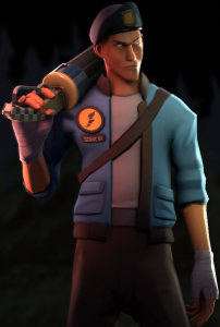
Imo the best is Innocence. The posing feels natural, it fits the Scout and I could totally see him walking kinda like that. The rim lighting feels alright, but the lighting on his body feels a little dull imo. It looks fine as it is, but I'd love to see what it looks like with a light facing down onto the Scout.
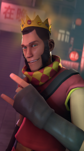
2nd best imo is the Tropical one. The posing is alright, but the lighting on the whole thing is pretty dull, and I feel like the cosmetics don't really fit together, and barely fit together with the background. Though I understand if the poster was made for someone and they wanted their cosmetics on it, in which there's not much to do.
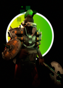
My least favorite is Rust and Lime. There just seems to be a lot of visual noise. The lime green just doesn't really fit with the demoman and his cosmetics, and the cosmetics really don't fit well (again though I understand if it was made for someone and that wale cosmetics were a request). The whole composition is kind of jarring on the eyes, and the posing is pretty boring.
Overall though, you did a great job on these, just a little rough around the edges. I hope you make more when you feel like it!

.png")