uma plata
L6: Sharp Member
- Jan 20, 2009
- 294
- 93
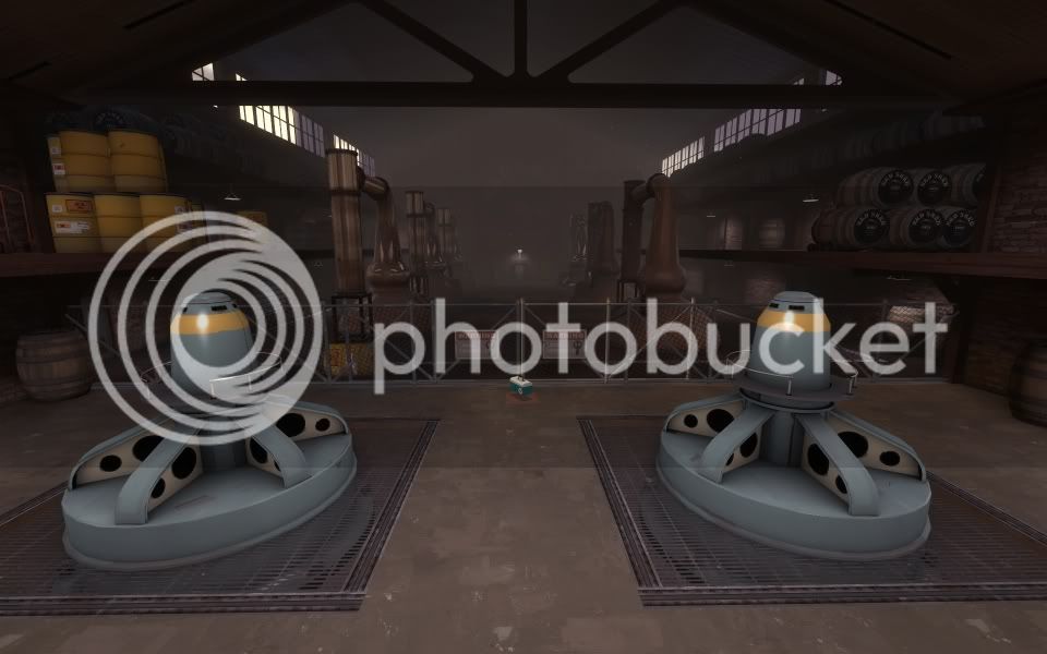
I'm very interested to try this. Visually it's looking good
Curious though, in CP push maps, back-capping is always a threat to a team pushing too fast, and can give a team on the ropes a little breathing room. It seems like with a push/pl, coming back from disadvantage would be more unlikely, so teams with momentum would have a tendency to keep momentum
Could this be balanced by having the attackers limited in their forward spawn locations?
Or, by doing that, would you make stalemates more likely?