I think the current choice of a medal as the icon to represent a veteran makes sense, as medals are awarded to military personnel after good service. I associate the Proof of Purchase with people who bought the game before a certain date in time. But the Veteran rank is seemingly given to people who reach a certain post count. The term doesn't quite fit but that's a topic for another thread.
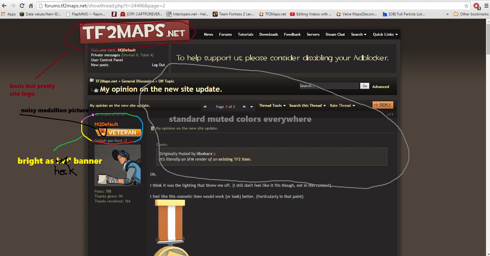
The warm colours of the medal prop go well with the background colour of the Veteran mini banner. The white, lightly-shaded border makes the banner stand out from the page slightly, but not too much as to draw undue attention to itself. It also hints of a change in direction of design, and of more changes to come. We should be careful not to judge these small images based on what they are replacing, as that could limit the possibilities. It's important to stay current and that means making changes to visual style.
The wrench icon looked a bit thin to me at first, and I know that someone mentioned that in the chat room. But I looked at it up close and I can see all the details just fine. The banners serve their purpose perfectly and I don't think there are better ways to do them, only different ones.
Thanks for the great feedback!
I've decided to drop the borders after feedback and testing what they look like without borders myself.
I think you've described our design choices perfectly and I appreciate it.

")