Glassworks

CP Glassworks RC7a

  • This map is featured! Our best maps, all together in one place for your viewing pleasure.

Crash

func_nerd
aa
Mar 1, 2010
3,322
5,501
Updated! All new screenshots in OP along with downloads!

Beta 5-
Detailing for days
Lots of lighting adjustments
Fixed a few clipping issues
Fixed neutral cp model
Flipped gaps in mid building's roof around
More optimization
 

MAkzu

L1: Registered
Jun 5, 2014
7
4
I see you used my idea on here so thanks for that :D (the middle spawnpoint truck)

BUT YOU FORGOT TO DO IT ON THE BLUE SIDE ._.
 
Sep 7, 2012
638
500
The colours in your detailing remind me a lot of Honeymustard's work on maps like Konkreet. Good job, it really looks snazzy!
 

Bakscratch

Finisher of Maps
aa
Oct 29, 2010
714
1,493
Starting to come together and looking awesome!
However the setting seems to be all over the place? Alpine, Mining, Industrial, observatory. Maybe simplify it down?
 

Crash

func_nerd
aa
Mar 1, 2010
3,322
5,501
Alpine Industrial is the gist of what I'm going for, but there is a bit of mining thrown in to show the source of the Glass-making materials. The observatory is supposed to be a bit of a nod to the "more is happening on this map than is being shown" but might not be doing quite the effect I'm looking for. I was really just looking for a big prop there and thought it looked good.

I'm definitely planning on doing a big "cohesion" pass once I get the bulk of the detailing down so maybe that'll take care of some of those issues.
 

xzzy

aa
Jan 30, 2010
815
531
I really like the skyline that the observatory dome helps create, but agree that specific prop doesn't fit the rest of the map all that well. You might be able to get it to work if you detailed the interior of that building with sciencey telescope stuff, but I'm not sure.

The superior option is to download Blender and make your own dome that creates the same skyline, but has an industrial flair.

You've been mapping for years now, time to take a big step and make your own props. If you can learn Hammer you can learn Blender. :thumbup:
 

Acadium

Playtest Extraordinaire
Apr 20, 2013
116
11
Wow, I'm really liking it. It's looking really awesome! The mountainlab lighting works really well with it.
 

xzzy

aa
Jan 30, 2010
815
531
But... But...

No!

You can do it! A half circle with nothing but ambient occlusion for a texture is like 10 minutes of work.. including collision mesh.

Four hours if you've never used Blender before. Okay maybe a week.

But after that it's 10 minutes tops!


Think of all the internet credibility you'll get when someone asks where that prop is from and you're all "I made it myself in blender."
 

Crash

func_nerd
aa
Mar 1, 2010
3,322
5,501
I just don't have the will power to learn a new program right now. Maybe after I wrap some projects up (and no longer need models for them, lol). It's definitely something I want to do, I just can't justify the time spent doing it yet.
 

YM

LVL100 YM
aa
Dec 5, 2007
7,135
6,056
Flow on this for a first-timer is absolutely terrible. It's massive and wide open, and yet somehow quite labyrinthine. I always ended up leaving my my base one way and approaching the enemie's base a completely different way, so the normal technique of "retracing your steps in the enemy base" didn't work at all. Your directional signposting is pretty bad too. I only remember seeing one, and it was in a place where it was pointing the only direction I could possibly go, so it was totally redundant.

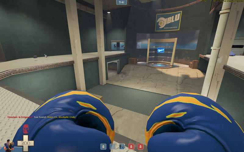
There's a spawn that exits you into this. I haven't turned a degree since leaving the spawn and this is what I see:
glassw-1.png

So I leave and assume the spawn pointed me in the right direction, and I ran right under the point:
glassw-2.png

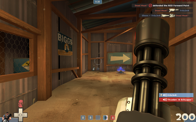
I didn't even see that teensy itty bitty arrow for ants until the next time I spawned and was actively looking for the right-way since the flow-way was wrong.
Point your spawns in the right direction!! Initial impressions suggested this one is 90 degrees from the right direction, but the spawn entities themselves are actualyl 180 flipped from the right direction, aren't they?

glassw-3.png

Coloured lights like this are holy-shitballs levels of ugly. Tone that shit down. (also it's casting light on the wall, behind it, which the light wouldn't reach, so make it a spot facing away from the sign)

glassw-4.png

This is your first impression play area, It's what players see first and it's what will set them up for the rest of the match. Hooo boy it gives a bad first impression. I know exactly what kind of fight I'm going to have in here: a snorefest. This is literally just a room with a cp in it. at something, anything to make it look like an interesting play space and not boredom city.

glassw-5.png

I always thought this wood texture looked gross. I could never decide if it looked more like vomit or diarrhea. Regardless of what I think of the vomit-texture, these beams are reeaaaallly ugly. They're super thick and the thinner ones seem placed with zero logic. I know beams in such structures can be a bit slap-dash, but they're at least placed with a little structural sensibility. The thickness of the main beams (what is that, 24 units?) makes it look like you're contracting the playable space in these corridors massively and make them feel very narrow, they'd do a lot better with thinner beams. *cough cough*
This picture also showcases the only sign I found without actively looking for one. And it points the only direction I can go.

Sprinkle the map with 
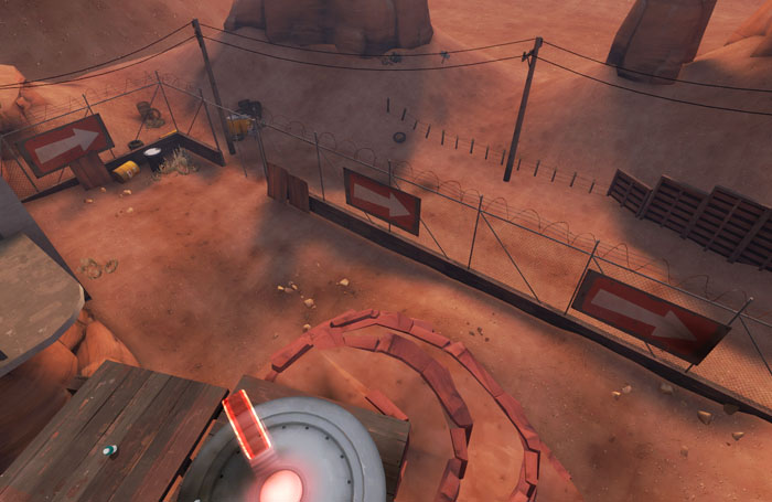
big arrows nice and liberally:
cpbadlands0003cc2.jpg


These are my first impressions.
 

Crash

func_nerd
aa
Mar 1, 2010
3,322
5,501
That forward spawn exit is something I've been struggling to sort out and an earlier version made a bit more sense (the door was in that corner) but I think I'm just going to have to remake them 90* from how they are so it's a straight shot out.

All the lighting is temporary at the moment, but I did already plan on yanking out the handful of colored light I have in there. It was just a small thing I set in right away for whatever reason and it's persisted to this point. I'm just now starting to take a serious look at the lighting on the map beyond the handful of ambient lighting angle things I tried to incorporate.

The gameplay of the map is pretty final at this point, so not much is going to change in that regard. The final works as intended, and the lower route (that admittedly isn't used a ton in pub play) mixes things up enough that I'm okay with how it is currently. It hasn't been detailed by any means so far, so maybe that will help make it look less like one big open room?

The thickest beams I made on the map are 16hu. I'll see about adjusting them a bit, though, as they do feel a bit chunky. And I'd rather make my own beams than rely on a program, thank-you-very-much. :p I see what you're saying about them being a bit nonsensical, though, I'll try to clean that up a bit for the next version. They could definitely be simplified.

As for arrows, I feel like I've put a ton in and didn't want to rely to heavily on them. I'll probably toss one or two along that fence on second, though.
101EA6EE443C235289B30A1C7753A4F18A187F87


Thanks for the feedback though, I'll definitely take it all into consideration.
 

Crash

func_nerd
aa
Mar 1, 2010
3,322
5,501
It reinforced that I'm heading in the right direction with it. I almost blocked off a route as an experiment but this test showed me it's not necessary. Glassworks is a bit flank heavy compared to other comp maps, but it still works well because they tend to dump out near each other. An organized team shouldn't have too much issue locking the routes down. Nothing's wrong with changing things up from how other maps play.

I'm also going to adjust a few sightlines, smooth out the roll out a bit (seriously though, was that not amazing to watch the demos at times?), stream line some things (as per YM's feedback as well as the test), adjust the health and ammo (adding a bit of each and moving a couple things around), and keep roll outs and places I feel could use some more stuff in mind as I detail.