Fusion

CTF Fusion B2

Acumen

Annoyer
aa
Jun 11, 2009
704
628
woah, that definately is a fast video movement. *feelingdizzy*
from the video i gotta say you're doing a wonderful job of incorporating the tf2 theme, yet the bridge supports look out of place. it looks random and forced. you seem to have started with the 2 concrete blocks, then decided it looked to blocky and put some more brushes in it, to hide that fact :D
i mean obviously there's so many bridges out there, i think you just gotta find the right reference image. maybe here:
http://www.aaroads.com/delaware/canal_crossings.htm
http://bridgehunter.com/photos/12/19/121994-L.jpg
http://www.aaroads.com/delaware/delaware001/de-009_reedy_point_bridge_02.jpg

i know i know, you wanted a big bridge but obviously couldn't take the viaduct or ym one, because in any case ym would be pissed for no reason ;)
maybe this would fit your need ?
http://www.columbiariverimages.com/Images/bridge_of_the_gods_south_support_2005.jpg

to cut a way too long story short - the bridge support needs to get some love, since it's such a huge eyecatching place in your map. just a matter of 30 minutes, till you get the right mix :)

aaaaaaaaaaand another thing coming from the video, apart from it being displayed in reversematrixtime - the colors. it all looks very grey and dull. i think you should put some color spots here and there. let it be lights or textures - the choice is yours, but the map will definately benefit from some color diversity :)
 

Ravidge

Grand Vizier
aa
May 14, 2008
1,544
2,818
woah, that definately is a fast video movement. *feelingdizzy*
from the video i gotta say you're doing a wonderful job of incorporating the tf2 theme, yet the bridge supports look out of place. it looks random and forced. you seem to have started with the 2 concrete blocks, then decided it looked to blocky and put some more brushes in it, to hide that fact :D
i mean obviously there's so many bridges out there, i think you just gotta find the right reference image. maybe here:
http://www.aaroads.com/delaware/canal_crossings.htm
http://bridgehunter.com/photos/12/19/121994-L.jpg
http://www.aaroads.com/delaware/delaware001/de-009_reedy_point_bridge_02.jpg

i know i know, you wanted a big bridge but obviously couldn't take the viaduct or ym one, because in any case ym would be pissed for no reason ;)
maybe this would fit your need ?
http://www.columbiariverimages.com/Images/bridge_of_the_gods_south_support_2005.jpg

to cut a way too long story short - the bridge support needs to get some love, since it's such a huge eyecatching place in your map. just a matter of 30 minutes, till you get the right mix :)

aaaaaaaaaaand another thing coming from the video, apart from it being displayed in reversematrixtime - the colors. it all looks very grey and dull. i think you should put some color spots here and there. let it be lights or textures - the choice is yours, but the map will definately benefit from some color diversity :)


Haha, yeah I know it's very fast. It was not really meant to show off the map :)
Once I learn how to use the smoother properly I will probably do a better one.

The feedback is all good though. The bridge support (I assume you're talking about the big stick in the middle) is just something I've kept around since earlier alphas. I have not really paid it much attention.
You bring up a valid argument though and tbh I'm not really too fond of it either, the whole bridge structure was the last thing I did before releasing (hurried) and I think that once I sit down to actually design something (in beta!) it will look a lot better.

The colors being dull is somewhat intentional. It's supposed to look incredibly cold, for some reason the snowfall disappeared in the demo. I will probably add some warmth when doing interior details. The outdoors are a little monotone, true.. I might have do add some more non-gray items, like another tree ;)
Thanks though. I'll keep it in mind!


DBP: it's Ronald Jenkees - Neptune
 

Acumen

Annoyer
aa
Jun 11, 2009
704
628
i think in every color theory, blue is said to be a cold color, yet i totally think it's underrepresented. just search for "cold" on google - you'll get lots of blue tintish pictures :)
while you got mostly grey to brownish color in your map. i think some more of the blueish color tint in there should make the map look a bit more distinguished.
you know what i mean ? not just the computers and the huge blue building on one side. but a blue walled texture here and there would make it more interesting and for players easier to set it apart.
the judgement is just based on screens and videos. but it's something i can tell right from the start on valve mapscreens and i think you could and should take the texture color choice into consideration a bit more. it's not much and it's already there in places but i think you can really push it a load. reduce the grey-ish and up the blue-ish ;)
 

Psy

The Imp Queen
aa
Apr 9, 2008
1,706
1,491
Played this the other day. The middle is far too lateral. So lateral to the point that Scouts can easily move between the bases whilst receiving little to no damage. I suggest you close the side buildings off.
 

Ravidge

Grand Vizier
aa
May 14, 2008
1,544
2,818
i think in every color theory, blue is said to be a cold color, yet i totally think it's underrepresented. just search for "cold" on google - you'll get lots of blue tintish pictures :)
while you got mostly grey to brownish color in your map. i think some more of the blueish color tint in there should make the map look a bit more distinguished.
you know what i mean ? not just the computers and the huge blue building on one side. but a blue walled texture here and there would make it more interesting and for players easier to set it apart.
the judgement is just based on screens and videos. but it's something i can tell right from the start on valve mapscreens and i think you could and should take the texture color choice into consideration a bit more. it's not much and it's already there in places but i think you can really push it a load. reduce the grey-ish and up the blue-ish ;)

I definitely agree, I have some ideas for how to texture the bases. But it would require me to cut up the brushes to make the different stuff align smoothly. I didn't really want a kind of patchwork base so I settled for this simple "1 texture fits all" look until I'm satisfied with the layout.

Played this the other day. The middle is far too lateral. So lateral to the point that Scouts can easily move between the bases whilst receiving little to no damage. I suggest you close the side buildings off.

Noted, I will look out for that when testing.
 

Ravidge

Grand Vizier
aa
May 14, 2008
1,544
2,818
Gameday. Went pretty well apart from the server starting out halffull.

Thoughs? I will review the demo for ingame comments again, but anything you want to expand/elaborate on would be nice to hear.
 
Sep 12, 2008
1,272
1,141
Can I suggest an intel cooldown? It was really annoying to find out that your intel was getting capped several times in a row because of the same sneaky scout that had a route you couldn't follow as a normal slower class.
I also didn't really like the exit at the intel on the right (when you come out of the left spawn exit), since it was REALLY easy for scouts to run in, grab the intel and turn back. This was only the case when there wasn't a sentry covering the point.
I thought it went very well though, but that the teams were kind of stacked at the beginning of the test was a bummer.
 

Gerbil

aa
Feb 6, 2009
573
846
The map was very fun to play and I thought the bases were really nice. here are some nitpicks:

Clipping error:
kn43d.jpg

Weird skewed hazard stripe:
2enrm6x.jpg

Apart from that I think the mid needs to be a tad more focused. I found it hard to fight against scouts since they can just dart to each side of mid and get the health kits while I would chase them stupidly :p. Maybe close off the side buildings or extend their outer wall inward. I also think you should change the snow texture. The current one makes the map look a bit "platic-ey". I also really like the hot air coming out of the vents. Nice touch!
 

StickZer0

💙💙💃💙💙
aa
Nov 25, 2008
664
647
Yeah Gerbil got a good pic of what I was going to show you.

Generally CTF maps have a bottleneck in the middle to help make sure combat is central, and while this usually goes bad (see 2fort or turbine), I found that your map was completely devoid of said bottleneck.

Scouts could easily get across unnoticed, as could heavier classes if they took the side route. It definitely needs tightening up somehow.

Also, please alpha blend that snow texture! :3
 

Ravidge

Grand Vizier
aa
May 14, 2008
1,544
2,818
Thanks a lot guys!

I'll see what I can do with the middle. Also I will do my best to optimize it, I could feel the fps drop myself.
 

Ravidge

Grand Vizier
aa
May 14, 2008
1,544
2,818
Yeah I should mention that I released a7. huphup go get it.
I replaced the snow... with that other snow. And some rough optimization.

http://213.115.191.55/~ravidge/tf/maps/ctf_fusion_a7.bsp.bz2

Had a pugtest 10 minutes after I finished it :)
I actually enjoy how this plays, it's a really viable tactic to try and pick them off as close their own intel as possible, to score a quickcap (which I did a few times in the test!)
 
Last edited:

Jimmy

L420: High Member
Jul 6, 2009
421
228
I loved this in the pub, played really well! I never did realize the different CTF setup though :(
If only there was a way to make it more obvious. Im sure theres a sign in spawn but I didn't bother to read :p
 

Ravidge

Grand Vizier
aa
May 14, 2008
1,544
2,818
Detailing the blue side.

Team_Fortress_2-2010.04.28-16.54.34.jpg

Team_Fortress_2-2010.04.28-16.55.22.jpg

Team_Fortress_2-2010.04.28-17.58.07.jpg
 

grazr

Old Man Mutant Ninja Turtle
aa
Mar 4, 2008
5,441
3,814
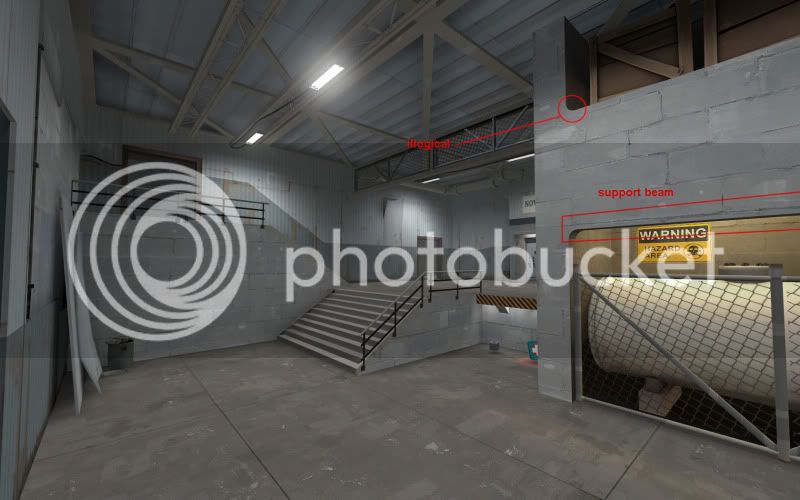
The TF2 theme doesn't really do curved corners, your first shot there reminds me i'm playing a HL mod because it's a very cliché HL detail. You're also using the completely wrong texture in allowing yourself to get away with these curves.

Team_Fortress_2-20100428-165434.jpg


You store stuff up there but the walls are very thin with no signs of structural support.

Sometimes i just ignore stuff like this... most players seem to think "OMG curved corners in TF2, how innovative" so i'd let players have their moment, but here it's really bugging me.
 
Last edited:

Ravidge

Grand Vizier
aa
May 14, 2008
1,544
2,818
I love you, That looks amazing. Keep up the good work :)

For you who don't know: Selentic is helping me detail the spawns with some new props I requested.
 

Penguin

Clinically Diagnosed with Small Mapper's Syndrome
aa
May 21, 2009
2,039
1,484
Can't believe I haven't posted here yet.

Just wanted to say I love the concept. it really promotes letting the enemy get away with your flag and then gunning them down at the last second for a really fast cap.