hi zythe_,
Since the A3 playtest didn't seem to go as well as the A2 one, I'm here to offer my opinion and some possible fixes.
First, I want to speak my mind - I imagine the teams and the players they were composed of had to do something with it, but I think the map isn't free of fault. When watching back the demo, I also admired the decisions you've made, which are all very insightful. And, after having written this post, I'm actually optimistic that this could be a very strong KOTH map.
Second, I want to recommend bringing back this section of wall from the unreleased pre-A1 version:
I put this wall in mainly as a courtyard-to-courtyard sightline blocker, but it also has a critically important second purpose (although I don't remember if it was intentional) - it means the enemy high ground can't see you (if you use the low ground) until you're already contesting the point.
Now, I don't want to be the kind of sore loser that just sourly defends their decisions that were removed from a project (although that's definitely part of my agenda here!). You clearly had a good reason to remove this, and I suspect it was because it left a glaring sightline open on the one obvious route to the point:
It would have also left behind a pretty grimy sightline once you removed these two diagonal walls:
I worried about this during development, too (apart from the sightlines that would arise from removing the diagonal walls), but I reasoned that it would be okay, because you could always use the new pipe/propjump routes I installed to get to the point and be safe from the snipers.
It also at least makes it slightly more obvious where you're safe or in danger from a sniper, which is something it looks like the map struggles with right now.
You could also use your team's highground, but that was less reliable, since the enemy highground could fire on you as you were trying.
And that gives rise to another issue. Trying to use the highground means you engage the enemy team before you contest the point, which makes the point harder to recapture.
And I don't just want to suggest that you remove new additions or re-incorporate old ones; I want to suggest entirely new geometry.
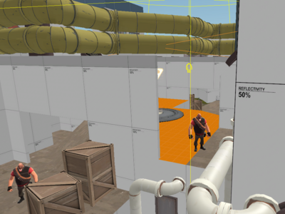
Maybe you've been wondering what these yellow pipes are doing in my screenshots:
Well, they're actually there to block visibility between the highground. That way, the highground serves as a way to watch the point, but in order to actually contest it/stop the enemy team reaching it you have to jump down and get fighting. Kind of like the original idea behind koth_fan. Limited combat between the two highgrounds can still occur, but it requires the players to opt in to it by jumping up onto the pipe or roof vent.
It would also help to install some kind of cover on the point.
Something like this could be interesting, since it provides limited cover from the highground, but doesn't interfere with the combat below it, and it also gives interesting positioning options to the players who would use the highground.
But I don't think it really fits in this map, which is thoroughly too sane to be a Tiftid map. (Tiftid map insanity tier list coming soon!!???!)
I also recommend raising the fans on the point.
They made things a little too convenient for defenders before. You could really quickly rotate between watching the main route, watching the long side route, and then jumping via the fan to the enemy highground. Attacker rotates were still faster, mostly, but it was a little too convenient.
Raising them would also help to let them fling players over the newly installed yellow pipes up to the enemy highground.
I guess you'd just kind of have to hope this wouldn't lead to rampant spawncamping?
Since I positioned the yellow pipes to block any and all sightlines up to the high ground, it'd be hard to stop enemies from using their highground to reach yours, then using the death pit to sneak behind your team.
You could try adding a fan that goes from your lobby to your highground (probably biased more towards the flank that has the full health in it) so that attacker rotates are faster and more convenient, and it's easier to shore up your highground and prevent spawncamping.
Finally, I want to try to indoctrinate you and mention a few spots where having a luxel size of 4 would be really beneficial.
In each of these screenshots, there's one surface where I've set luxel size to 4, and the shadows on that surface are really sharp and sexy and actually represent the shape of the complex object casting the shadows.
Then, the rest of the surfaces have a luxel size of 16, and have horrible, blobby shadows that represent the shape really inaccurately.


