WiP in WiP, post your screenshots!

Fruity Snacks

Creator of blackholes & memes. Destroyer of forums
aa
Sep 5, 2010
6,394
5,573
This is an offensive post. Also instances.

tJNTytD.jpg

Why does that look familiar...
 

Kube

Not the correct way to make lasagna
aa
Aug 31, 2014
1,342
1,850
Why does that look familiar...

I had a dream that I was playing TF2 and I saw pieces of the catwalk in an official map. I thought, "Oh no, he did steal it!" and I was going to report it.
 

puxorb

L69: Emoticon
aa
Dec 15, 2013
533
802
i made some boxes

That is a very interesting aesthetic you have going on there. I've never seen someone combine textures and props together like that. I'd love to see what it would look like in BLU assets.
 
Oct 6, 2008
1,965
450
The thing that bugs me the most (and I could be wrong), but that looks REALLY interesting to play on/around... and it looks like i can't reach half of it ;(


That's why they created a sticky jumper! :thumbup1:
 

hutty

aa
Mar 30, 2014
547
446
it does .__.

Too bad its all clipped off as scenery.
But then, nothings stopping me from re-using it.
 

Seba

DR. BIG FUCKER, PHD
aa
Jun 9, 2009
2,364
2,728
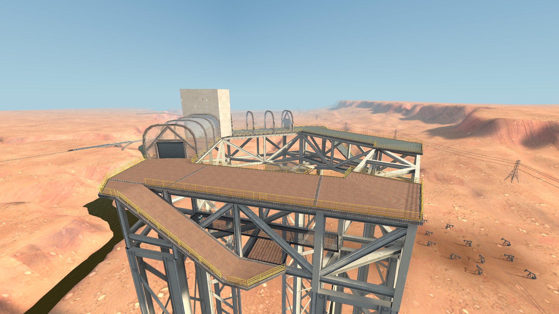
Don't make out-of-bounds areas that detailed, for the exact reason Frozen pointed out; if you take a look at the Hydro commentary, someone mentions that the area beyond the road barrier is boring so that players won't try to go there despite the barrier looking jump-over-able.
 

Zed

Certified Most Crunk™
aa
Aug 7, 2014
1,241
1,025
Surely you can work that into the layout or make it less distracting. Look at how the other MvM maps are detailed.
 

UKCS-Alias

Mann vs Machine... or... Mapper vs Meta?
aa
Sep 8, 2008
1,264
817
Surely you can work that into the layout or make it less distracting. Look at how the other MvM maps are detailed.
It has to do with an other reason there:
MvM is a fps heavy mode already. And for that you need to optimize whatever you can. The out of bounds areas for that reason are the first thing to remove detail on. To hide that low detail many stuff on the side is higher so its barely visible it has that low detail. Using other methods often will make the map heavier.

For other maps the detail level in the skybox can be higher. On normal maps having a higher focus on what an area has to show is more important. If you look at some maps you can see that the playable area still shows like its going on, except it has a huge gate in front of it. That gate is a clear barrier and blocks the detailed area that is behind it.

When you detail an area to a higher state, the barrier should be more clear aswel. If its a flat displacement with only a road texture on top of it, people will understand its not playable. As the area itself just doesnt look playable.
However, once it becomes more detailed the gap between playable and unplayable needs to become very visible. This can be done fences, it can be done by clear road blocking props, it can be done by a deathpit, and it can be done by simply making it impossible to go there to begin with (high flat building or cliff side with a few holes that have detail in them yet are clipped off).

The barrier has to make sense and the detail behind it should clearly indicate its not ment to play on.
 

tyler

aa
Sep 11, 2013
5,100
4,621
Pre-beta to beta WIP shots
It looks good, but the disparity between the tiles with clear water and then everything above that being dirty is really weird. Dirt should be everywhere, or things should be cleaner as you move up. There's no way that all the dirt would just stop above the water. Simply using a different water texture could be enough, but you might need something else or a slight re-detail of the tile parts or something, idk.

This was a ctf map though
They probably thought it was MVM because of the Mann Co stuff.

NOTE TO EVERYONE: The Mann Co stuff isn't team aligned. It's both teams. Putting it on a map as though Mann Co controls one of the facades is weird and confusing unless you're making an MVM map. Please stop.