WiP in WiP, post your screenshots!

puxorb

L69: Emoticon
aa
Dec 15, 2013
531
799
I was thinking about some more detailing that you could add:

Some of the detailing that I love about granary and 2fort are the hubcaps hanging on nails, milk jugs in the corners of rooms, and tools hanging on the racks. These give it a sense of real-world use and I think its what I love most about the farming theme. (and you have a lot of vehicles in the map so it would make even more sense!) Maybe some garden hoses too?

Also, since there seems to be a lot of tracks in this map, maybe some rails or ties in a pile and some hammers or other railroad equipment in the spawns would look really cool. Something to show that things are maintained.
 

UKCS-Alias

Mann vs Machine... or... Mapper vs Meta?
aa
Sep 8, 2008
1,264
816
On that last screen of aly i still find the wall looking flat with just a few holes. Its too easy to see a straight line through the whole area and i would prefer to see it broken up a bit. Especialy since the wall in the current state is just too empty.

Cant you use those windows that well has between 2nd and mid? I think those can actualy make the area feel less dull. Even if they arent used (and maybe alow some pipes being shot through) they still can add some detail to that area to make it less flat.

Still, it could simply be the unfinished back doing that. But in the current state it looks very unfinished to me.

The other screens however seem fine. They could have some more detail but for beta state they however are excelent and only need a little bit more detail. The skybox there already could be enough.

I also would like to see some higher structures. Granary has quite some high structures which can look very good.
 

Freyja

aa
Jul 31, 2009
2,995
5,813
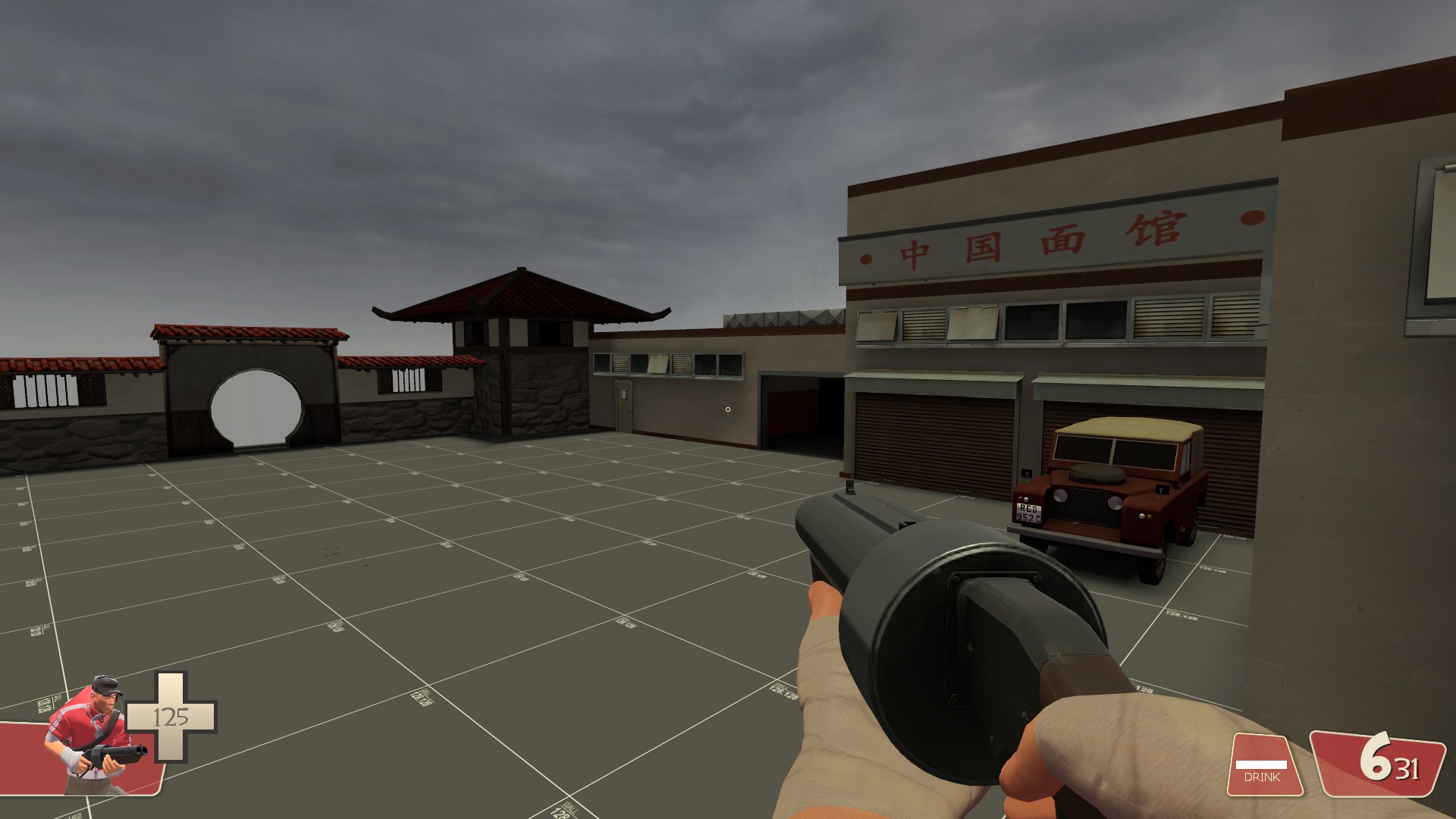
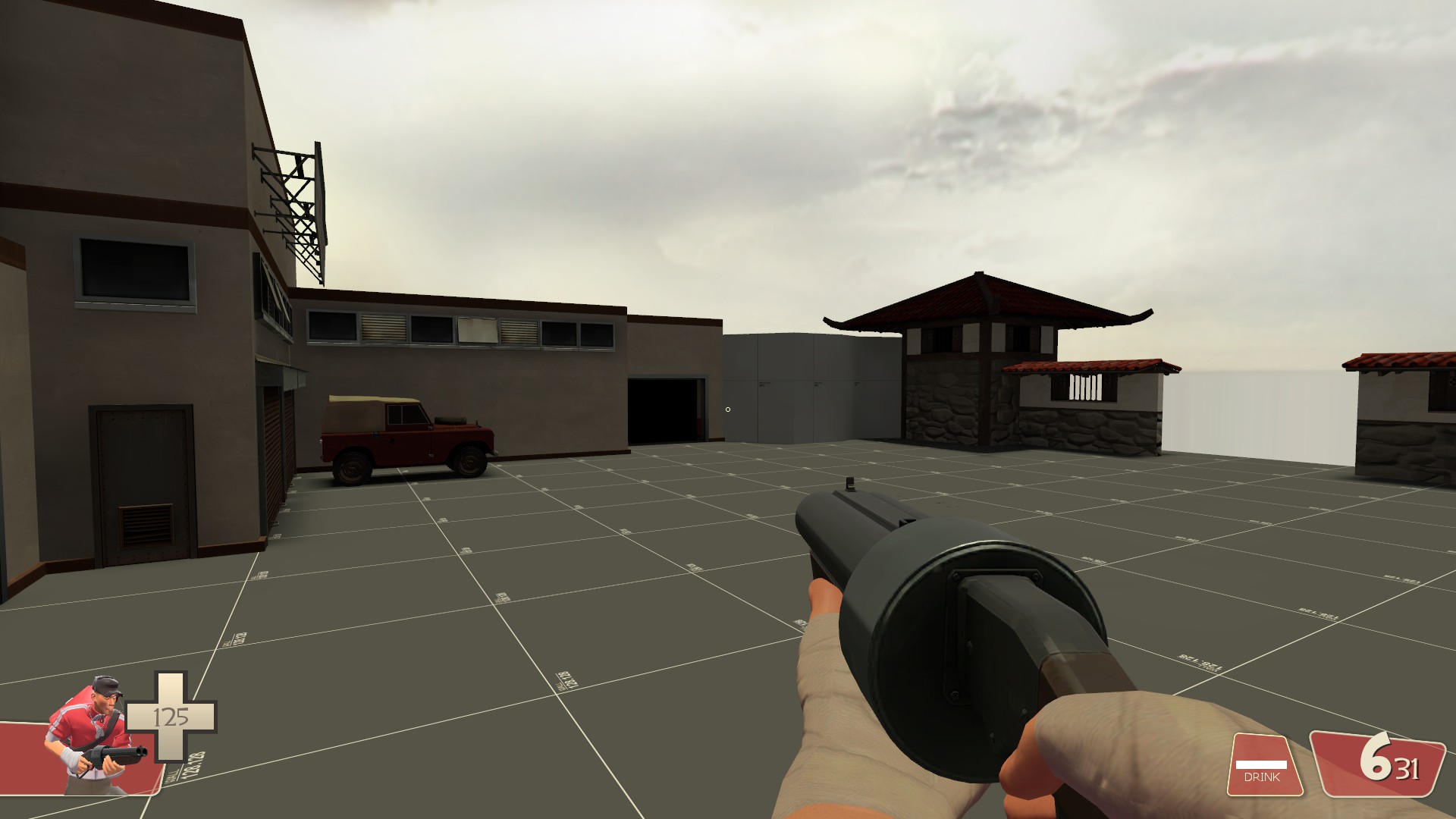
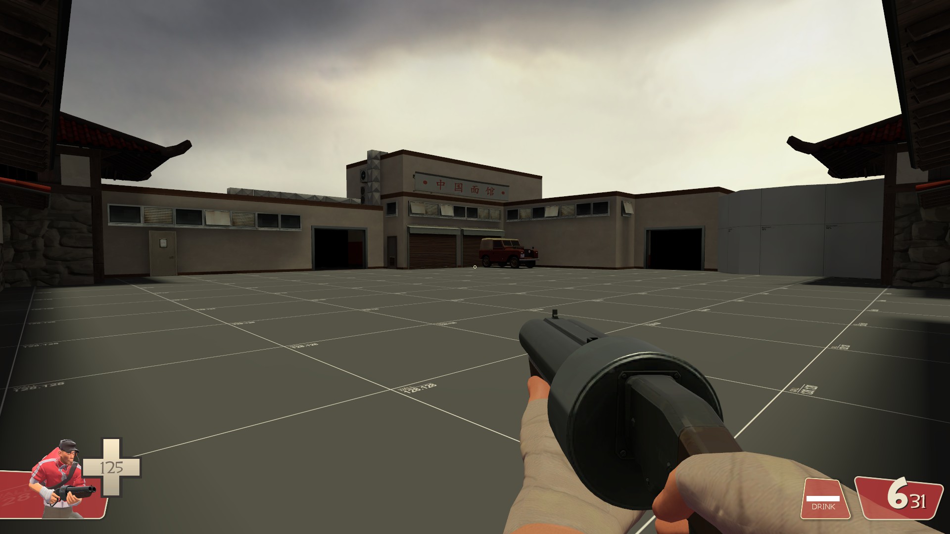
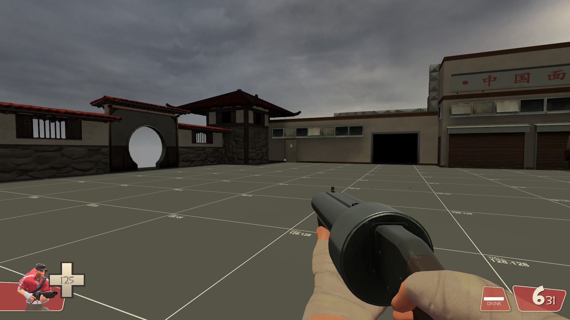
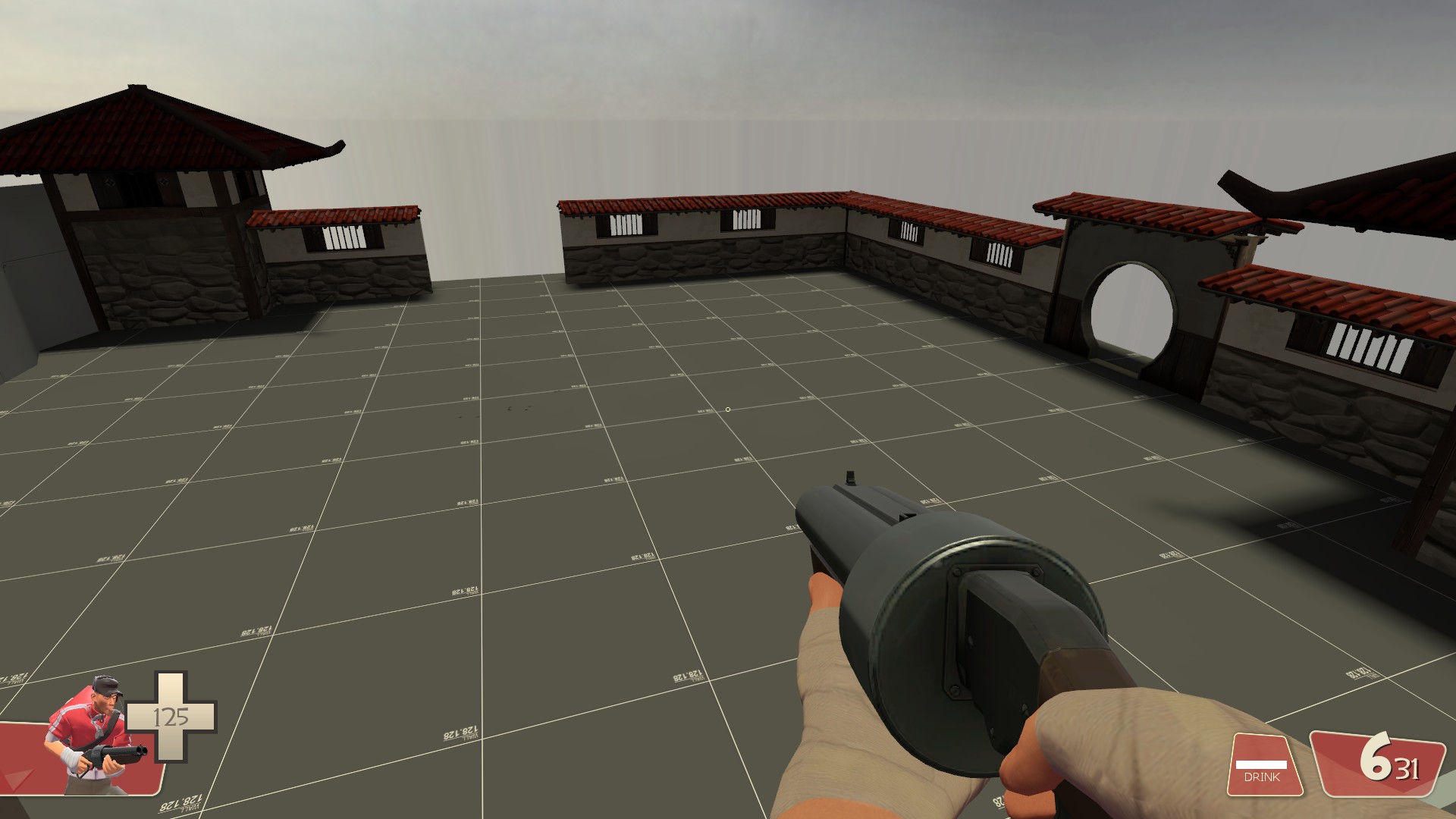
Fifth: I know you aren't finished, but I'm not convinced by the brick pillars having slightly less of a concrete base than the others. That might be something that Valve has done in the past, but to me it doesn't make technical sense.

That was actually a thing that happened when I forgot to resize the pillars after resizing the wall behind it, and I hadn't even noticed. Thanks for pointing it out.
 

xzzy

aa
Jan 30, 2010
815
531
I actually liked that look.. maybe not with a brick texture, but extending the pillar's texture beyond the seam between bottom and top does a good job adding some complexity.
 

Freyja

aa
Jul 31, 2009
2,995
5,813
Not as much progress over the last few days, with uni and assignments and whatnot.

2014-10-16_00001.jpg

2014-10-16_00003.jpg

2014-10-16_00004.jpg

2014-10-16_00006.jpg
 

RubbishyUser

L7: Fancy Member
Feb 17, 2013
414
488
That's a lot of brick.

Thinking about it Aly, the Granary style was designed for a 5cp map with few interior buildings equally divided between Red and Blu. It doesn't have many building textures/props/overlays really associated with grain. That's pretty much the opposite of *this map whose name I've forgotten since it's a random collection of syllables like everything you and Bakscratch puts out these days*, where you have far more Red buildings and spend more time indoors than even the standard payload map. Grain and wire spools can only take you so far. I think, in order to make buildings more varied and to escape that brick texture, you may need to introduce another subtheme.
 
Last edited:

xzzy

aa
Jan 30, 2010
815
531
There's a lot of brick because all four of those screenshots are the same building.

You're not wrong, visual variety is important, but forcing a new texture just because a single building has exceeded some arbitrary "brick overdose threshold" is not a better option. Every other building in the screenshots posted shows a lot of wood and metal buildings.. I think the map is a long way off from overusing anything.
 

Pocket

Half a Lambert is better than one.
aa
Nov 14, 2009
4,697
2,581
Just a heads-up: You've still got the old blue Gorge wall texture installed, the one that somebody posted here. Valve disliked it enough to make their own version when they bought Coldfront. I didn't even realize until the SteamPipe update because I decided to only copy over the custom content I personally needed.
 

RubbishyUser

L7: Fancy Member
Feb 17, 2013
414
488
There's a lot of brick because all four of those screenshots are the same building.

You're not wrong, visual variety is important, but forcing a new texture just because a single building has exceeded some arbitrary "brick overdose threshold" is not a better option. Every other building in the screenshots posted shows a lot of wood and metal buildings.. I think the map is a long way off from overusing anything.

Oh, my mistake. I thought I recognized one as the A building and 1 as the C. Still think there's a serious amount of brick, but maybe it's fine in game.

What's the difference between the old and new gorge wall textures?
 

Freyja

aa
Jul 31, 2009
2,995
5,813
What's wrong with the brick texture? It's cool? It gives a nice feeling. I deliberately included it because brick is cool, and I like it. And yeah, it's all one building, I'm not going to continue with the brick.
 

Pocket

Half a Lambert is better than one.
aa
Nov 14, 2009
4,697
2,581
What's the difference between the old and new gorge wall textures?
The one Valve made has dark tiles and a paint stripe that roughly matches the corresponding plaster wall texture, just like the red one does. Sadly, it must have been made by someone who didn't have access to the source files, since it also doesn't have tintfix if you look closely at a spot where it meets the plain white wall.
 

Fantaboi

Gone and one day forgotten
aa
Mar 11, 2013
892
1,050
Nikori Artpass, thoughts? Especially need thoughts on the trees
xCMWYri.jpg

X83avnk.jpg

I'm going to add grass the to the ground soon
(Also new version is out please test)
 
Last edited:

EArkham

Necromancer
aa
Aug 14, 2009
1,625
2,774
The Conspiratorial Cut

"Conspiracy nuts claim that if you unmask key Australian personalities, you will reveal that they're secretly New Zealanders. And also lizardmen."


Paintable. Flexes.

The Conspiratorial Cut Workshop Linkee

----

The Skinless Slashers

"Your human disguise is almost perfect. The only things that can cause the latex skin to tear off are acid, bullets, fire, water, sunlight, shaking hands, or just generally moving your fingers around too much."


Paintable.

The Skinless Slashers Workshop Linkee

These items together create the "Secretly A Lizard" set for Sniper:

  • Set Effect: "Mice are now 25% tastier."
 

Gunnysack Man

L1: Registered
Oct 16, 2014
13
16
Foolin around with a combination of urban japanese style combined with some zen garden themes. Not sure where this will go, but for now it's just a design idea I have in my head. The layout isn't really developed at all yet.

A few things:
1. I know how incomplete this is, I just wanted to get a quick opinion on the style.
2. I know the characters on the sign above the garage are chinese. Looking for somebody to make a reskin of those in japanese kanji, but for now I'm using it as a placeholder.
3. I know how incomplete it is. I really do.

Anywho.

kKQ4WD0.jpg


xujVtGW.jpg


ckHwdPp.jpg


iDKTtUQ.jpg


ackh1Cb.jpg


RX8POLA.jpg
 

Gunnysack Man

L1: Registered
Oct 16, 2014
13
16
I added some iterations of cliffs to see what it all looked like. I like them, but they're definitely not a finished product.

pmgYeTk.jpg


bkXpx9q.jpg


edit: Also, the roofs on my towers and the moongate door on the wall are rendering darker than other props. I recall once knowing how to do this, but it's been so long since I mapped and some of the technical things escape me. If anybody would be so kind to point me in the direction or tell me how to fix this, that'd be awesome. Thanks :D

edit2: Figured the previous question out. Had to do with the prop being partially submerged into the brush it was resting on. Made a lighting_origin and tied the props to it. Worked like a charm.
 
Last edited:

Seba

DR. BIG FUCKER, PHD
aa
Jun 9, 2009
2,364
2,728
Oh please

compile1.JPG


Wow fuck that was exactly four years ago