WiP in WiP, post your screenshots!
- Thread starter Arhurt
- Start date
You are using an out of date browser. It may not display this or other websites correctly.
You should upgrade or use an alternative browser.
You should upgrade or use an alternative browser.
Gunnysack Man
L1: Registered
- Oct 16, 2014
- 13
- 16
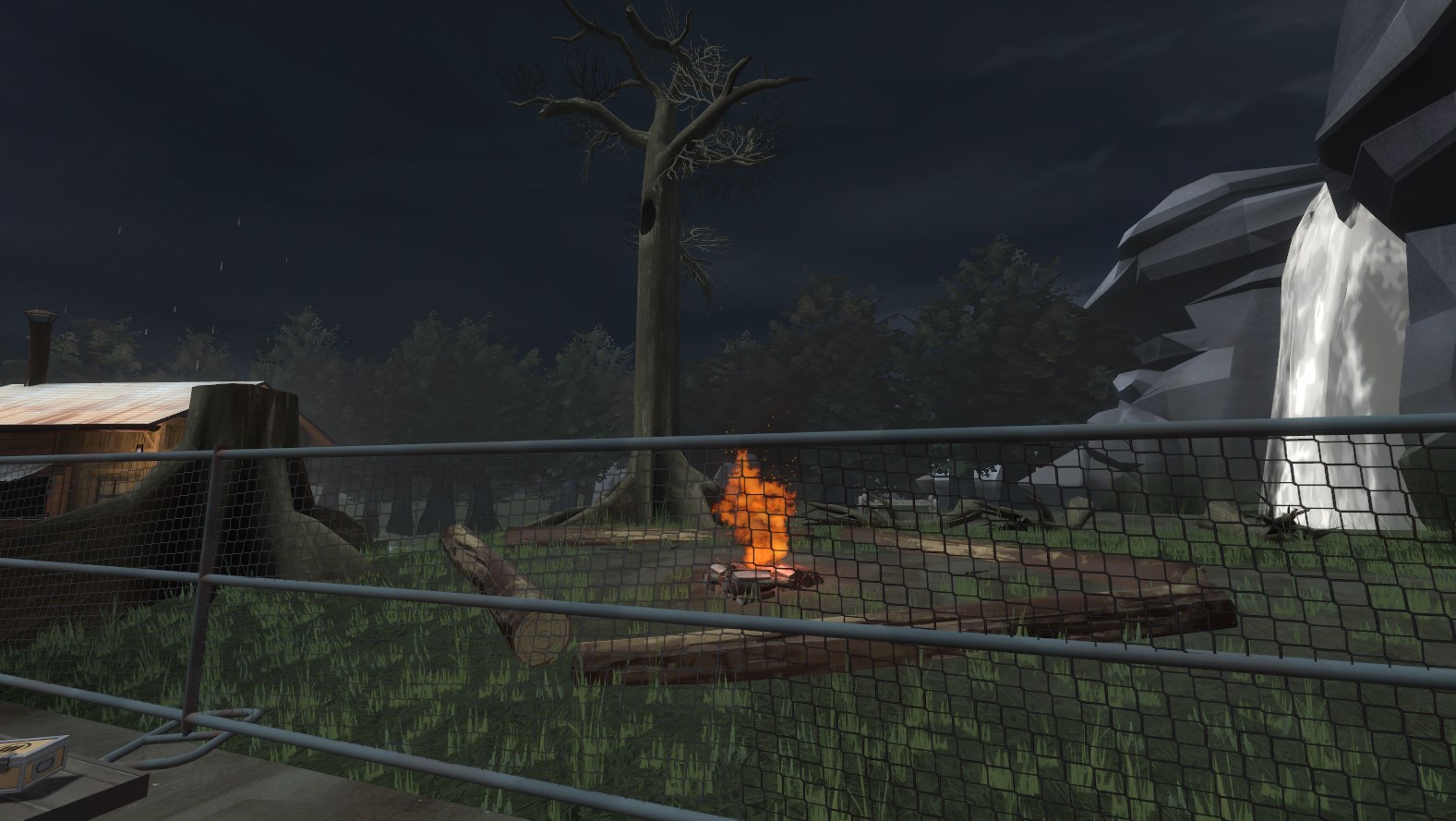
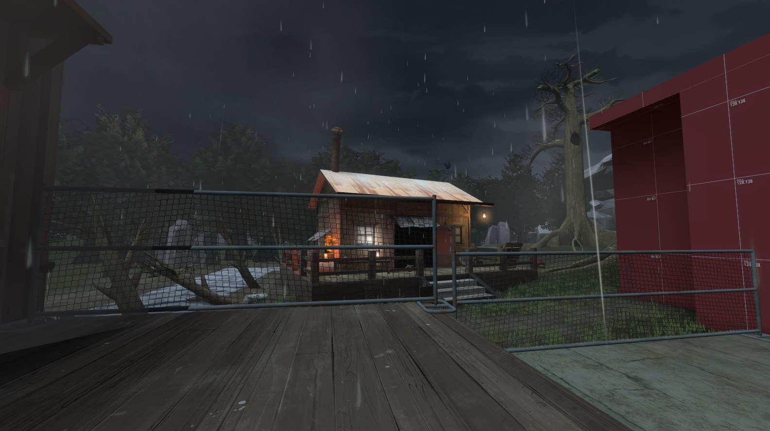
You could turn this into a midpoint. Koth, a/d, 5cp, whatever you want.
I was thinking of something like a CP map, but I'm really not sure yet. There's a few more design and style options I want to explore before committing to a mode or layout. A cap point would fit that big open spot though. I'd even like to figure out a way to streamline the design a bit more to give it viable flow for a ctf map.
Oh please
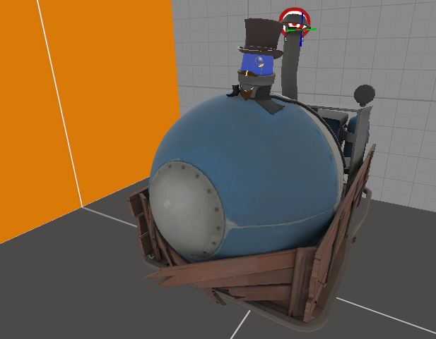
Wow fuck that was exactly four years ago
Stoneyridge has one too!
bobotype
L1: Registered
- Sep 24, 2014
- 39
- 5
this is my first attempt at a proper map, I'm so nervous 
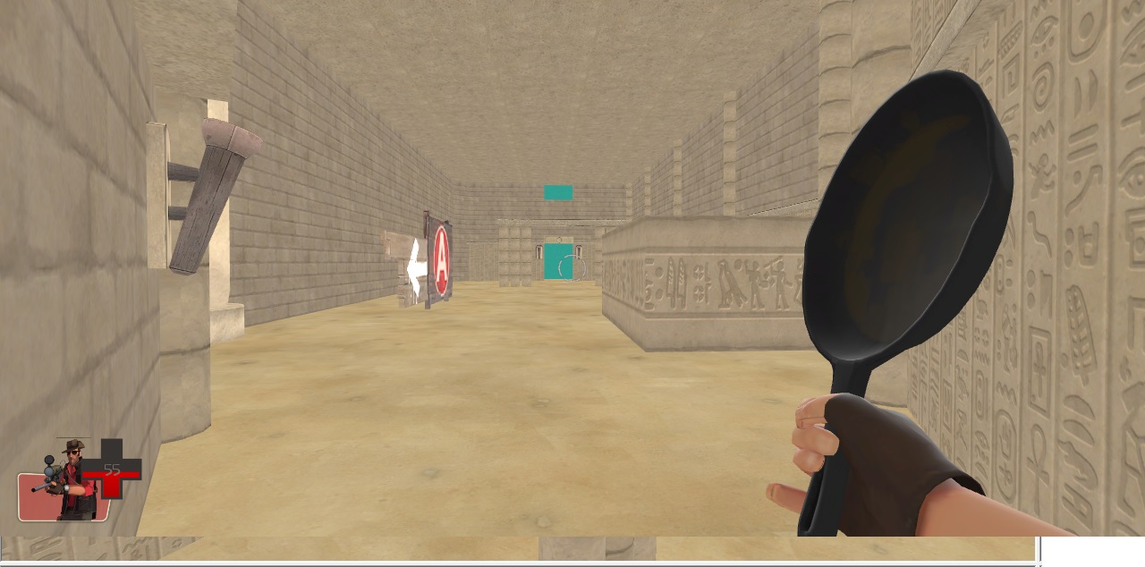
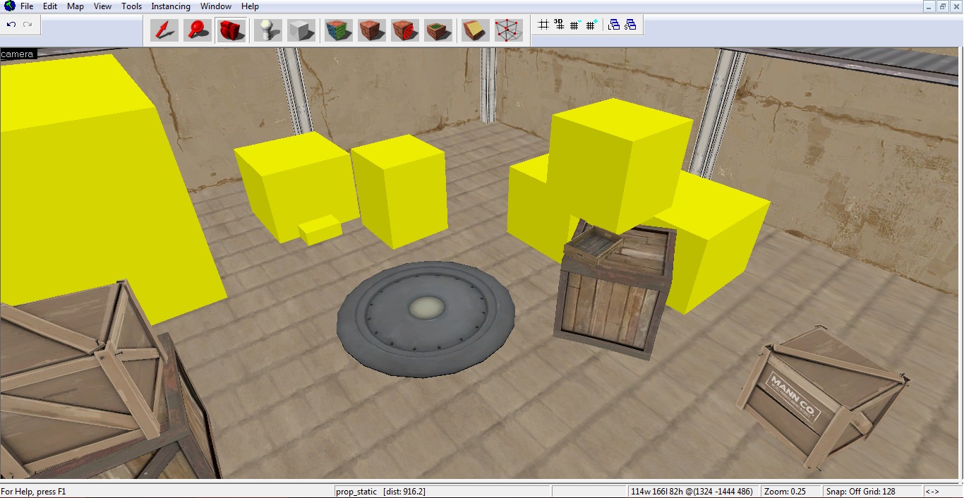
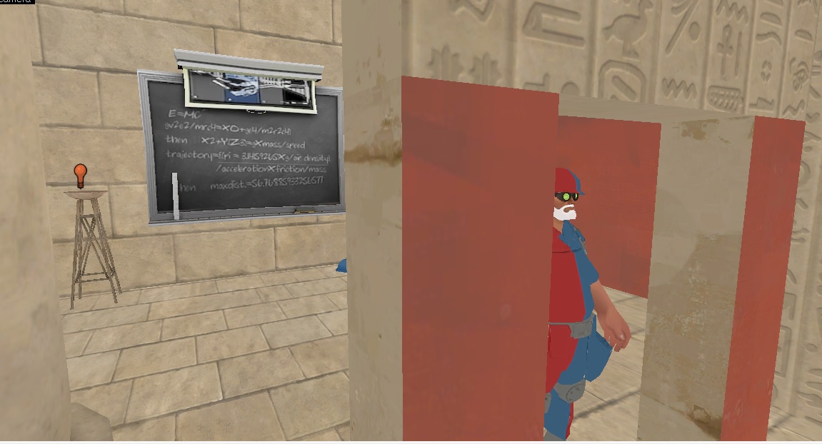
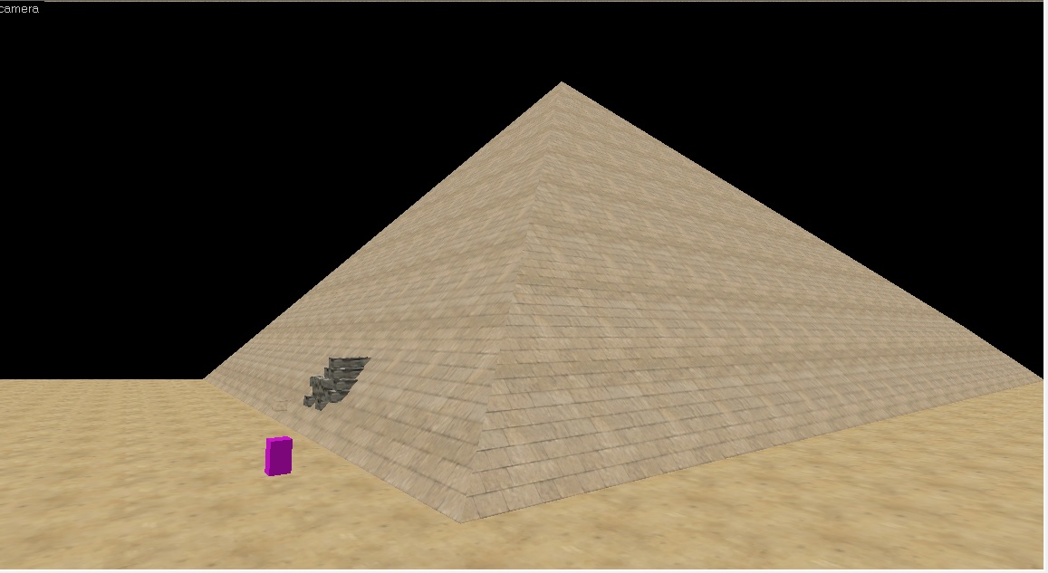
These shots haven't been updated because my computer's playing up on me, I've since learnt the error of my ways with the lighting and dev textures and what to have on my toolbar
Also I was going to try and carve the face of the pyramid using those blocks to make a crater but now i'll probably just make a displacement
Last edited:
Why do you have fullbright on?this is my first attempt at a proper map, I'm so nervous right now

bobotype
L1: Registered
- Sep 24, 2014
- 39
- 5
Why do you have fullbright on?
I think it's because I have RAD off? [I use a toaster] I'm still trying to understand lighting
- Mar 11, 2013
- 892
- 1,050
I think it's because I have RAD off? [I use a toaster] I'm still trying to understand lighting
You should join the tf2maps chatroom on steam (It's on the main page of this site just click it) there's a few things some of us can say to help put you in the right direction with your map.
But going off it so far:
-Don't detail during early stages (Alpha) focus entirely on the gameplay
-ALWAYS compile with both VRAD and VVIS, even if they're set to fast
-Don't use carve tool
-Play around in hammer's options tools to get everything right
Last edited:
bobotype
L1: Registered
- Sep 24, 2014
- 39
- 5
You should join the tf2maps chatroom on steam (It's on the main page of this site just click it) there's a few things some of us can say to help put you in the right direction with your map.
But going off it so far:
-Don't detail during early stages (Alpha) focus entirely on the gameplay
-ALWAYS compile with both VRAD and VVIS, even if they're set to fast
-Don't use carve tool
-Play around in hammer's options tools to get everything right
yeah haha I learnt from the ten commandments not to use Carve that was just to explain why those silly blocks were there
bobotype
L1: Registered
- Sep 24, 2014
- 39
- 5
You can increase the draw distance of props in Hammer, by the way, so you won't be stuck with yellow and purple boxes everywhere.
Oh gosh I genuinely didn't know that I'll go look it up now
Ah I see it's in Tools thank you very much
Last edited:
My biggest concern is that those are clearly skycards in the background. Make a little hill infront of that, and put some real trees on it, THEN have the skycard show up and it could look much better.
Gunnysack Man
L1: Registered
- Oct 16, 2014
- 13
- 16
Then it still depends on the way you use it. Spheres and cylinders for example give realy bad results when you carve them or use them to carve. Its because the result brushes are messy.
Its for that reason more recommended to use the arch tool for it. And if that one isnt doing its job, make it manualy. Even if there is no existing tool carve is unrecommended. Someone already had an image showing what carve should have done to make it clean.
This is one of those example images (from interlopers):

that right image is much more efficient for scaling reasons since each brush is simplistic. For complex shapes its still better.
This is why to avoid carve. If you know what you do with carve and know how to properly fix its mistakes afterward, you often also know how to manualy make it.
Its for that reason more recommended to use the arch tool for it. And if that one isnt doing its job, make it manualy. Even if there is no existing tool carve is unrecommended. Someone already had an image showing what carve should have done to make it clean.
This is one of those example images (from interlopers):
that right image is much more efficient for scaling reasons since each brush is simplistic. For complex shapes its still better.
This is why to avoid carve. If you know what you do with carve and know how to properly fix its mistakes afterward, you often also know how to manualy make it.
Gunnysack Man
L1: Registered
- Oct 16, 2014
- 13
- 16
Ah right. I forgot about circular objects and how much a pain they can be with the carve tool. I usually just use it for rectangular openings and such.

It's been a long time since I posted there. Doing a small artpass on blorav.
How did you achieve that grit and such around the drains? is it an overlay of sorts? It looks fantastic regardless, I can't wait to see the rest


