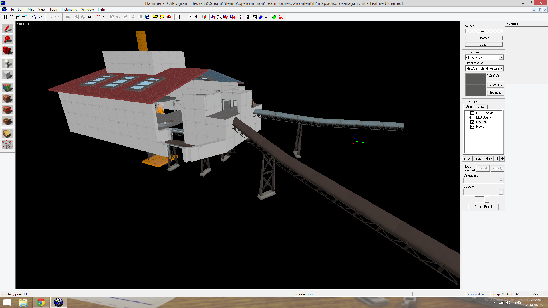
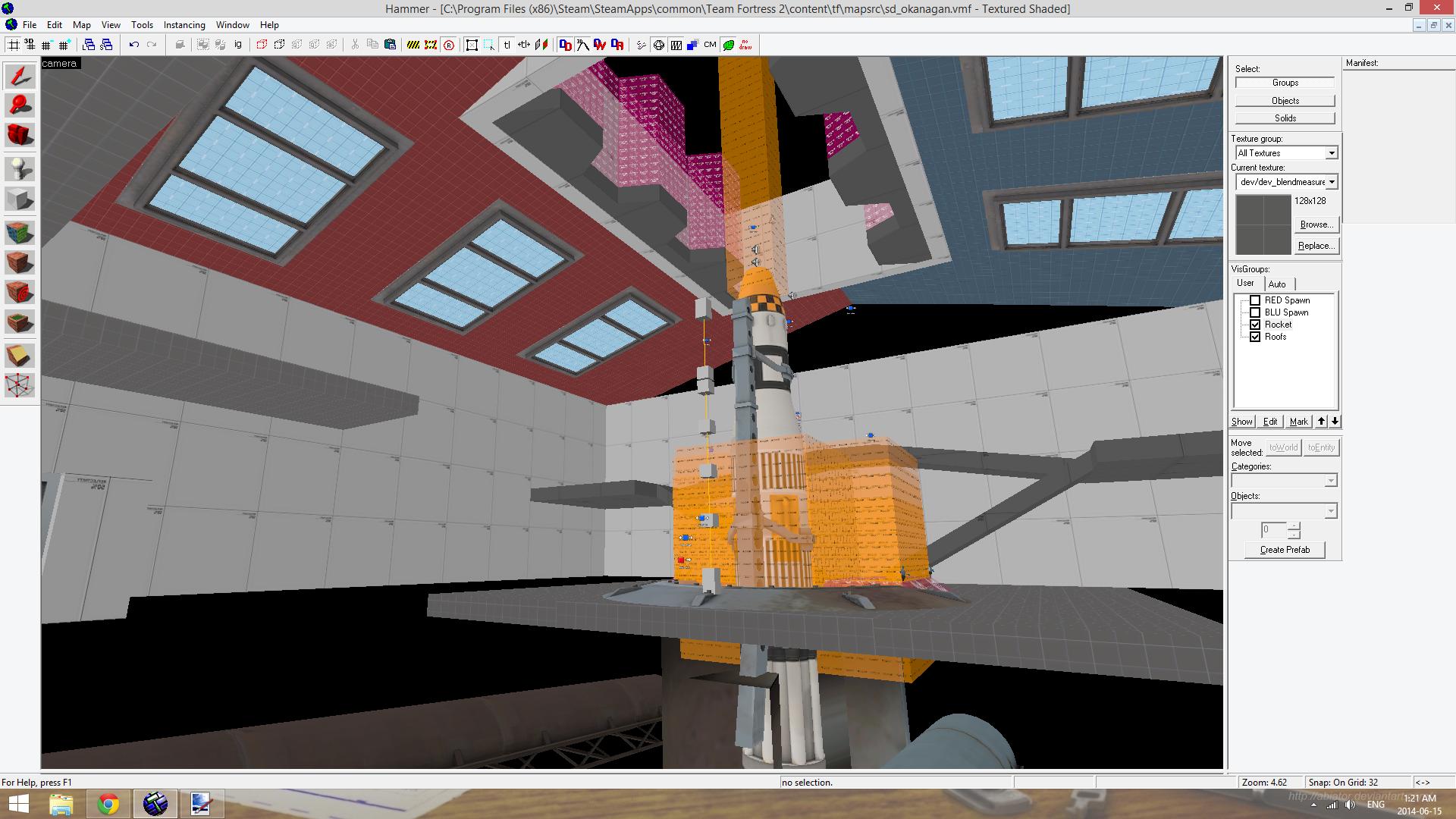
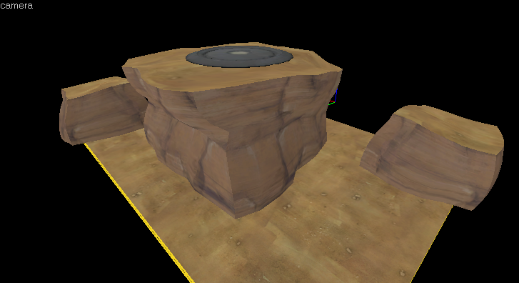
Well it's still pretty terrible, but I guess it means I have a proof of concept. Now I just have to make the textures and models not a steaming pile of poo.

It looks a bit better in game, because the reflections actually move. A solid color for the glass with low opacity and a very soft normal map seems to be the best bet, the one in the screenshot is a bit over exaggerated.
Phong ended up being a bust, it doesn't do what I thought it did. I went with a standard envmap reflection.
I think it would look better if there was a noticeable transition between the inside of the dome and the outside; maybe one is a desert and the other is lush and grassy? It would make it a sealed ecosystem sorta-thing.
Maybe.


