WiP in WiP, post your screenshots!
- Thread starter Arhurt
- Start date
You are using an out of date browser. It may not display this or other websites correctly.
You should upgrade or use an alternative browser.
You should upgrade or use an alternative browser.


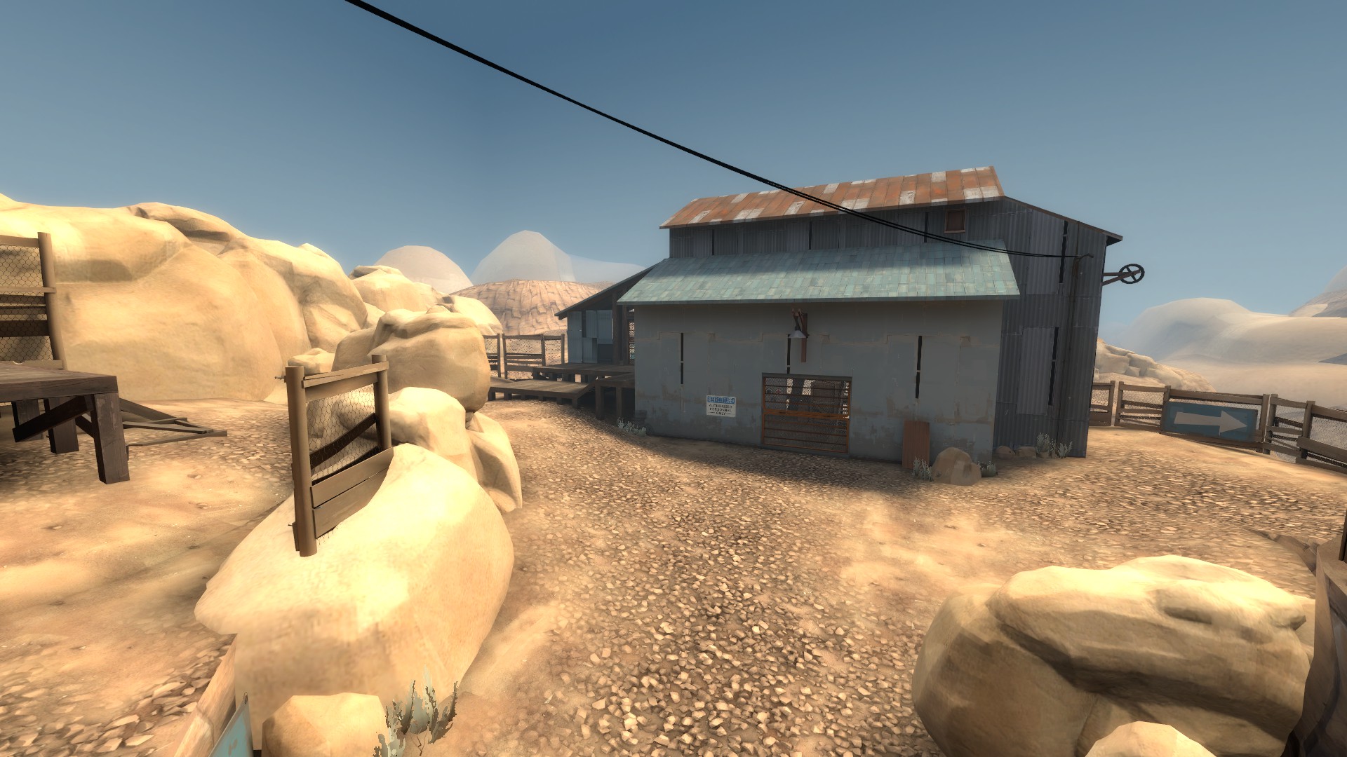
Well that looks a lot more coherent, but it's still quite a jumble of styles. look how close that raggedy wooden fence is to that set of clean, crisp metal steps; or how you have a wooden section coming right out of a breeze block building. And I still question: what the fuck is going on with that building's roof??
I know how lighting on props works, but thanks.
Those particular patch panels just don't light smoothly, I guess I'm not 100% sure the origin isn't buried in a brush but they have a bad habit of either being fully lit or fully dark. There's no real middle ground. Works fine in daylight maps because usually they'll either be in full shadow or full sunlight, but in a night map it sticks out like a sore thumb.
I messed around with it for hours trying all sorts of options and I eventually gave up and demanded Crash and Hey You stop putting the things into the map.
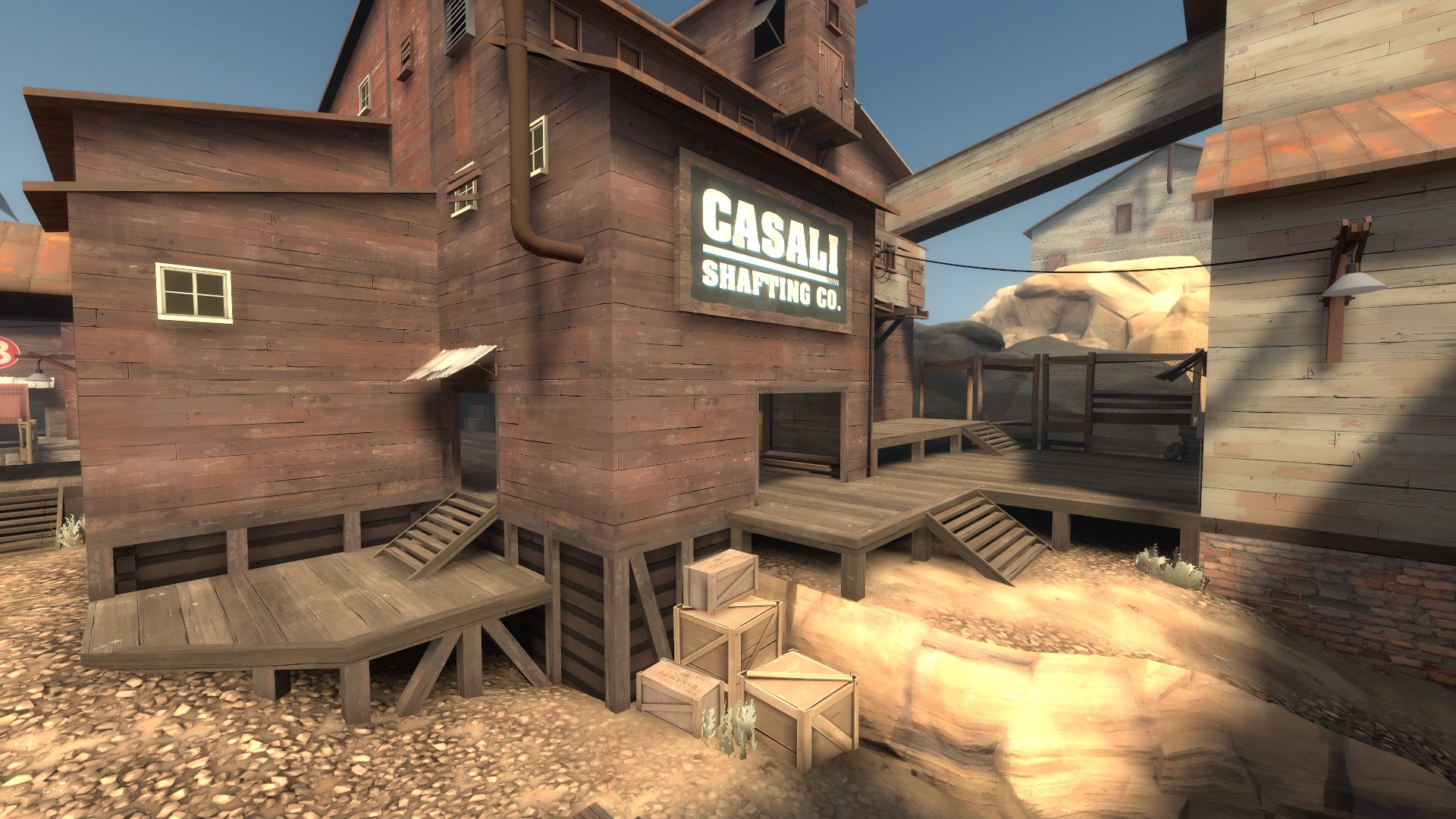
To be fair, no one's saying the detailing on stoneyridge is perfect. All of us who worked on it have been trying to delete and smooth out stuff every time we open the vmf. But there is SOME consistency with what's going on.. there is in fact a "story."
I think the map is overall pretty good with the aesthetics, even though there's lots to nitpick. It certainly makes some pretty screenshots.
I think the map is overall pretty good with the aesthetics, even though there's lots to nitpick. It certainly makes some pretty screenshots.
That looks bad because your props look nothing like your brushwork. Also that brush has one hell of an overhang.
It'd look a butt-load better if you replaced those props with brushes (possibly displacements) that emulated the raggedness. Then the whole roof would feel damaged, but unified.

How many people already do give feedback on such areas ingame? That number reaches close to 0 anyway. Its that we comment on a screenshot here and actualy try to find the issue in more detail.
People ingame give feedback on things blatently in the way, but those 'tiny' things arent something they complain about (as then in some maps the stream of complaints just would be too large). If they do they at most will say 'area looks weird'. Not even giving a slight indication on what exactly is that weird looking thing.
People ingame give feedback on things blatently in the way, but those 'tiny' things arent something they complain about (as then in some maps the stream of complaints just would be too large). If they do they at most will say 'area looks weird'. Not even giving a slight indication on what exactly is that weird looking thing.
Beetle
L9: Fashionable Member
- Aug 17, 2008
- 627
- 178
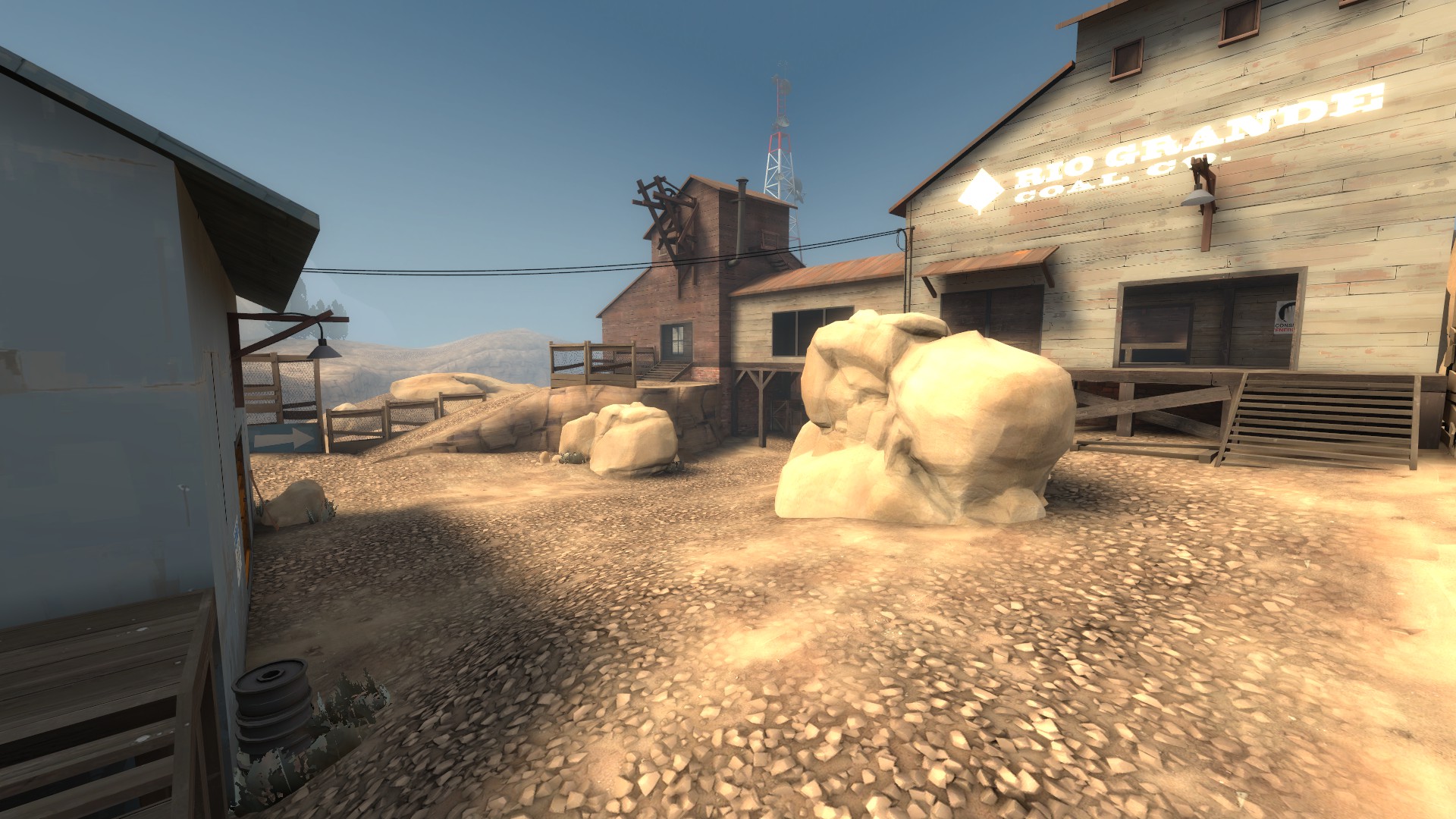
When Are you gonna make the ground not look like toxic waste?
You don't understand. That IS toxic waste. That's the gimmick.
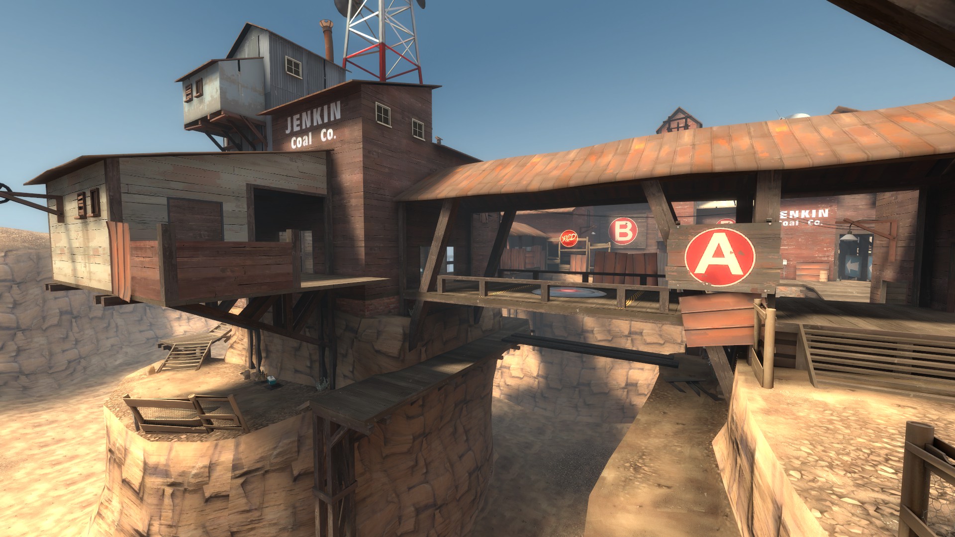
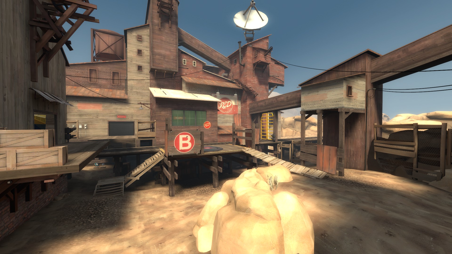
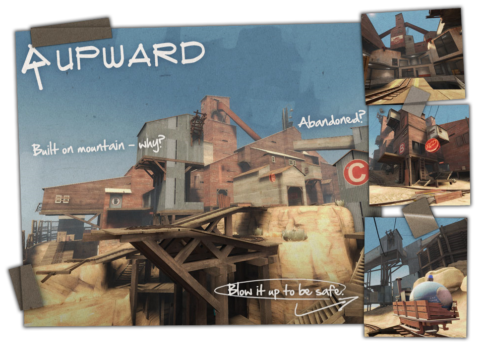
It was heavily inspired by upward obviously, done in the upward theme. Of course it's meant to remind you of upward 
I don't understand?
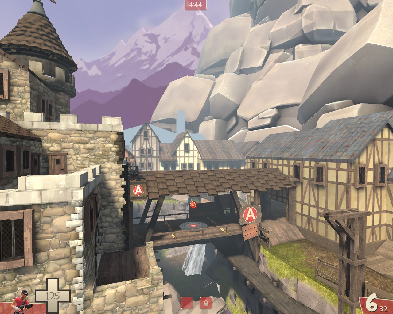
Aly and bridge walkways haha
I don't understand?