I originally wrote this for my portfolio, but decided it would be best shared here as well for more exposure and archiving. Images are re-hosted on TF2Maps.net for archival purposes as well. It was written for an audience that is not familiar with Team Fortress 2, and it is also meant to showcase my skills as a designer while being medium-short in length, so it reads a little awkwardly as a proper article. Anyways, enjoy!
Steep actually started as a completely different map. I was new to MvM map design and wanted to create something very simple, and the end result was an industrial farmland map designed as a large figure 8.
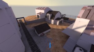
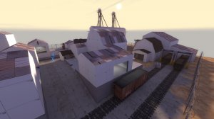
A couple of shots of the original map. The first is where bots drop into the map, and the second is of one of the main routes (bottom right in the next image).
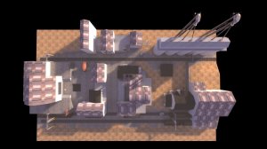
The figure 8 design. Robots spawn on the right and take either the upper or lower train tracks around a central group of buildings. They then cross over in the middle street, and continue the opposite side of train tracks towards the hatch on the left of the image.
After testing and iterating this layout a few times, I realized I had made some mistakes in the overall layout. The central group of buildings was far more complicated than it needed to be (and could only really be simplified by shrinking the map, which was already relatively small), and the central road where robots crossed was difficult to design around, since bots could be walking in either direction. It wasn't very much fun to fight robots as they turned the corner towards the hatch.
Lastly, it was difficult to iterate on the design because I had designed it without any negative space in the layout, meaning changing any piece of the middle of the map would effect everything around it. Train tracks on either side also made the layout less flexible to work with.
The main takeaway was that, while there were some good ideas present, the map deserved a full redo.
I took this as an opportunity to start something different entirely. This new map, which became the final product, was inspired by two things: A diagram, and a trip to see relatives in Oregon.
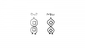
This diagram was my solution to the problems surrounding the central road and the final corner towards the hatch. The middle crossing point is now a simple intersection instead of a long stretch of road, meaning the area doesn't have to be designed to work in both directions. The final corner towards the hatch is no longer a 180 turn, but a 90 degree turn, making it easier to design around.
This final diagram doesn't show up in the final design, as there is no middle crossing point, but the important part was that it got me thinking about how to design corners in a layout that were fun to play around, which the original layout lacked.
My trip to Oregon involved driving through a lot of mountains, some of which were next to the water. Inspiration struck as I was on a road that was flanked by the large banks of a river and heavily forested mountains. I had the idea of robots coming out of the water, over the road, and into the mountains. One route would go through a valley up the mountain amongst some abandoned mining buildings, and the other would go through a mine.
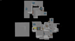
First draft. The figure 8 idea is visible. Note how the outdoor route is designed as a complete valley rather than a single slope, with a low ground in the center and high ground surrounding it. Both routes were designed to have "reset routes" where players can knock the bomb-carrying robot into a ditch to force them to backtrack. These were later ditched in favor of deathpits, which made more thematic sense for both routes when the outdoor path went from a valley to a single hillside.
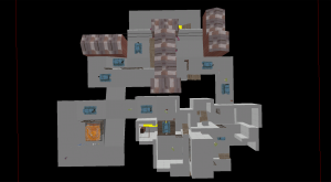
The outdoor route was redesigned to something closer to its final version. The figure 8 shape was putting some weird pressures on the cave route (and therefore also the hillside that would have to cover it) and was soon discarded in favor of a simpler shape for the landscape.
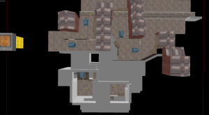
The figure 8 idea disappears and becomes the more simple form seen in the final map. Note how this simpler shape allows both routes to be more independent of one another, making the map easier to design. Early versions of this map actually have some connections between the two routes, but the final map has the routes completely separated, as players would only walk through the route the bots chose to attack on, and the connections went unused.
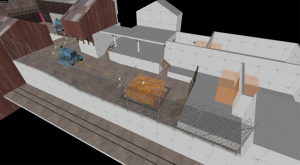
An early design of the hatch area. The hatch was later moved into the mountain for layout and aesthetic reasons - a vertical shaft in the mountain didn't make sense being that close to the ledge, and giving a sharp turn right at the end of the map helped make a design unique from other existing MvM maps. It also gave the spawn a much more formal design, which helped in detailing and navigability.
The testing and iteration schedule of this project was the most intensive I'd ever dealt with in a level design project. After an initial period of about one week to develop the first version, new versions of the map and robot waves were tested on a daily basis (excluding the time I took two or three days to entirely redesign the outdoor branch of the route). Daily iterations continued for about two weeks, and the map was artpassed in the following week. Overall, the map was completed in about a month, which was necessary to complete the map before the contest deadline.

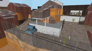
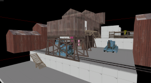
Redesign of the outdoor route. Robots being funneled down the train tracks was annoying to fight against, as was trying to fire weapons through the structure. The final design is less faithful to actual mining structures, but it makes the same general gestures and doesn't look out of place. The gap in the fence was outlined in wood for the final version so it was more immediately visible to players, as the grey thin fence tended to blend in with the valley vista behind it.
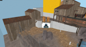
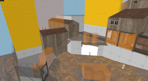
Bots originally entered the map only through one entrance. This was both boring and also easily countered by more experienced players. A second entrance was added so that players were less easily able to camp the higher route. This also provided some flexibility in designing the robot waves, as it was possible to specify which entrance robots would enter from.
---------------------------------------------------
---------------------------------------------------
Steep actually started as a completely different map. I was new to MvM map design and wanted to create something very simple, and the end result was an industrial farmland map designed as a large figure 8.


A couple of shots of the original map. The first is where bots drop into the map, and the second is of one of the main routes (bottom right in the next image).

The figure 8 design. Robots spawn on the right and take either the upper or lower train tracks around a central group of buildings. They then cross over in the middle street, and continue the opposite side of train tracks towards the hatch on the left of the image.
After testing and iterating this layout a few times, I realized I had made some mistakes in the overall layout. The central group of buildings was far more complicated than it needed to be (and could only really be simplified by shrinking the map, which was already relatively small), and the central road where robots crossed was difficult to design around, since bots could be walking in either direction. It wasn't very much fun to fight robots as they turned the corner towards the hatch.
Lastly, it was difficult to iterate on the design because I had designed it without any negative space in the layout, meaning changing any piece of the middle of the map would effect everything around it. Train tracks on either side also made the layout less flexible to work with.
The main takeaway was that, while there were some good ideas present, the map deserved a full redo.
---------------------------------------------------
I took this as an opportunity to start something different entirely. This new map, which became the final product, was inspired by two things: A diagram, and a trip to see relatives in Oregon.
This diagram was my solution to the problems surrounding the central road and the final corner towards the hatch. The middle crossing point is now a simple intersection instead of a long stretch of road, meaning the area doesn't have to be designed to work in both directions. The final corner towards the hatch is no longer a 180 turn, but a 90 degree turn, making it easier to design around.
This final diagram doesn't show up in the final design, as there is no middle crossing point, but the important part was that it got me thinking about how to design corners in a layout that were fun to play around, which the original layout lacked.
My trip to Oregon involved driving through a lot of mountains, some of which were next to the water. Inspiration struck as I was on a road that was flanked by the large banks of a river and heavily forested mountains. I had the idea of robots coming out of the water, over the road, and into the mountains. One route would go through a valley up the mountain amongst some abandoned mining buildings, and the other would go through a mine.

First draft. The figure 8 idea is visible. Note how the outdoor route is designed as a complete valley rather than a single slope, with a low ground in the center and high ground surrounding it. Both routes were designed to have "reset routes" where players can knock the bomb-carrying robot into a ditch to force them to backtrack. These were later ditched in favor of deathpits, which made more thematic sense for both routes when the outdoor path went from a valley to a single hillside.


The outdoor route was redesigned to something closer to its final version. The figure 8 shape was putting some weird pressures on the cave route (and therefore also the hillside that would have to cover it) and was soon discarded in favor of a simpler shape for the landscape.

The figure 8 idea disappears and becomes the more simple form seen in the final map. Note how this simpler shape allows both routes to be more independent of one another, making the map easier to design. Early versions of this map actually have some connections between the two routes, but the final map has the routes completely separated, as players would only walk through the route the bots chose to attack on, and the connections went unused.

An early design of the hatch area. The hatch was later moved into the mountain for layout and aesthetic reasons - a vertical shaft in the mountain didn't make sense being that close to the ledge, and giving a sharp turn right at the end of the map helped make a design unique from other existing MvM maps. It also gave the spawn a much more formal design, which helped in detailing and navigability.
The testing and iteration schedule of this project was the most intensive I'd ever dealt with in a level design project. After an initial period of about one week to develop the first version, new versions of the map and robot waves were tested on a daily basis (excluding the time I took two or three days to entirely redesign the outdoor branch of the route). Daily iterations continued for about two weeks, and the map was artpassed in the following week. Overall, the map was completed in about a month, which was necessary to complete the map before the contest deadline.


Redesign of the outdoor route. Robots being funneled down the train tracks was annoying to fight against, as was trying to fire weapons through the structure. The final design is less faithful to actual mining structures, but it makes the same general gestures and doesn't look out of place. The gap in the fence was outlined in wood for the final version so it was more immediately visible to players, as the grey thin fence tended to blend in with the valley vista behind it.


Bots originally entered the map only through one entrance. This was both boring and also easily countered by more experienced players. A second entrance was added so that players were less easily able to camp the higher route. This also provided some flexibility in designing the robot waves, as it was possible to specify which entrance robots would enter from.
---------------------------------------------------


