Stallberg

PL Stallberg rc3

Fluury

L5: Dapper Member
Jul 30, 2017
237
171
Hello good sir, so I am curious if this map is being made for casual or competitive. I was just wondering cause my group is doing maptests to help out new mappers. If you are curious let me know and I can send you a DM

I'd personally argue I'm not exactly a new mapper perse given I already have two entirely finished maps under the belt which did pretty alright - so if your project truly focuses on new mappers, I'd suggest taking a look at some other maps - however;

I try to make my maps accessible for both casual and competitive similar to how Badwater/Upward are great as both casual and competitive ( speaking highlander and I guess kinda prolander) maps. Emphasis is on try.
Afterall, a lot of issues you find in competitive gameplay in a map are reflected in their casual play aswell.

I'm not exactly going to pass up any kind of testing but as I already said, if your project focuses on new mappers it's up to you to decide.
 

Dwaggy

L1: Registered
Jan 30, 2018
6
1
Alright, forgive me I didn't realize that you were a more experienced mapper, regardless I would still like to help you by providing tests from a competitive side as well as casual. Not only that but my group focuses on breaking maps to find bugs and other things as a good portion of them have a easter egg hunting vigor to them.

Also forgive me, but I am not very familiar with the website and how do I DM you so I can send the discord link? lol
 

Dwaggy

L1: Registered
Jan 30, 2018
6
1
Also I did notice my comment above seemed a little rude, I do apologize if it did come off as that. I actually don't know much on how tf2maps ranks works for the mappers so like I said, do forgive me for misunderstanding.
 

Fluury

L5: Dapper Member
Jul 30, 2017
237
171
Also I did notice my comment above seemed a little rude, I do apologize if it did come off as that. I actually don't know much on how tf2maps ranks works for the mappers so like I said, do forgive me for misunderstanding.
It's completely fine, I don't exactly put a lot of pride in this.
You can just DM me over Discord - Fluury#3018 - and tell me the details of your lil operation.

As far as "breaking" maps go I'd personally argue it's best to do that on beta maps given not only do you have a lot more possible problems there given you actually work with props at that point but alpha maps are really just there to confirm the general gameplay flow works before the detailing process begins.
 

Fluury

L5: Dapper Member
Jul 30, 2017
237
171
To make Last both more interesting and better to conquer as BLU - they now have an underground area similar to foundry to access and flank essentially straight to the end of the cart's track! This is a pretty significant change to Last which will hopefully improve it massively.

Outside of this, a few sightlines were fixed and a lot of cover was added to the cliffs to prevent Pyros from going as mental as they did.

I am very confident that this change will make Last interesting and more doable for BLU, while RED now has 2 layers to defend rather one plain, boring area.

Read the rest of this update entry...
 

Fluury

L5: Dapper Member
Jul 30, 2017
237
171
In response to Cap 1 being awkwardly hard to cap, I have decided to expand the area a bit - making the cap area less cramped and hopefully more accessible for BLU.

As far as the rest goes, I am personally happy enough with the map (if the cap 1 shit goes right) that I am heavily considering starting to detail it a bit and entering beta. If my opinion will change on this, we will see.

CHANGELOG:
- Made the Cap 1 building larger and expanded the ceiling a bit so it isn't as cramped
- as a result, the small hill before it was removed
- - this change might introduce a few toxic sightlines, unsure about them
- replaced the diaper skybox with a semi-proper skybox which should hopefully significantly boost performance
- added another door at cap 2 which leads to the flank, hopefully making more BLU players take it into consideration
- Ditched trying to make the doors properly work after a spawn changes and instead decided to just teleport players.

Read the rest of this update entry...
 

Fluury

L5: Dapper Member
Jul 30, 2017
237
171
Mostly smaller touch-ups and a rather big change for first.

CHANGELOG:
- Removed RED's first spawn in an effort to make first less difficult for BLU
- Added a window at first
- Adjusted overall respawntimes
- Added cover at the highground at last so players which leave spawn will no longer get eradicated by snipers
- A bunch of misc changes

Read the rest of this update entry...
 

Fluury

L5: Dapper Member
Jul 30, 2017
237
171
After spending the last month or so mapping every single day, a lot of asking in the TF2Maps discord and a lot of fiddling around, I am happy to present the beta update for Fraud - now temporarily(?) renamed to "Wreckenberg".

The map in it's current state with this update is entirely fully detailed, skybox and even the tiniest of patches for healthpacks included.

The current things still to be done are:
- Adding soundscapes
- Fixing a few lighting issues
- Squashing issues found from actually playtesting the beta!

I learned a lot from this process, and while I am pretty confident in the balance of the maps given the numerous runs in alpha, we will see.

No changelog; There are too many changes. The map itself staid mostly the same - but there are a lot - and I mean a lot - smaller changes scattered all across the map during the process of detailing.

Here are some sloppy screenshots!

If you have name suggestions, please suggest them!
Fraud as a name is pretty bad. Wreckenberg is more on the nose, but is also kinda eh in my opinion. Bergkamp sounds nice, but might be too foreign for people that don't know german.

Either way, see you next imp hopefully!

Read the rest of this update entry...
 

Fluury

L5: Dapper Member
Jul 30, 2017
237
171
This update mostly fixes smaller, non-fully gameplay related issues as the first test went pretty smoothly with no gameplay balancing issues detected yet.

Things changed include fixes to a few visual issues, a few playerclips here and there to ensure smooth gameplay and a few fading props being toned down.

I'd also like to address a specific kind of feedback received - the "Should I really be able to stand here" feedback.
I personally believe that these "strange" spots are what give maps a lot of charm. When I was newer to TF2 but started to understand how maps worked and the like, I actively seeked out these spots. They are a ways to reward players that explore with tactical areas to stand in.

Unless the spot allows for something gamebreaking such as a cursed sniper sightline, chances are they will stay

Until the next imp!

Read the rest of this update entry...
 

MegapiemanPHD

Doctorate in Deliciousness
aa
Mar 31, 2012
2,002
1,311
Here's some feedback:
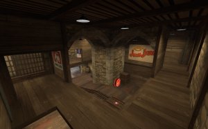
20190825162129_1.jpg
-I found this area to be overly complicated. There's so many paths everywhere it's hard to tell what leads where and how to get from one spot to the next. It causes defenders to split up too much for defending, and attackers to split up too much for attacking
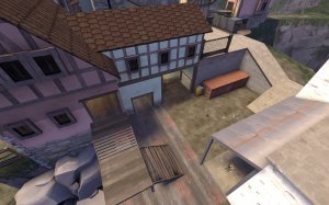
20190825162346_1.jpg
-This area has a similar issue. There's like 4 separate paths here with many leading to the same or similar areas
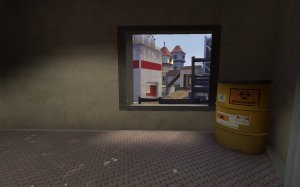
20190825162500_1.jpg
-red computers fade out in this building
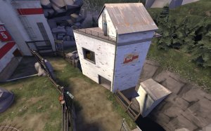
20190825162509_1.jpg
-I rarely see anyone use this building. You could probably remove it without much change to how this area plays
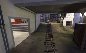
20190825162603_1.jpg
-There's 3 separate routes from this one spot alone, not to mention a 4th through a building over on the right. You could probably close up the path on the left to help teams be more focused on the corner
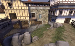
20190825162753_1.jpg
-Again, there's just so many doorways here. Consolidate some of these paths so teams don't split up as much.
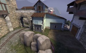
20190825162824_1.jpg
-these 2 locked doors lead to the same room. There's already 3 paths past this building, 2 on the left and a rocket jumping path around behind it. I'd suggest merging this building and the jump path together to just be 1 thing
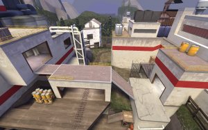
20190825163313_1.jpg
-Last also has issues with a multitude of paths. Having red spawn split up like this makes it hard for them to group up when they are getting their butts kicked, and difficult for BLU to know where they'll be coming from when they are holding the point well. I do like the underground path around behind last though.
 

Fluury

L5: Dapper Member
Jul 30, 2017
237
171
Here's some feedback:

20190825162129_1.jpg
-I found this area to be overly complicated. There's so many paths everywhere it's hard to tell what leads where and how to get from one spot to the next. It causes defenders to split up too much for defending, and attackers to split up too much for attacking

20190825162346_1.jpg
-This area has a similar issue. There's like 4 separate paths here with many leading to the same or similar areas

20190825162500_1.jpg
-red computers fade out in this building
20190825162509_1.jpg
-I rarely see anyone use this building. You could probably remove it without much change to how this area plays
20190825162603_1.jpg
-There's 3 separate routes from this one spot alone, not to mention a 4th through a building over on the right. You could probably close up the path on the left to help teams be more focused on the corner
20190825162753_1.jpg
-Again, there's just so many doorways here. Consolidate some of these paths so teams don't split up as much.
20190825162824_1.jpg
-these 2 locked doors lead to the same room. There's already 3 paths past this building, 2 on the left and a rocket jumping path around behind it. I'd suggest merging this building and the jump path together to just be 1 thing
20190825163313_1.jpg
-Last also has issues with a multitude of paths. Having red spawn split up like this makes it hard for them to group up when they are getting their butts kicked, and difficult for BLU to know where they'll be coming from when they are holding the point well. I do like the underground path around behind last though.

Thank you so much for the detailed feedback.
I'll try to explain my reasoning behind the areas to the best of my ability.

1st area:
BLU is given 4 ways to attack the point. The main choke, the left stairs that lead to highground and the right stairs which lead to the highground. I personally don't find it to be very complicated or for 4 ways to be too much, especially when 2 of them somewhat blend into another, but will keep a steady eye on the area in future maptests, specifically on how split teams are given I can see where you are coming from.

2st area: Same applies here, really. As far as the choke itself goes, players are given only 2 options: Go for the flank area, or go for the choke. The same applies to the RED team - they could scatter in the ways they go to the area, but they will still find eachother.
Unlike the first point where I can understand that the teams might scatter given the areas are somewhat far apart from eachother, I can't see it here, given the players are merely given more options on how to approach two specific areas, rather than there being too many areas in their own right.

I find "too many ways" to be problematic when the areas they lead to are far apart or the "ways" are long and winded - this isn't the case here, atleast from my perspective.

Last building: Players somewhat frequently used the building. I agree that it's kinda rare, but I wouldn't say it's worth removing given there still is usage.

Last choke: This is something where I once again I don't really agree with, especially because it is one of the more hold-happy points of the map given it's a last area. If the left area was closed off, a single demoman could effectively control the entire point. Pressuring through the point would be very difficult as it's the primary choke, going down the "path" on the right is dangerous as it doesn't have a lot of cover - so you are only left with the flank from the right building, and 1 flank I'd personally consider to not be enough. The left area is somewhat close and allows players to get *around* players pressuring the choke, which makes for a more dynamic fight - as always, in my opinion.

1st point head-on screenshot:
The path under the bridge is irrelevant for BLU attacking 1st.
The bridge path, also, is mostly there to transition from the "first push" into the building more effectively. Players which are coming from BLU spawn will not use it to enter the BLU area.
This leaves us with the main choke, the left door, the right one, and the upper one. That 4 doorways to enter the 1st choke, with the upper one leading closely to the same area as the main choke door.
As explained in the first point comment, I can't see the large issue but will keep a steady eye on it.

Locked door building:
Earlier iterations of it had only a single path inside it. No one used it. It was simply too annoying to use it given you had to walk around the sight-line blocking piece of it that is sticking out. Adding another door fixed the problem altogether, and it once again leads teams to the exact same area while making it less annoying for BLU to navigate to it. I can't see the issue.

Last:
I tried to follow a similar idea that Badwater has, where teams split up from being on the highground and the lowground. I hate to repeat that sentence again, but I can't see the large issue; Teams are relatively close to one-another similar to Badwater, it is not like one of them spawn in the underground area that is entirely separate to the upper one if you can follow my train of thought.

And of course; Thanks for the fading prop report, they'll get adjusted.

I hope I didn't come off very harsh, but I personally simply like maps offering a lot of paths compared to ones which offer very little. The latter enforces teamplay more while the first allows for less teamplay, but more one-guy-heroes. I usually try to find the balance between those two things.

But maybe my opinions will change. I will keep a very close eye to the problematic areas you mentioned in the next imps, and if needed, they will be adjusted.

Thanks again for the feedback!
 

Fluury

L5: Dapper Member
Jul 30, 2017
237
171
This update adds the leftovers of what would need to be something I personally consider a full package map - standard stuff that was missing before. With this update, you've got the whole happy meal on your toes now. Minus the crusty fries because we still have some lighting issues to deal with..

CHANGELOG:
- Reworked the arch gate around second so the second opening doesn't look ugly
- Added Soundscapes/Ambience all over the map! Wow, you can actually hear things now and the inner of a building sounds like it should, alongside of that waterfall...
- RED will now instantly respawn after third is capped.
- Arrows have been deleted/relocated
- Added a decent chunk of "No entry" street signs over doors to prevent players from walking into the wrong direction - unless they were to entirely ignore it.
- A few detailing touch-ups here and there
- Fixed several fade distances
- Clipped a few areas
- Added really cool demoknight jumps at second and first
- Touched up a certain secret hidden in the map :)
- Fixed a few fullblack faces/screwed props
- Added spectator cameras
- Some more optimization efforts

THINGS TO DO:
- Continue to keep a steady eye on imps to make sure gameplay works as I imagine it to
- Fix some lighting issues
- A light touch of detailing here and there maybe
- Find a better name because Wreckenberg still sucks as a name

See you next imp!

Read the rest of this update entry...
 

Fluury

L5: Dapper Member
Jul 30, 2017
237
171
Even though the last imp was quite messy with the teams being decently unbalanced, people friendlying and what not, I was still able to find some valuable data out of it.

CHANGELOG:
- put down judgement on several spots and clipped them - some will stay though, as I do not find them to be problematic.
- Adjusted respawn times for 1st and 2nd
- Closed the window around 1st and slowed the cart down as it goes up hil in an effort to simplify the area and allow RED to hold it for longer. This should significantly impact the performance RED has on the first point, as before RED would often just get beaned out of it. It also makes the Sentry on the highground a lot more powerful.
- Fixed some ways of shooting into BLU spawn's outdoor area.

Given I am mostly focusing on balancing and want to see how these changes play out, smaller bugs such as lighting issues/purely visual ones will be fixed at a later date.

Read the rest of this update entry...
 

Fluury

L5: Dapper Member
Jul 30, 2017
237
171
Moving closer to release.

CHANGELOG:
- Added HDR support
- Fixed several lighting issues
- clipped several things you could get stuck on
- Fixed a few exploits
- Adjusted respawn times

TO-DO:

Fix like the last 3 lighting issues left, I can't get rid of them

aaaaaaaaaaa

Read the rest of this update entry...
 

Fluury

L5: Dapper Member
Jul 30, 2017
237
171
I was finally able to crack down on several lighting issues thanks to the help provided in not only the Discord, but also the forums here, so a big thank you to everyone that helped.

This finally cleared one of my biggest frustrations I had with the map, and I am happy to say that unless my mind suddenly changes, release is crystal clear very very soon ahead, making B6 very likely the last in the beta line and the following imp very likely the last.

The map has been tested even outside TF2Maps and from both a visual and gameplay perspective, I received a thumbs-up from groups I very clearly trust as far as TF2 goes.

But for all I know I'll realize I left out a big thing while I'm under the shower tonight and I'll sit on this map for the next month - let's hope not!

Either way, the changelog:
- Clipped the absolutely living hell out of the map. A lot of detailing support beams will now be non-solid, which means that explosive classes and the like should not bump their heads on them and be freely allowed to jump with their fullest potential.
- Fixed a few non-solid props in gameplay spaces.
- Fixed several incredibly annoying lighting issues!
- Raised the non-accessible roof around the flank at second to prevent players from thinking they can go on top of it.
- Changed a few HDR values.

See you next imp, it'll be an interesting one!

Read the rest of this update entry...
 

Fluury

L5: Dapper Member
Jul 30, 2017
237
171
Quick version swap! I accidentally pushed the version out that bumpmaps disabled on a lot of the ye olden hamlet buildings which led to a bunch of lighting errors on higher settings. It was an older compile.

This update basically switches out the old version with the newer one, where this issue doesn't persist. The rest of the changelog holds true.

Read the rest of this update entry...
 

Fluury

L5: Dapper Member
Jul 30, 2017
237
171
I am happy to announce that this update will mark the public release of Wreckenberg - now known as Stallberg because Wreckenberg is a bad name.

This map took a lot of effort and a lot of annoying the crap out of TF2maps community members to get them to help me fix some lighting issues, but it was all worth it in the end!

I learned a lot during this map, and while often stressful was also a lot of fun to develop.

CHANGELOG RC1:
- Updated the original download with the most recent description, name, screenshots etc.
- Changed name from "Wreckenberg" to "Stallberg"
- Fixed a few texture issues
- Fixed a few lighting issues
- Fixed resupply lockers not animating properly
- Clipped a few brushes
- Slightly adjusted detailing at a few areas

I'm off to uni now, but I hope we'll meet again in a TF2Maps server near you!

Read the rest of this update entry...
 

Fluury

L5: Dapper Member
Jul 30, 2017
237
171
Heya!
First of all I wanted to say thanks to the players that are playing Stallberg and are submitting feedback. Ever since I pushed this beast out into the world, the reception has been very welcoming.
This Update is pretty late. This stems from the fact that I had started my first semester at University 8 weeks ago, and as it turns out these 8 weeks were sucking every single ounce of time I had left out of me. Change happened, which is why I have more time now.

But personal stuff is not on the table; Here are the changes. The problems beforehand were all mostly visual, which is why I didn't make this update a huge priority. There are some slightly more significant ones there, though.

RC2 CHANGELOG:
- Fixed pasterwalls at last and second using wrong textures causing lighting issues
- Fixed missplaced texture within the building at third
- Introduced a small extension to the building on second. This should block a nasty sniper sightline into RED's building from incredibly far away and should also introduce a new, cute way of getting to the highground via. the Detonator, as scout etc.
- Added bulletblockers to the capture point models to prevent stickies to be hidden in them.
- Fixed the cart making the screen shake at third under unfortunate circumstances
- Made the cart move slightly faster at second
- Slowed the cart down when going uphill at third to give the enemy team slightly more time
- Decreased explosion radius of Payload when winning the game as BLU.

That should hopefully be the last touchup I have to do for the map. I like the way it plays at the moment, but honestly the main reason this patch happened was because of this inexcusable texture missplacement:
oNKvLYd.png

...Which I have only noticed like 100 days after the initial release of the map. Mental.

Read the rest of this update entry...
 

Boonie

L2: Junior Member
Sep 22, 2015
84
57
Hi, I run this map on a server, so far its been pretty fun! Every map I add to the server I go over beforehand and fix all exploits.

Suggestions:

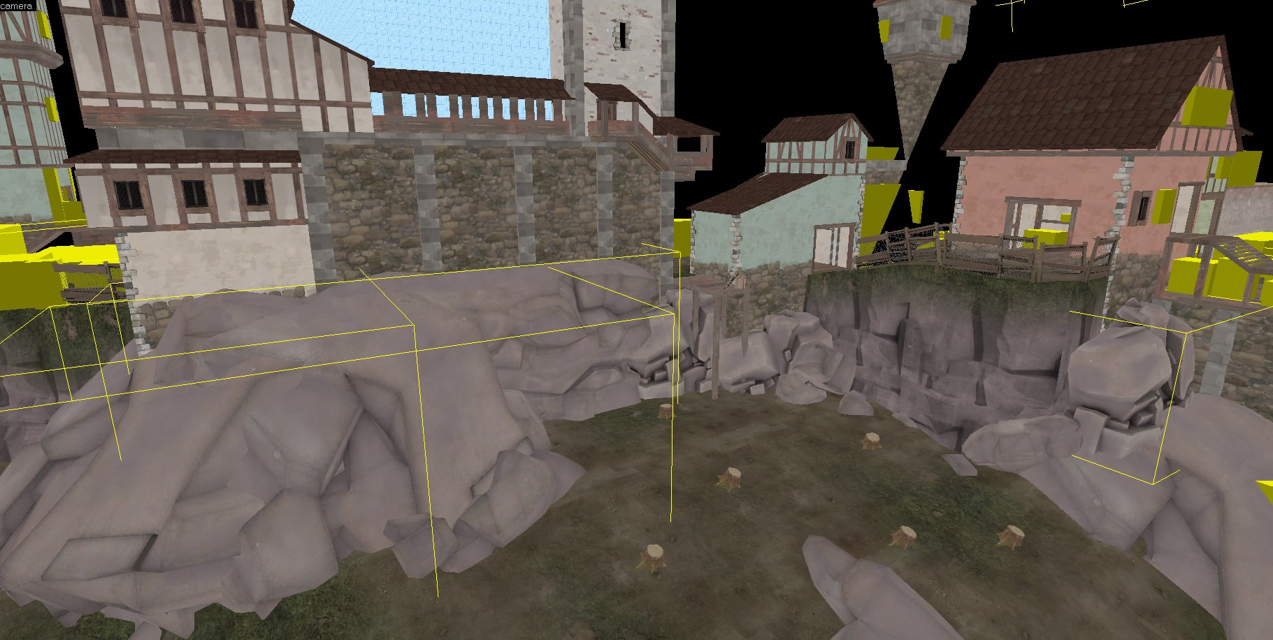
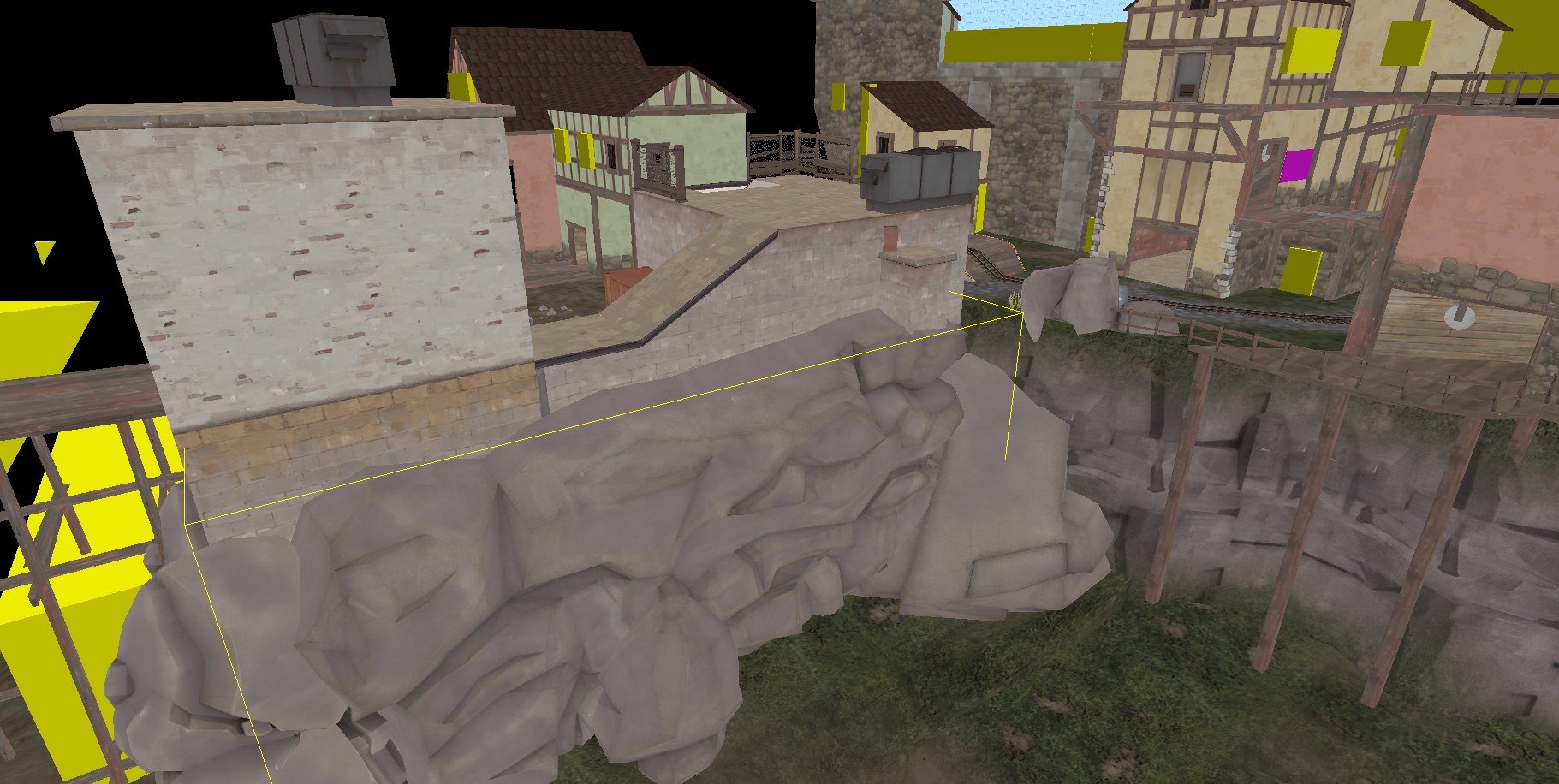
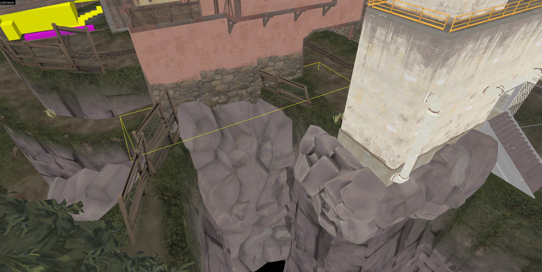
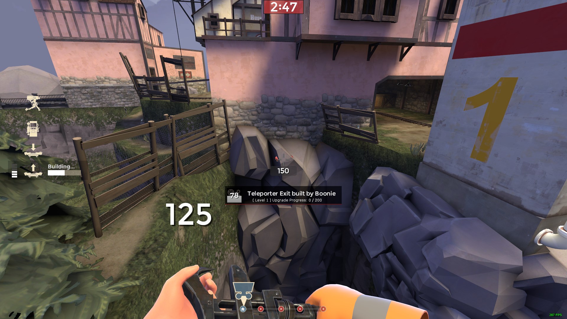
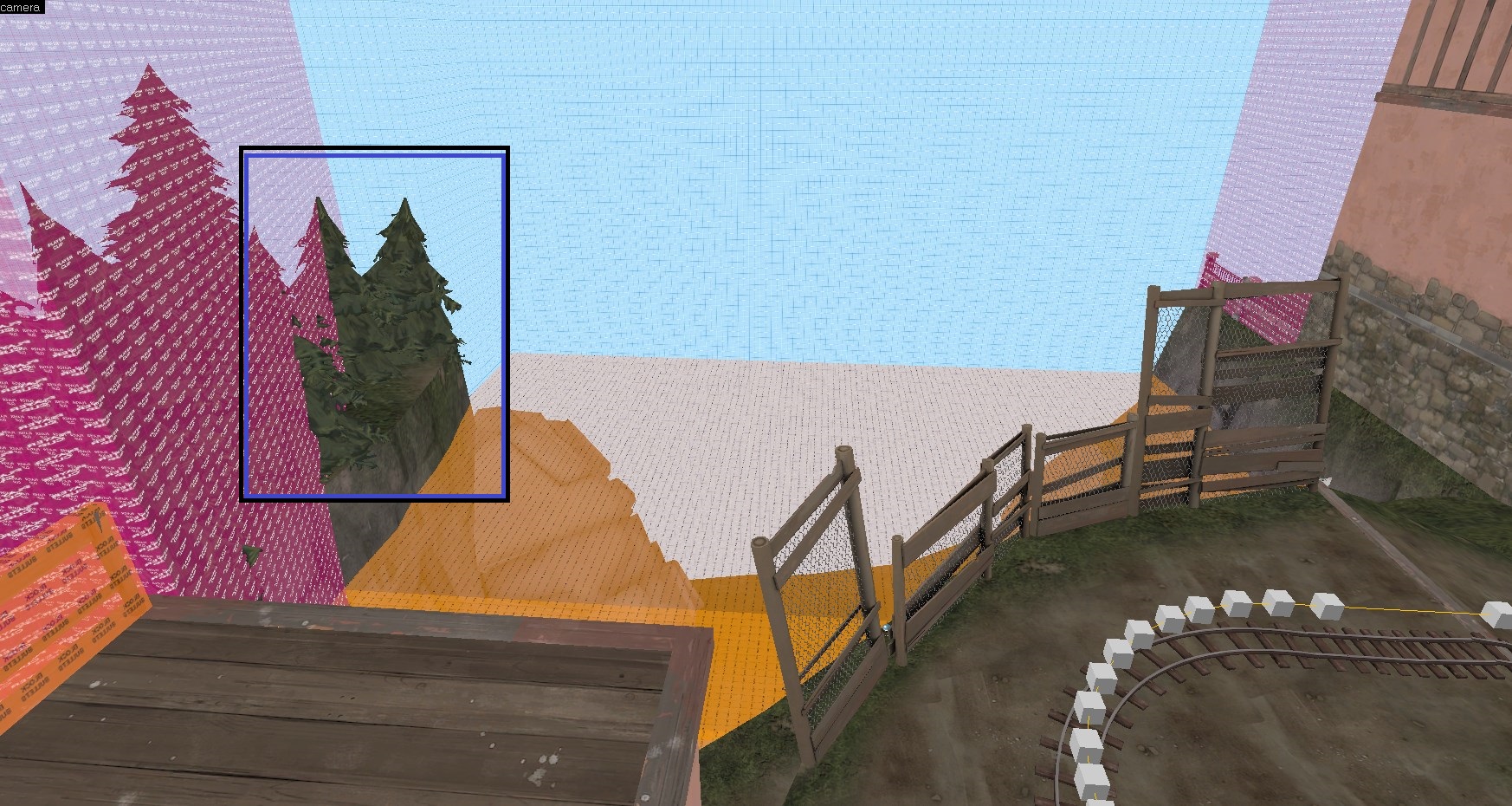
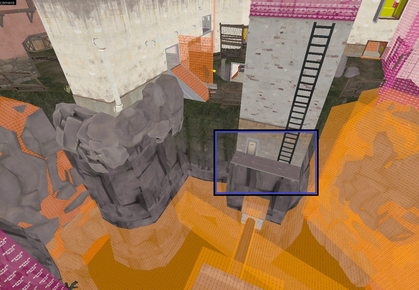
I would either push the models of the cliff walls way down lower (for the ones you cant stand on), or remove them entirely. People have complained that they don't know what they can stand on.
BDyHAjs.jpg

KSuCPa0.jpg


For the ones you want people to stand one, I would clip them better, or replace them with displacements. You don't really know when the clip ends so you tend to fall off super easy, not to mention you can hide some nasty teles.
OQW3nxB.jpg

cm9D5Ir.jpg


Exploits/Weirdness:

All this is func_brush, which doesn't allow stickies to stick to them. I would suggest going over your entity report, you have some other stuff that is func_brush that shouldn't be (of course unless this is how you want it to be).
qUM7owv.jpg


Not clipped, allowing people to stand (and build).
Yks5MAQ.jpg


Add nobuild
a3KTeJu.jpg


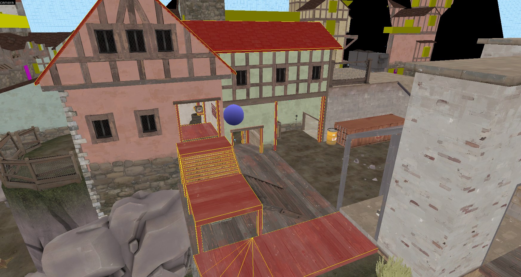
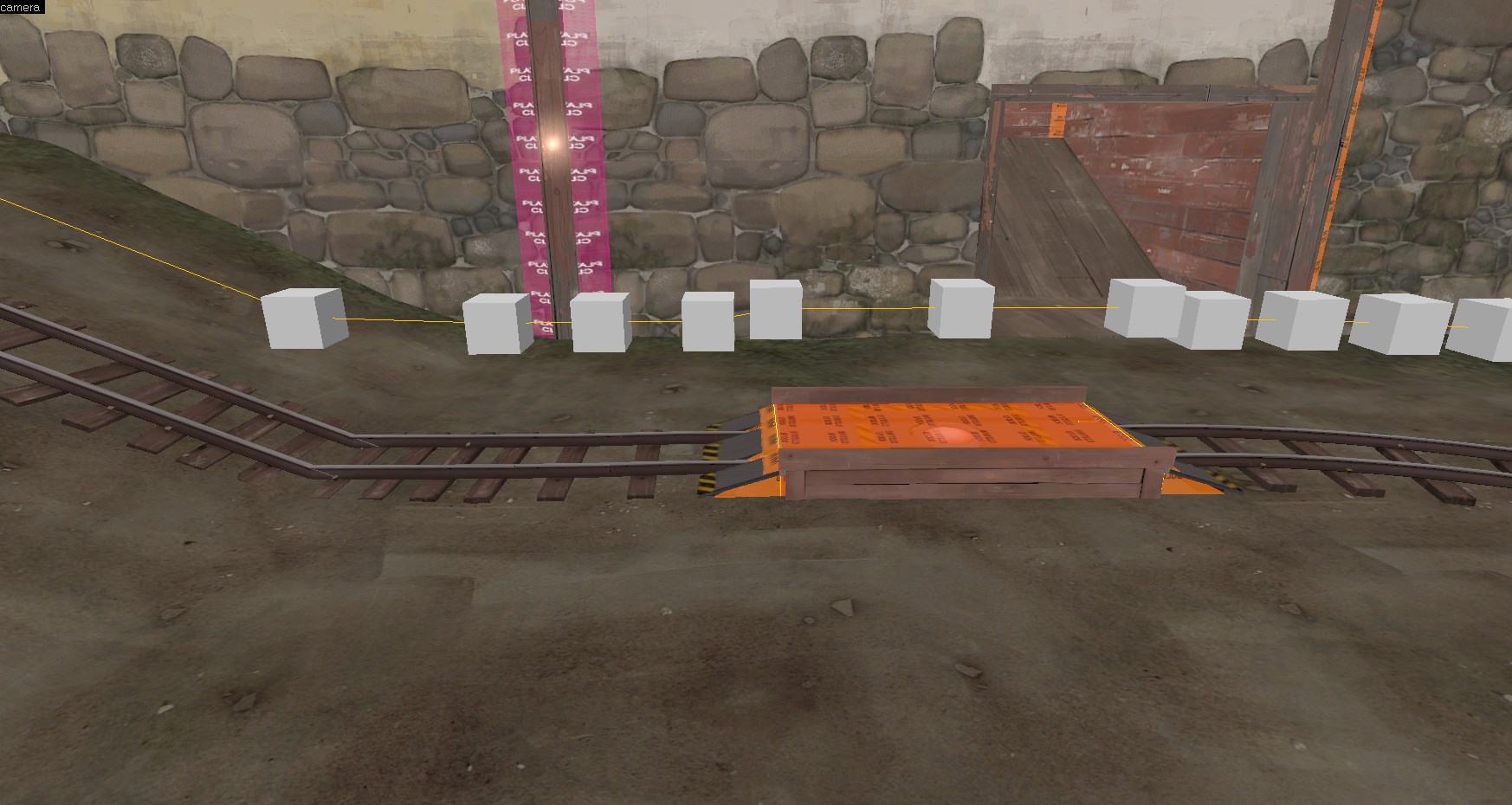
Cart gets stuck on point's blockbullets (since you made individual triangles for the ramps). I would just use the clipping tool instead (and move the path_track back a little).
41OoGxS.jpg