
I'm finding that this site in particular gets a lot of repetitive questions asked in the help section of the forum. On a lot of sites the search feature is pretty obvious, but TF2maps.net suffers from a "shy" search button. Which probably attributes to this trend.
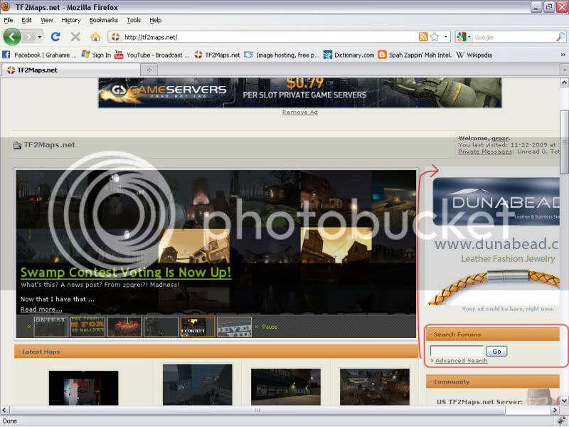
A combination of the large dynamic news feed scroller and advert ditract from the main features of the home page. A lot of new comers will not be donators and so the advert impacts on their ability to navigate the site and realise the search feature. I realise you can't just remove the advert, but i assume there's some level of control over where it is positioned. As a resource site the search feature is probably the most important tool, and its neglected. Plus the search feature is accessible from multiple locations depending on progression through the forum pages, lacking consistancy.
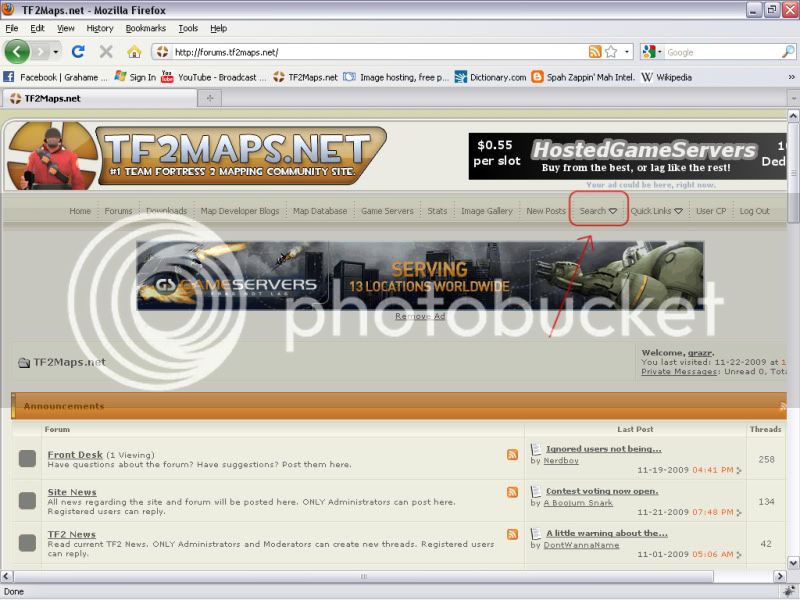
When browsing the sub-forum menu's the search feature is only accessible from the tool bar at the top but is sometimes available elsewhere on the page.
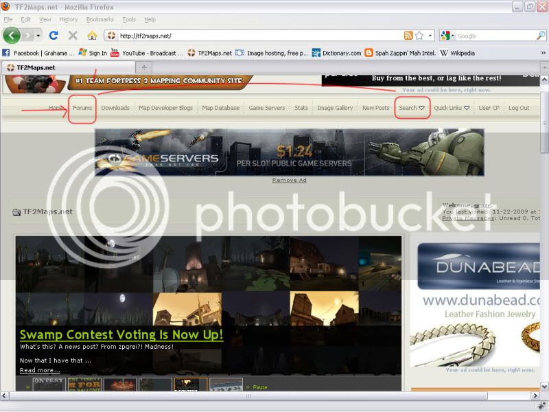
If they do read it the first thing they see is the forum section, whilst the search feature is disguised behind a drop down feature at the end of a list of site links irrelavent to one off users.
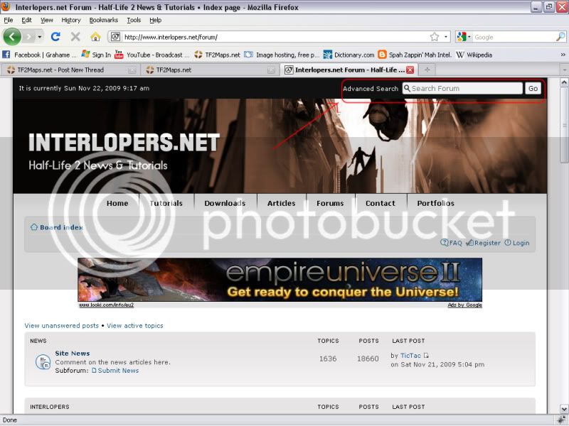
The search bar really needs to be a lot more visible. Interlopers kind of have it out of the way, but its obvious, and remains in the same place for every page. TF2maps does have the toolbar remain static for each page but its still 'hidden'.
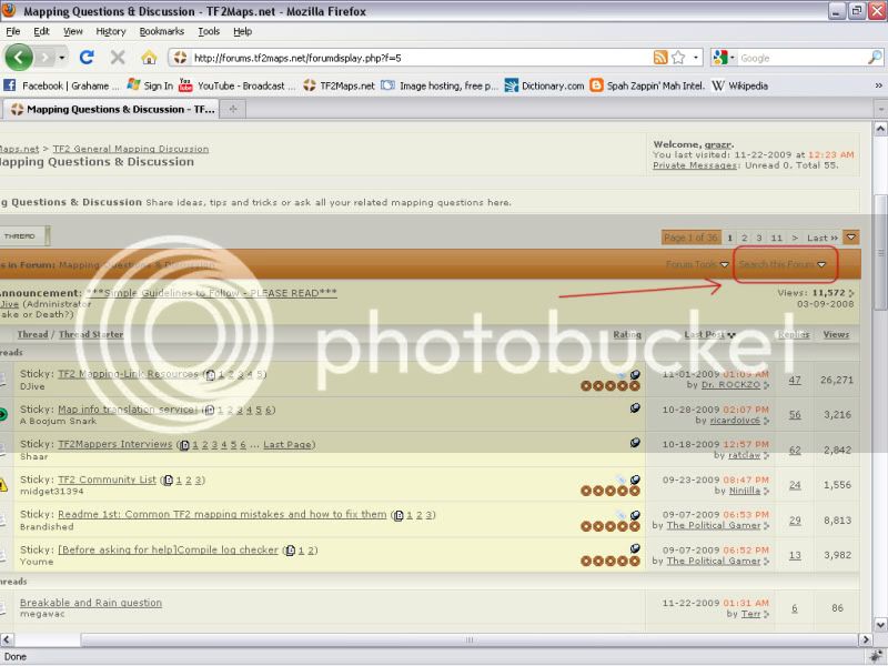
When inside the sub-forums the search feature is disguised by the dark text on orange sub-banner and drop down prevents the user from immediately locating the search feature text box that has become standard across many sites.
I guess what i'm saying is the search feature needs its bar and to be put somewhere significant.
Additionally, The 'quick links' seems redundant, and there are 7 feeds on the front page which really seems excessive. The scroller only reitterates the existing feeds, whilst the forum feed has options to access the site news and events feeds that are already displayed above it in their own seperate feeds. It's actually rather messy and could probably be toned down.
A combination of the large dynamic news feed scroller and advert ditract from the main features of the home page. A lot of new comers will not be donators and so the advert impacts on their ability to navigate the site and realise the search feature. I realise you can't just remove the advert, but i assume there's some level of control over where it is positioned. As a resource site the search feature is probably the most important tool, and its neglected. Plus the search feature is accessible from multiple locations depending on progression through the forum pages, lacking consistancy.
When browsing the sub-forum menu's the search feature is only accessible from the tool bar at the top but is sometimes available elsewhere on the page.
If they do read it the first thing they see is the forum section, whilst the search feature is disguised behind a drop down feature at the end of a list of site links irrelavent to one off users.
The search bar really needs to be a lot more visible. Interlopers kind of have it out of the way, but its obvious, and remains in the same place for every page. TF2maps does have the toolbar remain static for each page but its still 'hidden'.
When inside the sub-forums the search feature is disguised by the dark text on orange sub-banner and drop down prevents the user from immediately locating the search feature text box that has become standard across many sites.
I guess what i'm saying is the search feature needs its bar and to be put somewhere significant.
Additionally, The 'quick links' seems redundant, and there are 7 feeds on the front page which really seems excessive. The scroller only reitterates the existing feeds, whilst the forum feed has options to access the site news and events feeds that are already displayed above it in their own seperate feeds. It's actually rather messy and could probably be toned down.


