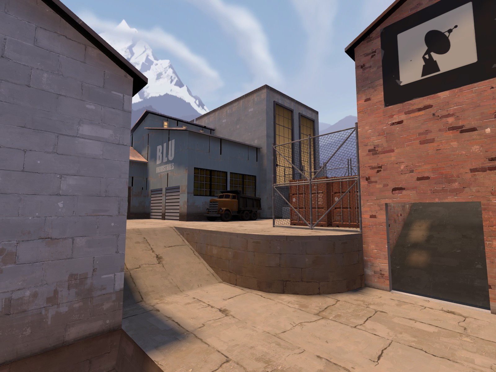
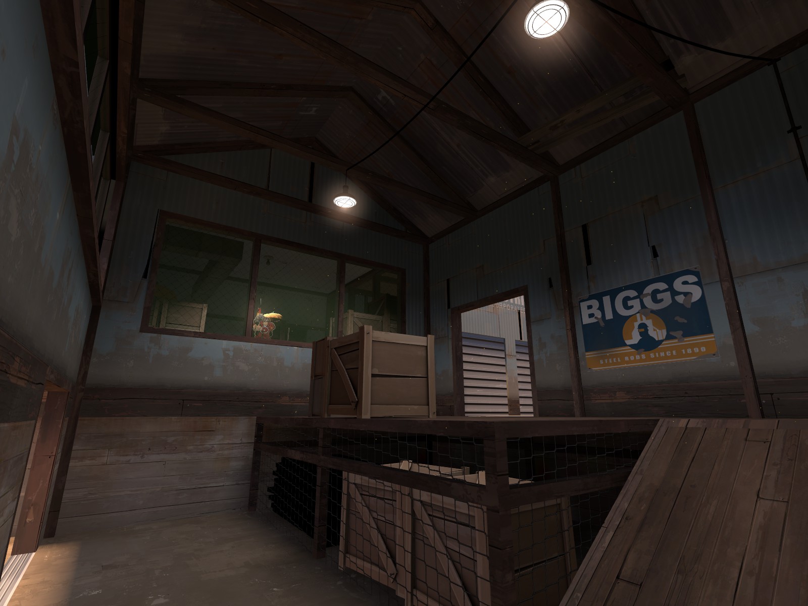
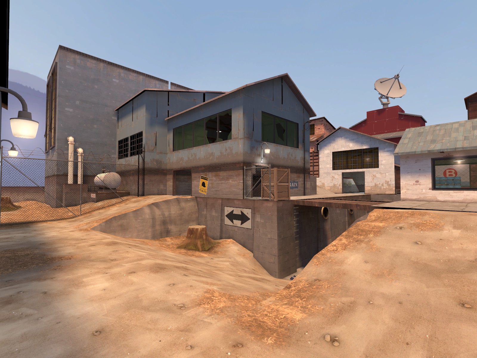
Mudwater

CP Mudwater B4

Berry

resident homo
aa
Dec 27, 2012
1,056
1,898
CP Mudwater
By Berry and TheoF114

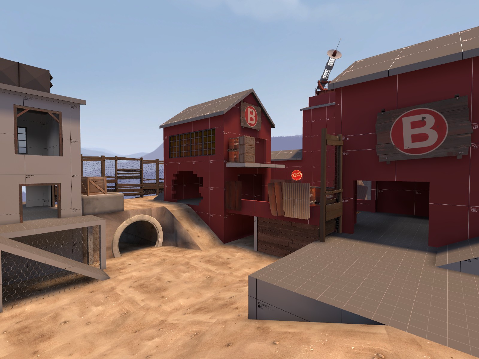
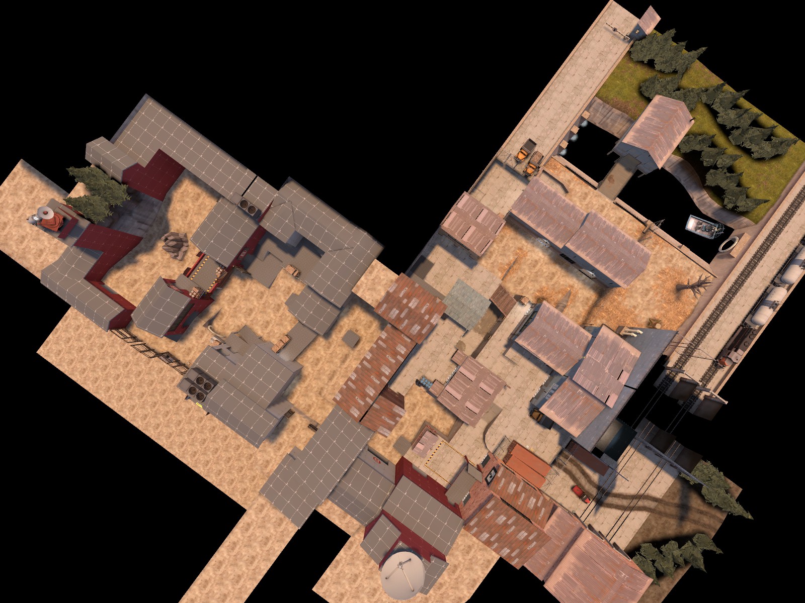
Swampy attack/defend map, submission for the Mercs vs. Aliens contest.

Other special thanks to:
Frozen & Ronin: Hosting the MvA contest
A nice portion of TF2M members: Testing & Construction Pack assets
Facepunch: Vehicle pack
FissionMetroid101: MvA particle effects (Credit applies for versions prior to B4)
 
Last edited:

Berry

resident homo
aa
Dec 27, 2012
1,056
1,898
A2
- Removed the weird rock at B, placed a shed there
- Added a third way up to the B point area
- Added a small shed at the A point with an elevated exit only to reduce the amount of routes red can push out
- Water route changed: One way door, bigger under the building, exit moved to block long sightline
- Added a large building at the A point to make it easier to defend

- Medium ammo beside B point changed to small
- Added a small way up beside the right shed at the A buffer
- Elevated engineer spot in the building route to B so people don't try to jump it
 

Berry

resident homo
aa
Dec 27, 2012
1,056
1,898
A3
- Largely revised B point. Too much effort to log. Bridge, water route, lower concrete route, more rock
- Added a small health pack under the cover at the A point
- After A is capped, red's spawn time isn't increased as much (From between 10-20 seconds to between 8-16 seconds)
 

Berry

resident homo
aa
Dec 27, 2012
1,056
1,898
A4
- Round time shortened by 1 minute
- Added walls for cover on the bridge, also blocks some sightlines

- Added a small walkway at B to reach the roof
- Put player spawns at a 45* degree angle to disorientate less
 

RubbishyUser

L7: Fancy Member
Feb 17, 2013
414
488
As part of an initiative do more longhand feedback, and because during the test for a4 there were some insanely negative people, I thought I'd try my hand at some detailed analysis.

So let's start with the catalyst for a lot of the nasty things said about this map with the route access given to Red above the B point. I think you know already that it was a mistake, but for those who weren't there the result was that heavies and demos medics could sit up there with height advantage and destroy any Blu force that came out of the door, which was supposed to be the main entrance or at least the main flank. Let's not talk of it again.

The second complaint was the lighting. Here' I think the issue was you achieved the moody look by actually making the map darker rather than Valve's super secret technique. That technique is keeping intensity the same - in fact, in Sawmill it's almost higher than some bright maps like Viaduct - and instead whacking up the sun spread angle to 15. What this does is make the shadows far more diffuse, giving the impression of dense cloud cover without making life harder for the player.

On the off chance you did actually rip the lighting straight out of Sawmill and something else is the problem, I'd say that you need to add more lights, particularly outdoor lights. At this stage, player readability is king and muddiness comes second, so whack those lights in even if they look terrible. Remember that people are going to play in a variety of lighting conditions, so the more you can do to help the better.

Oh, and I apologise for being a total nerd and failing to recognise that you were Berry under the alias Steamy or whatever it was and thinking this was your first map and didn't know what lighting was. I would have sounded incredibly patronising.

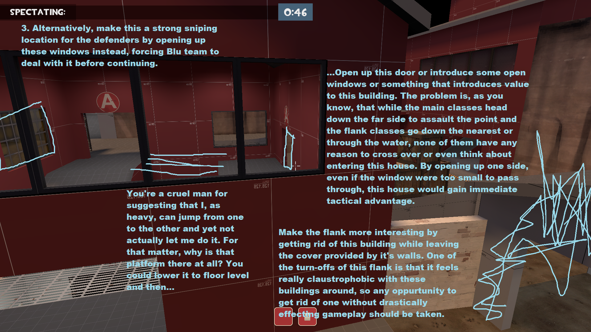
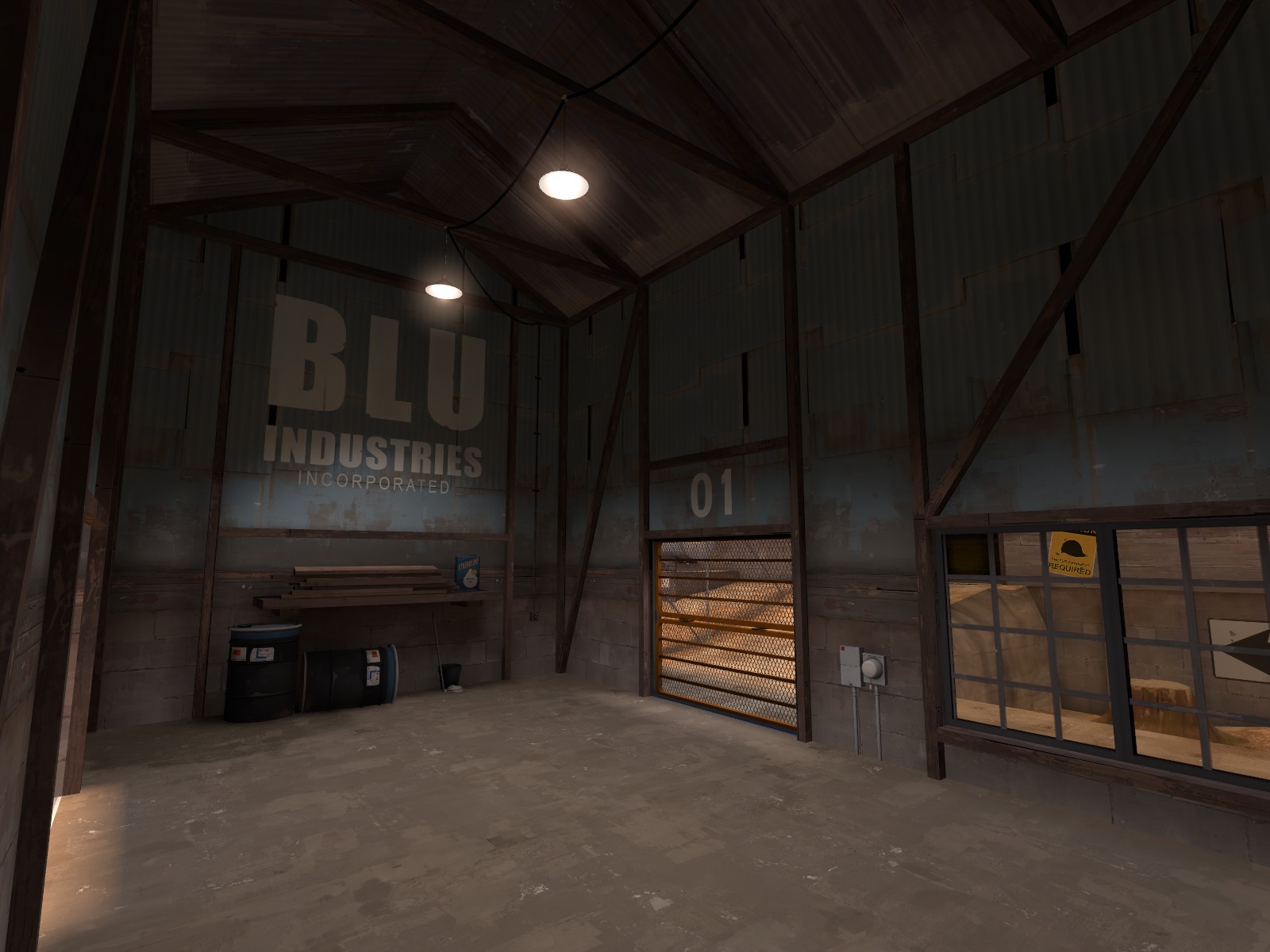
Now actually onto the map. I really like Blu spawn area and the whole first point area is decently interesting and is a reasonable difficulty for the attackers to cap. I do have some qualms though:

mudwater_pic1.png


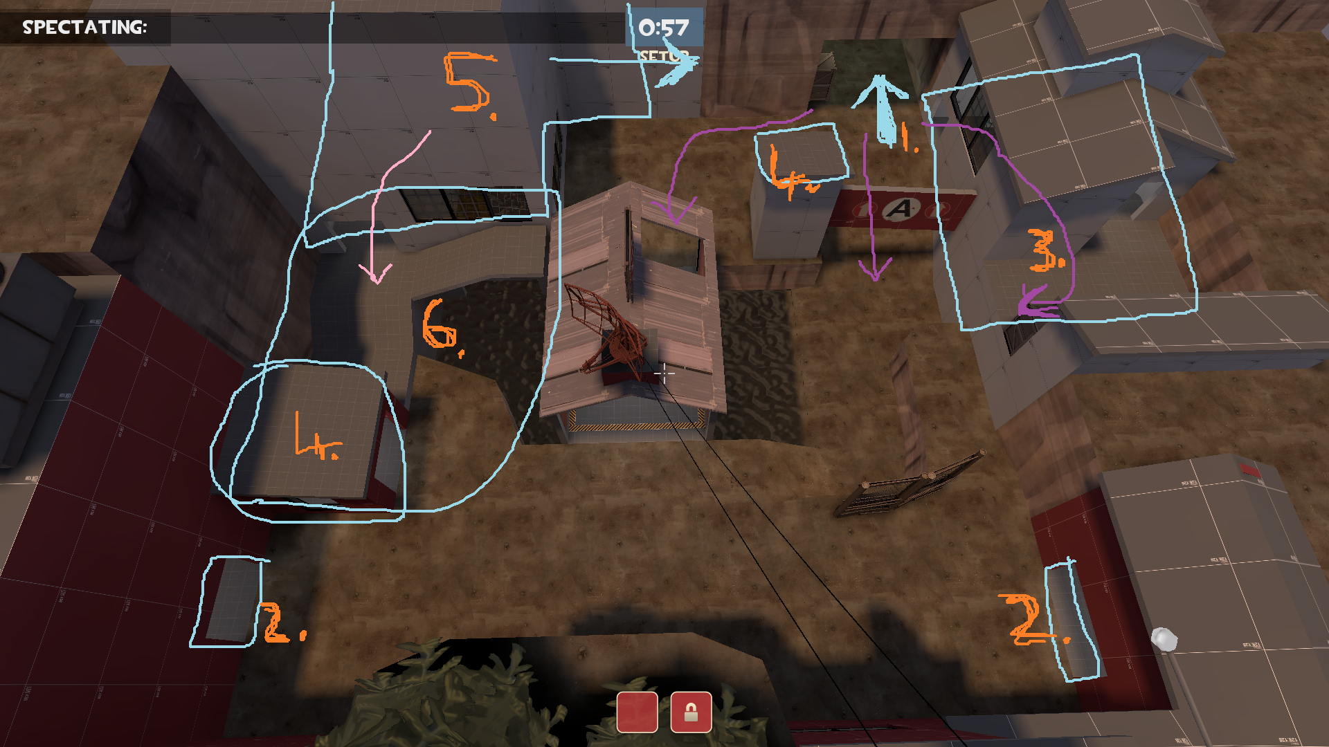
Now onto the second stage. Ignoring the problems with the roof, here's what I found troublesome with it, colour-coded and numerated for your pleasure:

mudwater_pic2.png


  1. The area inside the caves is the WORST offender for being too dark. Here, it actually affected player behaviour it became such a problem. See by counting the directions coming into the B area I realise that you totally intended for this route to be the main route blue takes to get to the point, with the pink arrow and the water route (we'll get to that later) being flanks. However, despite the fact that this main route is can be reached directly by stepping moving from the cap, the simple fact that the flank building number 5. was better lit resulted in far more players heading that way than the level design could allow. BLU team, quite literally, choked.
  2. Now here, I want to apologise for being an ass in the impromptu. I repeatedly asserted that red had a forward spawn when they don't. Here's why. Thanks to particularly lucky spawns, the one time I played Red I spawned on the left side of the pack during setup, with the spawns being somewhere below the hud, and then I turn left. By the time I died, we lost A and I spawned on the right hand side instead. When I came out the door in a wildly different place to my first time, I assumed we'd gone back a spawn. That tells you my issue here. The spawns are crazy far apart. Here, I think the left hand spawn should be dropped somewhere closer to the middle, with the spawnroom adjusted to compensate. Why move the left hand one? Because 6 is supposed to be the flank route, and yet if Red comes out of it they'll ruin anything you might call a flank!
  3. This building was completely unused throughout the playtest. I think the majority reason why was because Blu team spent the whole game on the flank dying repeatedly, but I'd bear this in mind for future testing. Is it supposed to be for attackers or defenders? Why?
  4. So access for every man to the B roof was A Very Bad Idea. What about these? I'd say clip'em completely. Soldiers are often bad enough when they have height advantage sitting on fences camping spawn, but give them the ability to dodge and retreat because they're on a nice large roof and you start crushing souls.
  5. Part of the reason this flank was so heavily used is because it also happens to be an excellent location for a forward base, whereas the main route has no such advantages.There is no easy fix for this, but I'd maybe suggest opening up the blu arrow so they have an oppurtunity not to run into the meat grinder.
  6. There is an alternative possibility. It may be that you intended for 5 to 6 to be the "main route" and that the caves area forms a flank. Here's how I would achieve that: widen the 6 area, pushing the point building to the right. I'd also cover the water completely and have a much, much wider door.

And now, my last peeve. I hate water in TF2. That's a bias on me, but I especially hate the water you have here. I know it's supposed to be mudwater. But the particular height of the water here is extremely frustrating. In the first pool, crouching bugs you out and you immediately stand again. That feels nasty. In the second, you still can't crouch but everyone is reduced to tiny heads in a particularly dimly lit part of the map - impossible to see! Plus, I swear that hitscan doesn't seem to pass through the water's surface, rendering fighting even more difficult. If you're gonna use water, find out how much Bakscratch used in Stallone, as that was the best of both worlds, or a thin, thin layer like in ctf_sawmill's intel, i.e. pretty much none.

If you're yet to be convinced, ask yourself why you have the water there. If you can't think of a gameplay reason and you can think of why TF2 water is so terrible, then you should probably do without. You'll find a way to manage when it comes to detailing.

And that's it. This thing is basically apologies for being a butt during the imp.
 
Last edited:

Berry

resident homo
aa
Dec 27, 2012
1,056
1,898
a11
- new blue spawn area ish
- new engi building at b

- peeps can't jump down onto the full b ammopack over the cliff anymore (front door open still)
- more detail
 

YM

LVL100 YM
aa
Dec 5, 2007
7,158
6,079
Apologies for drawing over a10, but I'm guessing it'll still be useful to you:

Here are your main issues:
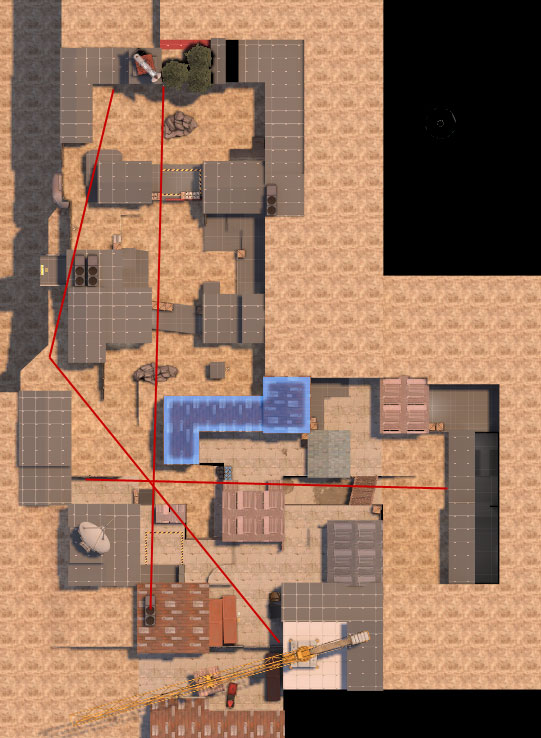
Not a single building effectively cuts vis because your buildings are all empty boxes with a window or a door on every single side, so a line of sight can be drawn from one side to the other without even trying.
Pretty much every single building is just an empty box. Four walls, some windows, some stairs, and that's it. No internal walls or anything. It's pretty terrible.
mudwater_problems.jpg

Even ignoring your building problems, the red lines are sightlines around the buildings themselves. You can see everything, from everywhere. The glowing building would be fantastic for splitting up that 90 degree corner, except it's a seive, so you may as well func_detail the whole thing and forget about optimisation.


Here are some solutions:
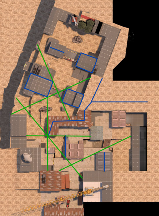
As you might have guessed, I think you should put internal walls in, take out windows you can't shoot through so that you can't always see from one side to the other with your buildings. The glowing building is the most important here. You need to make sure that you absolutely cannot possibly see from one side to the other. You can do this with internal walls, closing up all of those massive, functionless windows and making sure the doors can't possibly see each other around the internal walls.
mudwater_solutions.jpg

Once you've done that, put a sky brush along the top like I've done here in blue. I'd advise making the building taller too, this is your main vis blocking building, it should be tall.
Next up is increasing the height of all of the buildings I've put sky brushes over and adding the sky brushes as I have. The one with the barrels I've extended to be in line with the corner building's sky brush so you can put a hint between them (the green brushes). I've splinked the hint brushes between corners of buildings and flush with walls where I think it'll help you, but you have to do the supporting work blocking vis through the buildings to help.
I have angled the latter section, I don't expect you to do this, but you ought to be moving that stuff back around so that your angle is less 90 degrees and more like 110 or more. The fact that you can stand on CP 1 and snipe cp2 is fucking ludicrous and you NEEEEEEDDDDD to section that shit off. Always try and build arenas with divisions. Me and frozen fucked this up with snowplow and have been trying to sort it out since. Dustbowl is the perfect example of this. Every CP is in it's own arena with a big division between them. You don't have to go anywhere near as extreme as dustbowl did, but it illustrates the point well.

While writing all this I downloaded 11b and looked at that and you still have some really fundamental issues. Everything mentioned above is still there.
Your visleaves are something like 2000 units tall, which is reaaaaallly bad, especially with short buildings. here's a diagram taken from this excellent article that you need to read (if you have already done so, do it again so that it actually sinks in):
16.png

Without the hint there, the visleaves around the engie and the sg would extend upwards to the sky, since you can move up to the sky above you without leaving your visleaf, and that would allow you to see the SG, you can see the SG from the ground. You have to cut the visleav so that the one you're in, can't get into a position to see the SG. So you need to take a huuuuuuge hintbrush that covers the whole map and put it 128 units above the ground (use cp1's ground). Then put another 256 units above that, and another 256 units above that. The first one will stop players on the ground seeing over buildings, the other two will help anyone jumping from seeing too much.

Moving on to the next issue:
mudwater_detail.JPG

You need to cut shit like this out. This is horrible. (I'll ignore the fact you don't nodraw the tops of those brushes and so have wasted lightmap data)
Buildings need their tops. If you absolutely must have a sloped ceiling as well as a sloped roof, add that separately so that it's a worldbrush and flush with the tops of the walls. Better yet: add a floor above what is accessable to players and have your roof much higher up. Then only func_detail the actual roof. Don't leave your buildings open topped until you actually understand vvis and understand when leaving an open topped building isn't going to cause problems.

Using r_drawfuncdetail 0 shows the problem you have with windows.
mudwater_detail2.JPG

Standing in this doorway near cp2, what is that poster I can see?
mudwater_detail3.JPG

Oh. :|
 

RubbishyUser

L7: Fancy Member
Feb 17, 2013
414
488
Is mudwater now in the fine tradition of maps with water in their name but no actual water? Excellent.

EDIT: YM just ninja'd me with a far more insightful post. Ignore this one and read that one again.
 
Last edited:

YM

LVL100 YM
aa
Dec 5, 2007
7,158
6,079
Look how much dustbowl renders at once:
db_21.JPG

db_22.JPG


As I said, it's a little extreme, but the idea is what's important. Build your maps into arenas and make sure each one is separate.
 

Pocket

Half a Lambert is better than one.
aa
Nov 14, 2009
4,701
2,583
Hang on, there's a client command to hide func_detail in-game? How have I never heard of that before? I need this in my life!
 

YM

LVL100 YM
aa
Dec 5, 2007
7,158
6,079
No, because there is no opportunity to look over something. There's skybox brushes in the way.

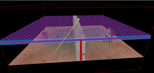
Here's a side view, top has skybox brushes like dustbowl, bottom hasn't like mudwater.
(assuming the tunnel is blocking vis by being slightly twisty)
tallvis.JPG
 

YM

LVL100 YM
aa
Dec 5, 2007
7,158
6,079
Well it's a general rule of thumb. It also fits with the general rule of thumb that you want smaller visleaves rather than big ones (Down to a reasonable level, like 128^3 or 256^3, much beyond that and they're not really giving any benefit, they can but generally)
 

Another Bad Pun

In the shadows, he saw four eyes lit by fire
aa
Jan 15, 2011
806
1,850
Hopping onto the feedback train YM started here:

I think the area highlighted in red below is an awkward part of the map. The space itself really only exists because of the building to the right of it, which YM pointed out could be utilized to improve optimization.
Most of the sightlines in the map actually lead to this area, and as a red player, it is really daunting to walk here since it's so exposed. More than anything though it feels like additional unneeded walking to the point.
As a blu player, the sightlines become helpful, but it still feels like too long of a walk. The route left of it, where the med healthpack is, is rarely used and pretty out-of the way.
Something else that is probably the most important but that I'm saving for last is this: I think the choke is an odd position compared to the rest of the B area. Right now it's just a little too far out of the way and feels disconnected from the rest of the map. Out of the three areas it leads too, only one of them is majorly useful.
mudwater.png


The reason I'm bringing this area up is that by altering it you can hopefully make your arenas stronger while also fixing a few of your optimization issues.
Maybe you could connect it with the buildings to its side? (Maybe not in a rectangle shape?) Another option would be changing nothing, (and feel free to do that if this post is actually bad advice.)

This next thing isn't as big of a deal, but:
mudwater%202.png

Realistically, I'm pretty sure these tunnels lead to a dead end. How did the engineers not notice this? Maybe it's an intentional metaphor? Or a plot to confuse the aliens?
Most of all though, what's up with that comic sans question mark? I guess this is over my head.

Finally, even though your optimization problems are pretty major, I think it would be disappointing if you dropped the map saying "lesson learned." I'm not saying you would do that, but it's something that would be extremely tempting to me. To me, the technical aspects of a map heavily influence how it plays. If you somehow managed to push through to the end, I think this could be a great map someday. (Make sure you do a decent job with the pushing though for best results.)
If you do drop it though, it's completely understandable. I just prefer not to give up no matter how doomed I am.

Thanks for reading this, and hopefully it was helpful, (like YM's.)
 
Last edited:

Berry

resident homo
aa
Dec 27, 2012
1,056
1,898
many words

I wanna say dropping it isn't in my plans, but I might put it on low priority (not that I've spent too much time mapping recently).

I do still want to get it finished because the gameplay is at an alright level (or IMO).
 

Berry

resident homo
aa
Dec 27, 2012
1,056
1,898
BC1
- Beta candidate; we're taking detail feedback now. This also means TheoF is now doing work on the map too.
- Added major optimization changes. Most notable is the new centre connector building just after A, splitting the map into two.

- Removed an easily abused awning at the B point
- Removed a few windows that dropped FPS a nice chunk
- More detail.

Download (.bz2)

xZLWauN.jpg

Zfw0Dgm.jpg

xmTKOT0.jpg

4WgjUDV.jpg

0dHcWdU.jpg

tUTbWjc.jpg