Launch

CTF Launch a2

Urban

aa
Jul 27, 2009
212
354
Launch - Single stage A/D CTF
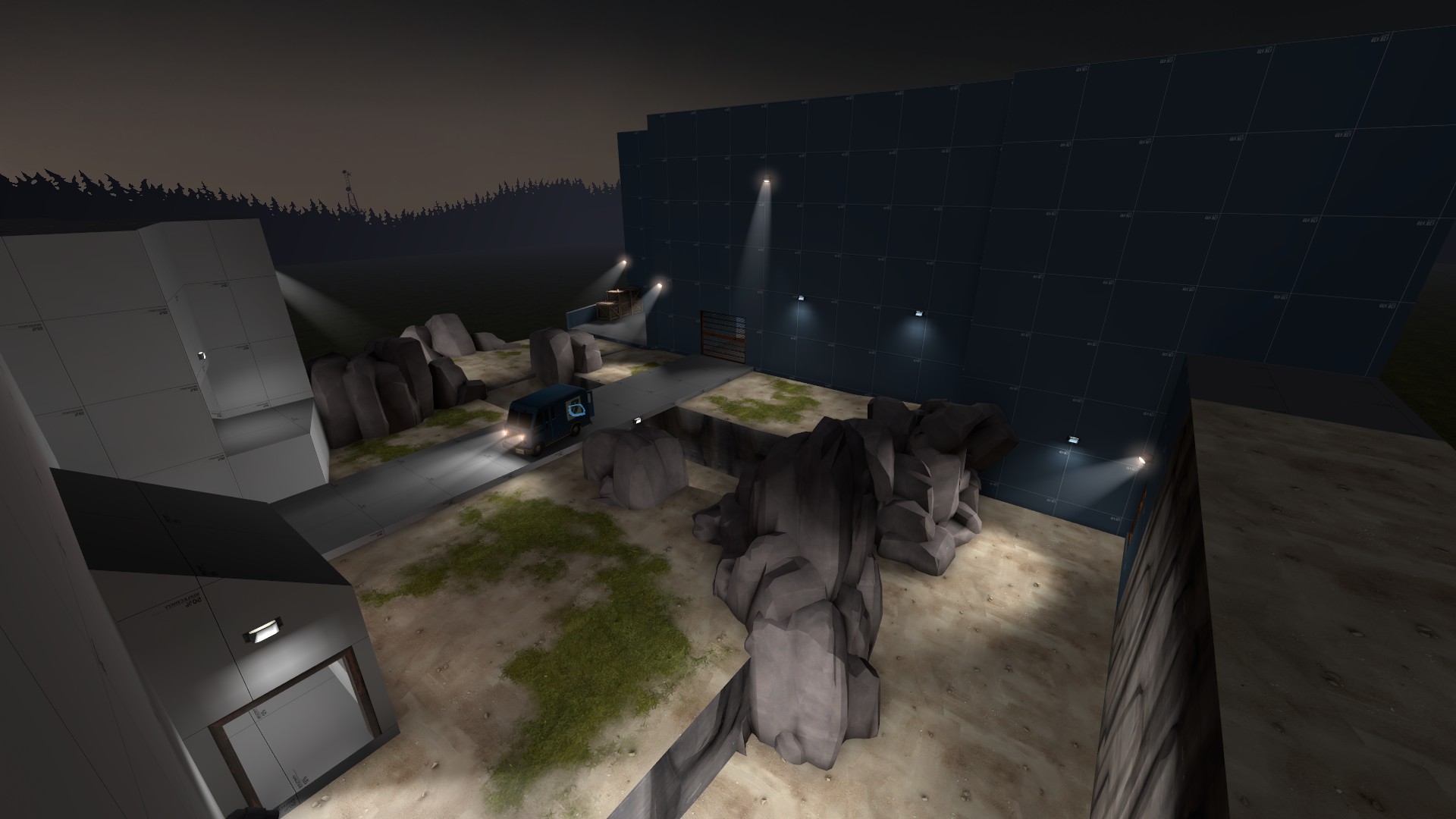
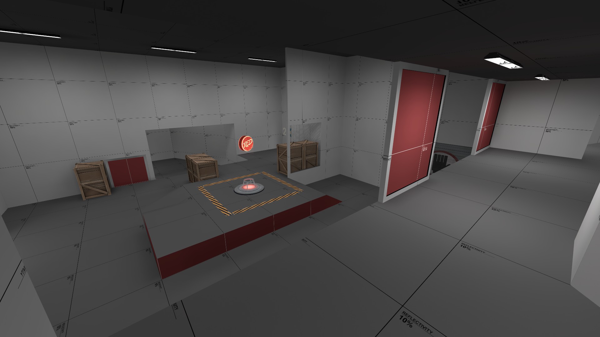
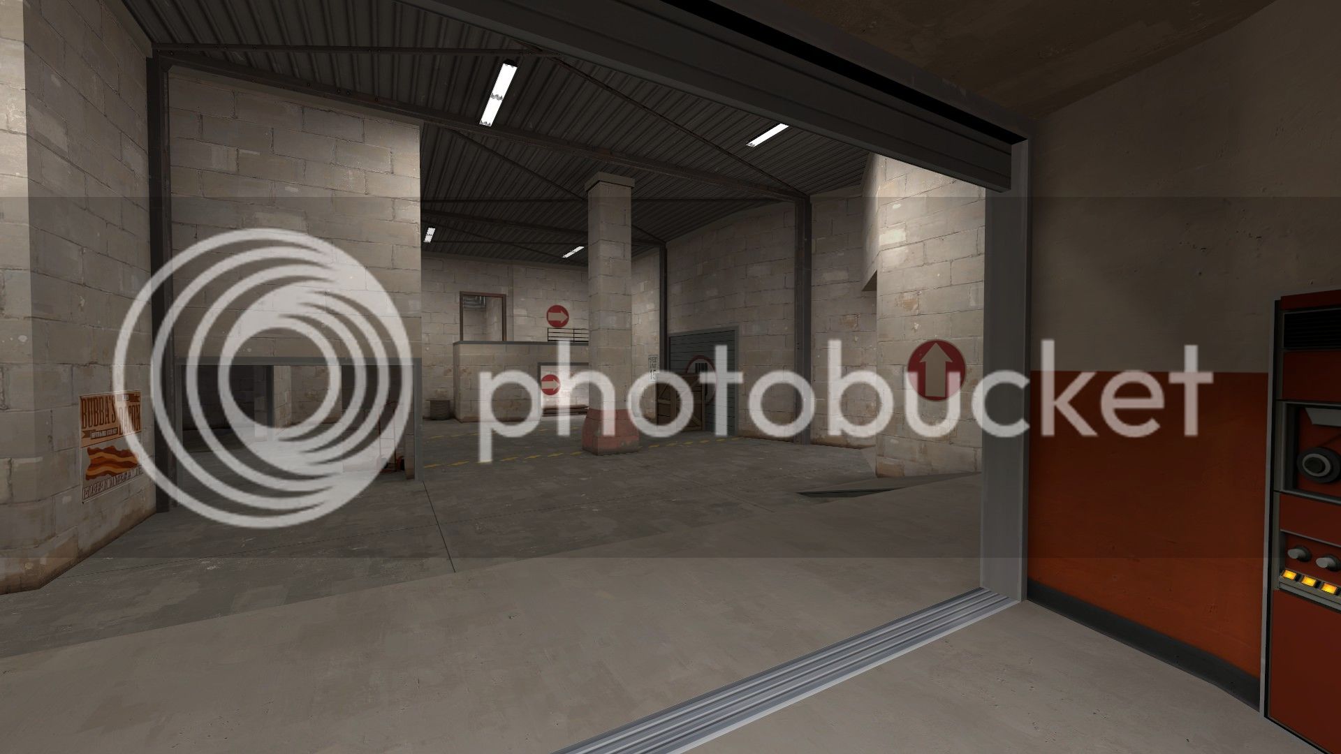
launch_a2_01.jpg
launch_a2_02.jpg
launch_a2_03.jpg
launch_a2_04.jpg
launch_a2_05.jpg


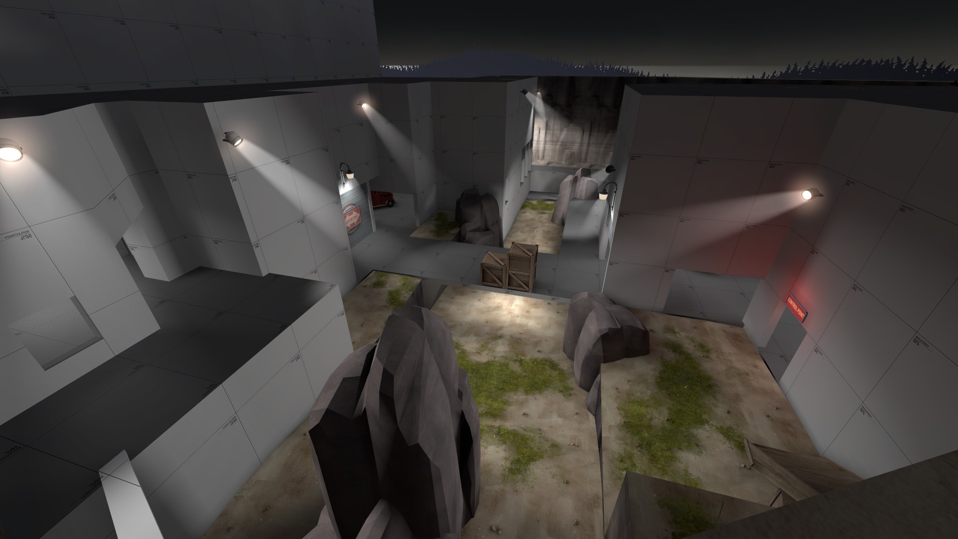
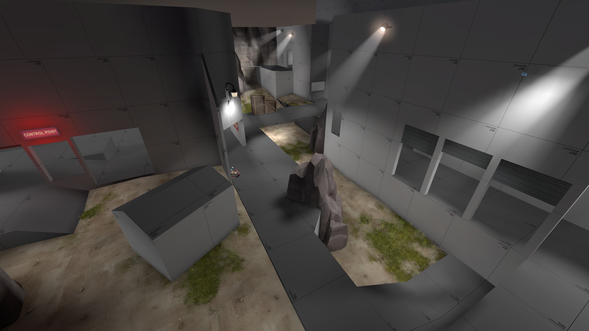
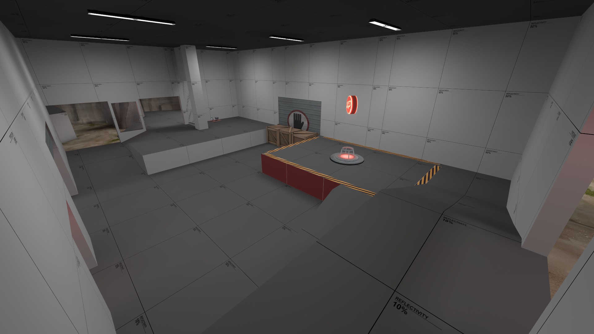
Currently a single stage A/D CTF map, more stages are to be added eventually.

BLU has to take the flag to the capture point and hold it for a few seconds. After the first point is capped the flag will respawn after a short break to allow RED a chance to get back on their feet.

Currently a industrial-ish alpine night themed map, this will be subject to change.
 
Last edited:

SnickerPuffs

(*single chuckle*)
aa
Apr 10, 2014
1,325
1,866
Funny. It's about launchtime here.

Terrible puns aside, this looks like a very fun map. Judging by the screenshots, my only complaint is using the 10% reflectivity texture on the floor instead of the dark gray/light gray grids, but then again it may just be me.
 

Urban

aa
Jul 27, 2009
212
354
Funny. It's about launchtime here.

Terrible puns aside, this looks like a very fun map. Judging by the screenshots, my only complaint is using the 10% reflectivity texture on the floor instead of the dark gray/light gray grids, but then again it may just be me.

Thanks :) The 10% reflectivity thing is just a preference on my part to be honest, I've never liked the small grid dev textures much! If it bothers lots of people I can change it I guess.
 

SnickerPuffs

(*single chuckle*)
aa
Apr 10, 2014
1,325
1,866
Thanks :) The 10% reflectivity thing is just a preference on my part to be honest, I've never liked the small grid dev textures much! If it bothers lots of people I can change it I guess.

It's not that big of a problem, don't worry!
 

RataDeOrdenador

L5: Dapper Member
Oct 12, 2015
230
105
Oh boy,this reminds of a map I made a while ago... still getting dust because it sucks/I suck/don't have time because LIFE and GOTTA FIND A JOB AND KFDJGHDFG

Anyways,map looks really fun and well done. The only problem I see is that the CP might be WAY too small for RED to defend.

The only way for RED to block the capture (or insta-capture,dunno what you're doing exactly) is to stand inside the capture zone. The second they left,BLU can cap it in an instant. So try to make it somewhat bigger.

I would check out Vector. It has some nice ideas on how to know when the CP is being blocked by RED or not. I tried to do that in my map. It went good,but HUM... It misses something.

OH WELL,Hopefully I can test this map. I seriously can't wait for it. o3o
 

Urban

aa
Jul 27, 2009
212
354
Thanks for your input, I played Vector a long time ago when it was in Alpha I think, I never played it in it's finished format though. I'll go have a look through it sometime.

Currently the points are timed capture, I wasn't a fan of the instant cap variant much. I agree with you on the capture area size, I'll increase it a bit for A2 and see how that goes. RED lost every round (3 total) in the playtest last night, this was probably a combination of the RED respawn being too long and their spawndoors rather campable, as well as the capture being awkward to block. As far as I could tell every time the point was capped most, if not all of RED team was dead. I need to go through the Demo to confirm that though.

Overall the test went well I think, I recieved no feedback regarding the first point, which I am going to say is a good thing for now, while the second point was regarded by all to be awkward to attack with too many chokes and small doorways. Another thing I noted was little use of the high ground near B by both teams, and also people running past the intel without picking it up. I will keep my eyes on this during future tests to see if this is just an issue with unfamiliarity with the gamemode/map.

Currently the todo list for A2 looks like:
  • Add voicelines to the intelligence (DONE)
  • Reduce RED respawn times (TBD)
  • Move RED spawn back a bit and adjust spawn exits (TBD)
  • Rework B Point and surrounding area to be wider and less chokey (TBD)
  • Make entrances to B Point larger, i.e. not spamholes of doom (TBD)
  • Clip some things better (DONE)
  • Some other things I have probably forgotten already...
 
Last edited:

Urban

aa
Jul 27, 2009
212
354
A2 Released:
  • Better clipping
  • Voicelines added
  • Moved Red Spawn back a bit
  • Adjusted spawntimes (still need work most likely)
  • Increased capture zone size
  • Widened & adjusted combat area prior to Point B on one flank
  • Widened doorways around Point B
  • Opened up Point B building on 1 flank
  • Added cover on main bridge near Point B
  • Things that I have probably forgotten
launch_a2_03.jpg
launch_a2_04.jpg
launch_a2_05.jpg


Read the rest of this update entry...
 

Another Bad Pun

In the shadows, he saw four eyes lit by fire
aa
Jan 15, 2011
806
1,850
Hello, I have some layout feedback!

You should probably delete all of these props. The map feels very closed in and it's mostly due to props in gameplay space trying to break sight-lines, which honestly isn't the best way to do it.
hl2%202016-09-10%2020-37-15-22.png


Would be interested to see a version with this door removed
hl2%202016-09-10%2020-38-01-92.png


There's so much stuff in this one spot that it's difficult to walk and see. I think you're overcompensating for sight-lines.
hl2%202016-09-10%2020-37-29-69.png


These crates are not needed and just take up space
hl2%202016-09-10%2020-36-57-46.png

no
hl2%202016-09-10%2020-36-47-24.png


There is a lack of point signage that is definitely confusing people. This is especially important because of the custom game-mode. I know you're going for a garage theme, but point '1' and '2' won't cut it. It took me ages to figure out what that meant and points are labeled as letters in every other map.
hl2%202016-09-10%2020-51-44-70.png


This death pit should be pushed in because right now it presents almost no threat. In fact, it's so far away from the main entrances it really only creates a bunch of negative space that doesn't pose much danger as far as I can tell. Also, so many rocks!
hl2%202016-09-10%2020-52-12-98.png

I love attack/defend ctf, and I like how the map is designed as if red's base is blocking a straight road right to the end. Please keep working on it!
 

Urban

aa
Jul 27, 2009
212
354
Hi ABP, thanks for taking the time to leave some nice in depth feedback!

1, vehicle propspam: Yup, they are already gone in a3 after Mud said much the same thing in an imp the other day, I replaced it in a3 with the below pillar, which should hopefully offer a modicum of cover without being too in the way. See below images from the theme test I've been fiddling with for a few days.
detailtest01.jpg

detailtest02.jpg


2, door removal: I might try it, I'll have to see if there are any horrid sightlines from the point though.

3, more spam: Yeah, I'll have a look and see if I can rework the area to be less sightliney in the first place.

4, crates: Agreed.

5, cows: You'll have to take them from my cold, dead hands.

6, signage: Yeah, I saw this setup in another a/d ctf map I played ages ago (can't remember which), it would probably be wise to stick with the usual convention so I'll change it all back.

7, deathpit/route/rocks: Yeah, after Yrr's comments in the gameday I will be reworking that whole side. I think the route itself is enough of a payoff as its pretty much the only way for non-jumping classes to get to the highground on A, but I will make it more risky and probably add a little health there too as an extra bonus. I'll see if I can do anything about the rockspam as well!

My other plans involve reworking B point to make it a bit of a bigger space to play in and might add a sneakier route into it as well, if I can get that to work. Also making the voicelines a soundscript instead of PlayVO.