You are using an out of date browser. It may not display this or other websites correctly.
You should upgrade or use an alternative browser.
You should upgrade or use an alternative browser.
Changelog:
+Added more health and ammo
+Clipping
+Fixed an issue with blue's resupp cabinet
+Lowered overall brightness on light_env (map felt a bit white washed to me)
+Added a window in the room behind point
- removed the peaked roofs (wasn't a huge fan of that theming)
To do/consider
_Scale up? (x/y directions)
_work on the small enclosed out door space that are part of the spawn exits
_test more to see balance
Read the rest of this update entry...
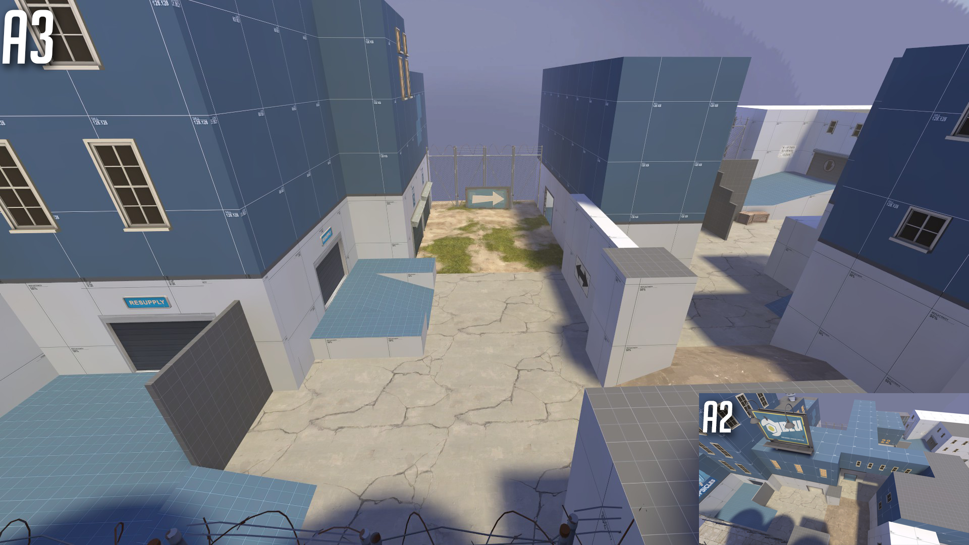
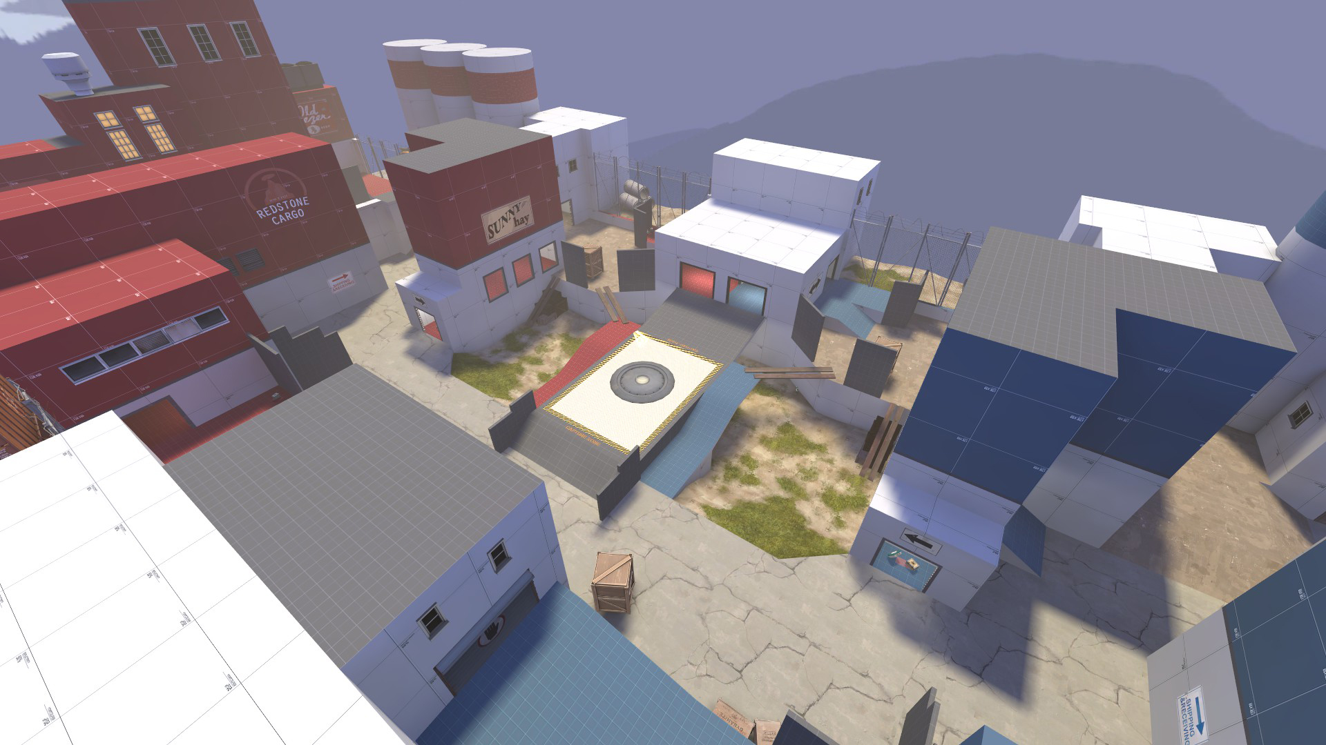
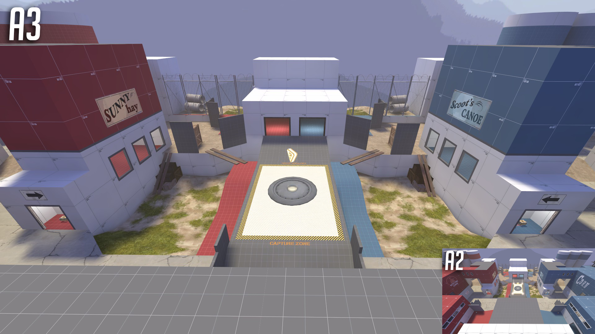
A3 CHANGELOG
+Widened Map in Both x and y directions
+aligned to grid now (was a few pixels off in one direction)
+more cover
+opened up spawn areas
Read the rest of this update entry...
+Widened Map in Both x and y directions
+aligned to grid now (was a few pixels off in one direction)
+more cover
+opened up spawn areas
Read the rest of this update entry...
Minor update
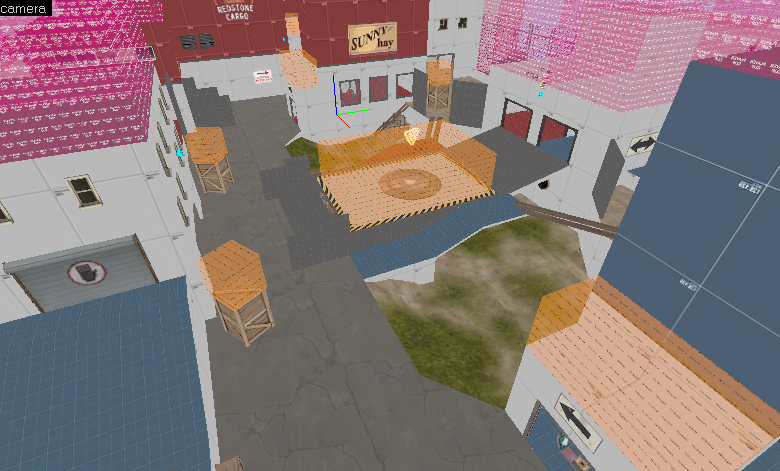
+added nobuild ontop of crates and certain areas near spawn
Read the rest of this update entry...
+added nobuild ontop of crates and certain areas near spawn
Read the rest of this update entry...
A4 Changelog
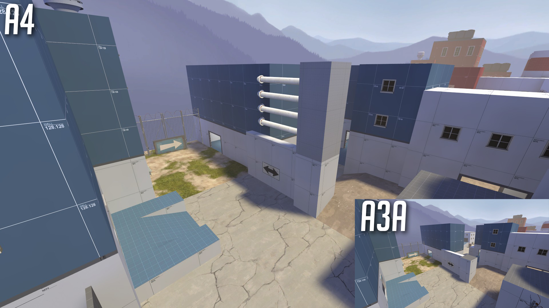
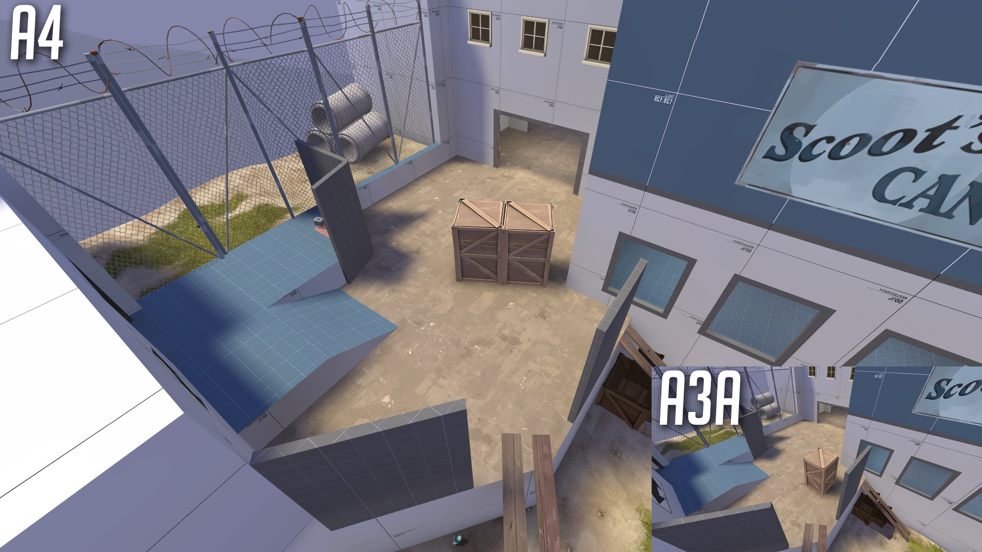
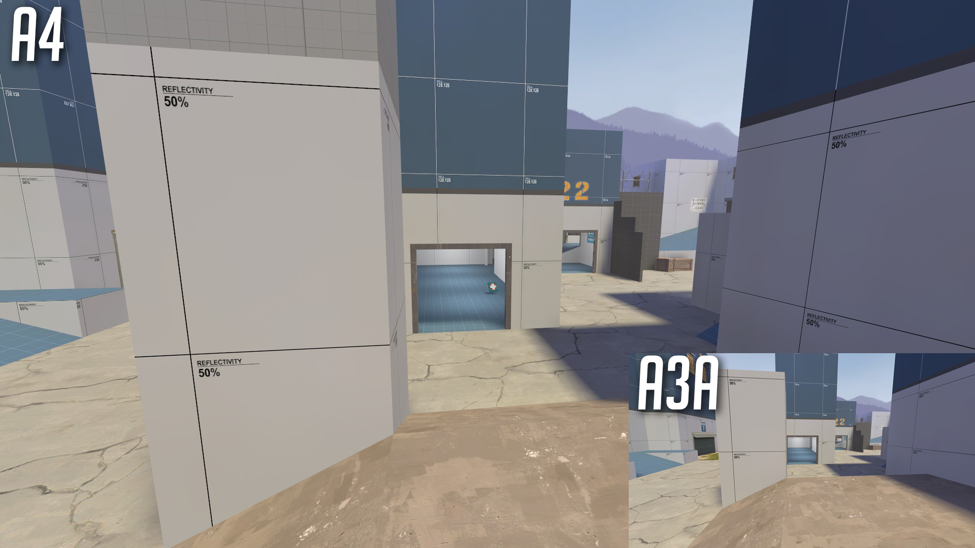
+added geometry to disallow jumpers to get to point too fast from spawn (hopefully)
+moved existing crate and added one more on side entrance to point to allow more space but keep the sightline blocked
+added two more healthpacks on each side
+added a crate on either side to block the sightline between the triple window rooms on either side of point
Still to do
_More scaling up?
_Skybox brushes to help divide map?
_Optimization (area portals etc.)
_More testing for health and ammo placements and amounts.
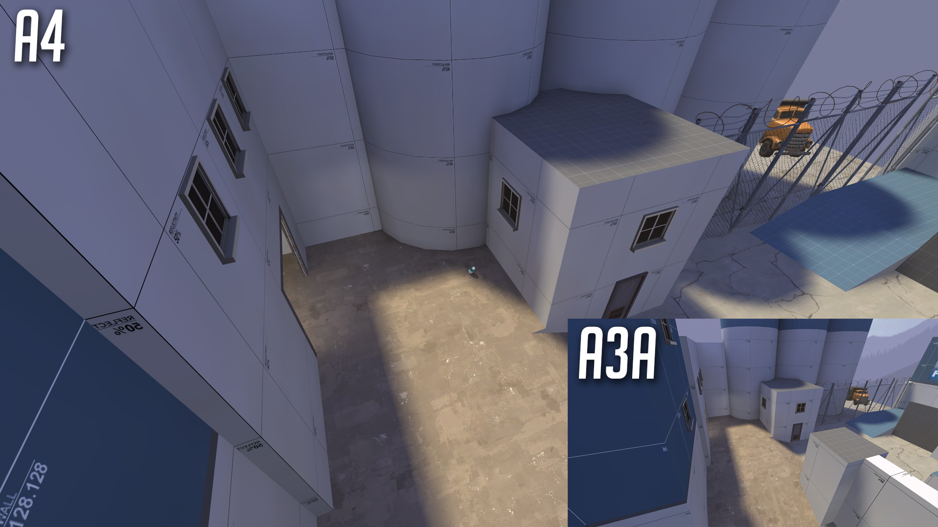
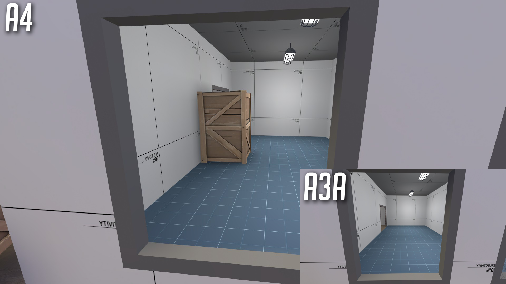
Read the rest of this update entry...
+added geometry to disallow jumpers to get to point too fast from spawn (hopefully)
+moved existing crate and added one more on side entrance to point to allow more space but keep the sightline blocked
+added two more healthpacks on each side
+added a crate on either side to block the sightline between the triple window rooms on either side of point
Still to do
_More scaling up?
_Skybox brushes to help divide map?
_Optimization (area portals etc.)
_More testing for health and ammo placements and amounts.
Read the rest of this update entry...
Im back at working on this after a long hiatus, i dont exactly remember what i changed from a4, so ill be uploading my usual picture in picture screen shots with a changelog once i get a chance.
Read the rest of this update entry...
Read the rest of this update entry...
Last update wasn't packed, sorry about that. Here's a full list of all changes between this version and a4. Ill be uploading screenshots for it shortly. Still no cubemaps because compile pal has an issue with me trying to do cubemaps and doing it the normal way never seems to work for me.
+ Complete overhaul of spawn area
+ more distance to point
+redesign of exits and spawn buildings
+ extra building and dividers
+ reworked the silo cylinder areas
+Optimization reworks
+Area portals have been added/fixed
-duplicate brushes and spec cams were removed
+func detailing
+Aesthetic additions/changes
+Changed doorway style
+Changed crates for brushbased custom ones
+lots of overlays/signs have been removed to focus on the gameplay
Read the rest of this update entry...
So its been a while since i last worked on this, or any map for that matter. I took a walk around the map in game and fixed some problem areas, and changed up some buildings.
This isnt a quite full or accurate list, but it give a basic idea of the changes.
- removed a hideous sightline allowing players to shoot from just behind the point to either spawn.
- blocked some more sight lines around point to encourage cqc and cut back on sniper lines.
- closed off a redundant route behind point
- adjusted doors and walls to give routes some variation
+ slight themeing around point and spawn areas, not quite sure where its going yet though
What I need from you:
+gameplay feedback
+health/ammo feedback
+point feedback (does it need more/less cover, height variation, etc.)
Read the rest of this update entry...
*****IMPORTANT: Somethings up with the hdr/ldr, not sure what, but theres a high bloom effect going on, players using HDR may have to switch that off if its too much.*****
So i forgot to pack last time, my b. I think im getting close to going beta, which if i do, itll be the first time ive taken a map to beta!!
+added walls to exits/entrances around point to protect from snipers
+Increased ammo/health all over map, should be playable for engies now.
+actually packed the map
Read the rest of this update entry...
Previous update had an HDR issue where my tonemap wasnt set right, making the map almost fullbright for HDR users. This version should fix that.
Hopefully if all goes well the next version should be b1!
Read the rest of this update entry...
Hopefully if all goes well the next version should be b1!
Read the rest of this update entry...
Imp test revealed some holes, here's my attempts to patch them.
+added some walls to point, should hopefully increase cover
+added clipping to the orange walls (my bad, that should've been done in a8)
+increased speed of spawn doors, had at least one complaint of them being too slow
+minor brushwork cleanup to improve performance, probably not noticeable
Read the rest of this update entry...
Before i say anything ,the map is not bad or anything but i feel like it misses a gimic-a good idea behind it so as to distinguish it among all the other koth maps.
of course like i said i dont want to "attack" the map, quite the opposite, I would like to help the map Improve somehow in the future.
If i had to suggest something i would say : either go with a not so common theme for this map for example ( snow theme - seaside etc )
or add something to the existing map. such as a platform moving , or a entirely original layout for mid or something similar. some maps use some props to either advantage as well so you could keep in mind that.
I hope i helped you and good luck with your map
babu rola
L1: Registered
- Jul 20, 2018
- 16
- 5
what does this mean?some maps use some props to either advantage as well so you could keep in mind that
babu rola
L1: Registered
- Jul 20, 2018
- 16
- 5
for instance look at granary, Do you see these big pipes that both teams can use? it adds some verticality to the map and it greatly benefits from it.
ah i see what you mean. hes already used props to his advantage in other parts of the map. if you look at the a4 screenshots he posted he uses pipe props to block verticality so people cant rocket jump straight into or out of the spawn area.
he could add some awning props on top of the windows on each side of mid though for a little more verticality and some overhead flank routes.


