You are using an out of date browser. It may not display this or other websites correctly.
You should upgrade or use an alternative browser.
You should upgrade or use an alternative browser.
- Jan 15, 2015
- 134
- 274
Major update, new finale layout, updated first. Still need to fix spawn issue wher players get stuck if they dont leave spawn after a cap
Read the rest of this update entry...
Read the rest of this update entry...
- Jan 15, 2015
- 134
- 274
- Jan 15, 2015
- 134
- 274
This map seems pretty rushed. Here's some feedback.
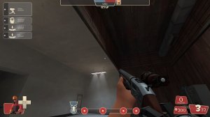
-The transition between concrete and wood here just looks odd. Why not make the whole thing one or the other?
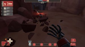
-I can hide buildings in these rocks. Only really works for mini's and teleporters but will also hide sticky bombs.
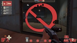
-messed up render order. This happens sometimes, try messing with the brush a bit and using compilepal for a full compile. Its the most I've found to do about fixing this kinda thing.
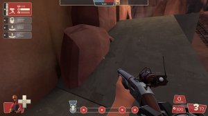
-The rock going through this concrete doesn't make sense. Also the odd lip on the bottom of the ramp is weird.
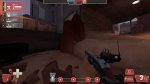
-You're going to want to use an info_lighting to change the light origin of this prop.
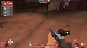
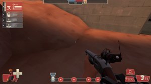
-These displacments don't line up.
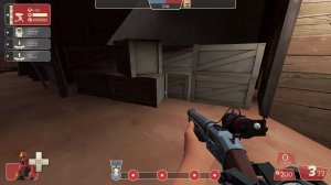
-The clipping in this area is really odd. I'd expect to be able to get to the crates but the clip brush is right farther in front of it.
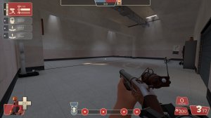
-Big and empty.
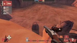
-Really easy to see where the change between in game and skybox is.
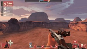
-The displacments out here are nice, though a few are misaligned, but you could use some rock models and such to make it more interesting. Look at badlands and see how they do it.
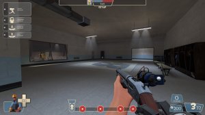
-Again, big and empty
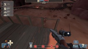
-Make this railing nonsolid and use a clip brush to stop players from walking through it. Shooting through railings can be annoying so this is how they're pretty much always done.
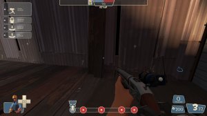
-Put some clipping on these planks.
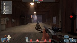
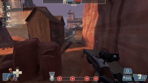
-That's a REALLY long sightline with no cover.
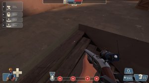
-The clipping for these stairs doesn't go all the way up to the concrete.
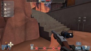
-Those are some chunky stairs.
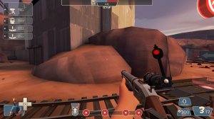
-the angles on these raised areas are difficult to walk on. Simplify it.
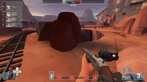
-Change lighting origin.
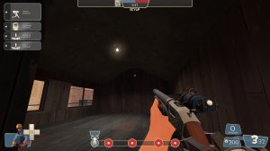
-Concrete on the ceiling of a wooden building? That doesn't make sense.
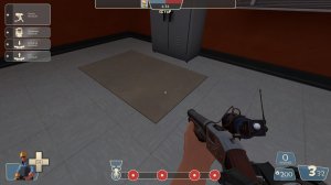
-This bit of concrete is really weird just hanging out here. It's the only thing like it in the room.
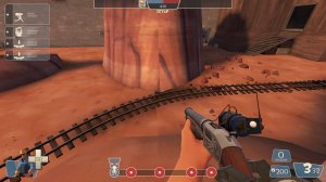
-Misaligned textures
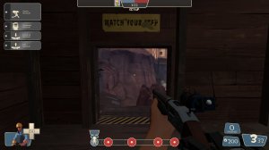
-Really short door.
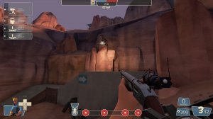
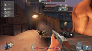
-I don't think these lights should be bright for the time of day this map is set.
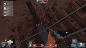
-Textures misaligned.
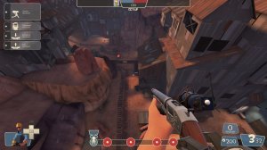
-This is a heck of a choke for the first point. I'd suggest adding a flank on the left through that rock area. Some kinda tunnel or cave thing.
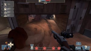
-There are no flanks here for attackers at all, just one path for everything to go through. I imagine it plays like a meet grinder which is rarely fun.
That's all for now, best of luck.

-The transition between concrete and wood here just looks odd. Why not make the whole thing one or the other?

-I can hide buildings in these rocks. Only really works for mini's and teleporters but will also hide sticky bombs.

-messed up render order. This happens sometimes, try messing with the brush a bit and using compilepal for a full compile. Its the most I've found to do about fixing this kinda thing.

-The rock going through this concrete doesn't make sense. Also the odd lip on the bottom of the ramp is weird.

-You're going to want to use an info_lighting to change the light origin of this prop.


-These displacments don't line up.

-The clipping in this area is really odd. I'd expect to be able to get to the crates but the clip brush is right farther in front of it.

-Big and empty.

-Really easy to see where the change between in game and skybox is.

-The displacments out here are nice, though a few are misaligned, but you could use some rock models and such to make it more interesting. Look at badlands and see how they do it.

-Again, big and empty

-Make this railing nonsolid and use a clip brush to stop players from walking through it. Shooting through railings can be annoying so this is how they're pretty much always done.

-Put some clipping on these planks.


-That's a REALLY long sightline with no cover.

-The clipping for these stairs doesn't go all the way up to the concrete.

-Those are some chunky stairs.

-the angles on these raised areas are difficult to walk on. Simplify it.

-Change lighting origin.

-Concrete on the ceiling of a wooden building? That doesn't make sense.

-This bit of concrete is really weird just hanging out here. It's the only thing like it in the room.

-Misaligned textures

-Really short door.


-I don't think these lights should be bright for the time of day this map is set.

-Textures misaligned.

-This is a heck of a choke for the first point. I'd suggest adding a flank on the left through that rock area. Some kinda tunnel or cave thing.

-There are no flanks here for attackers at all, just one path for everything to go through. I imagine it plays like a meet grinder which is rarely fun.
That's all for now, best of luck.
- Jan 15, 2015
- 134
- 274
- Full compile
- Better lighting in supposed dark places
- Updated red last spawnroom
- Polished textures and details
Read the rest of this update entry...
- Better lighting in supposed dark places
- Updated red last spawnroom
- Polished textures and details
Read the rest of this update entry...
- Jan 15, 2015
- 134
- 274
- Fixed clipping in red's second spawn
- Added visualizer for first red spawn, because blue could enter it when the door was opened.
- Tweaked visuals and brightened the map
Read the rest of this update entry...
- Added visualizer for first red spawn, because blue could enter it when the door was opened.
- Tweaked visuals and brightened the map
Read the rest of this update entry...
Jack5
L4: Comfortable Member
- Apr 6, 2018
- 189
- 37
I really like this map, but I have a couple of caveats with it. Here are my recommendations for the map, mainly just minor stuff to improve the casual side of play (especially this map's useability on community servers), and hopefully also improve competitive.
One entrance locations
There are quite a number of rooms that only have one small entrance, or its other entrances are extremely hard to reach. I believe that rooms like these should have multiple access paths.
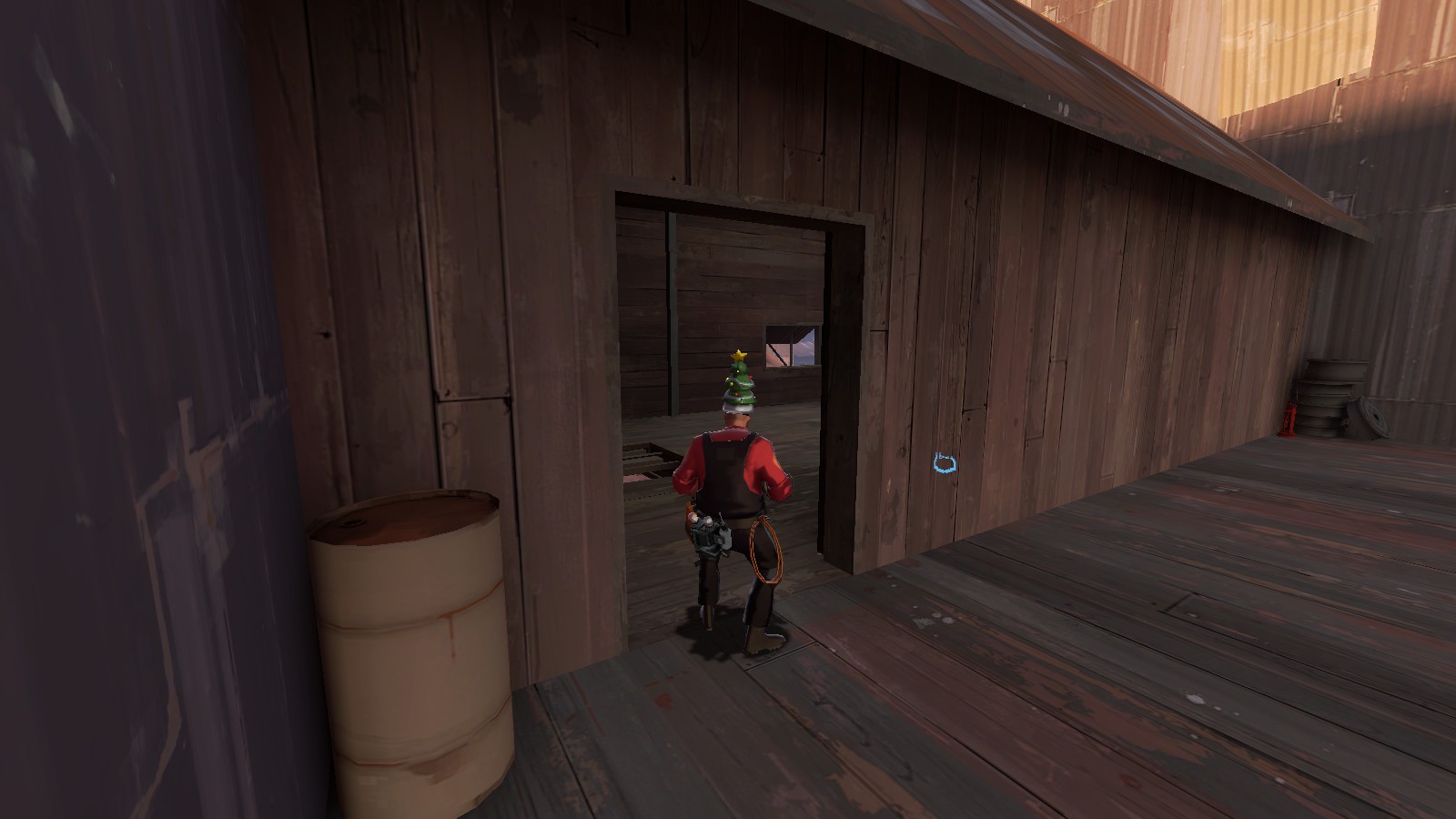
This place has two entrances. The first is the primary entrance, and the second is extremely hard to reach as any player. A third entrance along this wall may be required.
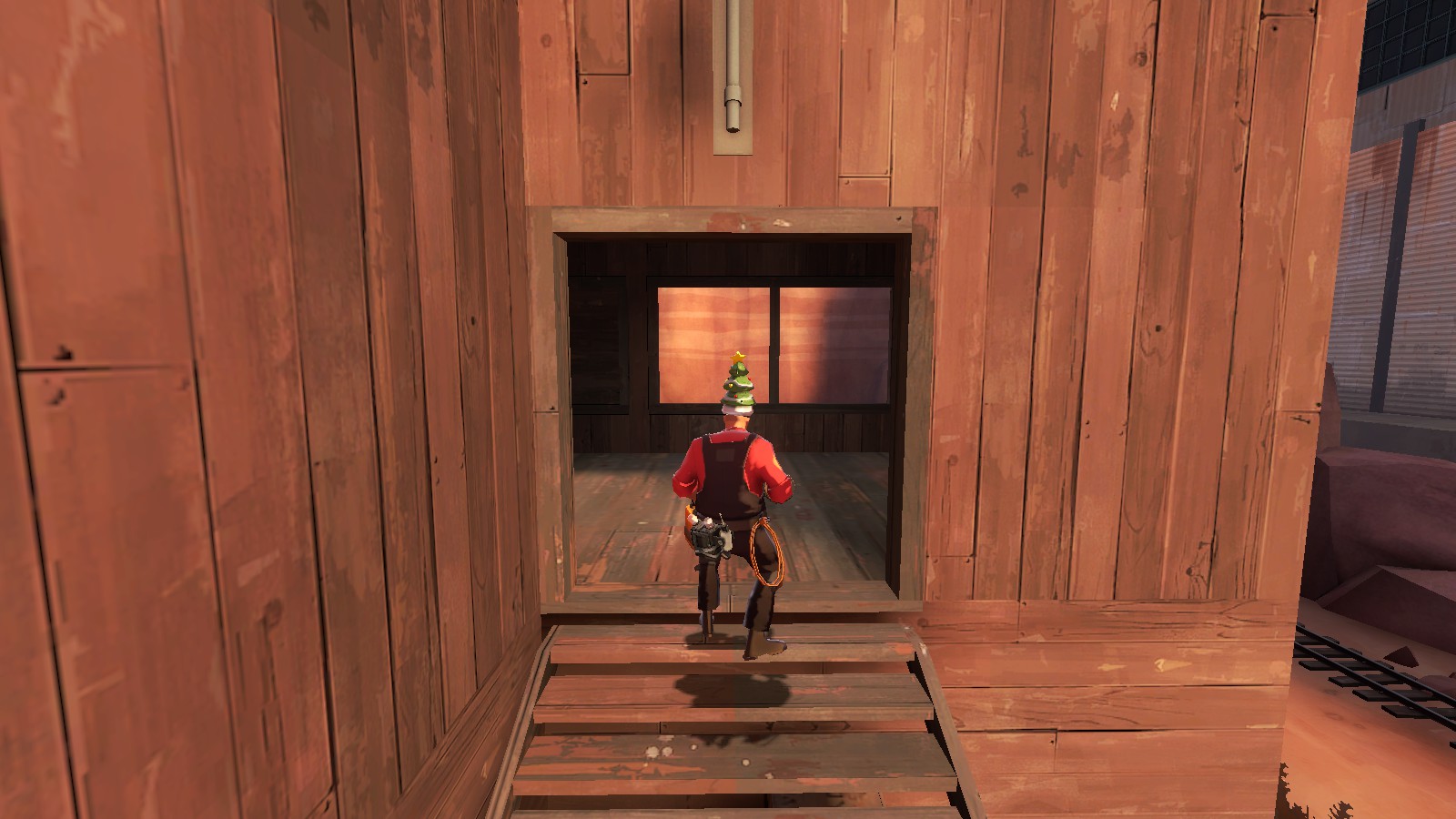
Only one entrance here. Maybe try increasing the width (by a lot) and height (not too much) of the entrance?
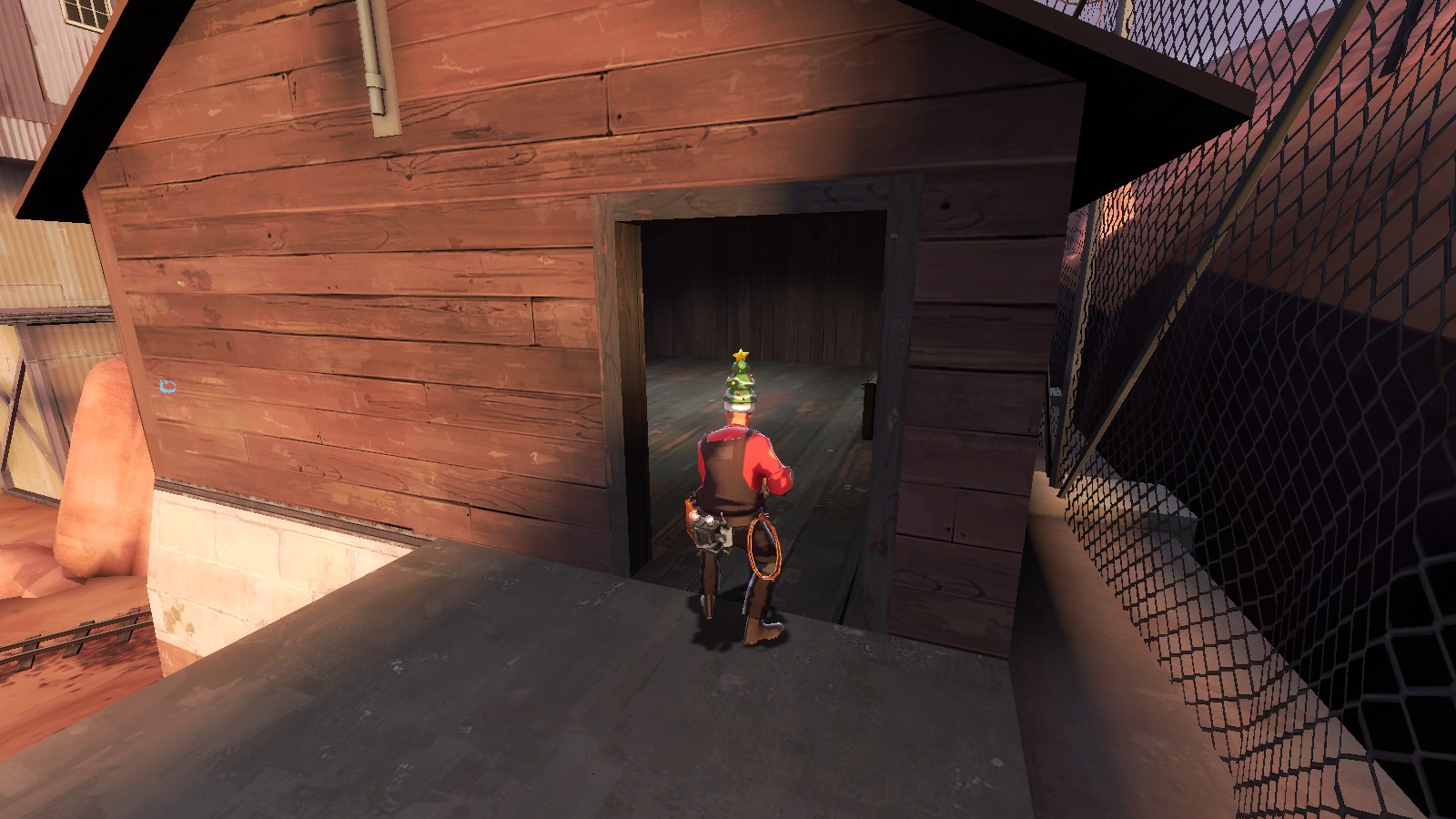
Same idea behind this one.
Clipping issues
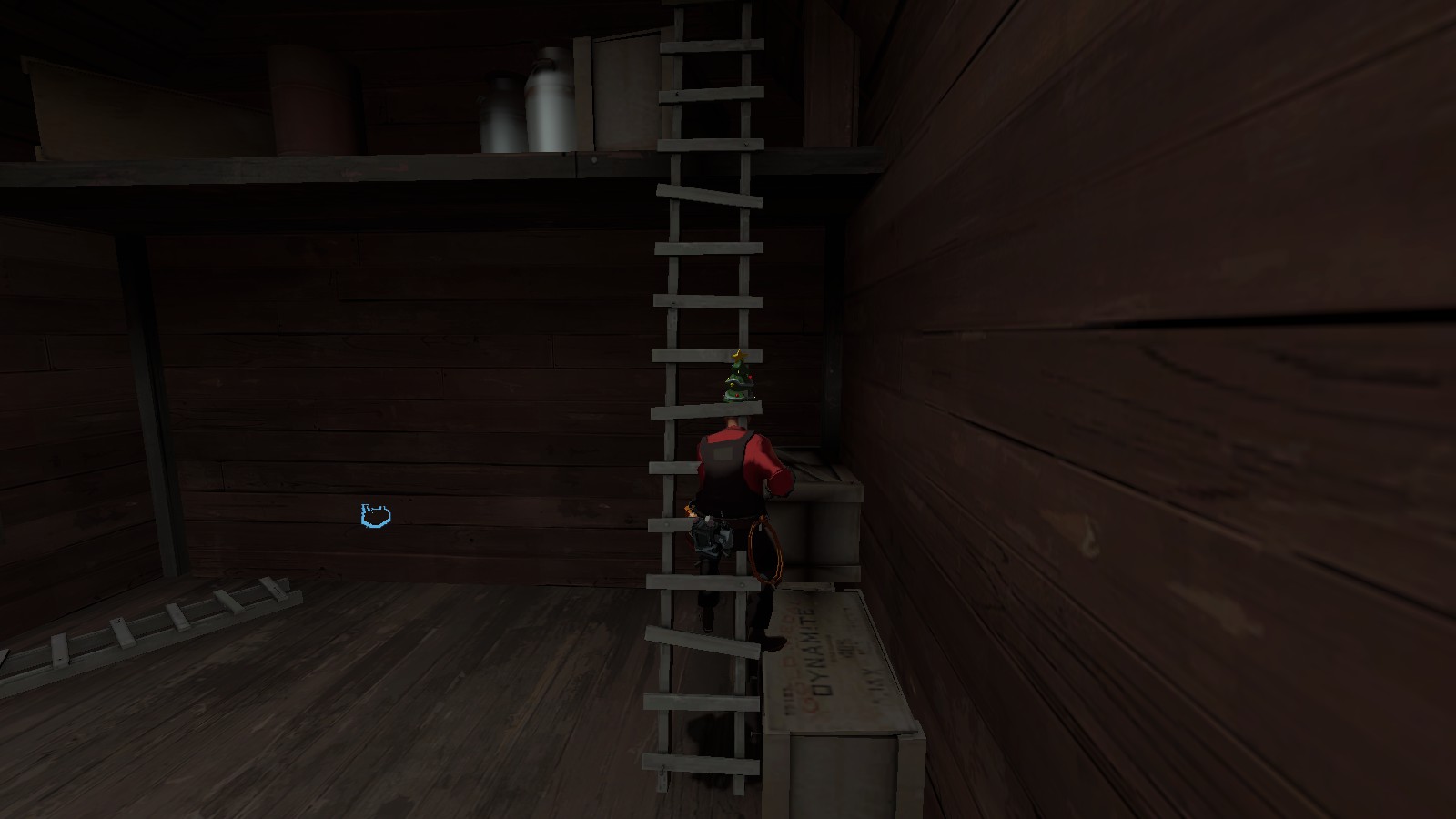
Yeah, this ladder isn't realistic enough. I'd much rather prefer to not be able to climb it rather than to pass right through it.
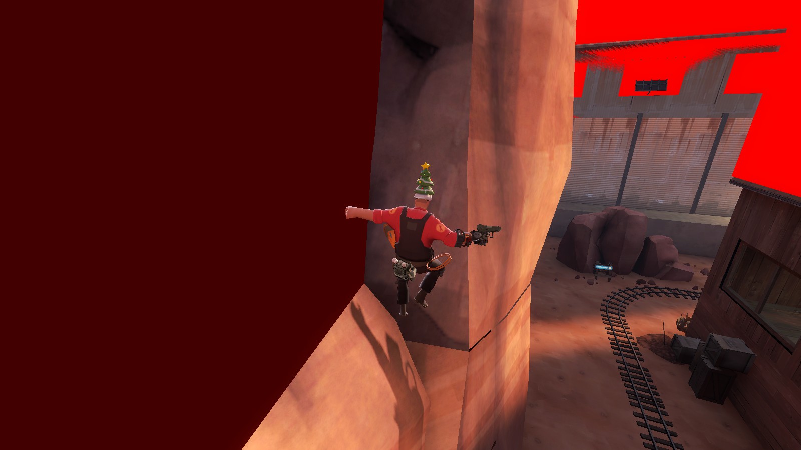
I entered the command r_drawclipbrushes 2 and this is the only place I could find that might be a problem. A person can stay here by holding the up and left keys. The displacement below probably needs to be flattened a little more.
Miscellaneous problem
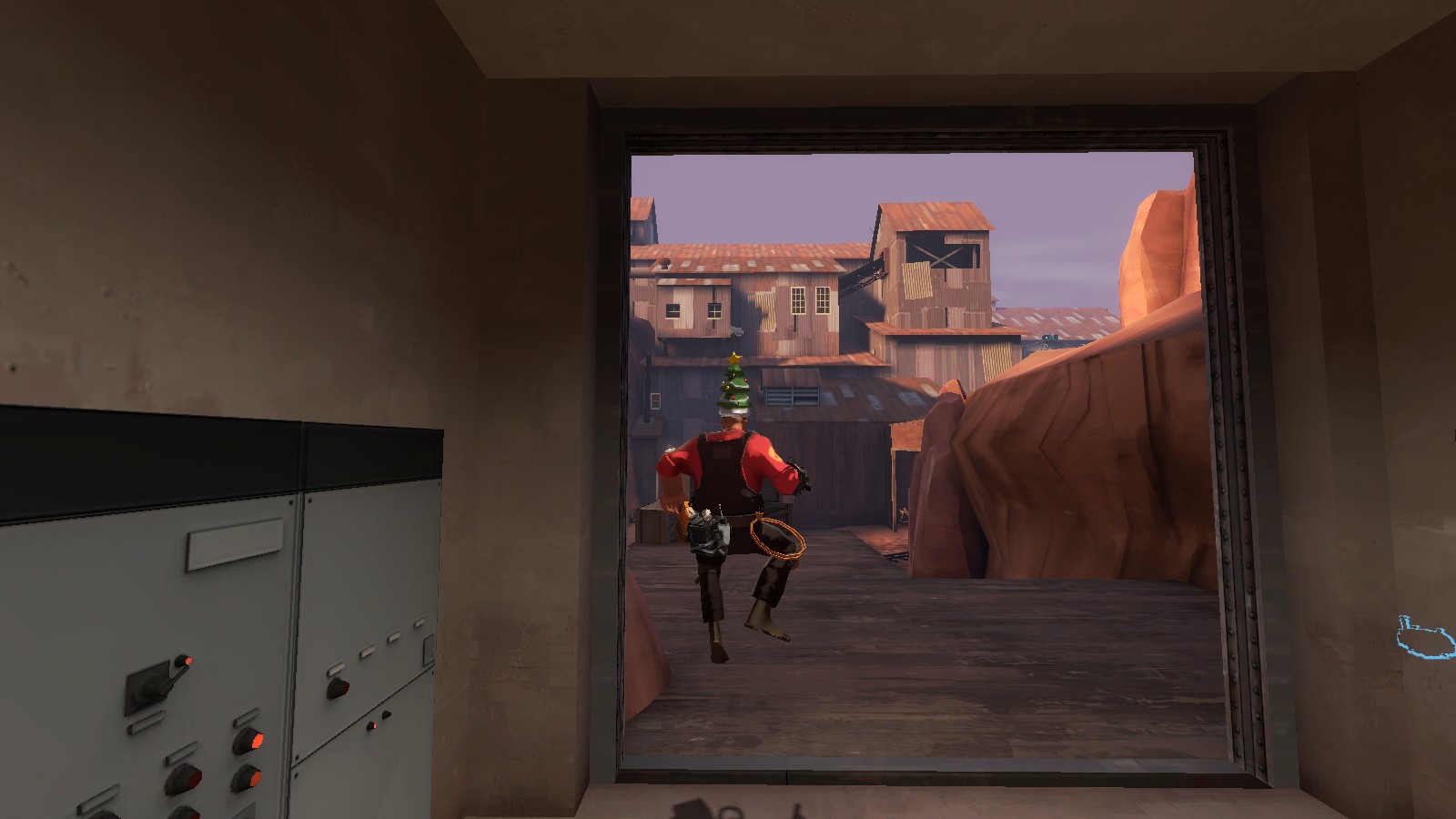
I think this doorway is simply too high. Perhaps decrease its height to somewhere inbetween three quarters and a half (and those one entrance places I mentioned earlier could do with a height adjustment to match).
No matter what happens, I will continue to watch this map's progress, for I really like the theme and wish to be able to play on it, no matter the gamemode.
One entrance locations
There are quite a number of rooms that only have one small entrance, or its other entrances are extremely hard to reach. I believe that rooms like these should have multiple access paths.

This place has two entrances. The first is the primary entrance, and the second is extremely hard to reach as any player. A third entrance along this wall may be required.

Only one entrance here. Maybe try increasing the width (by a lot) and height (not too much) of the entrance?

Same idea behind this one.
Clipping issues

Yeah, this ladder isn't realistic enough. I'd much rather prefer to not be able to climb it rather than to pass right through it.

I entered the command r_drawclipbrushes 2 and this is the only place I could find that might be a problem. A person can stay here by holding the up and left keys. The displacement below probably needs to be flattened a little more.
Miscellaneous problem

I think this doorway is simply too high. Perhaps decrease its height to somewhere inbetween three quarters and a half (and those one entrance places I mentioned earlier could do with a height adjustment to match).
No matter what happens, I will continue to watch this map's progress, for I really like the theme and wish to be able to play on it, no matter the gamemode.
- Jan 15, 2015
- 134
- 274
This map has been on the front page of the workshop for like a week so i felt like I should check it out eventually. And then I did
I won't make many gameplay comments because the map is pretty detailed already, but if I you want feedback on that I'd be willing to 1v1 you on the server about it.
As far as betas go it's pretty nice looking. Some obvious complaints have been addressed already so I won't go over them. I would advise polishing the details of this map quite a bit once the contest is over. Here's a few thoughts I had / things I noticed:
Seems to be a texture goof here. Pretty hard to fix you might have to redo the entire map
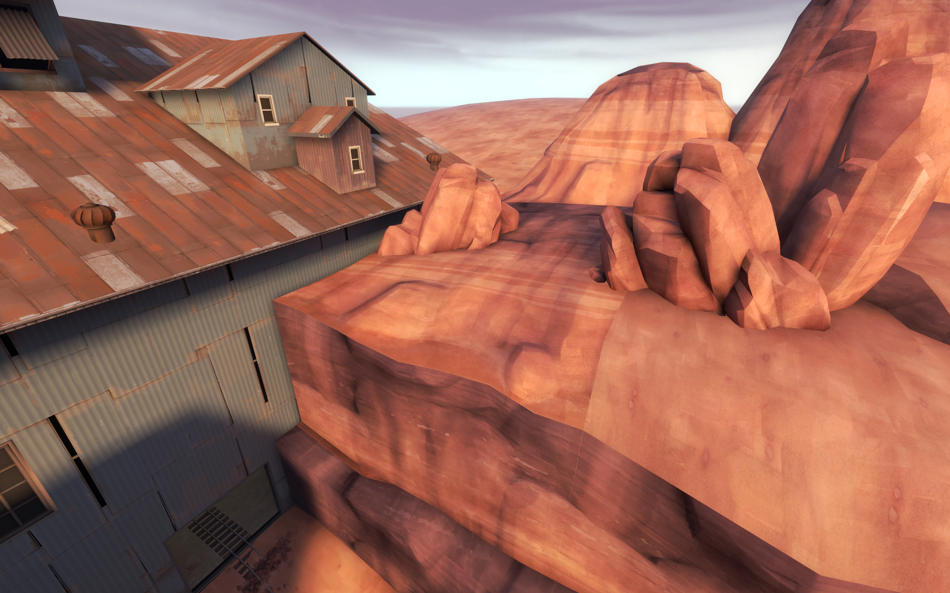
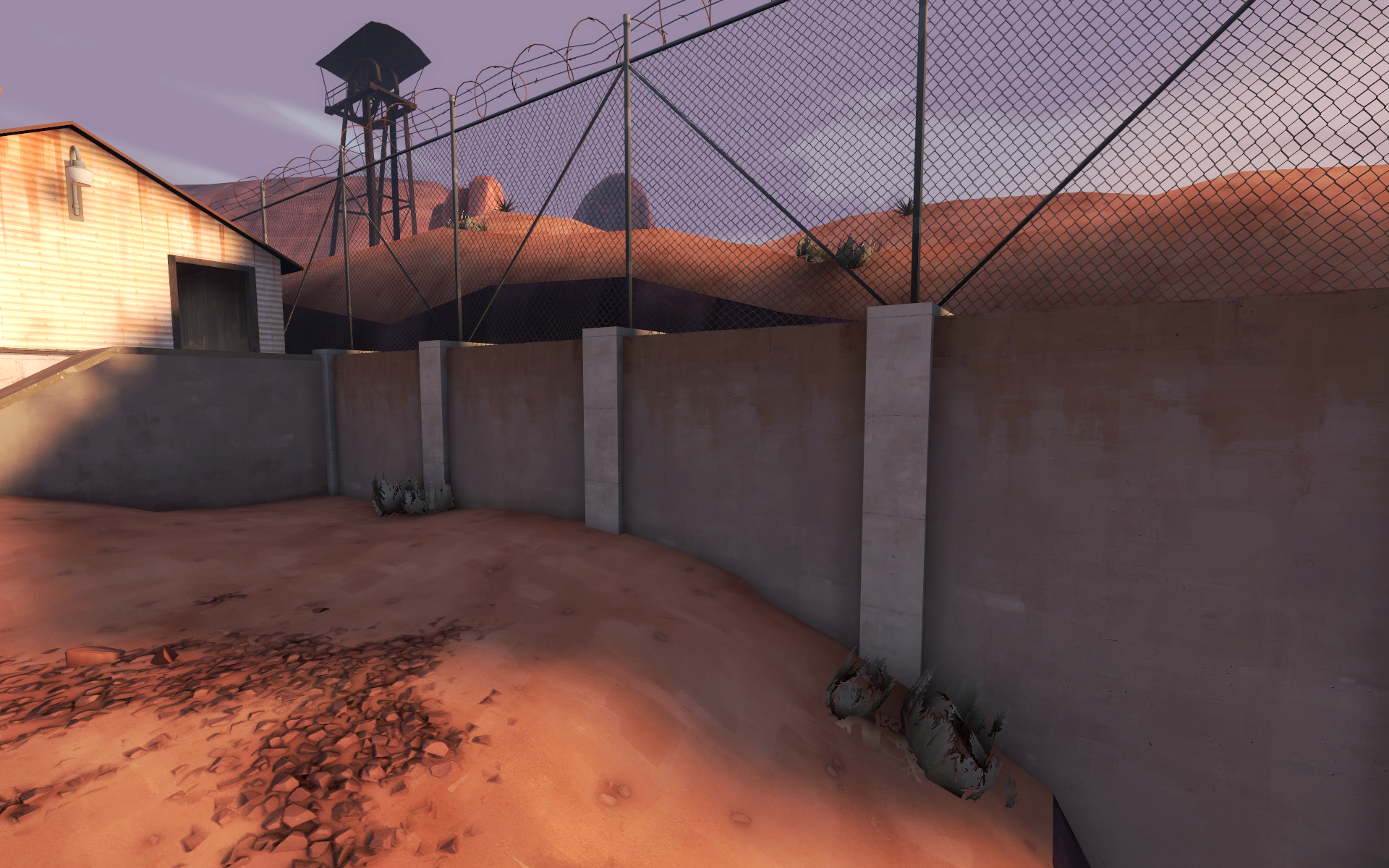
I don't like the texture choice for the columns on this wall. Slightly too bright colored for me. I think the wall should also be taller, if possible.
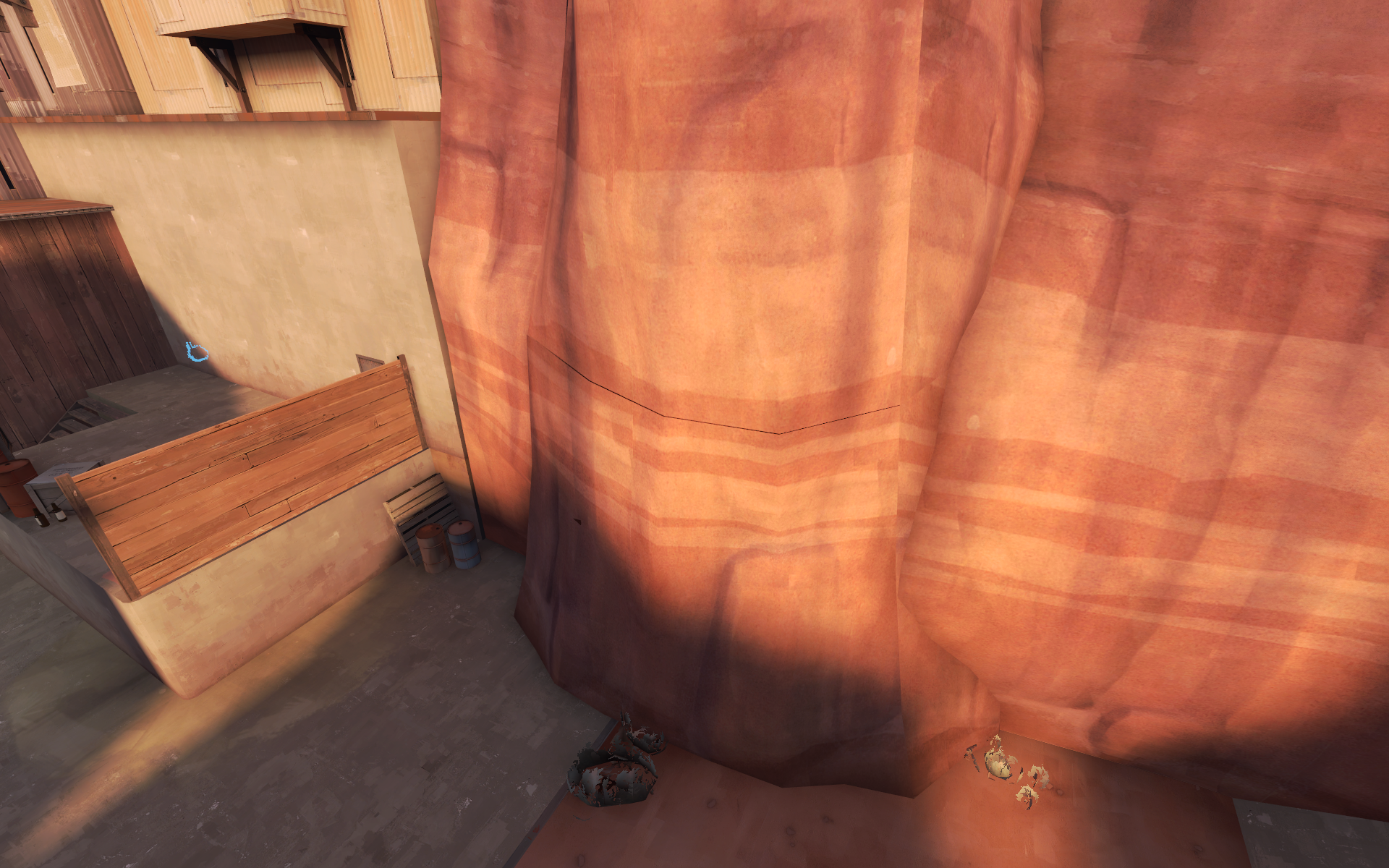
this cliff segment is FRiCKED
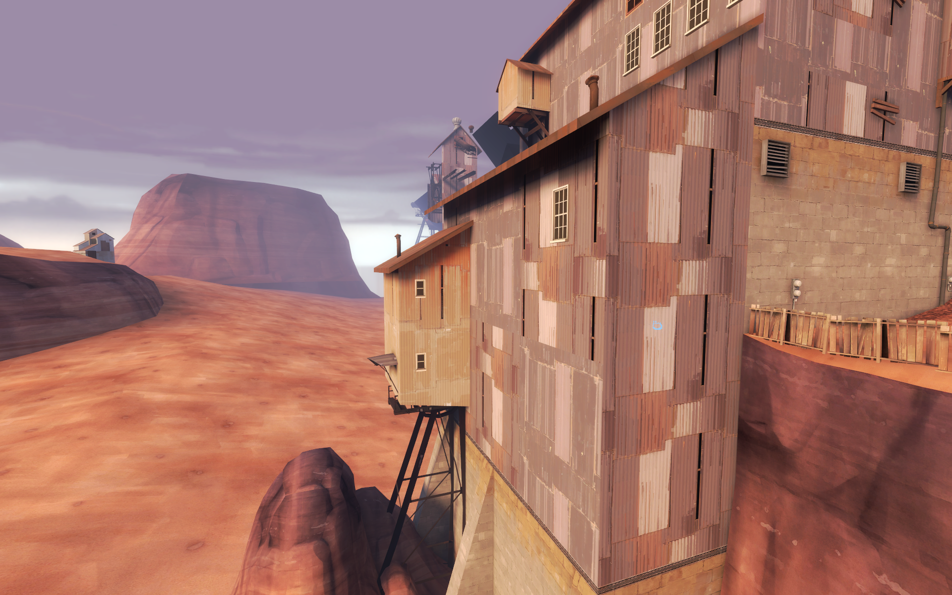
I like this building thank you for making it
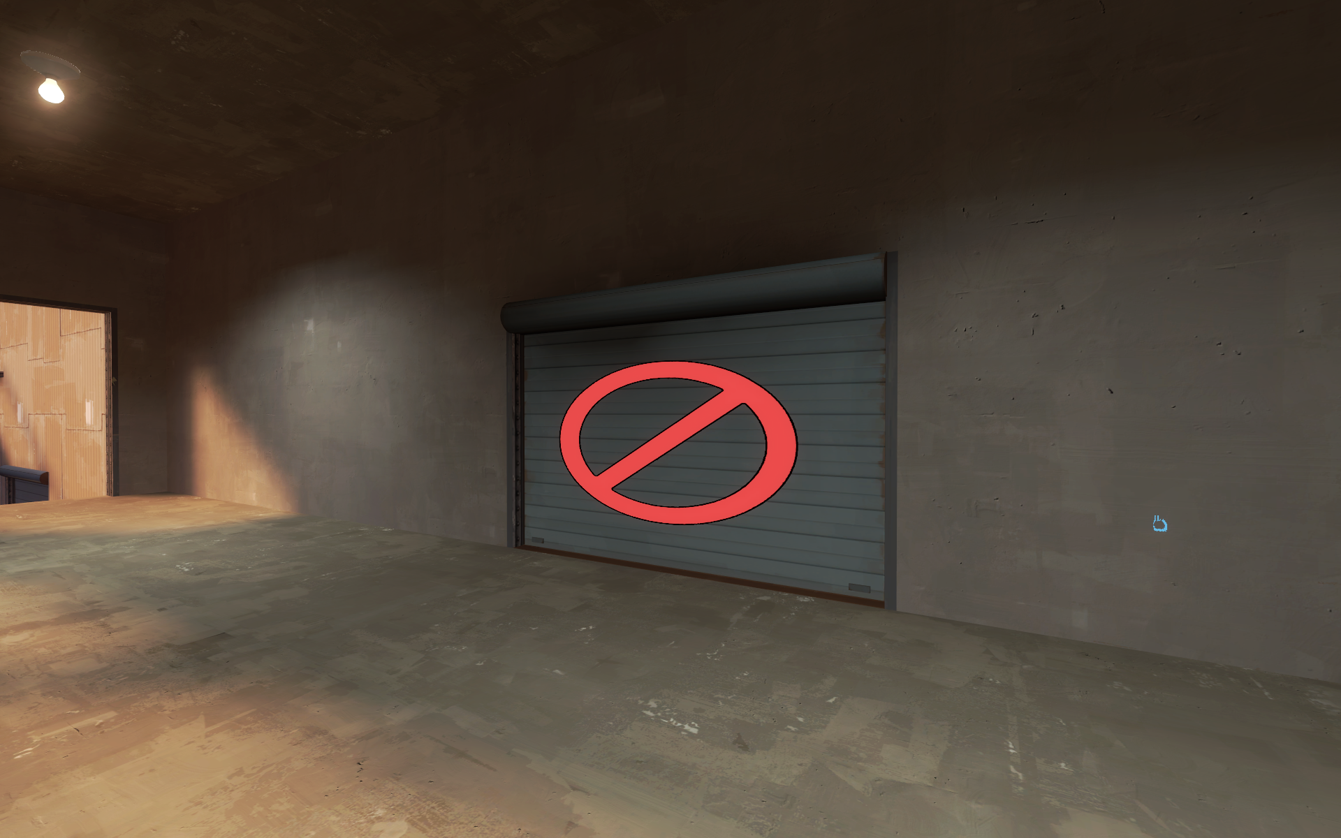
Instead of using Fit to scale the no entry textures, set the scale of the texture to .55 and center it. It will look better.
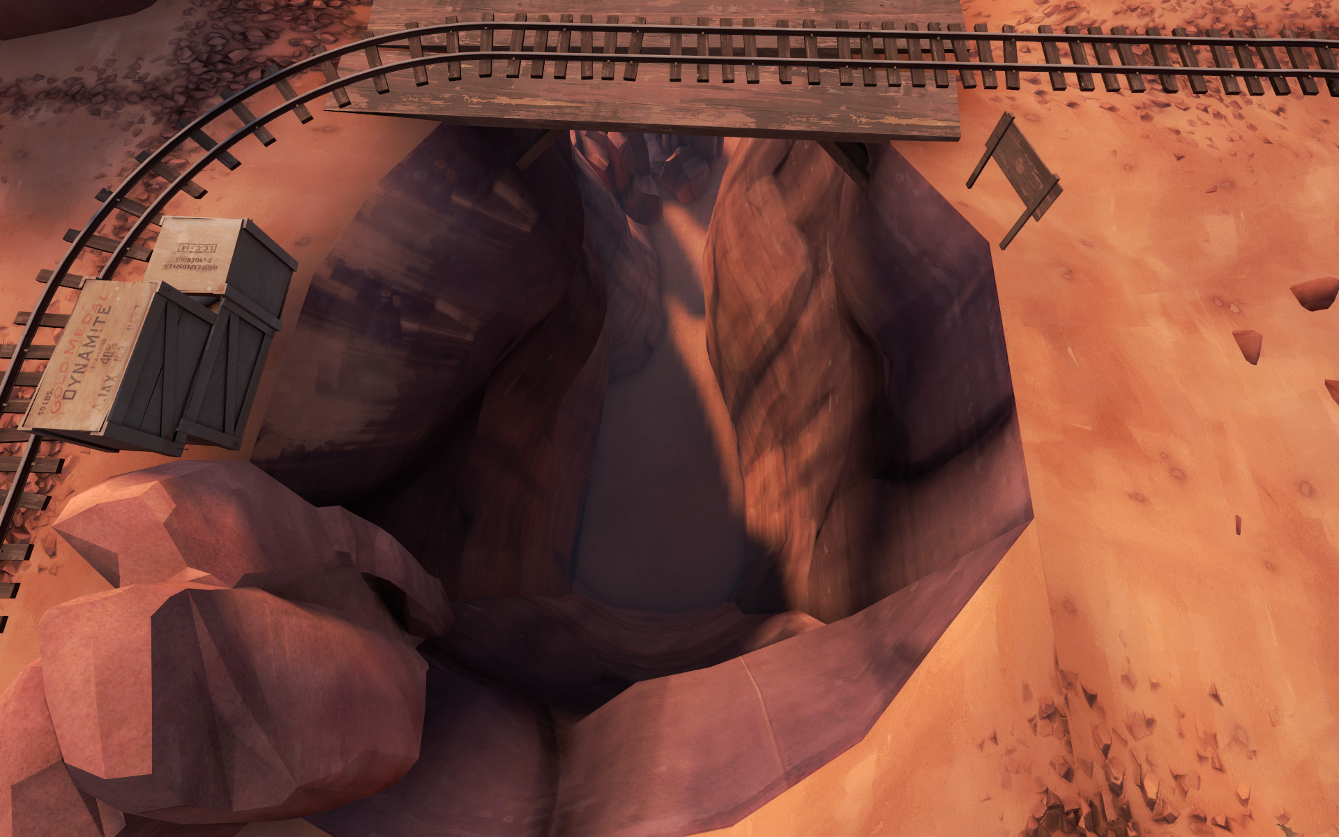
Put something cool in this crevice because I feel that people are gonna be falling into it quite a bit. Maybe some minecart bridges at the bottom. Maybe some rock debris. Put anything, really
Here's a gameplay one! On a full server, blu team is probably going to have a ridiculously hard time pushing through this area (if they can get up the giant rollback to begin with.) You really really need at least one alternate route up in here, especially because red has height advantage and because their side of the map is far more open than what blu would own while trying to push through this choke. Please try to address this in a major way because otherwise I feel it will probably be very broken / not balanced.
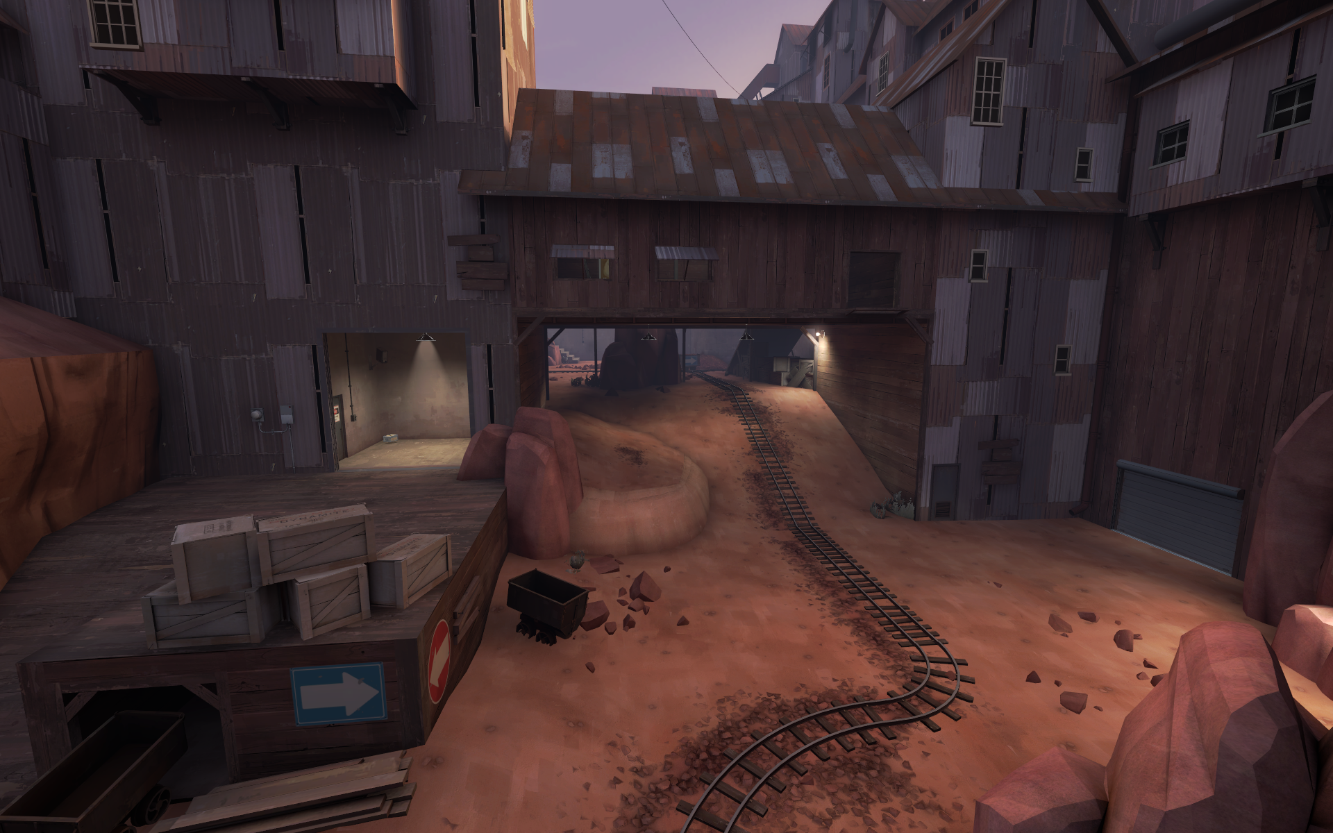
I think this room looks really nice.
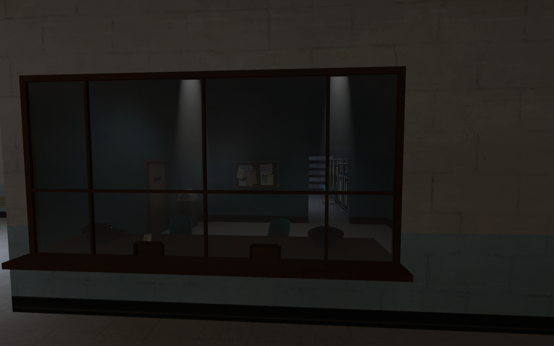
In conclusion: I think this map is always going to be flawed gameplay wise because as far as I'm aware, it did not receive much testing on a full server or on larger playercounts. When you have less than 9 players per team, it's not even possible to have at least one of every class - so how would you balance a map around them in that case? Testing is important. Please do it!
However, you seem to know how tf2 detailing works, which I appreciate. I really want to see you detail a well tested map.
I won't make many gameplay comments because the map is pretty detailed already, but if I you want feedback on that I'd be willing to 1v1 you on the server about it.
As far as betas go it's pretty nice looking. Some obvious complaints have been addressed already so I won't go over them. I would advise polishing the details of this map quite a bit once the contest is over. Here's a few thoughts I had / things I noticed:
Seems to be a texture goof here. Pretty hard to fix you might have to redo the entire map
I don't like the texture choice for the columns on this wall. Slightly too bright colored for me. I think the wall should also be taller, if possible.
this cliff segment is FRiCKED
I like this building thank you for making it
Instead of using Fit to scale the no entry textures, set the scale of the texture to .55 and center it. It will look better.
Put something cool in this crevice because I feel that people are gonna be falling into it quite a bit. Maybe some minecart bridges at the bottom. Maybe some rock debris. Put anything, really
Here's a gameplay one! On a full server, blu team is probably going to have a ridiculously hard time pushing through this area (if they can get up the giant rollback to begin with.) You really really need at least one alternate route up in here, especially because red has height advantage and because their side of the map is far more open than what blu would own while trying to push through this choke. Please try to address this in a major way because otherwise I feel it will probably be very broken / not balanced.
I think this room looks really nice.
In conclusion: I think this map is always going to be flawed gameplay wise because as far as I'm aware, it did not receive much testing on a full server or on larger playercounts. When you have less than 9 players per team, it's not even possible to have at least one of every class - so how would you balance a map around them in that case? Testing is important. Please do it!
However, you seem to know how tf2 detailing works, which I appreciate. I really want to see you detail a well tested map.
- Jan 15, 2015
- 134
- 274
-Added stairs to reach second point via alternate means
-Improved clipping
-Brightened some areas that were too dark
-Custom doorhandle model
-Removed giant Peter Griffin face from skybox
Read the rest of this update entry...
-Improved clipping
-Brightened some areas that were too dark
-Custom doorhandle model
-Removed giant Peter Griffin face from skybox
Read the rest of this update entry...
- Jan 15, 2015
- 134
- 274
- Jan 15, 2015
- 134
- 274
Jack5
L4: Comfortable Member
- Apr 6, 2018
- 189
- 37
Here's another large post for you. This post accompanies my previous one, of which not all of the things I mentioned were changed, so you may need to investigate those again, this one most of all.
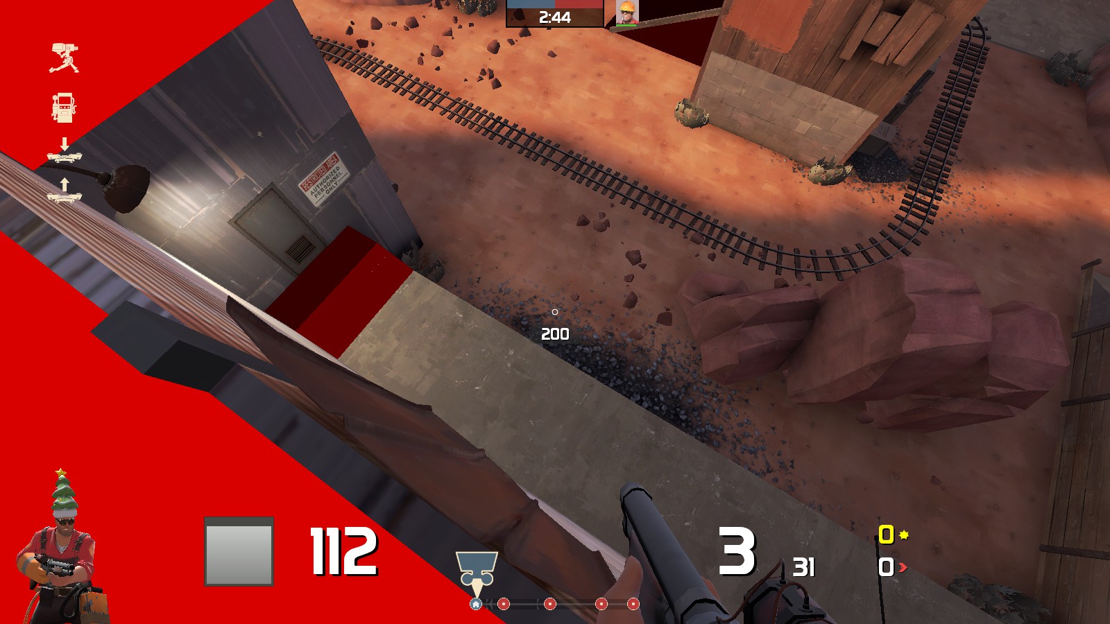
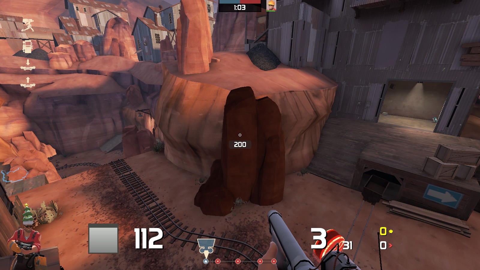
Clipping problems - standing on issue
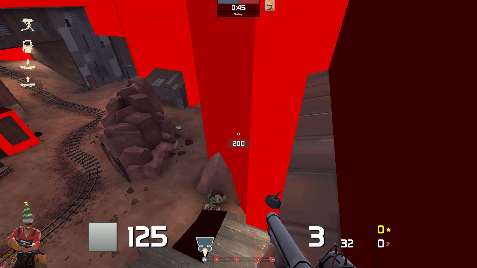
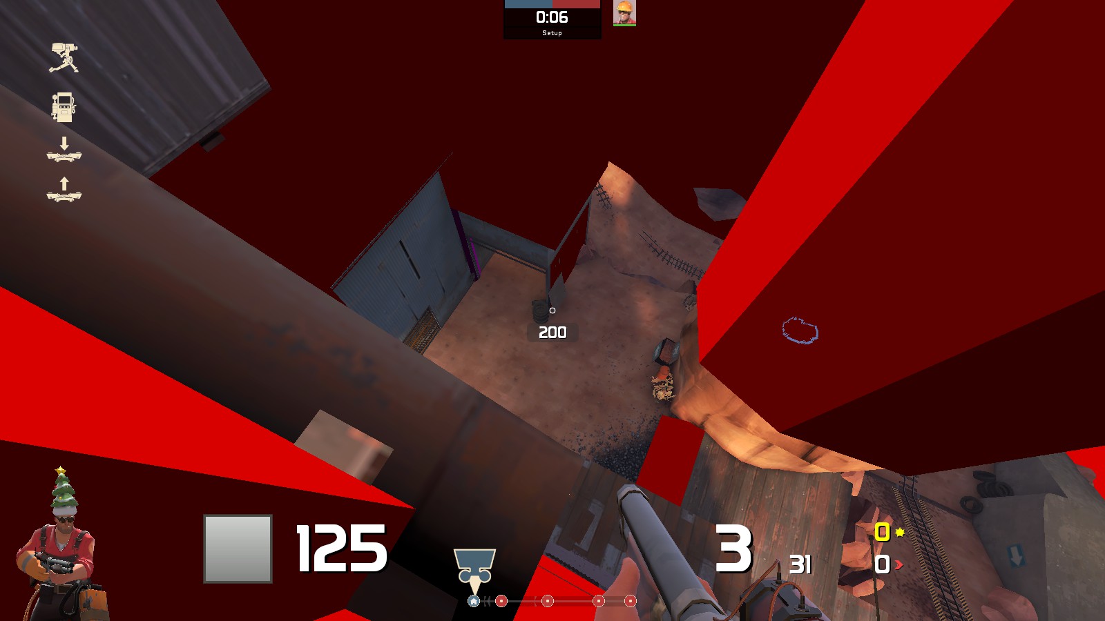
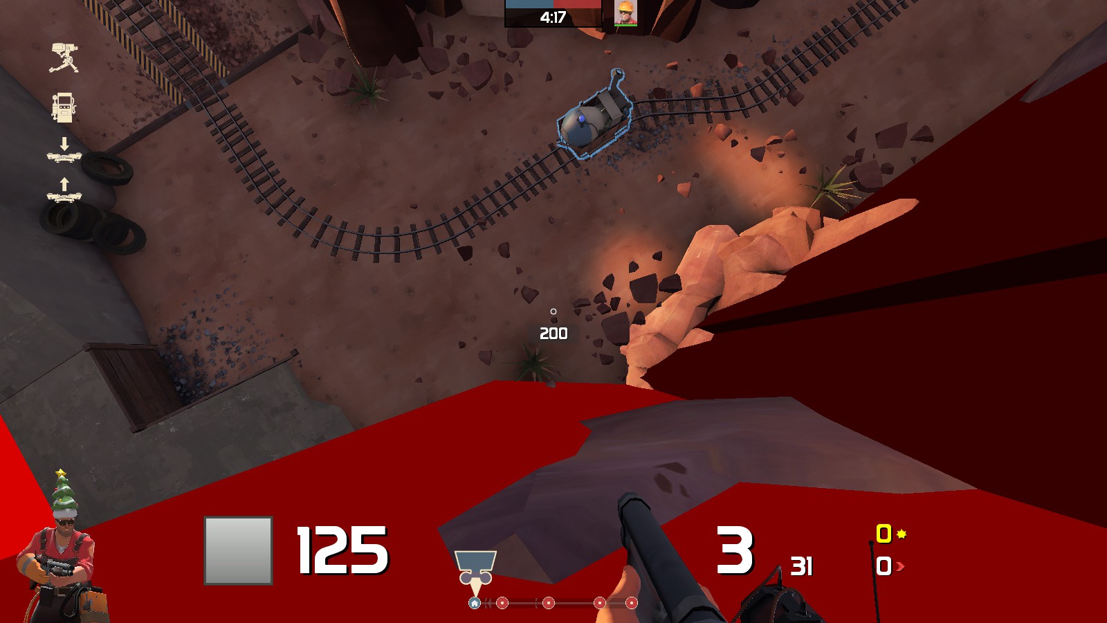
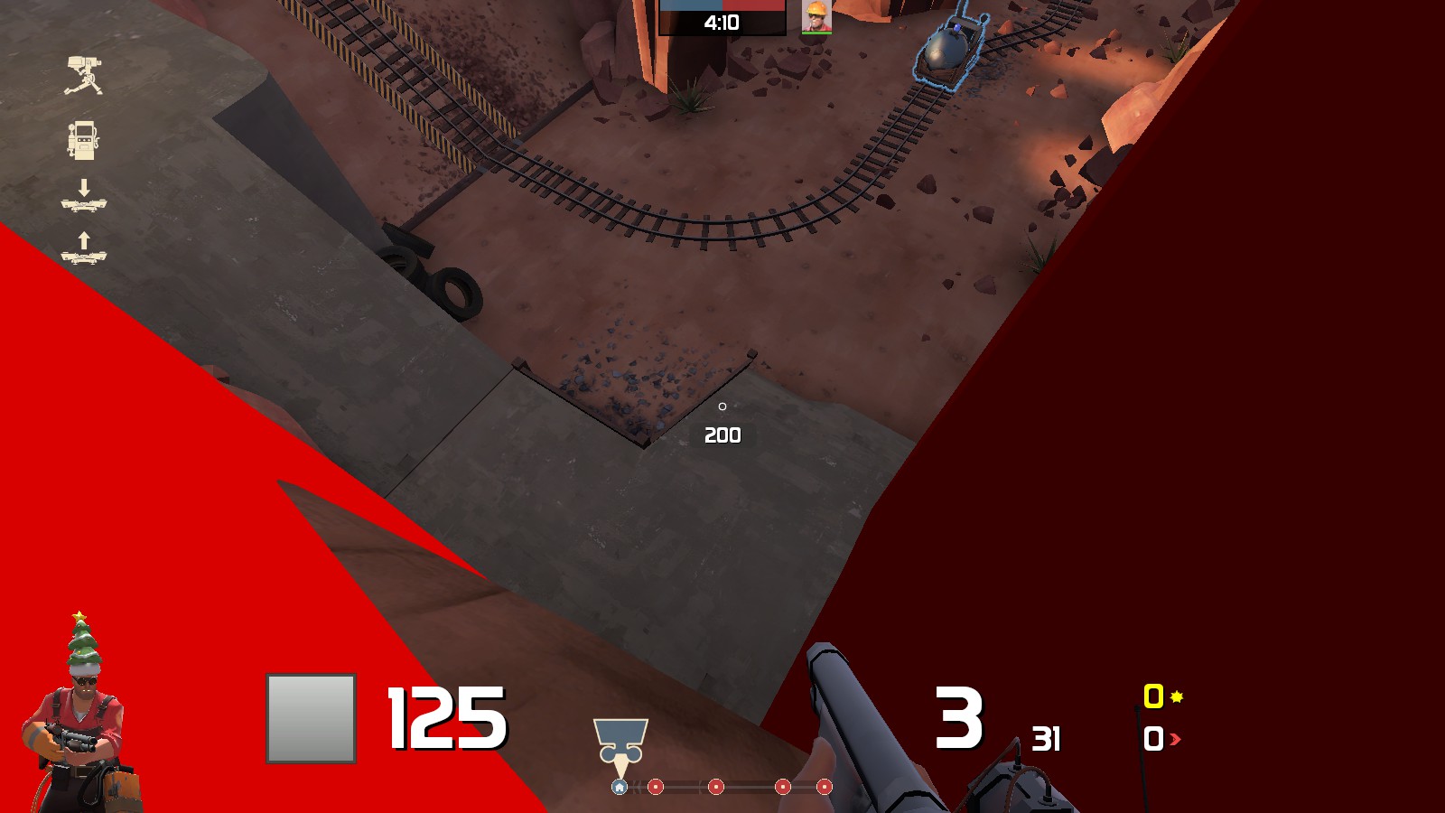
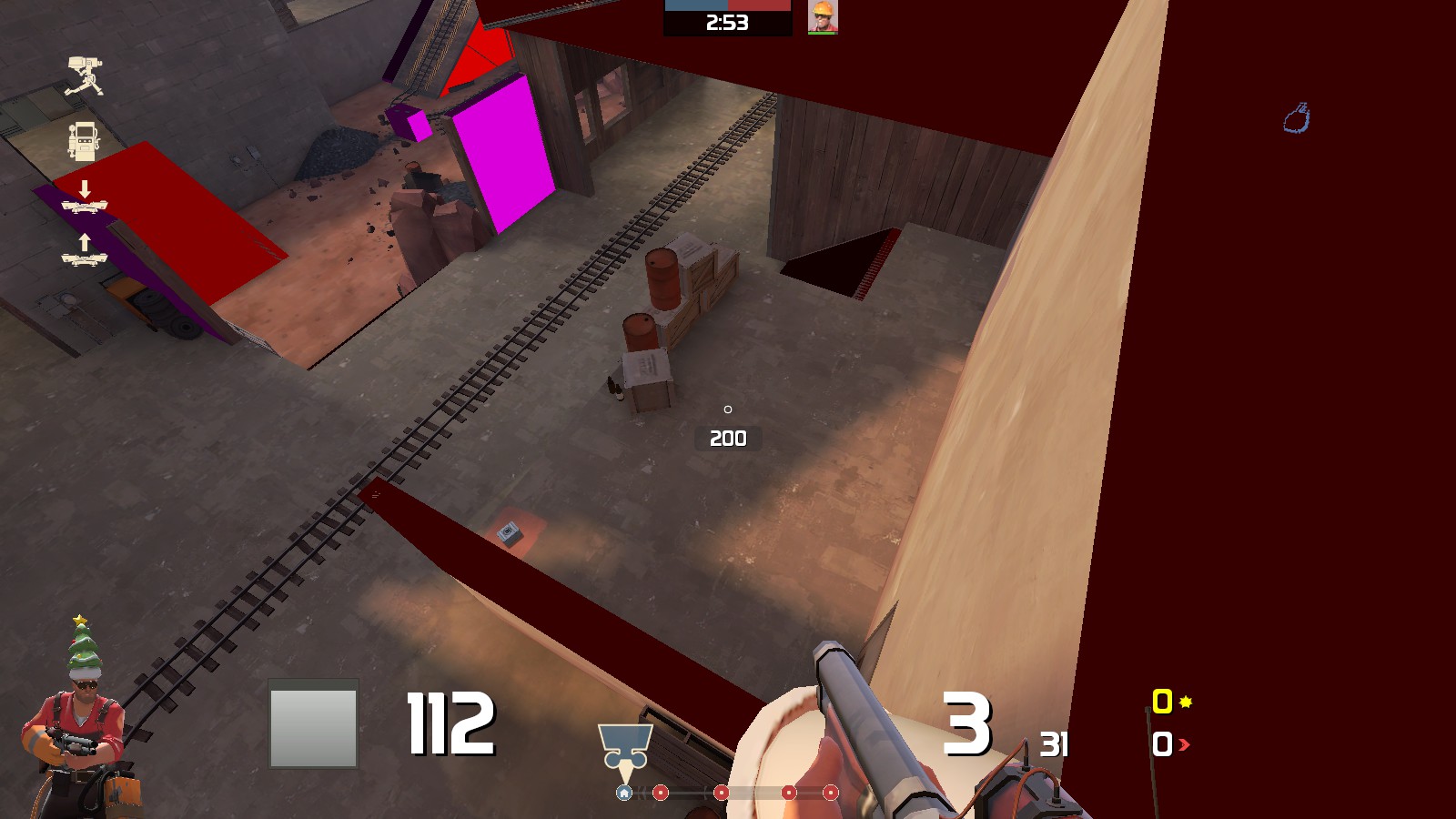
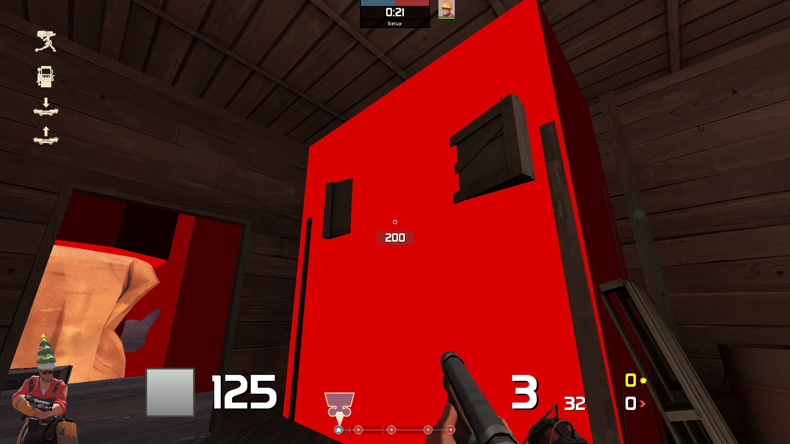
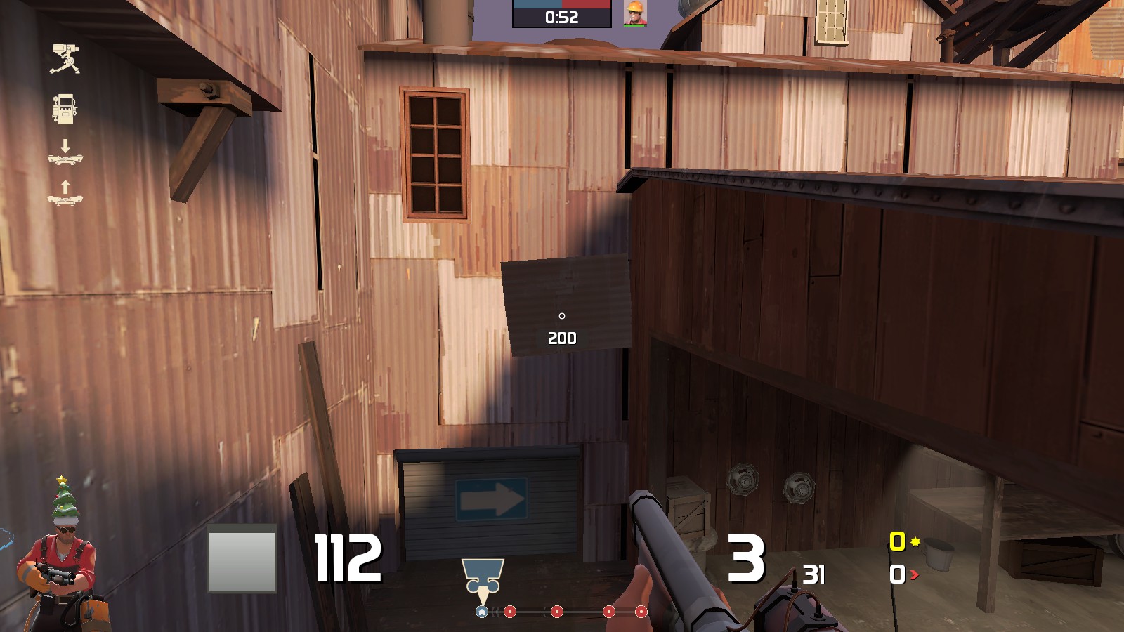
Clipping problems - looking at issue
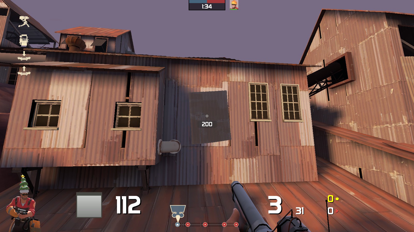
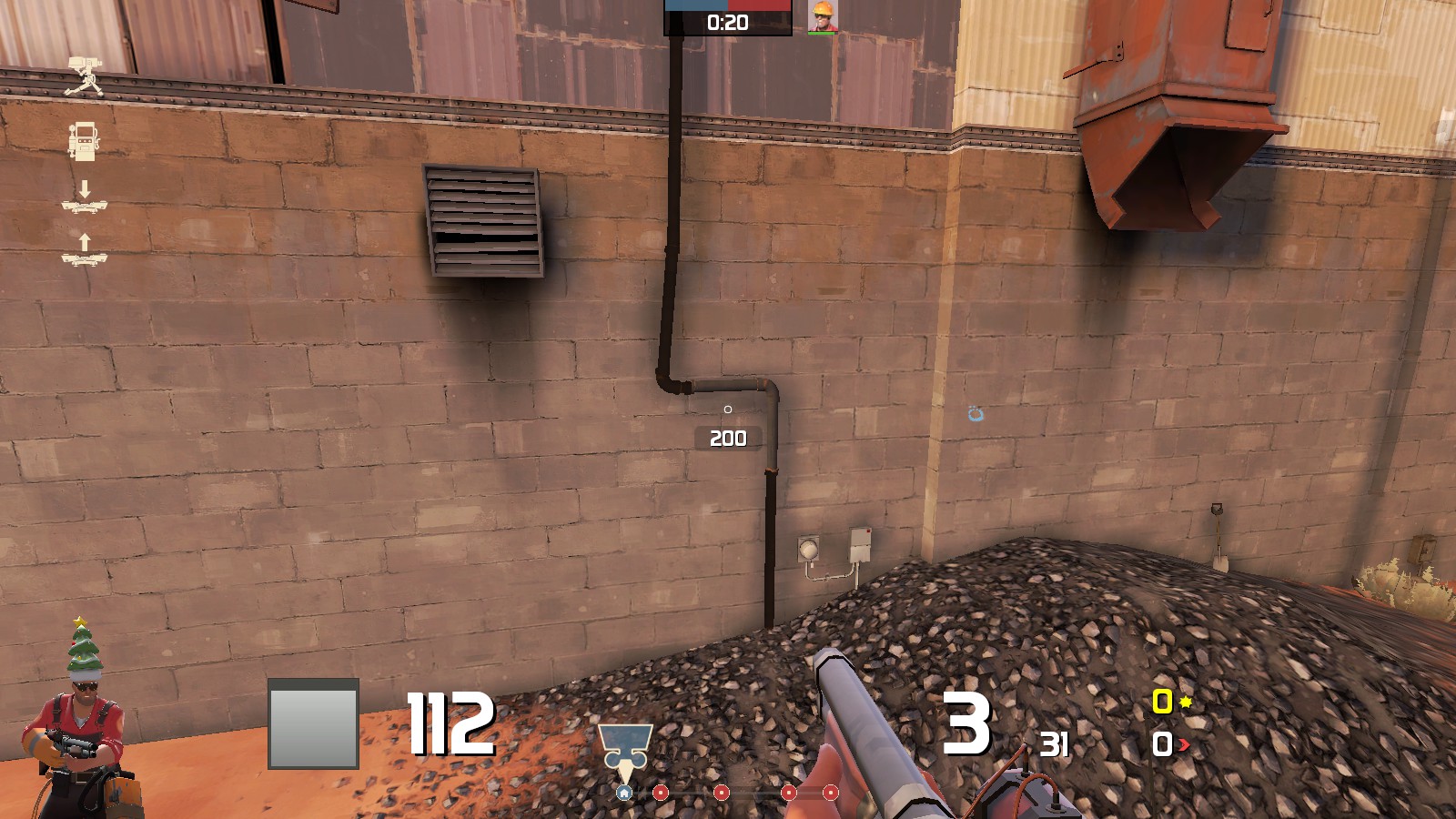
Bad lighting and/or shadows (fix with HDR slow compile with -staticproplighting added to $light.exe line)
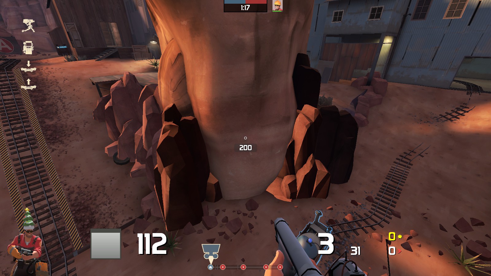
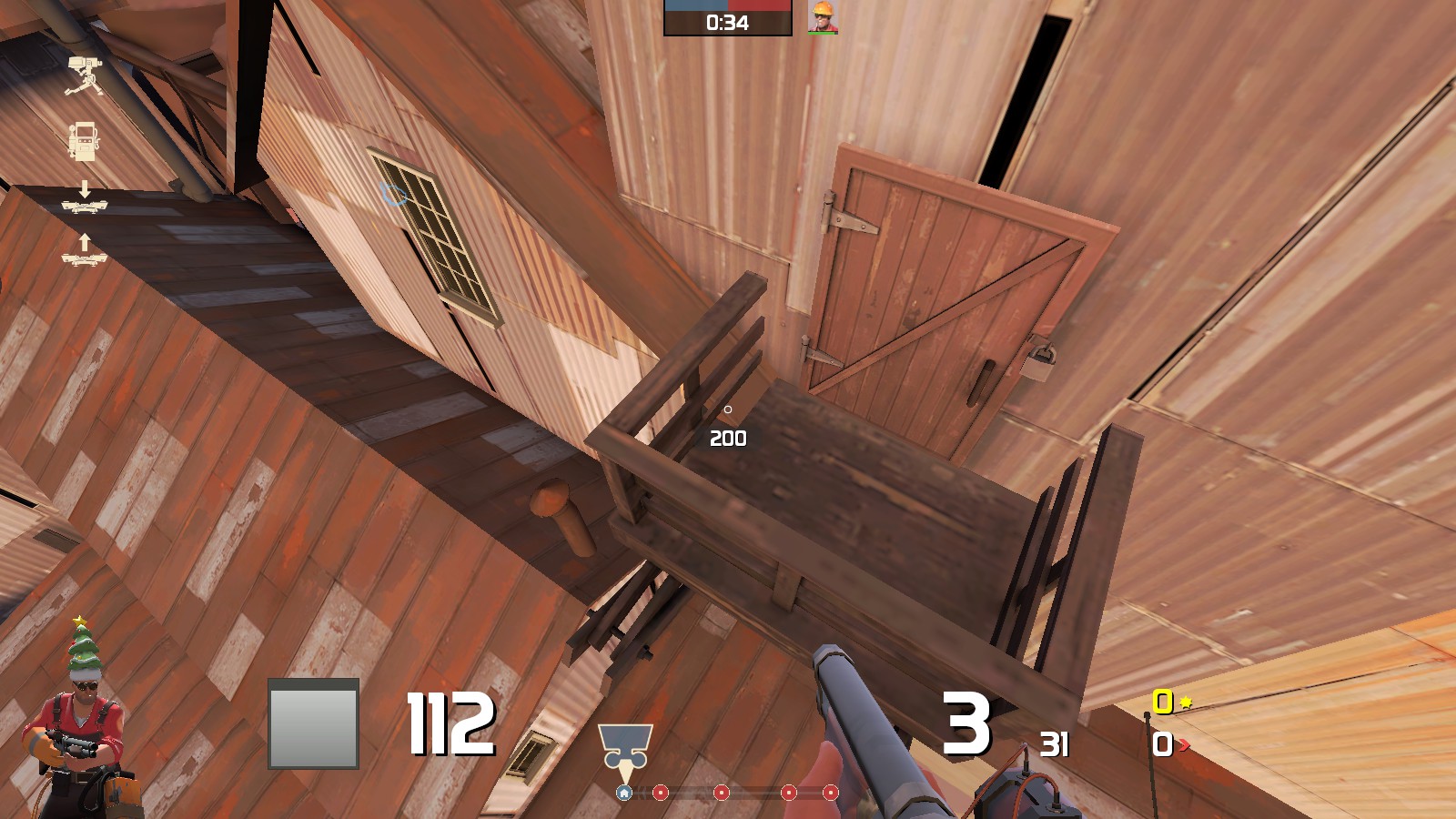
Just doesn't look right
Clipping problems - standing on issue


Clipping problems - looking at issue

Bad lighting and/or shadows (fix with HDR slow compile with -staticproplighting added to $light.exe line)


Just doesn't look right

- Jan 15, 2015
- 134
- 274
beta 14:
-Updated some details
-Fixed clipping issues
-New flank for blu on last point
Read the rest of this update entry...
-Updated some details
-Fixed clipping issues
-New flank for blu on last point
Read the rest of this update entry...
- Jan 15, 2015
- 134
- 274
-Updated the last flank to be cliffside instead of wooden planks
-Fixed clipping in certain spots
-Very minor detail touchups
-Easter eggs
Read the rest of this update entry...
-Fixed clipping in certain spots
-Very minor detail touchups
-Easter eggs
Read the rest of this update entry...
- Jan 15, 2015
- 134
- 274
- Jan 15, 2015
- 134
- 274
-Final compiled
-Clip fixes
-Reduced some unnecessary/distracting details
Read the rest of this update entry...
-Clip fixes
-Reduced some unnecessary/distracting details
Read the rest of this update entry...
- Jan 15, 2015
- 134
- 274


