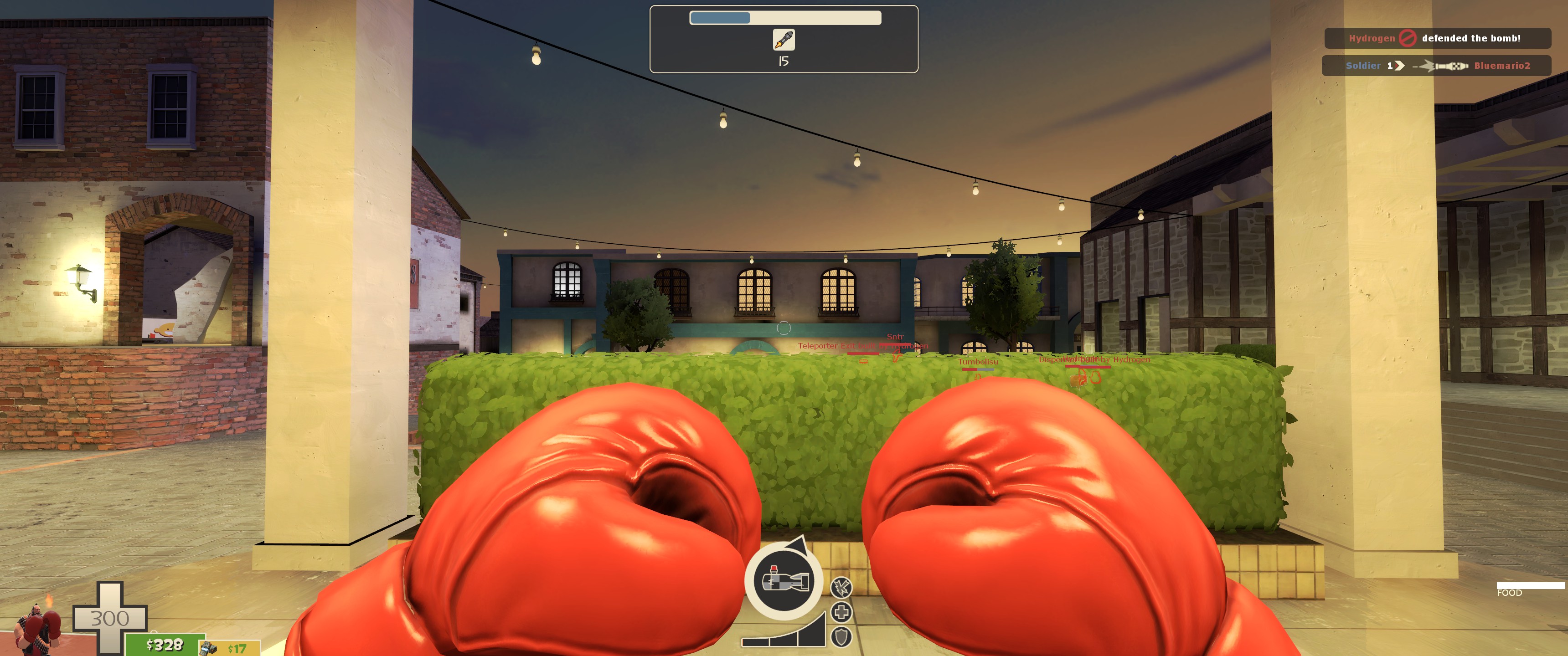
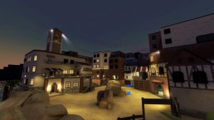
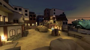
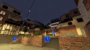
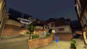
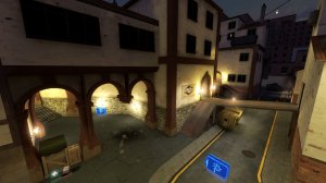
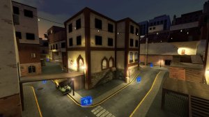
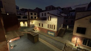
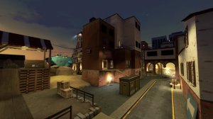
I find it a bit off-putting visually that there are so many materials and styles used for buildings. Like you have the plaster and medieval textured beach side buildings, which is fine. Then you a wood shanty looking building next to a brick one. And in the skybox you have brick skyscrapers. The brick matches the Mann Co building, but not the Caribbean beach side buildings at the start.
I think you should go with a more natural transition between the two, kinda like how Watergate has the plaster on the brick buildings fading off. Replace that wood building right past the beach with a plaster building that transitions to the brick on besides it, and maybe do something to make the skybox less jarring with the several styles within the map.
Also, something far more minor, but I find the lighting to be kinda flat in the map. I think you should remove some of the many lights around and let some of the map be a bit darker than it is now.


