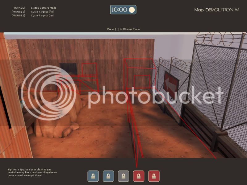
The first CP could do with some better layout design choices. It's bland, boring and only ever gets attacked by soldiers and demo's rocket jumping too and from the battlements (as this is a heated zone). But this can be resolved by appropriate use of relavent props to add cover. But at the moment it's a cliché looking final point that looks uninteresting and insignificant (Why are RED/BLU attacking this place?).
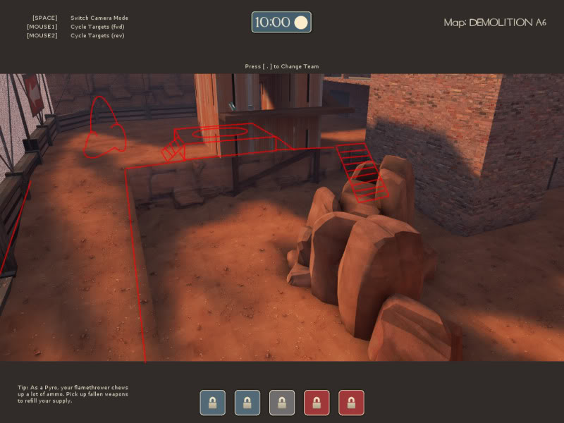
Second CP needs to be made more open. it's like a cross between Balands 2nd CP and the orange_x central tower (which is bad). Make it bigger in construction (Like Gravelpit) but not so big that it's a chore to attack/get onto. Place it further from the battlements, right now it looks like you can jump onto it as a normal class when you can't; you just fall short.
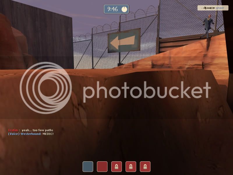
There was a displacement ditch i kept getting stuck in infront of the tower.. you'll probably want to sort that out.
Also, i don't know whether it was a bug, or my graphics card not rendering a pyro (it does this rarely, invisible players ftw) but it was like i kept getting airblasted from under the second CP.
Central point is alright i guess. Will probably look a lot nicer with more detail. But you seriously need to redesign your final cp's and the "bases" they reside in. Open up the area around the second CP and move it slightly away from the base.
edit:
Something like that would be enough/appropriate. Then you can include cover as you deem necassery.
") (
(