- Sep 10, 2016
- 616
- 477
I'm here with mostly minor detailing feedback, and by "mostly minor detailing feedback" I mean an essay, because of course I do. It's me.
I don't know why I keep butting in with this map. It's not my map, you're free to detail it however you want. But I do think this map will get in the game, and I want it to be really special when that happens.
Too many smissmas maps are just "normal TF2 map but with snow and presents". We can do better. We have the power to come up with fresh, original themes that are still detailed beautifully and still feel like TF2, and can still get accepted into the game, but the reskin approach is unfortunately tried and tested, and Wutville didn't exactly give people confidence that a new, original theme could be good.
But I think this map has the potential to stand out from the crowd. Its tight layout and unique story of "deliver the present" sets up for a storybook christmas town, with high-up windows protruding from old medieval walls complete with balconies adorned with flowers, shop windows blazing yellow light onto the snowy paving stones, and a busy town square with wood stalls and carts professing their wares, surrounding some central well or statue.
However, I think this map isn't there yet, and it needs the extra effort to really feel lifelike, or better than lifelike - like a beautiful painting. Which is basically what I'm getting at with this essay.
For starters, I think the map is too bright. It's good to have a lot of ghost lights to light your map's gameplay space, or to use bright light_environment values so the sun does the heavy lifting for you in terms of player visibility... but that's for alpha.
The Source engine can do dark areas really well. It's one of the perks it had over Goldsource. But it really feels like this map misses out on that opportunity. Everything is pretty much equally bright. It needs some variety, some contrast.
Here's a screenshot from Vampire: The Masquerade - Bloodlines (weird pick, I know, but its detailing really impressed me) which I hope illustrates this point:

This area actually has a very simple roofline and little overhead detail. But to compensate for this, it offers you a lot of eyecandy inbounds, and more importantly, it's dark as fuck out of bounds.
Here are the light_environment settings for the map in the screenshot:
Direct Brightness: 71 75 126 75
Ambient Brightness: 81 130 155 5 (!!!)
Colours:


As you can see, the lighting is not only very dark, it's also very blue/purple. This is important, because it creates a dual contrast with the bright yellow in-bounds lighting, which naturally draws your eye to the parts of the map you can actually see.
The lighting is also carefully coloured to match the sky, meaning the roof blends in with the sky and fades into the background even more.
All of these things are absent from Chimney. The out-of-bounds area does a decent job of being darker than the in-bounds area, but the higher parts of the in-bounds area don't. This, combined with the very static blue-white lighting throughout the map, means that the average screenshot of Chimney looks very bland and low-contrast:

This is why I think lighting is so critically important. When I look at Chimney, and I look at the 2004 game Vampire: The Masquerade - Bloodlines, I keep thinking that the 2004 game is prettier, even though I really don't want to. This also happened to me when I replayed Half-Life 2 and looked at a bunch of people's maps. We should be doing better than 2004 games, but we often aren't, and we need to find out why.
This is not to say that I have nothing good to say about Chimney. That screenshot I took has really good composition. The rooftops in the centre top frame are the perfect height to draw your eyes to the higher and lower areas to the left and right, as well as the all-important roof that you have to defend. Although I do wish the wall of that building was darker so it looked different to the identically textured building to its left.
This is another area that I think has really good composition for similar reasons. The lighting is also much better here!

However, I feel it's ruined by the highly visually busy 3D skybox. It has trees, buildings, and a texture meant to represent buildings, but they're all at roughly the same height. If this was Half-Life 2 or Vampire: The Masquerade - Bloodlines, I bet this area would look more like this:

This might make you privy to another thought I have: I think generally the visual of the town infinitely extending into the distance is very cool, but it lacks variation and needs to be broken up with some taller buildings. Maybe part of it could be a graveyard on a tall hill with graves and the manor gothicfences silhouetted against the sky. Maybe one building could be a church with a bell tower, or mansion with a clock tower. Maybe there could be a cliff breaking up two parts of the town, with a solitary house on top of said cliff.
I understand that it's hard to do that without making the 3D skybox more visually interesting than the main map and confusing players, which is why when I drew these elements into my paintover, I drew them very close to the main map and much taller in the frame than the relatively flat 3D skybox, making them unmistakeable, I hope.
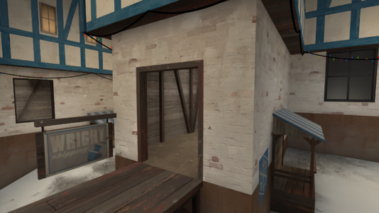
As an example related to that - it's really hard to tell the difference between this shed that's supposedly part of a factory, and the green plaster house right next to it. They're the same height, width, roughly the same colour, and aren't factory yards usually separated from residental areas by a metal fence?

I can suspend disbelief for the house where you deliver the presents being right next to the main factory building, because the main factory building actually looks different from the house and kind of forbidding, which sets off the right signals in my subconscious. But the factory's shed lacks that distinction, and it makes the whole illusion fall apart for me.
In a similar vein, here are some construction-related nitpicks (although take them with a grain of salt since I'm no construction expert and I also just generally don't get out much):
-It doesn't really make sense to me that a brick building would have a wood interior. Brick walls are pretty sturdy, so they usually don't need wood beams, and especially not wood planks pasted on the interior. How would you even nail them in?

-In the same building, it doesn't really make sense for the concrete foundation to suddenly go up 64 units. I reckon a concrete foundation would usually be built at a constant, unchanging height, and any internal variations (if necessary) would be done with brick and/or wood. It also makes for an ugly visual transition on the corner of the outside of the building.
-For these stalls, it kind of looks ugly where the beams transition into wood planks. I would understand more if the wood planks were pasted on the outside of a triangular beam like the one I've drawn here, but they aren't. Apologies if this was already an improvement you planned to make further down the line.

-I'm pretty sure it doesn't make sense for the wood beam plaster texture to have a stone trim that goes right over the wood beams. I think it makes a little more sense with the purely plaster walls, cause it kind of implies that the wall is stone and was plaster over, except on the edges for some reason. I think that plaster wouldn't be used in that context, but you're allowed to stretch the truth a little. But not for the wood beams, because it directly implies that the wall is made of both stone bricks and wood beams, and they don't interact in a sane way.


-The trees and the building skycard texture interact with each other in a way that causes rendering issues. From my rudimentary testing I've determined that they're both in the 3D skybox, so this is likely a transparency sorting issue.


I think this does a really good job of showcasing all the little details and polish that're needed to make a scene look truly great.
Also, when you're making a building - who lives or works in it? If they want to have a smoke, what porch or balcony outside are they gonna go to so they don't hotbox the place?
There's also one cool detail that I thought of, now that the BLU factory is actually animated:
You have these flaps over the packaging machines, which is a cool detail in itself, but they don't actually move when the presents pass through them, which is a total buzzkill:

So, make them flap up. You have the same size object moving through them every time with predictable timing, it shouldn't ever desync. The presents are also the perfect size for you to make only the middle three flap up. Maybe you could even slightly vary the time delay so the middle one flaps up first and it looks a bit physically simulated even though it isn't. If that makes sense.
I also appreciate the inclusion of the funny reddit spycrab on the conveyor belt, even if it's not meant to be a funny reddit moment. When making maps, it's important to remember that you need updoots from the 12 year old workshop and r/tf2 kiddies. I definitely know that the most interaction I ever had with the workshop as a customer was when I was 12!
I don't know why I keep butting in with this map. It's not my map, you're free to detail it however you want. But I do think this map will get in the game, and I want it to be really special when that happens.
Too many smissmas maps are just "normal TF2 map but with snow and presents". We can do better. We have the power to come up with fresh, original themes that are still detailed beautifully and still feel like TF2, and can still get accepted into the game, but the reskin approach is unfortunately tried and tested, and Wutville didn't exactly give people confidence that a new, original theme could be good.
But I think this map has the potential to stand out from the crowd. Its tight layout and unique story of "deliver the present" sets up for a storybook christmas town, with high-up windows protruding from old medieval walls complete with balconies adorned with flowers, shop windows blazing yellow light onto the snowy paving stones, and a busy town square with wood stalls and carts professing their wares, surrounding some central well or statue.
However, I think this map isn't there yet, and it needs the extra effort to really feel lifelike, or better than lifelike - like a beautiful painting. Which is basically what I'm getting at with this essay.
For starters, I think the map is too bright. It's good to have a lot of ghost lights to light your map's gameplay space, or to use bright light_environment values so the sun does the heavy lifting for you in terms of player visibility... but that's for alpha.
The Source engine can do dark areas really well. It's one of the perks it had over Goldsource. But it really feels like this map misses out on that opportunity. Everything is pretty much equally bright. It needs some variety, some contrast.
Here's a screenshot from Vampire: The Masquerade - Bloodlines (weird pick, I know, but its detailing really impressed me) which I hope illustrates this point:
This area actually has a very simple roofline and little overhead detail. But to compensate for this, it offers you a lot of eyecandy inbounds, and more importantly, it's dark as fuck out of bounds.
Here are the light_environment settings for the map in the screenshot:
Direct Brightness: 71 75 126 75
Ambient Brightness: 81 130 155 5 (!!!)
Colours:
As you can see, the lighting is not only very dark, it's also very blue/purple. This is important, because it creates a dual contrast with the bright yellow in-bounds lighting, which naturally draws your eye to the parts of the map you can actually see.
The lighting is also carefully coloured to match the sky, meaning the roof blends in with the sky and fades into the background even more.
All of these things are absent from Chimney. The out-of-bounds area does a decent job of being darker than the in-bounds area, but the higher parts of the in-bounds area don't. This, combined with the very static blue-white lighting throughout the map, means that the average screenshot of Chimney looks very bland and low-contrast:
This is why I think lighting is so critically important. When I look at Chimney, and I look at the 2004 game Vampire: The Masquerade - Bloodlines, I keep thinking that the 2004 game is prettier, even though I really don't want to. This also happened to me when I replayed Half-Life 2 and looked at a bunch of people's maps. We should be doing better than 2004 games, but we often aren't, and we need to find out why.
This is not to say that I have nothing good to say about Chimney. That screenshot I took has really good composition. The rooftops in the centre top frame are the perfect height to draw your eyes to the higher and lower areas to the left and right, as well as the all-important roof that you have to defend. Although I do wish the wall of that building was darker so it looked different to the identically textured building to its left.
This is another area that I think has really good composition for similar reasons. The lighting is also much better here!
However, I feel it's ruined by the highly visually busy 3D skybox. It has trees, buildings, and a texture meant to represent buildings, but they're all at roughly the same height. If this was Half-Life 2 or Vampire: The Masquerade - Bloodlines, I bet this area would look more like this:
This might make you privy to another thought I have: I think generally the visual of the town infinitely extending into the distance is very cool, but it lacks variation and needs to be broken up with some taller buildings. Maybe part of it could be a graveyard on a tall hill with graves and the manor gothicfences silhouetted against the sky. Maybe one building could be a church with a bell tower, or mansion with a clock tower. Maybe there could be a cliff breaking up two parts of the town, with a solitary house on top of said cliff.
I understand that it's hard to do that without making the 3D skybox more visually interesting than the main map and confusing players, which is why when I drew these elements into my paintover, I drew them very close to the main map and much taller in the frame than the relatively flat 3D skybox, making them unmistakeable, I hope.
As an example related to that - it's really hard to tell the difference between this shed that's supposedly part of a factory, and the green plaster house right next to it. They're the same height, width, roughly the same colour, and aren't factory yards usually separated from residental areas by a metal fence?
I can suspend disbelief for the house where you deliver the presents being right next to the main factory building, because the main factory building actually looks different from the house and kind of forbidding, which sets off the right signals in my subconscious. But the factory's shed lacks that distinction, and it makes the whole illusion fall apart for me.
In a similar vein, here are some construction-related nitpicks (although take them with a grain of salt since I'm no construction expert and I also just generally don't get out much):
-It doesn't really make sense to me that a brick building would have a wood interior. Brick walls are pretty sturdy, so they usually don't need wood beams, and especially not wood planks pasted on the interior. How would you even nail them in?
-In the same building, it doesn't really make sense for the concrete foundation to suddenly go up 64 units. I reckon a concrete foundation would usually be built at a constant, unchanging height, and any internal variations (if necessary) would be done with brick and/or wood. It also makes for an ugly visual transition on the corner of the outside of the building.
-For these stalls, it kind of looks ugly where the beams transition into wood planks. I would understand more if the wood planks were pasted on the outside of a triangular beam like the one I've drawn here, but they aren't. Apologies if this was already an improvement you planned to make further down the line.
-I'm pretty sure it doesn't make sense for the wood beam plaster texture to have a stone trim that goes right over the wood beams. I think it makes a little more sense with the purely plaster walls, cause it kind of implies that the wall is stone and was plaster over, except on the edges for some reason. I think that plaster wouldn't be used in that context, but you're allowed to stretch the truth a little. But not for the wood beams, because it directly implies that the wall is made of both stone bricks and wood beams, and they don't interact in a sane way.
Now some minor bugs:
-The 3D skybox isn't aligned with the main map's displacements, and is much darker and more flatly lit than the main map, to the point where the transition is really jarring and obvious. This is probably because the map's ghost lights can't actually lighten the 3D skybox, and because the 3D skybox's luxel scale is scaled up by a factor of 16, making the buildings look like they have a luxel scale of 128.-The trees and the building skycard texture interact with each other in a way that causes rendering issues. From my rudimentary testing I've determined that they're both in the 3D skybox, so this is likely a transparency sorting issue.
Thank fuck, we're finally at the last paragraph:
This didn't really fit anywhere else, so here's another screenshot of Vampire: The Masquerade - Bloodlines:I think this does a really good job of showcasing all the little details and polish that're needed to make a scene look truly great.
- -The 2dsky is augmented by swirling clouds in the 3dsky to create a sense of wind blowing so it feels colder and more like nighttime
- -Sound treatment also helps to accomplish this
- -There are birds flying overhead
- -There are cables between utility poles (YM told me this was a good thing in his nodraw.net guides)
- -The street is furnished with plausible details like stoplights, crosswalks, sidewalks, streetlamps, bus stops with benches, even some wacko waving a sign around saying the end of days has come for us all
- -The buildings lack detail, but they're shrouded in darkness and silhouetted against the sky, which lets you imagine detail that isn't there and provides strong composition for the scene
- -In the left, there are some buildings on a higher plane past an obviously inaccessible tunnel (well, obviously inaccessible or obviously a portal to another level, but in this case it's inaccessible)
- -Almost every light source is diegetic (actually exists in the world, not a ghost light) and garnished with an env_sprite
- -Even these are still enough to brighten up the scene
Also, when you're making a building - who lives or works in it? If they want to have a smoke, what porch or balcony outside are they gonna go to so they don't hotbox the place?
There's also one cool detail that I thought of, now that the BLU factory is actually animated:
You have these flaps over the packaging machines, which is a cool detail in itself, but they don't actually move when the presents pass through them, which is a total buzzkill:
So, make them flap up. You have the same size object moving through them every time with predictable timing, it shouldn't ever desync. The presents are also the perfect size for you to make only the middle three flap up. Maybe you could even slightly vary the time delay so the middle one flaps up first and it looks a bit physically simulated even though it isn't. If that makes sense.
I also appreciate the inclusion of the funny reddit spycrab on the conveyor belt, even if it's not meant to be a funny reddit moment. When making maps, it's important to remember that you need updoots from the 12 year old workshop and r/tf2 kiddies. I definitely know that the most interaction I ever had with the workshop as a customer was when I was 12!