Axle

CP axle rc

grazr

Old Man Mutant Ninja Turtle
aa
Mar 4, 2008
5,441
3,814
Last edited:

Seba

DR. BIG FUCKER, PHD
aa
Jun 9, 2009
2,364
2,728
Are those SGs there permanently?
 

Lazy Eskimo

L2: Junior Member
May 17, 2009
74
11
Med cabinets are too close to the doors. People can abuse it.

I don't like the one way path that leads right out to final cp. It's do or die for a very cheap backcap. I suggest to take path out.

Without that path unless you rocket jump there's only one way into first cp building. Which splits into only two ways to attack cp room. If you manage to get in both paths would be frustrating to attack.

If you go lower path once you go down ramp you will have a hard time pushing through with enemy having that vertical advantage in next room.

Higher path travel time is a bit long. When you hit the long hallway you have to go through a small entrance and fight at a major height disadvantage.

Sniper on first cp ledge is too powerful covering 2nd.

There needs to be area between middle and 2nd. Too easy to cap 2nd once you win middle fight and they are down players.
 

grazr

Old Man Mutant Ninja Turtle
aa
Mar 4, 2008
5,441
3,814
Thanks for giving it a walk through.

I had been considering a third entrance into the base from the middle CP area, what do you think of that? Originally there was a tunnel from the lower gulley that accessed the higher floor within the base, but this added 4 entrances to the base including rocket jumping, when i wanted the final CP to be a difficult battle but the middle 3 easier to take. So the map could easily swing from one teams advantage to another, and feel a little more like A/D whilst retaining the 5 CP setup and quality. The orientation of the final cp room gave me some difficulties in entrance options. I may rotate the 'base' so it directly faces the second CP, rather than the middle. To have some more sterotypical entranceways.

What i want to do is get the map playtested so i can find out peoples prefered travel patterns in the map. I was thinking of moving the CP2 back somewhat so that there were more defencive oppotunities. Originally there was no middle point which accounts for the small distance between the central and second control points.

I'll move the cabinets back as you suggested. I didn't think much of cabinet abuse as one had to drop down from a platform to get directly into a battle. But i guess they could just stand up there spamming.

Hopefully the layout changes will address your key points.
 

grazr

Old Man Mutant Ninja Turtle
aa
Mar 4, 2008
5,441
3,814
By the way, did this even get played in the end, last weekend?

I put it in for Saturday's U.S. gameday but said it could be moved to Sunday if it was necassery, due to the high map submission count.

Also, i asked for sourceTV as i was unable to attend, where are these?
 

AntonJ3000

I am inactive and make horrible maps
Oct 29, 2008
401
90
Played this map on Gameday today.
Stuff that you should change:

More signs, hard to find where to go.

HL2 Skybox, Just change it on Map Properties. List of skynames here

No Cubemaps, You said that you wouldn't bother with it until Beta, but you should do it anyway, Just because it's alpha you don't need to make it look bad on purpose.

Lack of playerclips, more specifically you could jump on the buildings near a control point, Video of it below:
[ame="http://www.youtube.com/watch?v=ZE59IyL2iuI"]YouTube - -UPLOADED TO BE LINKED ON TF2MAPS.NET-[/ame]
 
Last edited:

littleedge

L1111: Clipping Guru
aa
Mar 2, 2009
986
605
http://dl.getdropbox.com/u/1490725/cp_axle_a10020.jpg
http://dl.getdropbox.com/u/1490725/cp_axle_a10021.jpg
First picture shows you where I am. Second picture shows the problem: I have to jump to get up there. Not a good thing.

http://dl.getdropbox.com/u/1490725/cp_axle_a10034.jpg
These need playerclips to smooth out. I don't want to get stuck on them like I can now.

http://dl.getdropbox.com/u/1490725/cp_axle_a10032.jpg
Red computers in BLU base!? This is madness!

http://dl.getdropbox.com/u/1490725/cp_axle_a10030.jpg
You can only get on the point if you take the correct path, or if you rocket jump up. Add some ramps to get up.

http://dl.getdropbox.com/u/1490725/cp_axle_a10028.jpg
Dark rock is dark.

http://dl.getdropbox.com/u/1490725/cp_axle_a10027.jpg
Dark rock is dark. Also: I get stuck on it, you should playerclip it for easier movement.

http://dl.getdropbox.com/u/1490725/cp_axle_a10026.jpg
http://dl.getdropbox.com/u/1490725/cp_axle_a10025.jpg
http://dl.getdropbox.com/u/1490725/cp_axle_a10024.jpg
http://dl.getdropbox.com/u/1490725/cp_axle_a10022.jpg
I can get out of the map and on the roofs. Playerclip it all.

http://dl.getdropbox.com/u/1490725/cp_axle_a10023.jpg
I can see the skybox. Nodraw where it should be drawn, maybe?


The main problem with your map is this: the layout is confusing. It seems like the last point is out of the way of the others. To top it off, we couldn't even find it most of the time.

http://dl.getdropbox.com/u/1490725/cp_axle_a10033.jpg
Nobody will see that door. It's out of the way, and we go straight because it's the fastest route.

http://dl.getdropbox.com/u/1490725/cp_axle_a10029.jpg
There's only one way into the last point for the other team. If BLU just camps this tunnel, RED cannot get into the last point at all (omit spy cap)


http://dl.getdropbox.com/u/1490725/cp_axle_a10031.jpg
I'm a fan of this geometry work. Looks nice ( ^_^)b
 
Last edited:

grazr

Old Man Mutant Ninja Turtle
aa
Mar 4, 2008
5,441
3,814
Doh. Player clips...

I hope this didn't break gameplay too much.. i would like to know what people think of the layout.

I'll be turning the bases 'around' so hopefully navigation will generally be a whole lot easier regardless of signage. But i'll try and include more in my next release.

The skybox should have been TF2.. Hmmmm perhaps the DL file was not properly updated. My vmf environment settings are set up properly.
 

grazr

Old Man Mutant Ninja Turtle
aa
Mar 4, 2008
5,441
3,814
http://dl.getdropbox.com/u/1490725/cp_axle_a10020.jpg
http://dl.getdropbox.com/u/1490725/cp_axle_a10021.jpg
First picture shows you where I am. Second picture shows the problem: I have to jump to get up there. Not a good thing.

http://dl.getdropbox.com/u/1490725/cp_axle_a10034.jpg
These need playerclips to smooth out. I don't want to get stuck on them like I can now.

http://dl.getdropbox.com/u/1490725/cp_axle_a10032.jpg
Red computers in BLU base!? This is madness!

http://dl.getdropbox.com/u/1490725/cp_axle_a10030.jpg
You can only get on the point if you take the correct path, or if you rocket jump up. Add some ramps to get up.

http://dl.getdropbox.com/u/1490725/cp_axle_a10028.jpg
Dark rock is dark.

http://dl.getdropbox.com/u/1490725/cp_axle_a10027.jpg
Dark rock is dark. Also: I get stuck on it, you should playerclip it for easier movement.

http://dl.getdropbox.com/u/1490725/cp_axle_a10026.jpg
http://dl.getdropbox.com/u/1490725/cp_axle_a10025.jpg
http://dl.getdropbox.com/u/1490725/cp_axle_a10024.jpg
http://dl.getdropbox.com/u/1490725/cp_axle_a10022.jpg
I can get out of the map and on the roofs. Playerclip it all.

http://dl.getdropbox.com/u/1490725/cp_axle_a10023.jpg
I can see the skybox. Nodraw where it should be drawn, maybe?


The main problem with your map is this: the layout is confusing. It seems like the last point is out of the way of the others. To top it off, we couldn't even find it most of the time.

http://dl.getdropbox.com/u/1490725/cp_axle_a10033.jpg
Nobody will see that door. It's out of the way, and we go straight because it's the fastest route.

http://dl.getdropbox.com/u/1490725/cp_axle_a10029.jpg
There's only one way into the last point for the other team. If BLU just camps this tunnel, RED cannot get into the last point at all (omit spy cap)


http://dl.getdropbox.com/u/1490725/cp_axle_a10031.jpg
I'm a fan of this geometry work. Looks nice ( ^_^)b

Thanks for the feedback.

Yea, my major bad was not player clipping the submission. I had thought i had updated the vmf but obviously it had failed.

I've had a lot of feedback about the base being out of the way. I'm going to move it to either make the map linear like granary, or flip it over to behind the second CP. I think this improvement is unanimus. Hopefully this will give me more oppotunities for base entry ways. I had hoped double backing on ones self would make for more interesting gameplay between CP 2 and 1, but i guess it just confused players.

There was a second entry into the base via a sewage way. Which was supposed to have water in it and thus preventing the need to jump up. It seems that was missing from the update also. As well as rocket jumping onto the battlements. making that 2 and a 'half' entrance possibilities.

I had considered putting ramps in the central area, but wanted to make the bridge a focal point. Perhaps it was too important. I'll include them in my next update and see what people think.
 

J4CK8

L11: Posh Member
Mar 4, 2009
820
243
I lik ethis map, especialy the rounded doorway mentioned above. It has some good architect but needs signs. Most people got lost right away, I was still near our final cap whilst the other half of out team was cappign mid. As the game went on, I didn't get lost as much, but there are a couple of really dark coridors that need lighting. I think it was mainly the cordior leading from cap 2-mid cap bridge.

Also, in an unreltade note: Woo I killed Inferno in the 3rd pic from last in above post :D
 

grazr

Old Man Mutant Ninja Turtle
aa
Mar 4, 2008
5,441
3,814
Yea, i'm inclined to ignore most "i got lost" comments when people have only played one game of the map. But i'm always open to actual suggestions of improvement. Hopefully my changes to the first CP (base) will improve what you initially had trouble with.

The best i can think of at the moment is to include letters to the current arrow signs. But i don't know whether this will confuse players, due to it being a 5cp push map. I will endeavor to include more arrows though.

Hopefully my intentions will address all your concerns.
 

grazr

Old Man Mutant Ninja Turtle
aa
Mar 4, 2008
5,441
3,814
A little bump for yesterday's gameday since this got thrown 3 pages back overnight.

I watched the gameday demo and was a little dissapointed about the greeting it recieved as an A1. Most of the people couldn't get over the lack of cubemaps, textures and HL2 skybox so much they completely missed the point of its submission.

My major concern was the location and orientation of the base which has through some limited yet unanimus feedback suggestions been put on my changes list for modification.

A lot of people called for a ramp in the middle which i think i can requisition for you guys.

If anyone else has something to say layout wise i would like to hear it before i make a2 of this map.

Thanks to the individuals who seemed to grasp the concept of a1 whilst playing the map. Especially Littleedge. Rather than complaining and bitching about wanting to throw their computer out the window or something, which was childish and in no way helpful to the development of this map.
 
Last edited:

Lazy Eskimo

L2: Junior Member
May 17, 2009
74
11
You weren't planning to do a lot of work on mid? I had assumed it was a placeholder. If not a placeholder I have a big problems with it. It's so very basic. It's just two upraised squares.
 
Last edited:

grazr

Old Man Mutant Ninja Turtle
aa
Mar 4, 2008
5,441
3,814
You weren't planning to do a lot of work on mid? I had assumed it was a placeholder. If not a placeholder I have a big problems with it. It's so very basic. It's just two upraised squares.


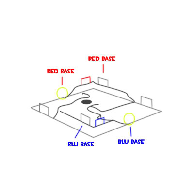
The middle has actually gone through several variations already. Originally there was actually no middle CP, it was only a 4 CP map. I tried a variaty of strong optimisation efficient layouts but failed to make the 2 'mid' points work with my desired theme and not have them overly sniper friendly and generally unbalance certain classes. I wanted to keep my theme more than the concept of a 4cp map so i chose to modify the layout rather than my intended theme. the original layout was 2 bases each with it's own nomans land otuside, with 3 possible entryways into the opposing nomans land. This would also make it easily modifiable for CTF mode as well.
layout1.jpg


So, i added in a central CP that was divided in two, so it was capturable from both sides of a seperating wall, meaning players would have to fiercly battle and flank each other to control the central CP. But also made it easier to capture in a counter attack, being capturable from cover provided the enemy did not strongly control your CP2. But i had trouble making it visible to both teams, as to who owned the point, other than on the HUD, without allowing players to see through to each area; effectively making CP2, 3 and 4 all physically visible at once.

I then expanded the wall into a tunnel which needed to be captured from the inside; part of which design currently remains in a1 (the dark tunnel that has been duplicated to either side of the central cp, that i forgot to update the lights in).

I changed this as i thought it would promote too much spam. Eventually expanding it into a fully fledged 5cp map with no central gimmick.

Essentially the central CP is not so much a placeholder as the layout is functionally as intended, but it has yet to be developed into detail for my theme. The layout will remain as is, but with ramps allowing exit from the valley without having to retreat or attack an enemy base a'la 2fort (as this upset players). Unfortunately it is hard to make any central area pretty in a1 without over doing the DEV and without an existing focal model, so this will have to do for now.

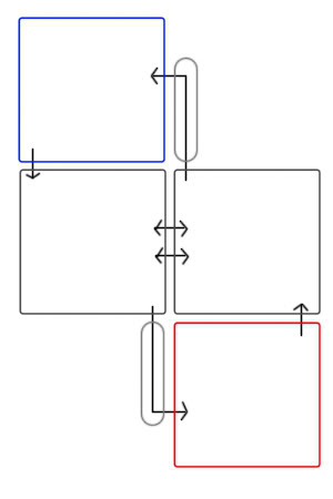
layout2-1.jpg


This is my intended modification:
Additional sewer entry either directly into base or towards CP2. As seen in yellow. This will be made possible by moving the base (and subsequently CP1) to behind CP2, within the buildings, rather than opposite it.
Additional ramp up to either side of CP3.
Additional forward spawn for controlling CP4. Similarly to Badlands.

Hopefully people approve?
 
Last edited:

grazr

Old Man Mutant Ninja Turtle
aa
Mar 4, 2008
5,441
3,814
Small progress bump.

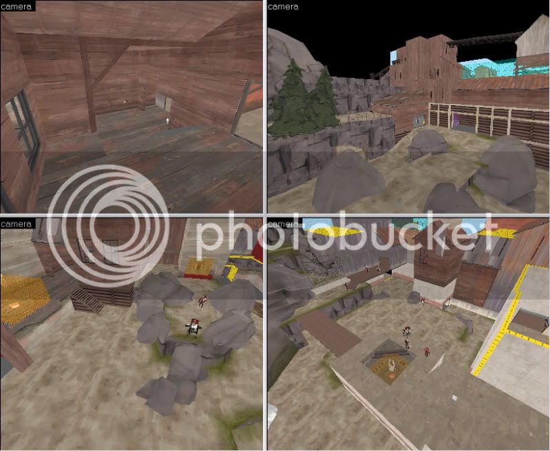
axle6.jpg


cp_axle is recieving a largish overhaul for _a2. I've completed most of my displacement work early. Against my better judgement. It will consist of a now majority textured version of its predecessor. going for an alpine theme (vs desert as originally intended). Minor detail inclusions. Third advanced spawn for holding enemies secondary CP. Completely New Final point. Which may dissapoint some people as this means a lot of the rounded architecture is now gone and replaced. Overall layout now comparable to Granary.

_a2 release is as soon as i can cordon the middle with a skybox, copy and rotate the Red base, retexture Blu base accordingly. Hopefully the middle wont seem so boring now with some included detail and subsequent cover.