it's not about improving light casting on the model but more making the round shape believable.
some examples from the game:
vault_door has ~32 sides
even the tiny wallclock model has 32 sides..
it's neither "massive unnecessary overkill" nor unoptimized work by valve. polygons are cheap today. but i'll stop here. tried to fight this fight too often in here
")
you know what looks good in your map !
I'm up for making any changes if there's a good reason.
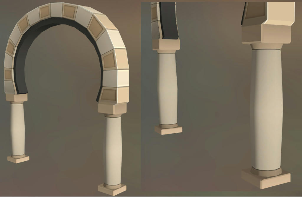
I looked up the models you mentioned, and maybe we're talking about different parts of the arch? That vault door needs to have at least 32 sides because the round shape of the arch is viewed from the front. Same with the clock, wagon wheel, etc., normal maps/smoothing groups are useless in this case so more geometry is the only way. I assumed you were talking about the columns, but are you actually referring to the archway? If so, the only reason mine is lower poly is because it's built from bricks and not intended to be a rounded surface. I just want to clarify that we're on the same page so I can understand you better.
Increasing the sides of the columns to 24 is still well in my reasonable budget for this model. So if you guys think it's a noticeable improvement, I'd be happy to go with that.
I would still dispute the argument that "polygons are cheap", though. It's really bad practice to think in these terms as a modeler, even with next gen games. I overhear the art lead bitching/joking about people who don't optimize enough all the time at work, and applications from talented artists are thrown out for this reason all the time.
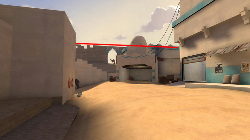
I'm thinking wood trim somewhere on the blue building on the right would be a big help for visual interest. Also is that building in the background the second shed thing that we were all talking about changes before, or am I just retarded?
Edit:
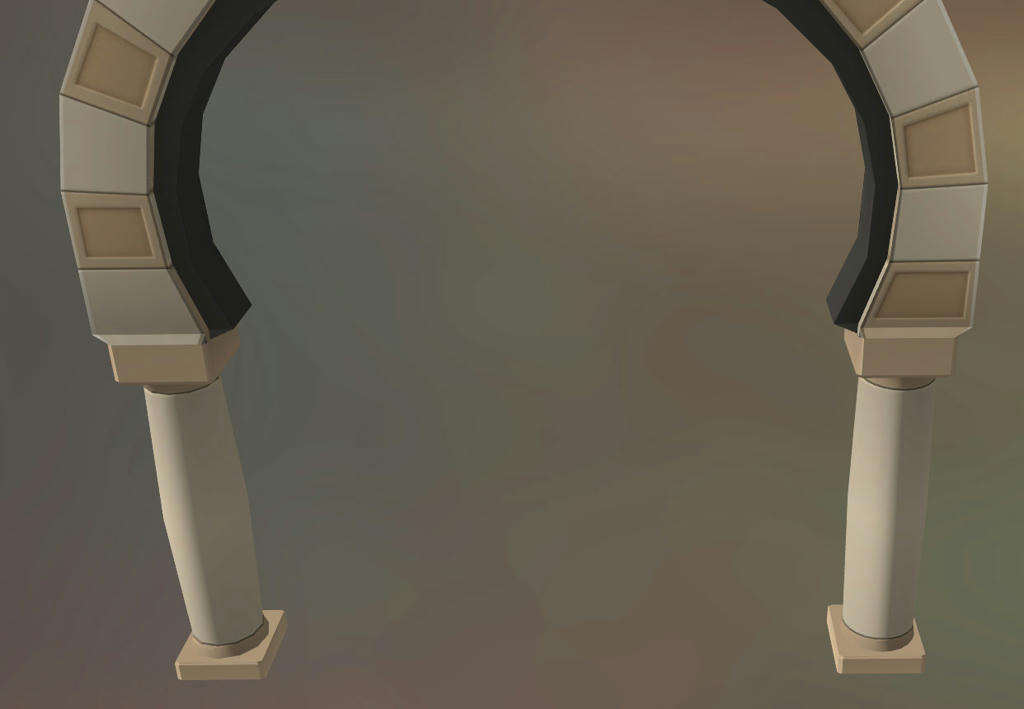
Oh, and I'm not too crazy about this straight line that forms across the top here. Maybe it's only from this angle, but it creates a sense of stasis. This is a nitpick.