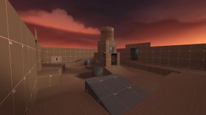
First off, last is just a flat brush. There's really nothing else to it, its boring and flat. The defending team does not even have any pickups on their side what so ever. Notice how on competitive 5cp maps, you've either height advantage to the sides of the point (Badlands, Gullywash), or you don't but last still has height differences (Process, Sunshine). I see you are trying to make this for 6's, so try to take inspiration from those maps? Even if you weren't, last is just bad design.
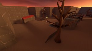
Second suffers the same problems as the previous version, along with last in this version. It's flat, bland, and boring. Nothing really going on with it. I'd highly suggest making your ground displacements, and creating some terrain with height differences. Second is just on one big, flat brush.
These stairs are too steep imo.
Top of this door frame leading into second has a lip sticking out. Not trying to be picky, but this shows that you are working on a grid size too small. I'd highly suggest working on a 16 - 32 grid size, and only dropping down to 8 every now and then for situational needs.
At middle; lip sticking out.
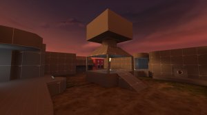
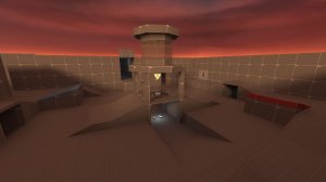
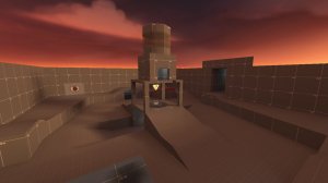
This circular object sticks out a tiny bit, and I've noticed myself rocket jumping while being close to the beam, and hitting my head on the little part of the circular object. Also, why is it even there? Its clipped off, and it really serves no purpose to the gameplay. However it looks like you can get on there, but its clipped. Going back to getting inspiration from other competitive 5cp maps, mid is always on the low ground to something that soldiers and demos can get on easily. On Process those metal containers, Gullywash has two different levels of the cap, the main one that people who aren't sollys and demos being the lower, Snakewater has the those big ledges/platforms.
I notice how on your map, you have a ton of full health packs. Most competitive 5cp maps dont even have one, and you have your map scattered with em. This will be a problem being under mid:
A lot of mid, especially this area, is just flat. Make your ground displacements and create terrain with height differences, no matter what your theme is.
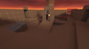
This entire room is way too dark, I had to turn on mat_fullbright to see where I was going.
I think you have an invalid brush here (on both sides of the map):
This cap zone feels too small for me, but may be okay, just need to see in testing. Though I'd suggest looking at decompiled maps that are your inspirations and seeing their cap zone size.
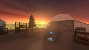
Floating props:
Again; way too dark:
Super huge sightline from this spawnroom, might be okay though.




 Cool Bruh