WiP in WiP, post your screenshots!

Mar 23, 2010
1,872
1,696
add a dangling scarecrow on the side of the castle tied to a rope hanging from a window
 

UKCS-Alias

Mann vs Machine... or... Mapper vs Meta?
aa
Sep 8, 2008
1,264
816
Sorry to clog up the pages a bit but I'm trying out some nice lighting:
B9EF37216AA40E678F810D4B48B046A569963534


I think it looks nice, but the castle is missing something. Any suggestions?
nice cp_gorge version :)

But as someone else said, filling up the sides will do alot. The right side is currently empty and even with some lower buildings similar to the left side it can do quite a bit detail wise. Youll however have to keep the castle as a main focus point.

Lighting wise i however would recommend to light up all walkable areas. At that buildings its currently hard to see that you can actualy walk into it. On the left side the inside has some light which already does quite a bit. On the right side that light isnt inside the building and makes it look like a dead end.

Even the bridge top and bottom should have some sort of light

Pumpkins or candles on the lowest area are a good light source since they dont realy stand in the way yet are very effective light sources. They dont lit up alot, but the floor still recieves most of it making it clear you can walk there.

The rules for a night based map are still required in halloween maps. Except you can often replace phantom lights with ones that come from props.
 

puxorb

L69: Emoticon
aa
Dec 15, 2013
531
799
Yep, a full lighting pass will be done. I remember yyler's guide on how to light up dark maps, and will be re-reading it for reference.

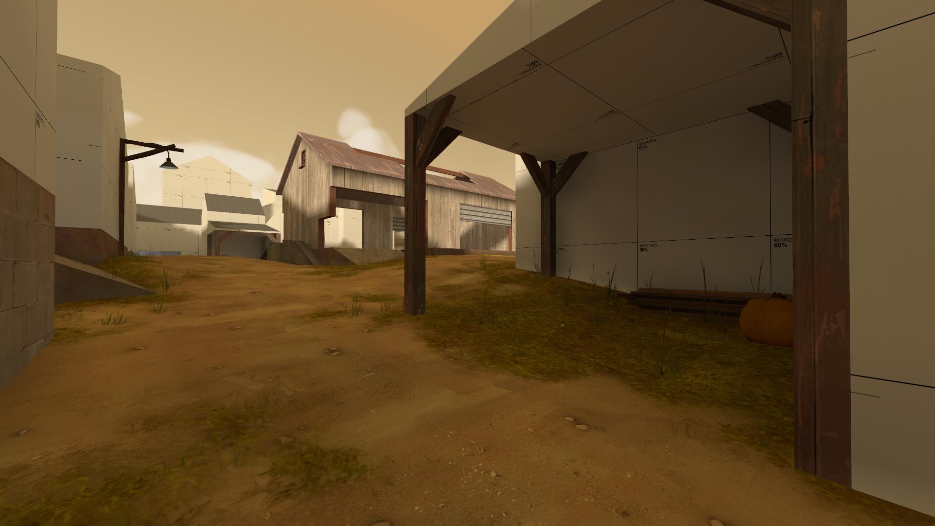
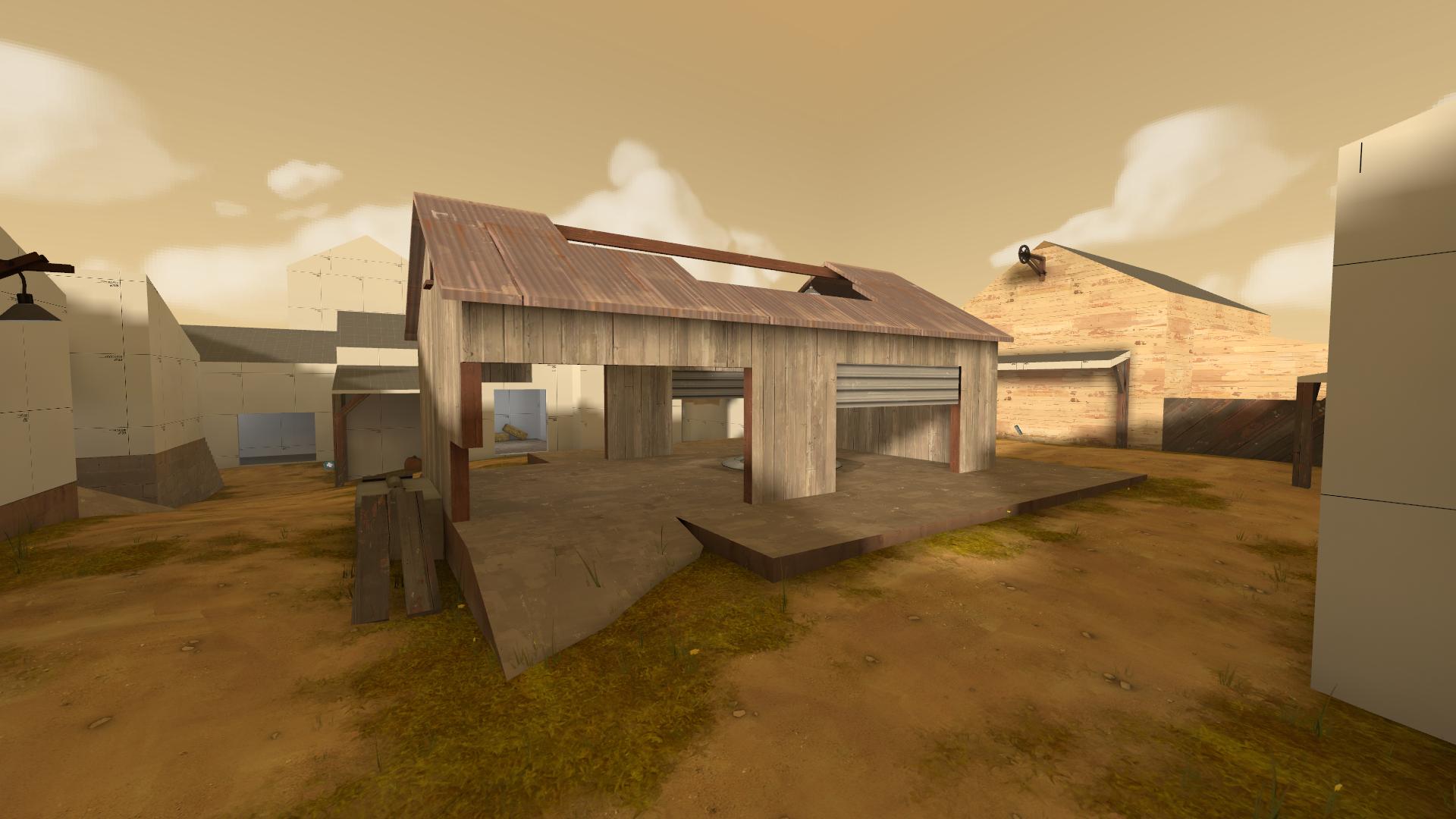
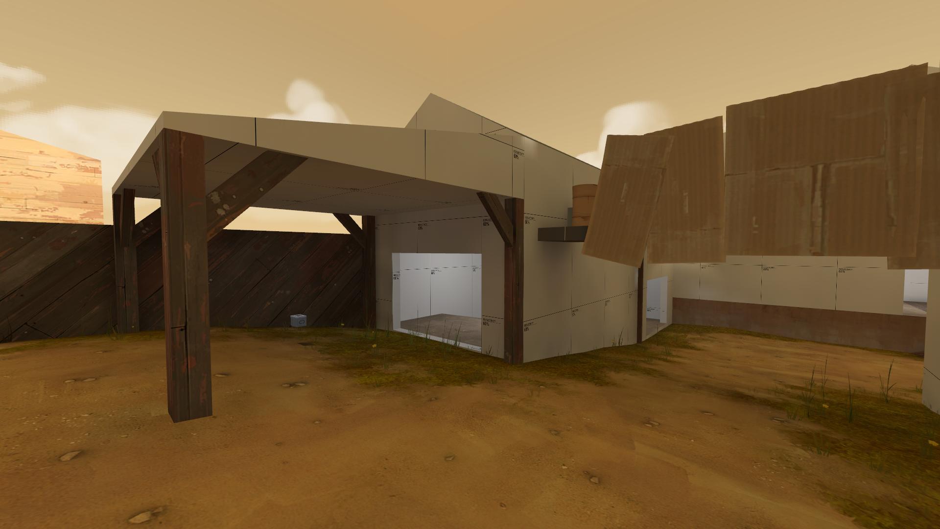
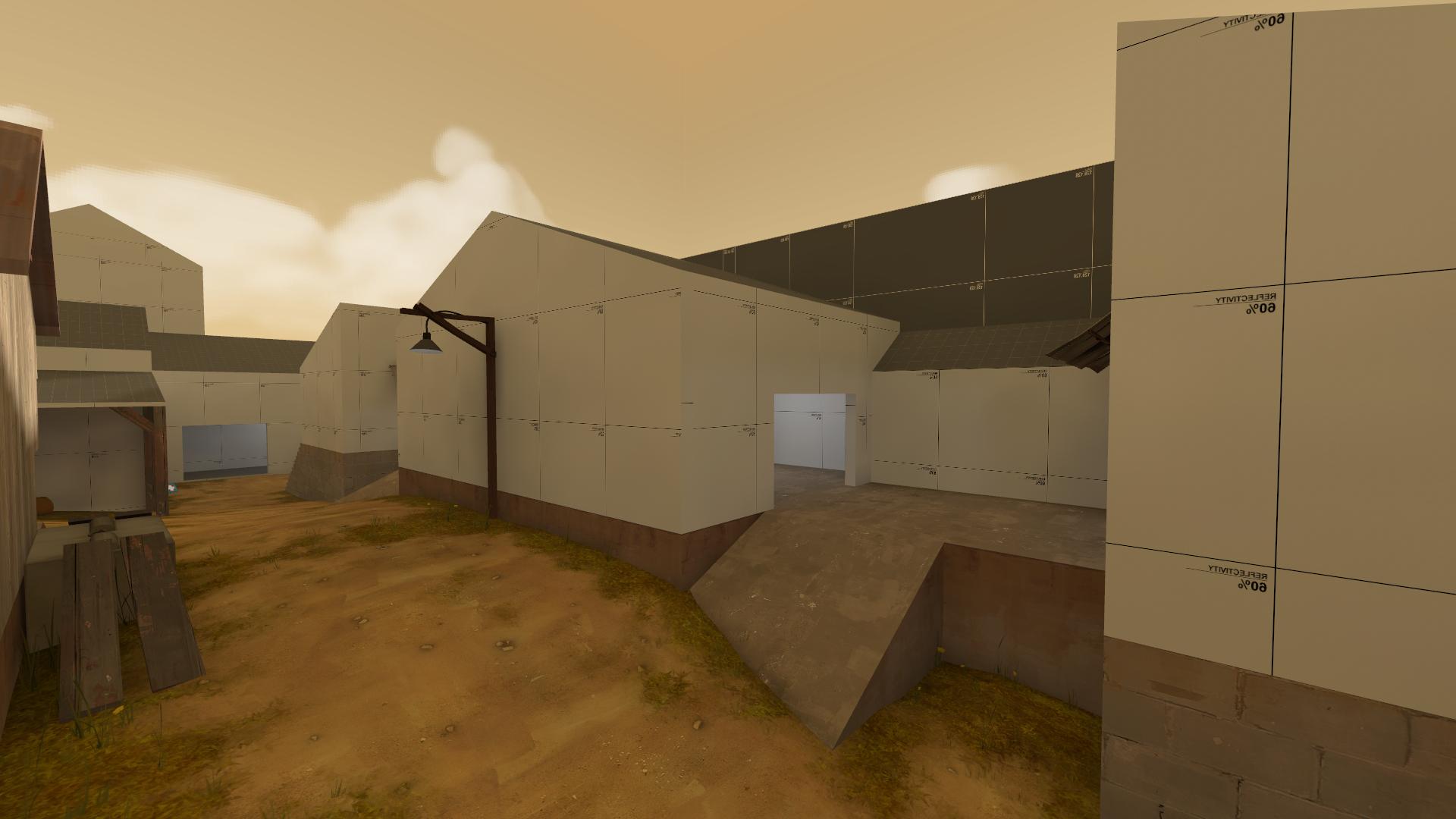
Also, I got a start on detailing the middle building:

4CF5AA283CD9F32E1B9AD99A147E0A6796DC7958

D57ABF5C4423FDD30E3C555636B3B2B914761210


Edit: I need help with those mountains. They look great on gorge but are ugly as hell in a halloween theme.
 
Last edited:

Jummbl

L1: Registered
Aug 30, 2014
24
9
Puxorb, I can't really tell from the pics so far, are you doing the 5cp version or the 2cp one?
 

Harribo

aa
Nov 1, 2009
871
851
Yeah, I'm not a fan of those modelled towers on the 1st building before the 1st point, 1 or 2 is fine in the whole scene but I think you are relying on them too much to spookify the place up. The left side of the building behind A doesn't look very castle like, more like a barn.
 

Yacan1

D I G I T A L I N F L U E N C E R
aa
Nov 7, 2010
411
793
Needs more support beams, just wood that is. Wall fixtures too like candles up the stairs. Needs stains and exposed pipes. The transition from white plaster to cobblestone walls isn't really smooth, maybe have more of a "utility" type room that changes over to it. Since with the paintings on the stone wall in the second picture in the back, it is kind of confusing. I assume the exposed stone is more behind the scenes stuff. Cobwebs and other decorations inside would be nice. m00r sp00ks
 

puxorb

L69: Emoticon
aa
Dec 15, 2013
531
799
Support beams! Duh! Those make the structure look a lot more realistic and add opportunity for interesting pipes, cobwebs and light fixtures. Thank you.

The past few days I have been focusing mainly on lighting, trying to get it up to an acceptable level, removing weird shadows, adding in some jack-o-lanterns and other light sources to make it seem realistic. Like I said, a lot of detailing to come.

But thanks for the ideas! :)


And for that painting in the back, that is actually hard to see from this angle, but its being stored there; it is leaning against the wall. Maybe I will flip it around.
 

wareya

L420: High Member
Jun 17, 2012
493
191
Those chairs on last are going to be incredibly fucking obnoxious, why not just do short benches that you wan walk up so there's nothing to worry about?
 

Jummbl

L1: Registered
Aug 30, 2014
24
9
Puxorb, it's looking great. Keep up the great work! imo, the lighting on the last point is too bright, maybe some bluish phantom lights around the points could add some atmosphere. I'd take my advice with a grain of salt, though.
 

Fantaboi

Gone and one day forgotten
aa
Mar 11, 2013
892
1,050
f3f7e58014.png

I've always wanted to showcase this map, and i'm so glad I discovered the depth of field effect
 

ZeGermanMedic

L1: Registered
Sep 10, 2014
24
8
The cp_gorge_event map really looks awesome. i am excited to play on that map someday when its finished! Oh, and also what Jummbl said - Maybe you should change the lighting at the last a bit, you clould also ignite the candles on the chandelier! That would make some atmosphere. :D
 

puxorb

L69: Emoticon
aa
Dec 15, 2013
531
799
Puxorb, it's looking great. Keep up the great work! imo, the lighting on the last point is too bright, maybe some bluish phantom lights around the points could add some atmosphere. I'd take my advice with a grain of salt, though.

I originally had blue phantom lights, but those were too dark. I might try to mix some orange and blue ones and see if that helps.
 

Seba

DR. BIG FUCKER, PHD
aa
Jun 9, 2009
2,364
2,728
f3f7e58014.png

I've always wanted to showcase this map, and i'm so glad I discovered the depth of field effect

I suggest removing the glow around the text, that way it'll look like an object in the map itself.
 

Harribo

aa
Nov 1, 2009
871
851
It is a barn :<
Why are you sad if I thought it looked like a barn when that's what you were going for? I don't understand, what I would say is I don't think a barn hanging off the side of a castle like butted right up against the side makes much sense but sure. I think it's coming along nicely, hope you work on it until Halloween.

A small change I thought might be cool is to make everything underneath the drop down to B a death pit:
QY5gYve.jpg

Could be interesting to make people have to defend B differently. Make a thread for it and I'll post it to some of the artsy TF2 bunch and see if anyone is interested in helping with paintovers or models maybe
 

puxorb

L69: Emoticon
aa
Dec 15, 2013
531
799
I like that idea a lot, but unfortunately I have book cases under the platform (not visible in that screenshot obviously). Today I added books to the table and created a couple of benches with some nice clip brushes, leaving only 1 chair at the head of the table. (You're welcome, wareya)