- Jul 26, 2010
- 112
- 39
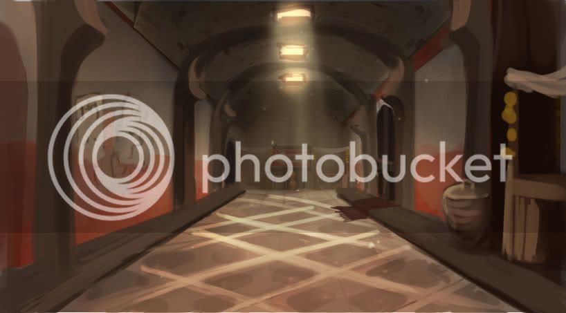
The brick texture doesn't really fit.
I was thinking maybe some sort of plaster maybe? What do you think?
The brick texture doesn't really fit.
Sorry, I just can't help myself.

")
Btw, whark I'm not sure if that was going to stay there, but what with the camel indoors? lol
The hallway doesn't need to be big and open. It COULD, but it doesn't need to be. The original is no taller than his detailed version, so I don't see the issue.
On another note, I'm really interested in what the CPs are going to look like on this. Don't forget to make the the visual points of interest.
Also I'd say those carpets are a little too busy and distracting. Try making the design a little less busy by for example removing the little triangles and making it look a little dustier.
The hallway is what made me post it, but it was a more general post about the whole map. So far it looks good, but while prettifying things it's easy to make the areas have lots of details and little room for the players. It's not happening yet, just saying it's something to look out for because this theme lends itself very well for something like that.
Point taken and your concerns are justified. Just bear in mind, that all of this that you see is inside the "Red Base" not outside. Outside is a whole other challenge.
Weird, could have sworn I posted this on page 8, but I think the post was eaten when trying to post. Or I became distracted by something shiny and closed the tab.
Anyway, yeah, this, exactly. The carpet with the blue in it especially should be heavily desaturated or the colours changed to more red & brown tones. As it stands, it draws the focal point right to the carpet, which is a little jarring due to how the geometry draws your focus down the hall.
Kep
If it's the RED base, I have another concern (woo) - how will you justify RED and BLU fighting over a random market? Are there going to be spytechy things at or around C?
Oh yea. Just for reference, this where the market area is located.


have no fear, the ceiling bsp in the original is now a player clip in the current version.
So wait... the ceiling from the original still exists, even though it looks like there's now an open space? Any soldier or demo man that tries to rocket/sticky jump in there, whether it's just to gain a brief height advantage or traverse the space more quickly, is in for a rude surprise.
If you're going to deny access to an area to players it had better LOOK like they either shouldn't be able to get there or otherwise wouldn't want to to begin with. Invisible walls/ceilings are uniquely annoying in any game, especially TF2.
The area looks awesome, but so long as players can't jump outside the playable area I don't think it's gonna change gameplay if you remove the playerclipped ceiling. Just playerclip the detail work so there aren't any ledges to perch on.
The final CP is a dangling mass of explosives that Red is digging up in a market courtyard. There will be a couple of explosive objects mixed in with the market goods as you get closer to it. Or that's the idea. I think that it would only be appropriate that when the match ends, the explosives fall into the stockpile hole and explode!
This actually explains all my problems of narrative I had with the map (why they would take a market, why there would be a random cardboard camel there), so go for it. Harvest used the exploding fruit thing as well, so it's not that out of place either.
Be sure to stick some spytech in there somewhere though, just enough to show that it's not all that (e.g. granary's spawn).


