Chemical Alia
L2: Junior Member
- Jul 22, 2010
- 98
- 52
Cool. I'll check that out.
Granary's starting area and backgrounds is the coolest thing about it. Like....there's a ship.
Cool. I'll check that out.
Granary's starting area and backgrounds is the coolest thing about it. Like....there's a ship.
I never pay attention while playing. I usually have to load a map alone and run about to really see it.
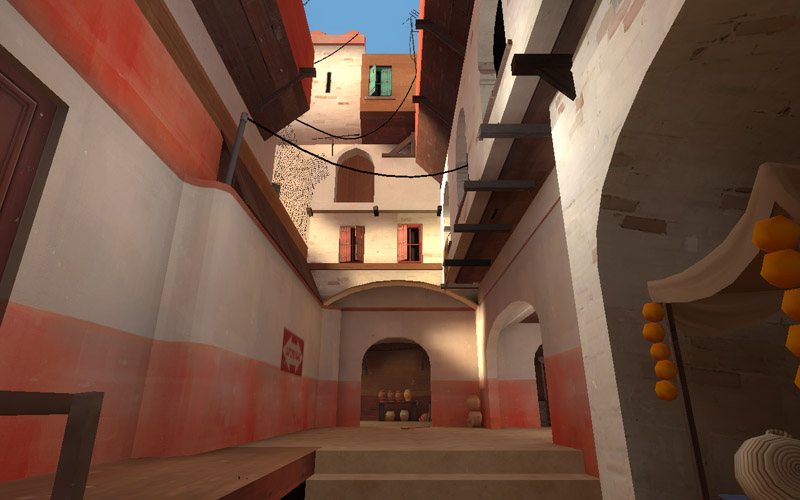
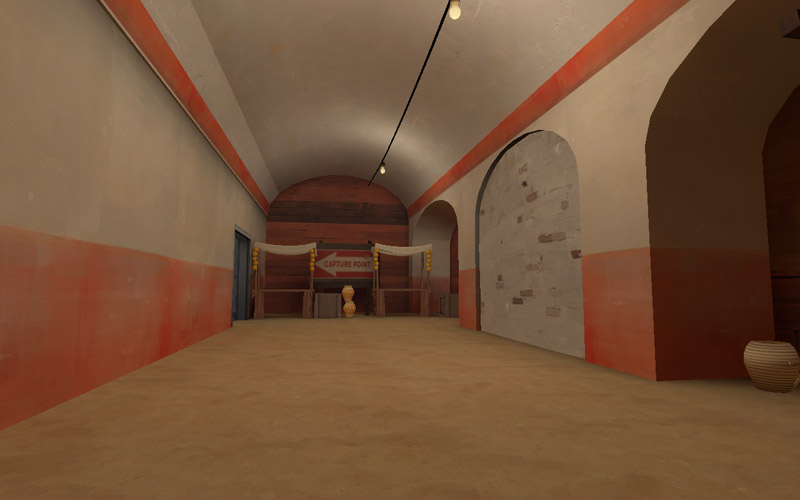
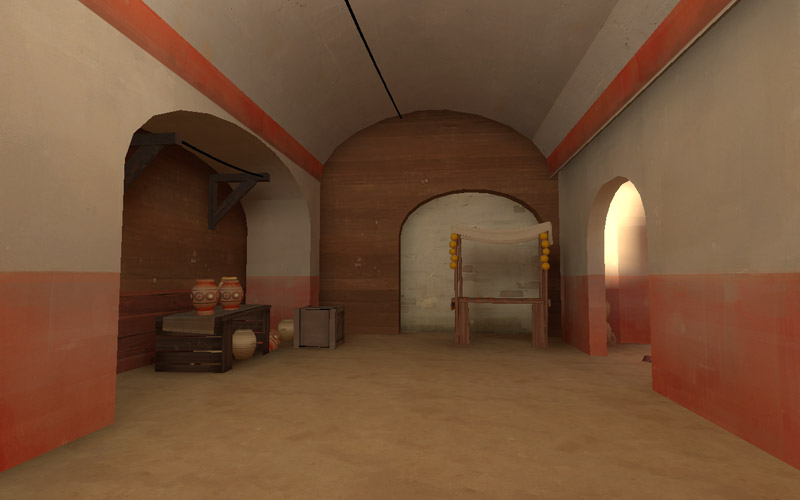
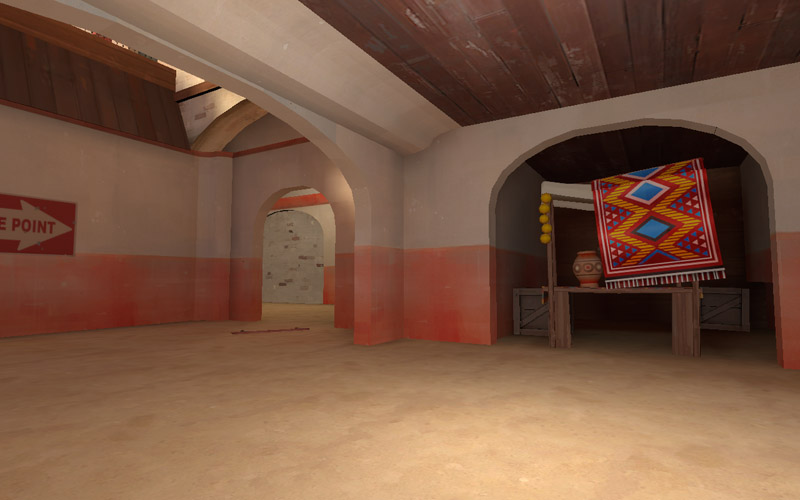
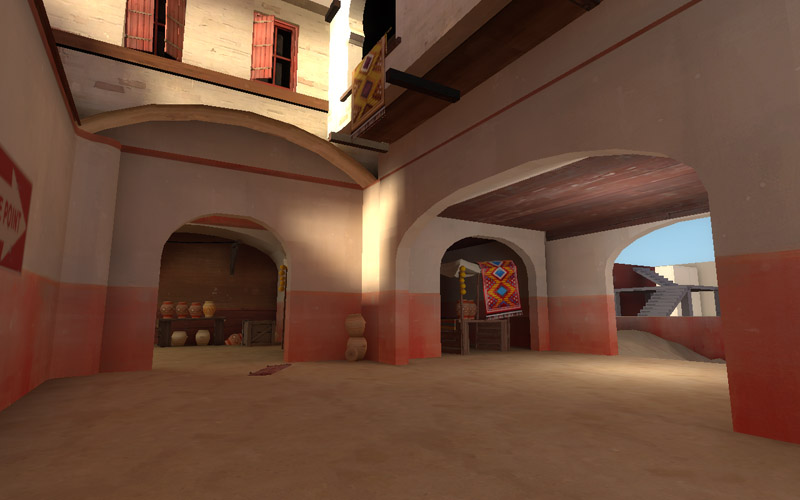
Perhaps you should try to have some models for your arch to have a better look in some place?
I've gotten pretty consistent feedback that that may be necessary. So, what I may do is get everything the way I want it using brushes then go back and replace them at the end once I have all the scales correct and all the geometry finalized.
Thanks.
I'm more than happy to make some meshes, after any of the other essential props are done (still gotta fix up those carpets too). I think they would add a lot.[/QUOT]
Thanks. I think they would go a long way in improving things. It would be quite some time before I would ask for them. There is this program called propper (don't know if it works with TF2) that can export brushes as meshes. Maybe once they are all in place I could just export the arches to models. Then you would have actual geometry that is the exact scale and shape for reference.
For reference hammer can export brushwork to DXF which 3ds max can import. Just need to attach them all and flip the normals after import and youre all good
i'd normally not advise this, but perhaps you should detail a single area to 100% to get a feel for how you'll fill in the rest of the world...
not convinced at the moment of the ability to pull the theme off, although your atttempt is laudable
I'm not really liking the color on that rug, I feel it sticks out in a bad way.
Fleshed out intersection between the entrance and the back alley area more.
Yeah, those rugs need to be desaturated (towards white) some. Too bright.
The vendor stall one should be faded less than the ones that are "purchased" (such as the one in the window) because it's "new" though it does need to pull away from that 100% saturation level.
I'm not really liking the color on that rug, I feel it sticks out in a bad way.
The vivid colors feels like a terrible contrast to its environment.
Same I'd say for the yellow rug, sadly.
Also, I'm hoping to see more neutral areas soon.
So far I've seen a lot of color, but I do hope a part of the map will still be noticeably neutral. The TF2 theme usually has a middle-ground that is neutral, where most of the battle will take place. Perhaps this is merely because you haven't had the time time to start working on the neutral area that much, but I'd just like to point this out just in case.
Doors and windows appear too finely detailed IMHO
