artpass_whark
- Thread starter Whark
- Start date
You are using an out of date browser. It may not display this or other websites correctly.
You should upgrade or use an alternative browser.
You should upgrade or use an alternative browser.


Scotland Tom
L6: Sharp Member
- Jan 19, 2008
- 332
- 64
- Jul 26, 2010
- 112
- 39
I've gotta agree with EArkham. I think it's the fairly clean/flat wall textures that are making the details of the props really stand out. I don't think the props themselves are too finely detailed.
Looking really nice! I'm anxious to see some other parts of the map.
Ah gotcha. I think you guys have collectively nailed the problem down. I can toss a noisier texture on that surface or perhaps some grunge decals over the existing texture.
coagulated
L1: Registered
- Aug 12, 2010
- 26
- 13
Doors and windows appear too finely detailed IMHO
Well sure, but the solution isn't to make them more simple. This is a theme which is allergic to cleanliness, I'd say just keep making the rest of the level more detailed until they fit in perfectly.
- Jul 26, 2010
- 112
- 39

Dirtied up the market a bit. Also changing out the back wall texture periodically. I'd like to exaggerate that particularly layered and haphazard look that the architecture of the area has.

Taking a stab at the other end of the market area.

Detail of the direction I'm pushing. I'm particularly interested in keeping the lighting subtle but interesting.

Minor tweaking to the alley leading from the main market.
Bunches more to show, no time to post.
- Jul 26, 2010
- 112
- 39
Looks great, but I'd say that the blue on those red mats should be a bit darker and/or paler. It draws too much attention as is.
We will have a revision on that shortly. I think Chemical Alia is finished with her art test(s) and ready to go. The feedback has been pretty consistent on those mats. Thanks.


Chemical Alia
L2: Junior Member
- Jul 22, 2010
- 98
- 52
Hey, is that the grime texture on the ground along the sides, or did you get that implemented yet? It's kind of hard to tell, but if it is, I need to make that darker.
Last edited:
- Jul 26, 2010
- 112
- 39
Hey, is that the grime texture on the ground along the sides, or did you get that implemented yet? It's kind of hard to tell, but if it is, I need to make that darker.
It's actually the blend texture for the sand.
- Jul 26, 2010
- 112
- 39
They look tons better. Tons.
Are they still displacements? That's the only criticism I'd have (certain that in game they'd look very flat or floating). I'd go with models or overlays.
They are displacements at the moment. I was thinking of exporting them out to Chemical Alia for scale reference and maybe replacing them with models. The overlay route could work for some.
Chemical Alia
L2: Junior Member
- Jul 22, 2010
- 98
- 52
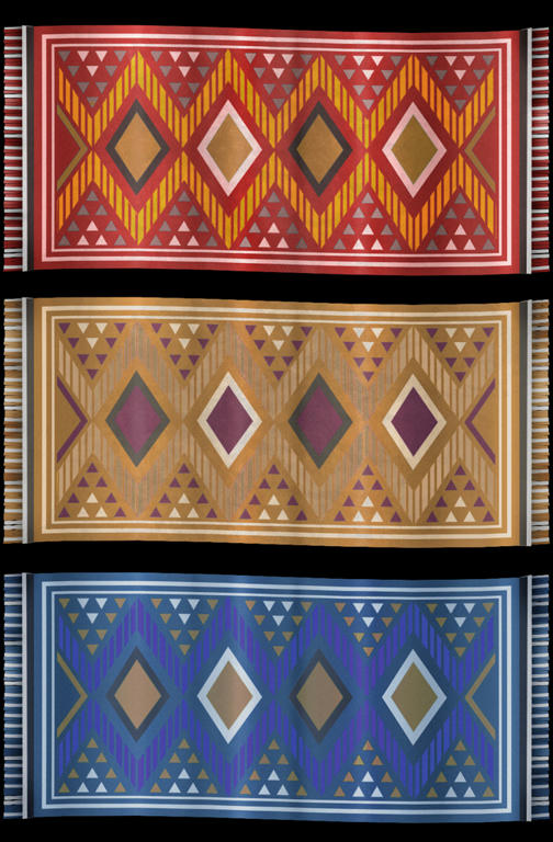
Here's the new carpet textures, with some different colors and toned down contrast/saturation. I'd like to see them in the world when there's a lot more stuff around them before deciding whether the pattern itself needs to be changed, but I hope this is a little better for now. We'll try a mesh for these too, I think.
I'm working on models for the archways right now, will try to get that available asap.
I'm working on models for the archways right now, will try to get that available asap.
- Feb 26, 2008
- 1,626
- 1,325
The main problem here is readability. Look around on the ground while playing tf2, the actual playable space: very plain. The materials, especially the natural materials, reflect this in terms of complexity. When you use overlays on the ground, typically stains, they're going to be probably mono or bitone, nothing complicated. If these rugs are to be on the ground they need to be a /lot/ simpler IMO. Hang them up on walls, etc, much smaller problem; but against the plainness of the sand they break up readability and don't do the material itself justice
Chemical Alia
L2: Junior Member
- Jul 22, 2010
- 98
- 52
The main problem here is readability. Look around on the ground while playing tf2, the actual playable space: very plain. The materials, especially the natural materials, reflect this in terms of complexity. When you use overlays on the ground, typically stains, they're going to be probably mono or bitone, nothing complicated. If these rugs are to be on the ground they need to be a /lot/ simpler IMO. Hang them up on walls, etc, much smaller problem; but against the plainness of the sand they break up readability and don't do the material itself justice
Yeah, I know what you mean. From the screenshots I've seen, I still want to go the route of having "clean rugs" and "dusty ones". The ones on the ground would show more wear and discoloration, and ideally blend a little with the sand texture (if I know that's what they're going on top of). I made one before, based on the old texture, but haven't seen it in the game yet and think it might be too dark/noisy. I'll make a new one with the mesh so we can see how it looks on the ground.
- Jul 26, 2010
- 112
- 39
I made one before, based on the old texture, but haven't seen it in the game yet and think it might be too dark/noisy. I'll make a new one with the mesh so we can see how it looks on the ground.
This shot has the worn one on the ground. (disclaimer: the red one is the old one.)

Last edited:
Chemical Alia
L2: Junior Member
- Jul 22, 2010
- 98
- 52
This shot has the worn one on the ground. (disclaimer: the red one is the old one.)
Oh yeah, I forgot about that one. I think it might be good to lighten it up and desaturate it some more, at least.

the alcove the the stall infront sits in look weird, being half wood and half wall, it looks wonky or uneven. I'm not sure if these textures here are temp or not or if the screenshot is old etc.
- Jul 26, 2010
- 112
- 39
the alcove the the stall infront sits in look weird, being half wood and half wall, it looks wonky or uneven. I'm not sure if these textures here are temp or not or if the screenshot is old etc.
yea its a WIP. I'm in the process of changing the geometry in that area. Its good to get that feedback though as it will effect what ends up being there.