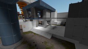
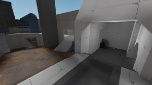
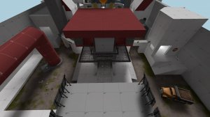
"Sir! We've fixed a couple of small details involving the area around the shrink ray!"
"That's great and all... but why...?"

After some testing I have come to the conclusion that there is still something missing from this map, something else that makes the map a bit more versatile, and so I've made an attempt of adding that.
So:

> Added area to the left of point
> Widened the area between the observation deck and the central point area
> Modified clipping
> Changed outside spawn doors so it's not a straight shot
> Modified skybox (still haven't figured out how I want it)
> Changed most of the staircases to be more.. beleivable
> Added stairs.. just a lot of them
> Cleaned displacements
> Added detail to store house room thing (for fun)
> More optimization

Big thanks to Blamo for his feedback! If only everyone else was as detailed and dedicated as you are. Your input is appreciated and taken into consideration.
"At last we have a functioning shrink-ray! Very nice work."
"Thank you, sir. Now if only we could make this place a bit less of a dump."

Well even the best-laid plans sometimes need to be re-visited, and this map is no different. I was severely dissatisfied with the space between spawn and just outside the point, so I went for the scorched earth method of modifying geography. Hurt to do it, but in all likelyhood a total redo of the first two areas was a long-time coming. Took some time to think of a new layout for it, so with this new one we'll see what things are horribly wrong with it this time.

> Deleted everything past the barbed wire and re-built from scratch
> Widened ramps by the point
> Added cover
> Added medium health kit
> Extended mid cover
> Added an admittedly pointless extension to the right flank
> Re-built the skybox to not be so shoddy
> Re-did clipping
> Jeez there's a lot of 're' in this update
> Re-lowered the shrinkray
> Moved the central building back
> Raised concrete walls
> Added better scaffolding
> Modified location of health kits
> Edited skybox/lighting
> Removed building health kits
> Relocated flank health kits

Images are here https://imgur.com/a/tmIjOam
20180731170456_1.jpg 20180731170540_1.jpg 20180731170508_1.jpg 20180731170559_1.jpg
"You've done well, eggheads. Great in fact. The one thing I have to ask is, why does it take so long?"
"...our office got outfitted with chairs that spin."

And so another update to this map is here. I had fun with this part, just because I've never detailed anything before... and I guess still haven't. it's a start at least. The previous verison - a5 - turned out to have a lot of technical issues, so this version fixes all of that.

> Began texturing, and minor detailing
> Shortened outside spawn area
> Improved clipping on pipes on flanks
> Moved health kits from ledge on left buildings and improved stairs
> Nulled unseen textures with no-draw
> Changed ammo boxes under bridges to medium
> Added medium rock on both sides of point
> Heightened fence walls on right sides
> Added patches under health kits and ammo kits
> Added in stairs and made ramps into pure clips
> Added center circle on point with proper clipping
> Added proper lighting
> Added proper skybox
> Modified overhead skrinkray
> Modified overhanging brushes
> Compacted spawnroom

Screenshots!
https://imgur.com/a/8yXWtZE

So after plenty of testing there really hasn't been any problems I've seen, meaning gameplay is probably as good as it's going to get. Whether that's a good or bad thing there's jury is still out, but hopefully more testing with different version will make more problems surface.

20180723122030_1.jpg 20180723122039_1.jpg 20180723122059_1.jpg 20180723122110_1.jpg 20180723122117_1.jpg 20180723122127_1.jpg
"Any update on the shrink ray?"
"Yes, sir! We put the health and ammo kits on a slightly raised platform!"
"At last, actual progress."


Koth_shrinkray is going to be the death of your dear old friend TwinMill, who only just realized his brushwork is hot garbage. Here's an update, and a major one at that:

> Adopted "a4" version string
> Lowered overall height of center slope
> Removed computers from platform near point, replaced with bridges
> Added small health kits under bridges
> Increased distance between spawn building and testing area
> Modified catwalks to match
> Added buildings on either side, complete with new flank routes
> Did indeed put center health and ammo on a raised platform
> Removed annoying as all hell pipes
> Improved clipping
> Added info_observer_point spots
> Removed right-side pipe covers
> Removed concrete blocks
> Added small ammo packs near point
> Improved sightlines
> Added dump trucks on both sides
> Updated barbed wire textures
> Widened right flank
> Modified spawn times
> Improved optimization
> Replaced batteries in smoke detectors

Okay so some explanations on the changes:
One of the biggest problems that seemed to arise was whoever caps the point first had it forever, and that just plain sucks. Most people mentioned pushing up that hill to the point was a nightmare, so I lowered the height. Since the only ways on the point were from either side, it was pretty easy for the opposing team to shut down people trying to get on it. I added some bridges to the point so maybe it wouldn't be so difficult. Another change was increasing the distance between the spawn building and the testing area, which is where the medium health kit is. It got pretty claustrophobic and choke-y there, especially with pyros, so I made it be a bit more open. Everything else is just kinda experimentation. still new to mapping so fingers crossed.

Also, the version string might be the second alpha here, but it's easily beyond fourth in its development. I've trashed so many versions of this map I've lost count at what alpha it's up to know. But, whatever, 4 sounded like a good number so I went with that. I at least know for a fact it's the most updated version.

ZZZAP! Let's get some screenshots! https://imgur.com/a/qnnPB
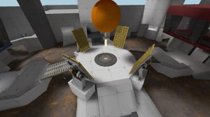
20180215143136_1.jpg 20180215143148_1.jpg 20180215143202_1.jpg 20180215143215_1.jpg