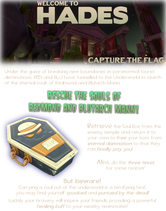
The only reason I gave this map 2 stars is because of the phenomenal artpass done by Freyja. Good job on that! Unfortunately, a great artpass cannot save a map from its own detrimental gameplay decisions. (In my eyes anyway) The absolute main thing I dislike about this map is that it commits the cardinal sin of capture the flag design: It makes the flag undesirable. This is a bad thing because the main objective of a CTF map is, shockingly, to grab the flag! Wow, crazy, what an insane idea. What this map does is scares you when you hold the flag, meaning that not only can you NOT defend yourself as the flag carrier, but you also can't even jump. Oh, and you're stuck in third person too :)
My second biggest gripe with the map is that the combat in and around mid is just... really unsatisfying. On the outside rim, it's super open, meaning you're fodder for classes like Scout and Sniper, but on the inside rim, you're destined to meet a gruesome end via splash damage, which in my opinion is just not very fun. Even aside from that though, the mid is just annoying to navigate, with a lot of annoying pillars in the way or dumb 1-way dropdowns that don't feel very fun to deal with. The river styx is also a cool idea but I don't like taking damage from outside sources, which is exactly what it does.
Coming back to the artpass, again I think the visual design work of the map deserves the most applause of the entire map. From the giant Greek.... pantheons? (hopefully that's what they are) for flag rooms, they really bring some much needed "Wow, that's cool!" geometry and visuals to the map. I do think the lighting is a bit drab on the outside of them, but I can forgive that. The river styx texturing looks COOL AS FUCK, as well as the little outpost thingies with the green bonfires out in the middle of the river! They're a really cool touch. In all honesty my main gripe about the detail would be the lighting, which I feel is cursed (haha) by the fact that the skybox had to be green or something. With its current texturing, I really think a beautiful blue sky would've done wonders for the mossy greek textures for the most part! (Definitely not the river styx tho)
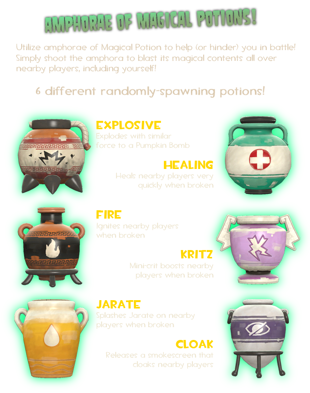
A few miscellaneous points now, I really appreciate that there are soul gargoyles on the map. Definitely a sign that there was at least EFFORT put into the map, even if most of it went to waste imo. I don't really like how the health pots grant a +100% buff in hp, that doesn't even degrade for like 3 seconds. The Jarate pot feels like a major 'Fuck you' to anyone near it, and isn't really fair because it's not even exclusive to sniper. There's some cute little physics prop pots that you can shoot around, which is always fun. I find the invisibility pot quite cool because it has a risk/reward aspect of accidentally using it near an enemy and potentially giving them a buff when it's not good for your team. The flag room itself is pretty well-laid out although I wish the main staircase would've been centered.
Overall, I think this map isn't very good. Like I said, the detailing is cool, but every design choice outside of that has done this zero favours. An easy 3/10, especially from how sucky it makes CTF itself feel to play.


