WiP in WiP, post your screenshots!

TheNotoriousTEK

L1: Registered
Jul 18, 2014
37
2
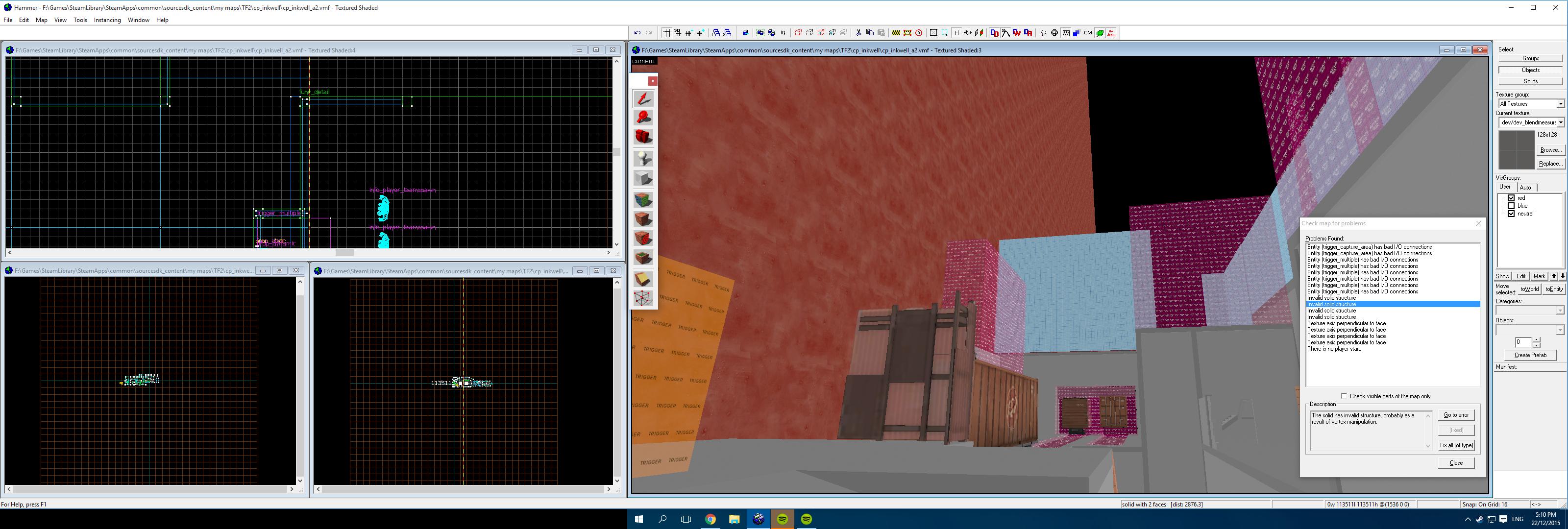
Quick little "sketches" of an upcoming map...

2015-12-22_00002.jpg

2015-12-22_00001.jpg


(btw is it just me or is the homepage dead)
 

zahndah

professional letter
aa
Jul 4, 2015
764
647
Done about half of the total amount of exteriors for buildings.
koth_dredge_b1dev0001.jpg
koth_dredge_b1dev0002.jpg
koth_dredge_b1dev0003.jpg
koth_dredge_b1dev0004.jpg
 

LeSwordfish

semi-trained quasi-professional
aa
Aug 8, 2010
4,101
6,597
Zahn, you really need to read grazrs guide because the chair, table and door on a thin metal roof make no sense whatsoever. Also: the tyre held up by a convenient chunk of wood, the flowerpots with their own scaffolds nowhere near the windows, the stone trim on a wood building.

Think about how people use the space, and think about which parts of the answer to that only make sense to you, because no matter how careful and considered your own internal reasoning for "there's a chair on the roof" is, only you know what it is.
 

zahndah

professional letter
aa
Jul 4, 2015
764
647
Think about how people use the space, and think about which parts of the answer to that only make sense to you, because no matter how careful and considered your own internal reasoning for "there's a chair on the roof" is, only you know what it is.

Thanks for the check sword, I really should think of it more as an actual place where someone could be living and that would actually be built.
 

Tumby

aa
May 12, 2013
1,087
1,196
I think the main problem is the edge highlighting. It's meant for sharp edges on metal/plastic, which might be the whole reason why it looks like plastic in the first place. It also makes the whole thing more noticle even though its just a small prop in the background. The stitches are ok, but I feel like there is something missing.
A possible solution to make this look more like a chair with cloth might be to put a typical pattern on it. Like flowers or something, Idk
 

zahndah

professional letter
aa
Jul 4, 2015
764
647
The amount of nonsensical things in drudic has decreased. Along with other progressions.
koth_dredge_b1dev0002.jpg
koth_dredge_b1dev0004.jpg
koth_dredge_b1dev0005.jpg

koth_dredge_b1dev0003.jpg

I dont really like this so It is probably going to go (namely the beam between the two sheds as it looks horrible and makes little to no sense).