WiP in WiP, post your screenshots!
- Thread starter Arhurt
- Start date
You are using an out of date browser. It may not display this or other websites correctly.
You should upgrade or use an alternative browser.
You should upgrade or use an alternative browser.
J4CK8
L11: Posh Member
- Mar 4, 2009
- 820
- 243
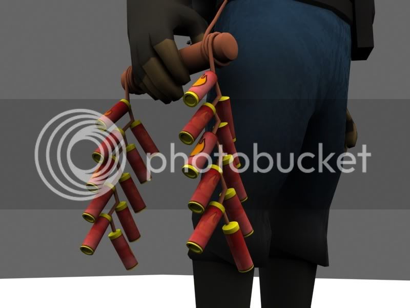
Could use a strap.
It has one...
Looks great though. Maybe Valve will sell it in the shop with the firepoker and something else, and you'll be $40,000 richer.

- Sep 28, 2009
- 3,075
- 2,778
It has one...
Wow... that's very hard to see from the in-game shots.


Batandy
L3: Member
- Oct 10, 2010
- 132
- 87


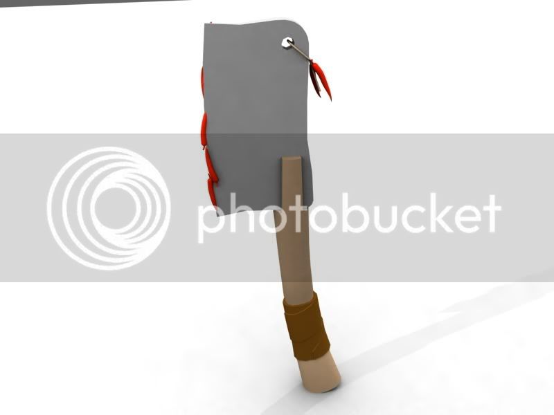
I would suggest making the strap go over the air vent thing on the mask so it's more obvious/more in line with the pyro being a little wacky.
I tried that originally, but unfortunately it looked pretty bad. I will try to tilt the hat a bit more for that wacky pyro-esque look; depends on how much modifiying I can do without messing up the jigglebones (I really really don't want to redo those, lol).
Kep