WiP in WiP, post your screenshots!
- Thread starter Arhurt
- Start date
You are using an out of date browser. It may not display this or other websites correctly.
You should upgrade or use an alternative browser.
You should upgrade or use an alternative browser.
Fredrik
L6: Sharp Member
- Aug 15, 2009
- 376
- 219
Wait, doesn't all that concrete and metal meet up with wood from the red side? That's gonna look really weird. I'd redo the entire bridge to be more consistent and neutral probably (if I am remembering right).
You are remember it right. And I can tell you that I have already changed it!
Jetti
L5: Dapper Member
- May 2, 2010
- 226
- 111
AngryAngus
L3: Member
- Jul 20, 2011
- 101
- 124
- Jul 31, 2011
- 872
- 1,021
- Jul 31, 2011
- 872
- 1,021
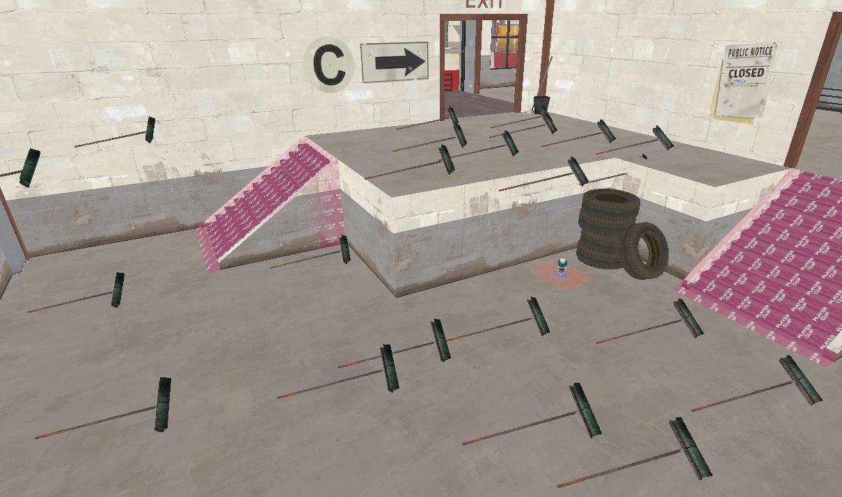
Something looks off about the 'Building Overlooking C' - like it's made of paper or something. Not sure what, though. Maybe the windows?
It's because the walls are so thin even though they have a concrete/brick texture. Same goes for the broom before C's stairs: bricks don't work like that, use a different support.
First of a bunch of Shadow Shaman items:
The Nomadic Lifestyle:

Vote with your clicking fingers (or, y'know, anything else you can use a mouse with...)
The Nomadic Lifestyle:
Vote with your clicking fingers (or, y'know, anything else you can use a mouse with...)
Jeremy
L11: Posh Member
- Oct 24, 2010
- 829
- 299
- Apr 29, 2008
- 1,068
- 709
That does look really swish EArkham, I'm liking your detailing a lot.
The one thing I would suggest changing is the team coloured walls near the rocket as they look very bright and there's a lot of colour there already. If it's an area where the two halves of the map meet then I'd suggest making the walls more neutral and implying team ownership with props and overlays instead. Minor gripe though, I'm just nitpicking because it looks better than my detailing ever does.
The one thing I would suggest changing is the team coloured walls near the rocket as they look very bright and there's a lot of colour there already. If it's an area where the two halves of the map meet then I'd suggest making the walls more neutral and implying team ownership with props and overlays instead. Minor gripe though, I'm just nitpicking because it looks better than my detailing ever does.
- Jul 31, 2011
- 872
- 1,021


