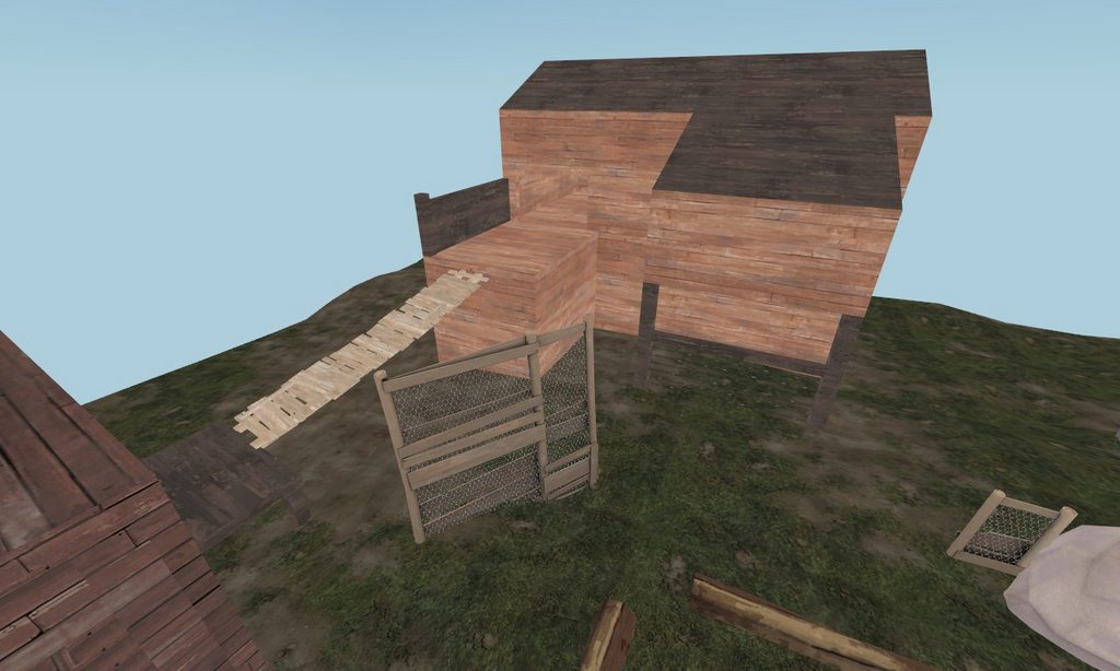
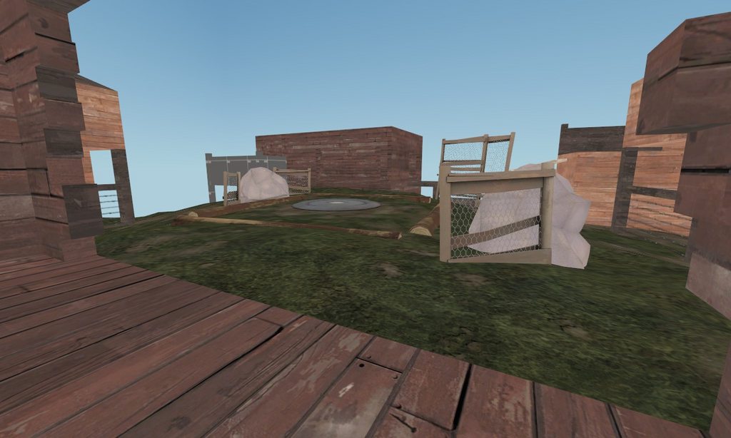
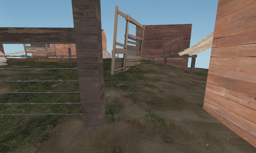
WiP in WiP, post your screenshots!
- Thread starter Arhurt
- Start date
You are using an out of date browser. It may not display this or other websites correctly.
You should upgrade or use an alternative browser.
You should upgrade or use an alternative browser.
- May 21, 2009
- 2,039
- 1,484
holy shit, that is gorgeous.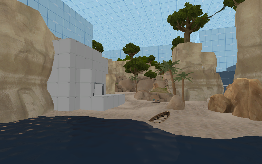
I will not change theme this time, guys. I promise.
- Sep 28, 2009
- 3,075
- 2,778
-image with offensive language-
EDIT: just FYI, the above is meant for humour, not hate. And to whoever deleted godling's post, that wasn't the right thing to do - could have replied and commented instead of straight-up censoring.
Would it kill you to not use that word?

I wish there were some sort of thing in the Source engine that renders any brushwork or displacements overlapping it invisible and not block lighting. And could be incorporated into models.
What I'm saying is that I wish it were physically possible for that boat to not be full of sand.

Would it kill you to not use that word?
Not at all. Sorry if I offended you, I'll remove it if you like.
Goombac
L4: Comfortable Member
- Mar 27, 2010
- 172
- 84

Kill_the_Bug
aa
- Oct 6, 2008
- 1,969
- 451
- Jul 22, 2009
- 1,874
- 1,258
I like titbit better
i prefer whole tits, not just bits of them
preferably with a body attached
- Sep 5, 2009
- 912
- 684
- Jul 31, 2011
- 872
- 1,021
- Jul 31, 2011
- 872
- 1,021
- Feb 26, 2008
- 1,626
- 1,325
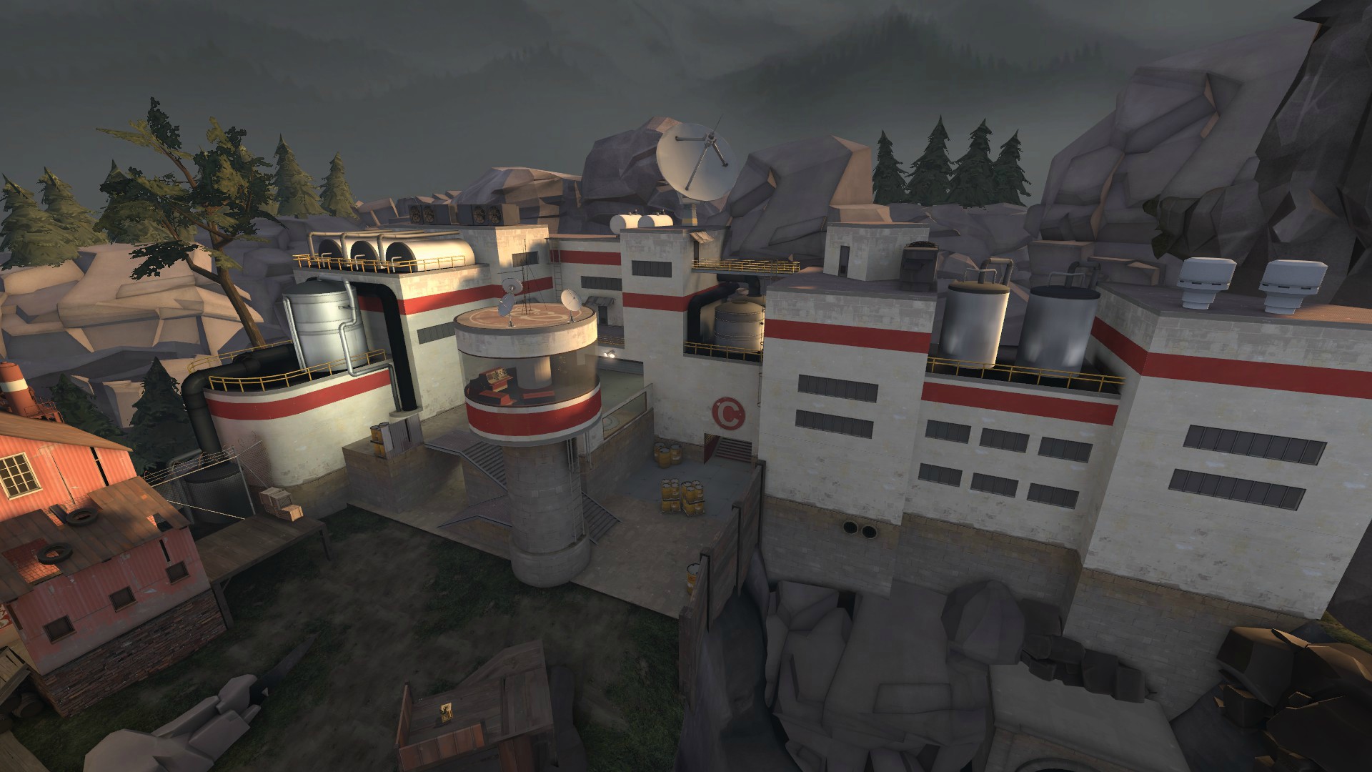
re:yyler's latest:
what'd you, give up on displacements you lazy FUCKER????? looks great but needs disp transition between rock prop spam and bricks on the right
Tower's fine
Needs trim/more emphasis around C door, looks like a hole in the wall ATM
Like to see a less lazy explanation of the random windows around the point
Still have to break up the concrete-dirt transition. Maybe have that ledge contour around the tower a bit, IDK
Throw some tire-track overlays into that shit too
- Jul 22, 2009
- 1,874
- 1,258
yeah yeah it's in the wip thread for a reason (because i was drunk)
take some fucking responsibility instea of blaming everything on alcohol
also the little diagonal housething on the roof under the 4 pines looks out of place. the whole building is all regular and orthogonal an stuff which makes that housething look like diagonal mapping for the sake of diagonal mapping