

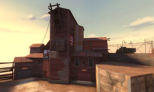
Why is the door on the right red...?
WiP in WiP, post your screenshots!
- Thread starter Arhurt
- Start date
You are using an out of date browser. It may not display this or other websites correctly.
You should upgrade or use an alternative browser.
You should upgrade or use an alternative browser.


BagOfChips
L5: Dapper Member
- Feb 7, 2009
- 227
- 17


- Mar 2, 2009
- 986
- 605
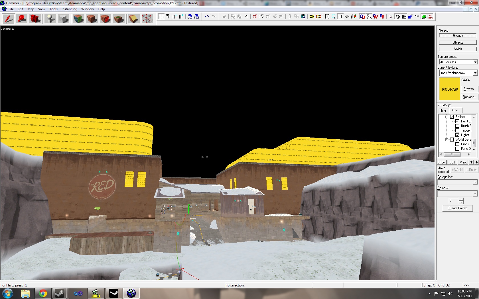
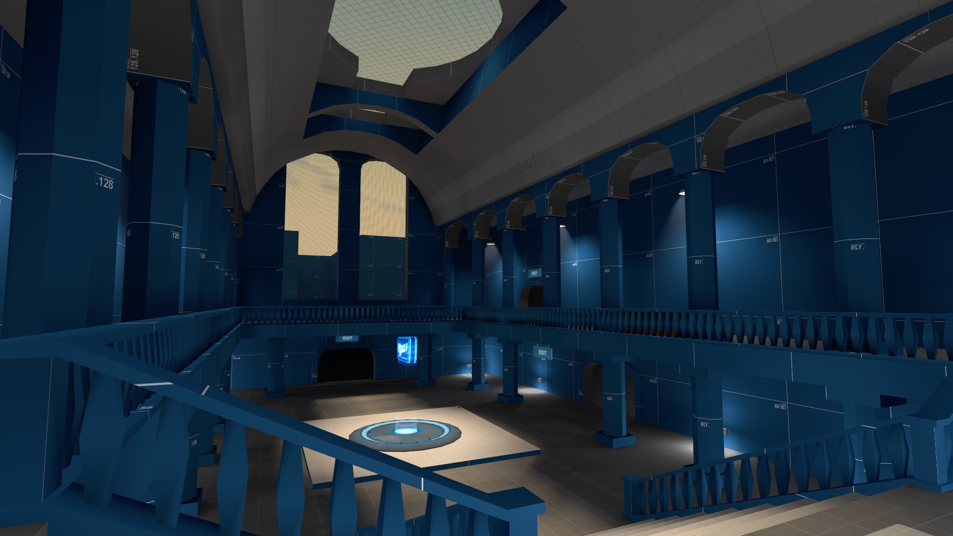
very early from hammer:
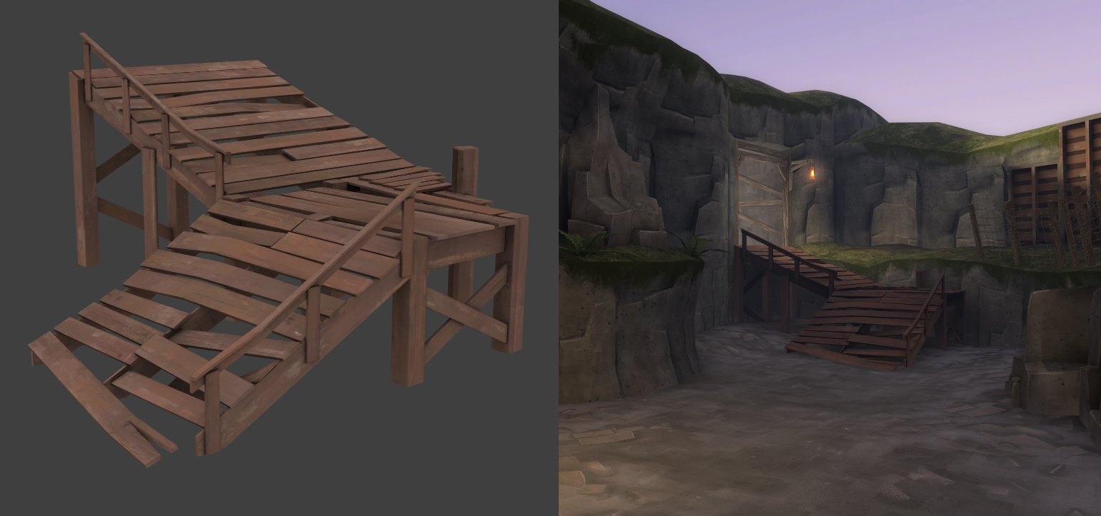
you see that there are 2 ways under construction, the plan is, that u can choose what u want, the short way, direct through the canyon or the way to the lift and over the bridge wich is a bit longer, but not in the canyon.
yeah, sure i use dev, just do a little experiment with the stone texture")
Do realize that if you have two paths, unless both routes are made up of the same number of path_tracks, the HUD won't line up on one of the ways through.
Red bread logo looks alright, but that seems like a good spot for the hanging wooden framework prop, that people put bucks on and such.
edit: lol like the one on the building right behind it
the logo is too small to begin with but looks odd when it's any larger, so idk
the crane thing could be okay but i dont want to make it nonsolid or clip it for jump classes so idk
BagOfChips
L5: Dapper Member
- Feb 7, 2009
- 227
- 17
C00Kies
L3: Member
- Sep 20, 2009
- 132
- 58
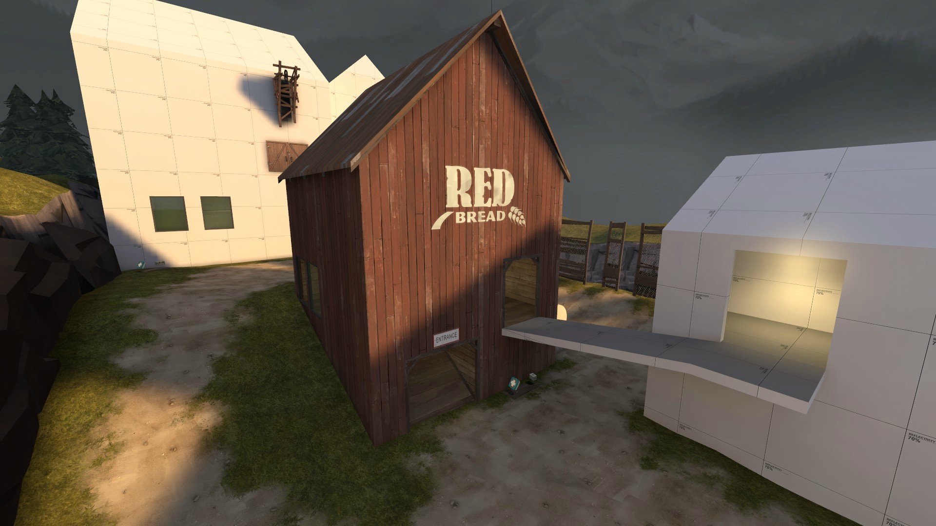
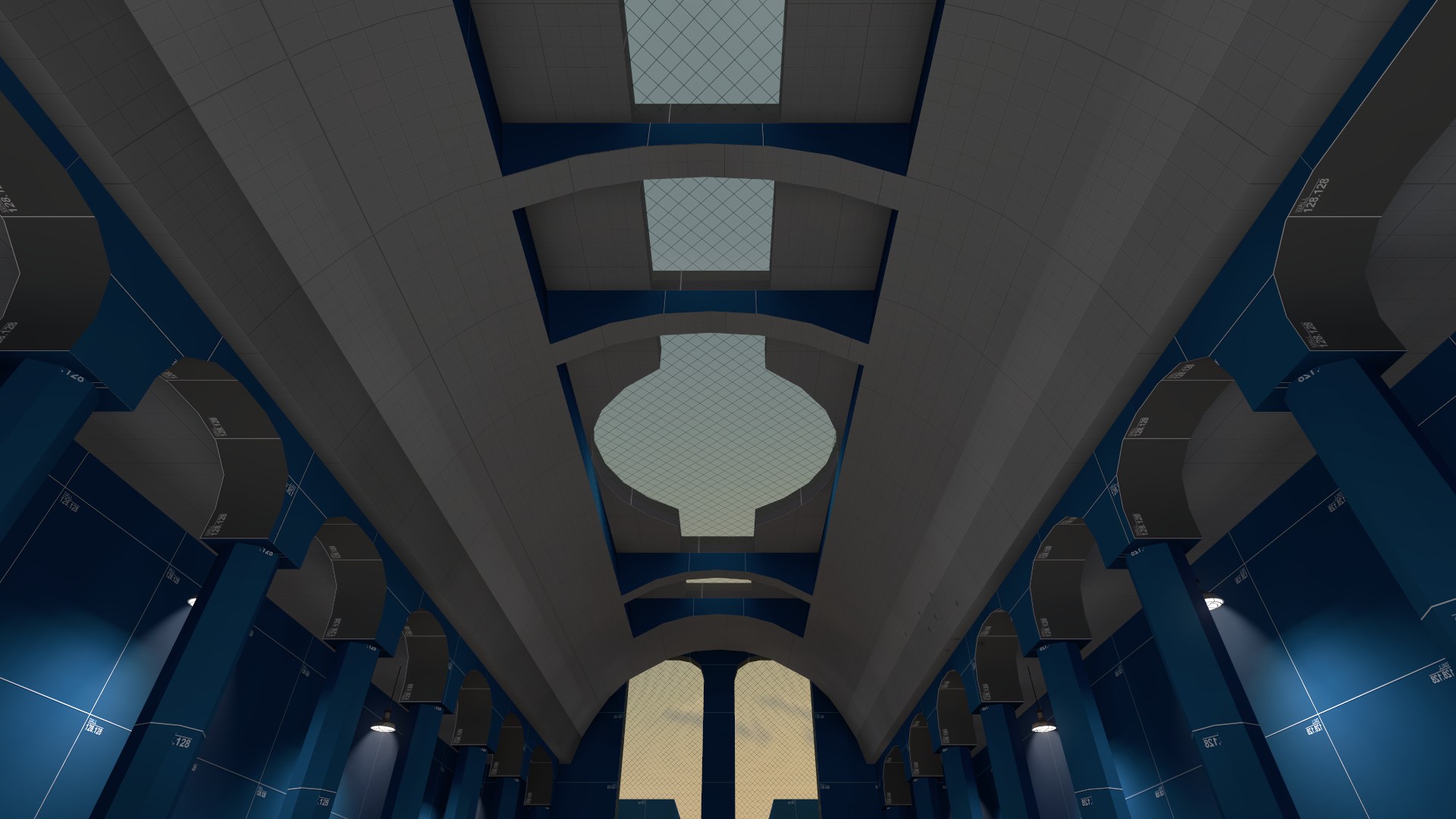
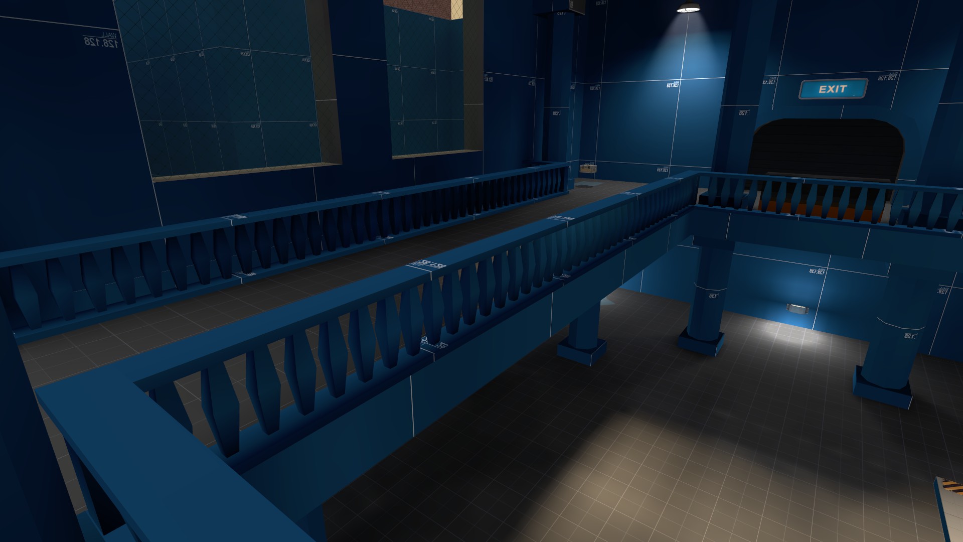
Well I'm pretty happy with how B is going in outpost...for now. So i moved on to A now

an overview
I have extended the Reds base out to create the new building and hopefully cut down on the major open areas. I still have more to go. I also did some changes towards the beginning of this "stage": added a stair way from the lower valley up and some other stuff. There is a ramp in front of A+B which the cart will slide down if untouched. Still much more to do but I think the main basic layout is ok.
SO...What do yous think?
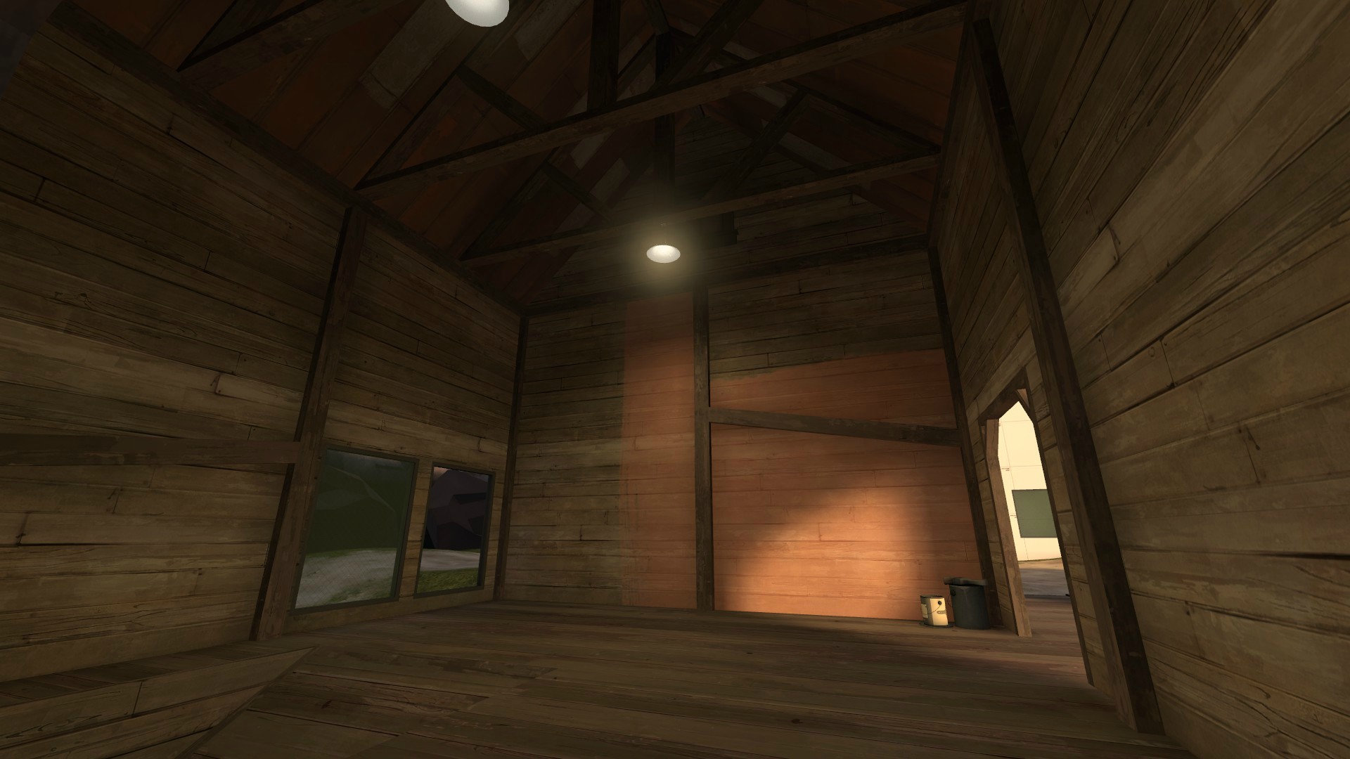
I think it would look better if the wood looks more damp and worn. Little darker.

looks great whats ur plan with the light? a bit sunlight could set an amazing atmosphere
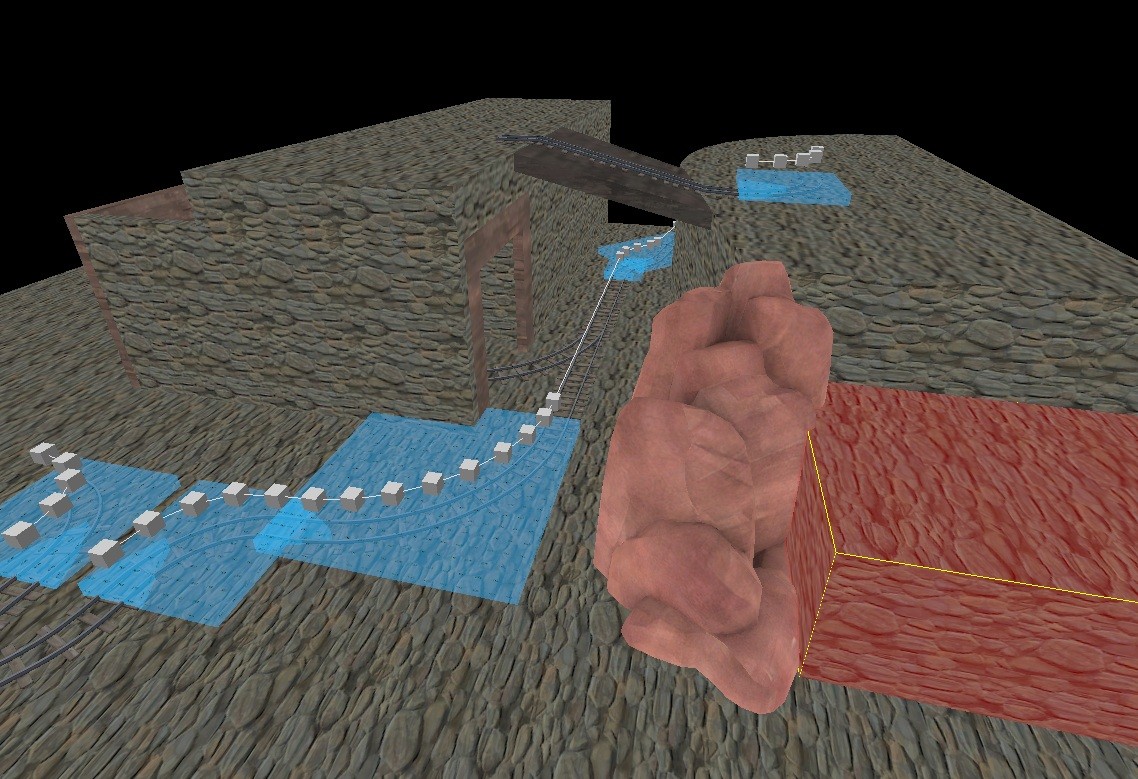
a little update:

grey is base high, red is low, (-96) and blue is +/- 48, the track will come out of a tunnel, i think of a small way over the tunnel at the red wall.
maybe i build a platform with capture point as a lift for the part uphill :O
whats ur plan with the light? a bit sunlight could set an amazing atmospherea little update:
grey is base high, red is low, (-96) and blue is +/- 48, the track will come out of a tunnel, i think of a small way over the tunnel at the red wall.
maybe i build a platform with capture point as a lift for the part uphill :O