WiP in WiP, post your screenshots!
- Thread starter Arhurt
- Start date
You are using an out of date browser. It may not display this or other websites correctly.
You should upgrade or use an alternative browser.
You should upgrade or use an alternative browser.


GenEn
L1: Registered
- Jul 16, 2010
- 46
- 54


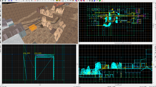
As my first map (that I plan on actually releasing, one day within my lifetime), I don't care about visuals much at this point, but any feedback about layout?
@Yyler: That tiny little fence on its own looks strange, because its taller than it is wide and stands on its own, but the others look okay to me.
Last edited:
GenEn
L1: Registered
- Jul 16, 2010
- 46
- 54
I know you don't care about visuals, but your lighting seems really weird, what enviromental lighting are you using?
I just used default color/brightness (255 255 255 200) with a pitch -86. I guess the fact that I used dark horizontal surfaces and light vertical services made them all balance out as grey...
Edit: Probably better!

Last edited:
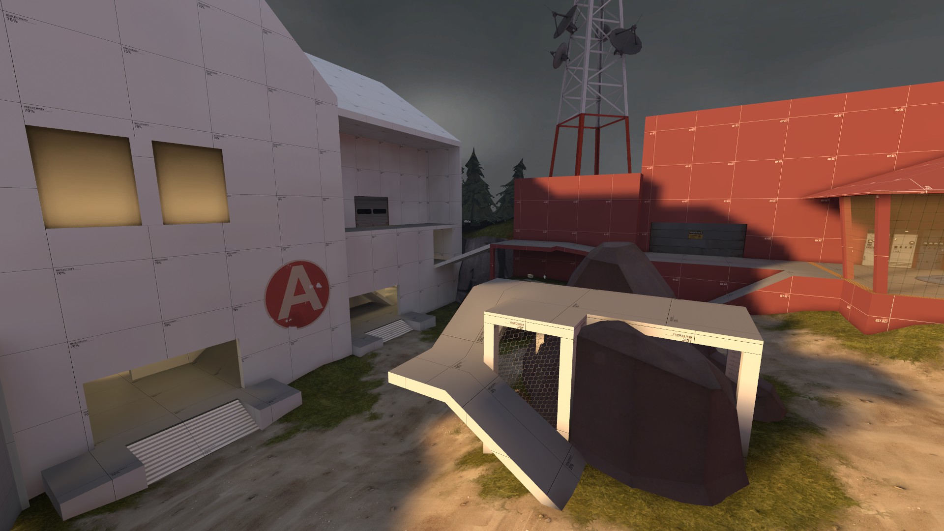
 don't really ever need to use above 50% ref.
yes to the second. but what this map really needs is a forward spawn for blu, or at least a good place for their engies to set up a forward base
In the first picture you're looking at a forward spawn also
oh yeah i see it now
DELICIOUS

- Feb 26, 2008
- 1,626
- 1,325


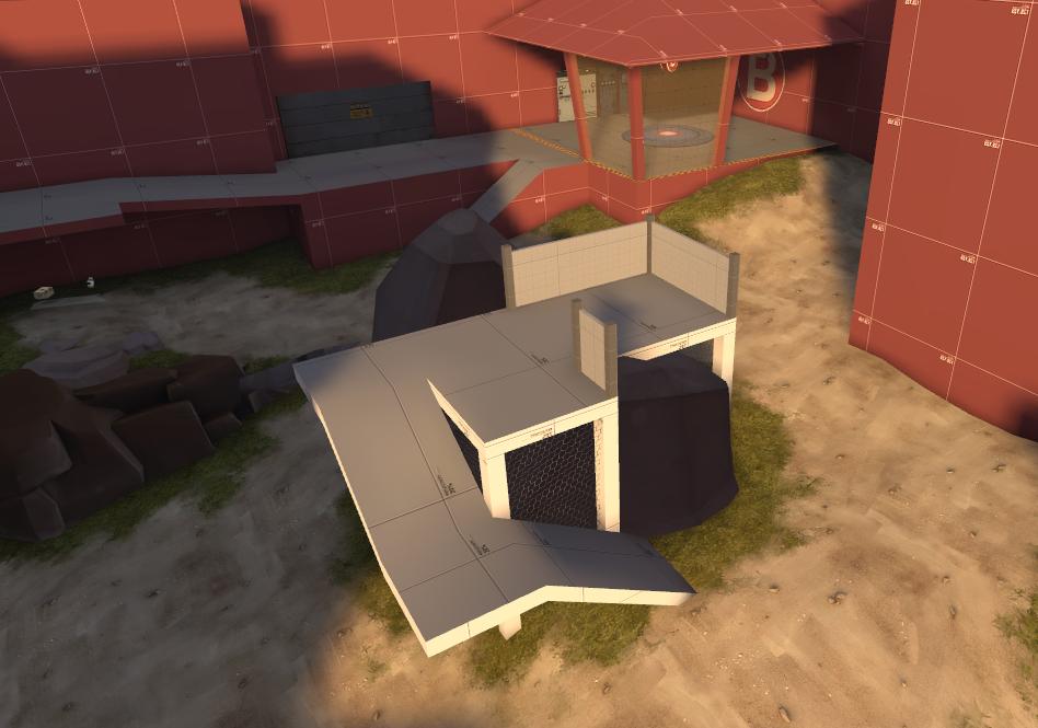
The other two stages look smaller relatively because they haven't had detail areas added, i imagine.
Yeah, stage 1 looks bloated because of all the detail added, it's really the same size as stage 2. Stage 3 is bigger because it has 3 control points.
- Sep 5, 2009
- 912
- 684
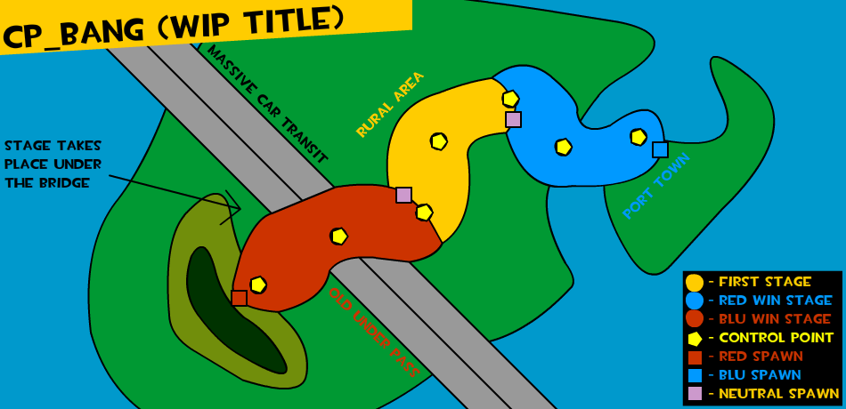
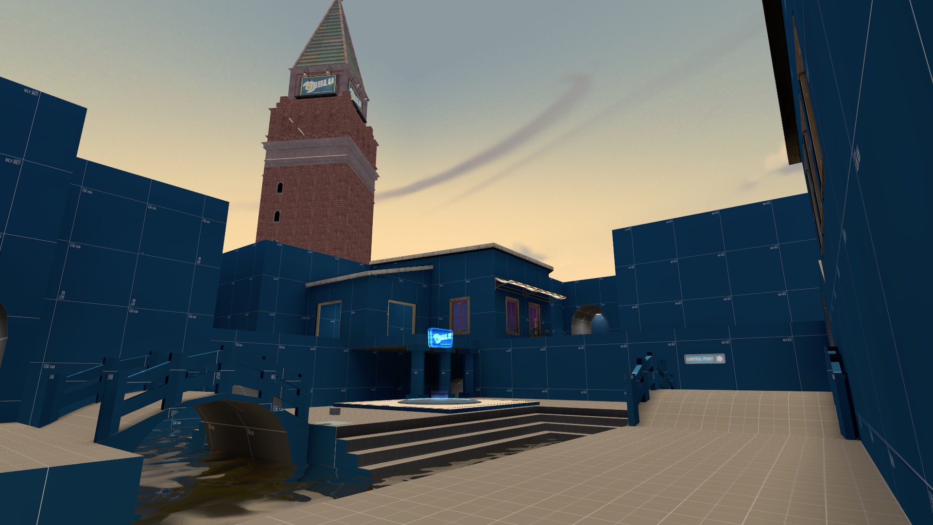
My idea for an A/D ~ Push map that has 3CPs. 3 Stages as you can see, with 2 linked CPs. I linked them mostly due to technical reasons and it shouldn't play much different without it being linked. I'm shooting for asymmetrical in my design, and I plan to use the maritime theme when the time arises to detail (I'm gonna work my ass off to get to that point). When it gets down to it, if I can't make it balanced for both teams to my liking than I'll simply have to mirror every stages layout.. I'll try my best to not have to resort to that.
In a way this is similar to TC but vastly less complicated and even if you're on the losing team you still have a chance to retaliate and win. Albeit you'll have to win 3 times in a row to actually "win" if you were pushed back to your lose stage.
Some reference pictures I'll be using for my architecture
- http://i.imgur.com/pENi6.jpg
- http://i.imgur.com/ttWqe.jpg
- http://festivaresorts.files.wordpress.com/2010/08/ncmm.jpg
- http://i.imgur.com/R31zN.jpg
- http://i.imgur.com/oUep5.jpg
Keep in mind this isn't gonna be that old of architecture, think coastal cities with stone buildings.
Questions? Comments? Hate mail?
GenEn
L1: Registered
- Jul 16, 2010
- 46
- 54
I like that theme, I hope this map gets to the detail stage quickly.
If there are 3 CP's per stage, say red team was pushed back to their final base/stage and successfully defended. So in the next round, in the central/rural area, would the center point be neutral again and both teams are on even ground? If that's the case, the only problem I could imagine is that if the final points were too easy to defend, it would get very repetitive playing on that central stage over and over again. But who am I to comment on balancing...
Point: Love the theme, like the game mode, please make.