Quick update, fixing spawns, lighting, and various other issues. This version is fit to test!
Read the rest of this update entry...
Read the rest of this update entry...
depression is, logistically and socially, the absolute worst thing in my life right now.
it's really odd and hard to describe but some of the things i do to cope with it i don't think i could have done if i had never had depression. i dunno. if i never needed a way to cope with my depression years ago i might have never started listening to music and buying a guitar and learning how to sing and eventually start writing music. i also might never have started mapping, might not have ever made maps, etc etc. all of this is a coping mechanism and i don't know if i can honestly say that i would have done all this if i didn't have depression. it's weird and it's still hard to fight it but mapping and music help, they help a lot
i won't downplay depression at all though, it's hard and tough and it sucks. but i mean i take what i have and i do what i can. it's the hand i was dealt in life so i have to make something good out of it, right?
anyways a2 should be out in the next few days, maybe tomorrow. probably tomorrow. thanks for playing and enjoying the map and i hope it can be even more fun in a2!
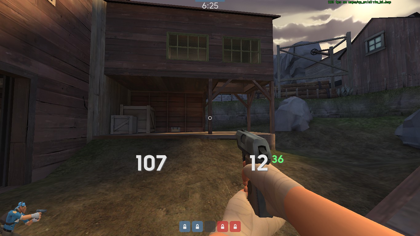
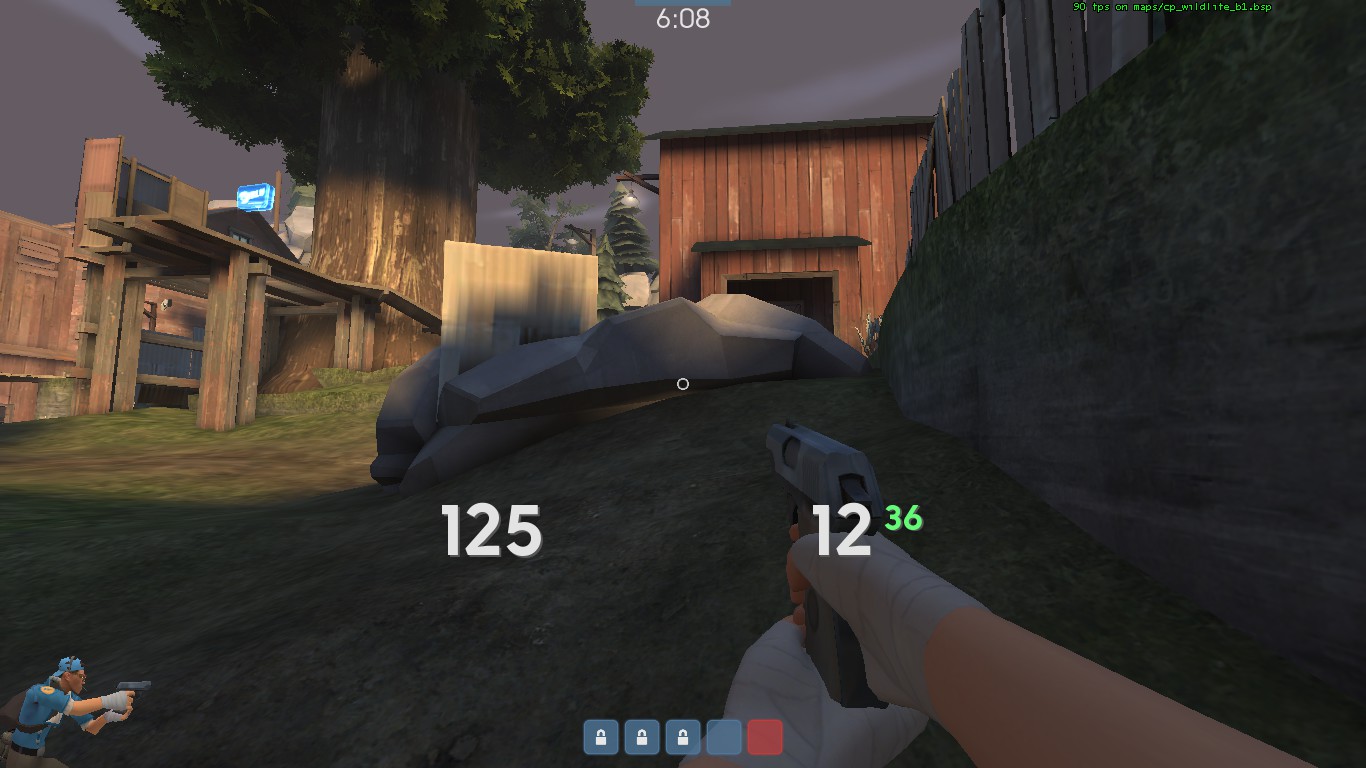
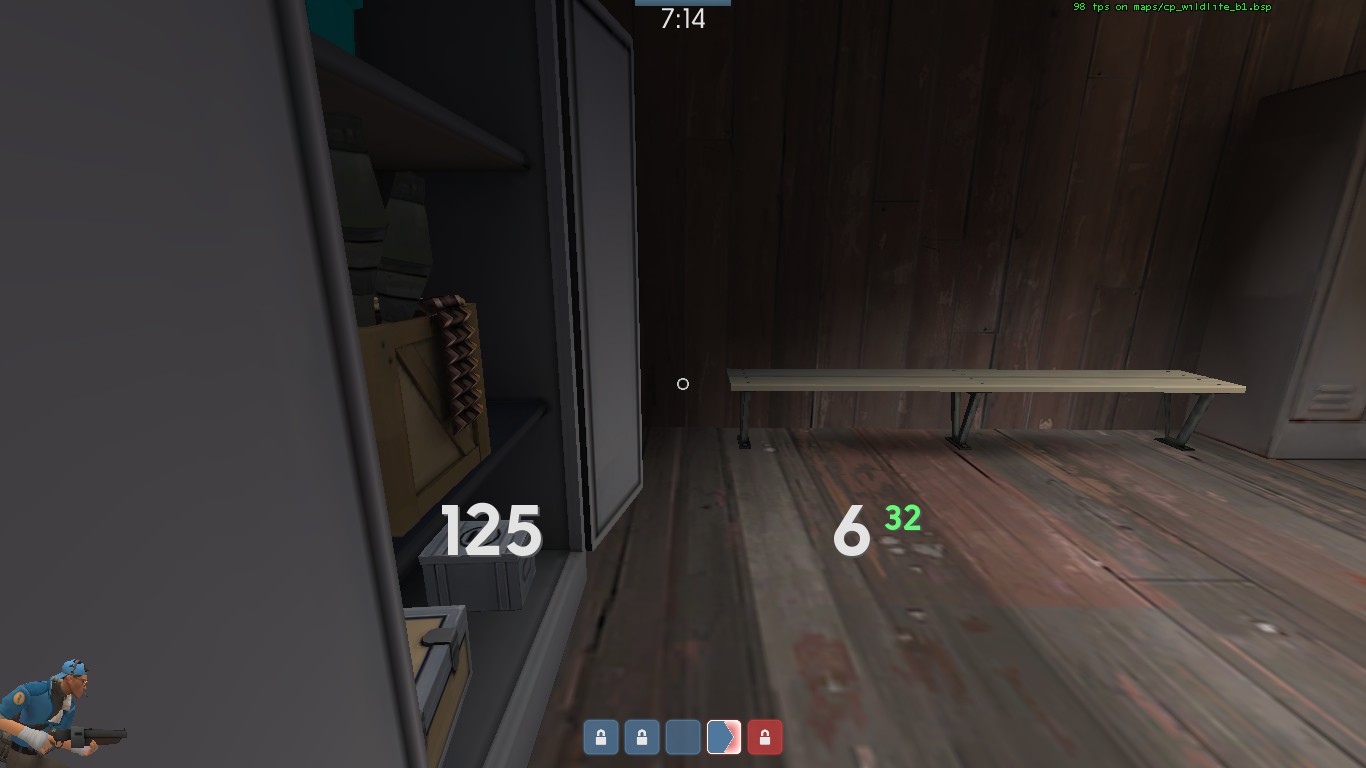

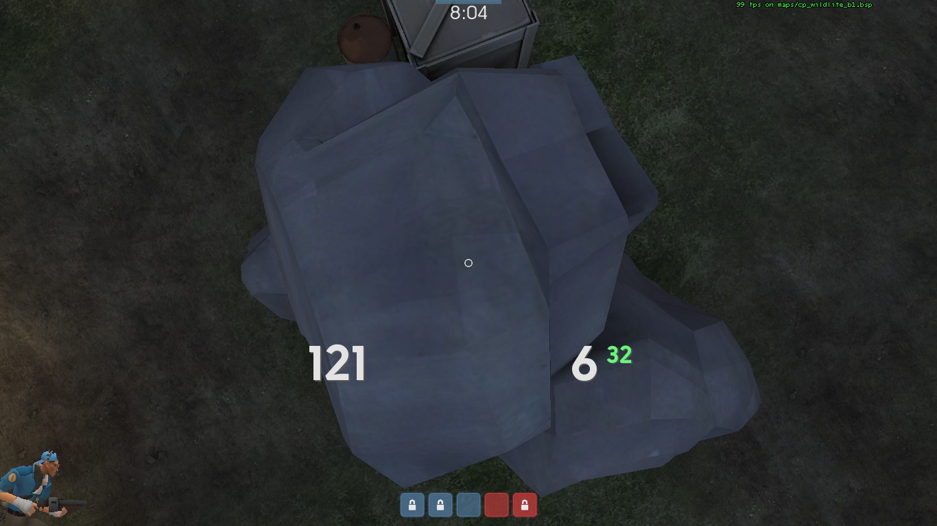


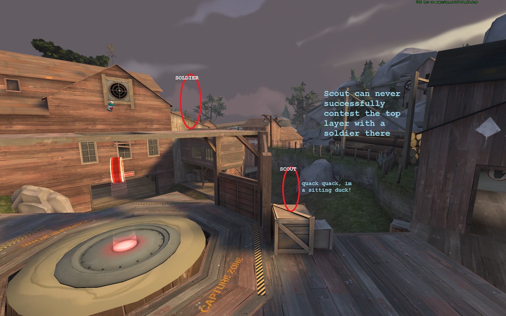
Not that it really matters, but it would be nice if the changelogs where layed out more like I did on Banana, it's much more easy to read/write imo.
tons of positive changes here, definitely interested in seeing how it plays in 6's soon
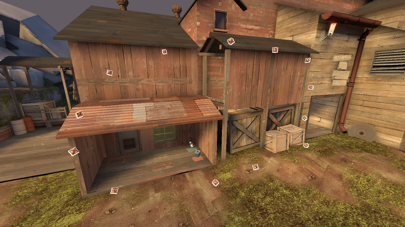
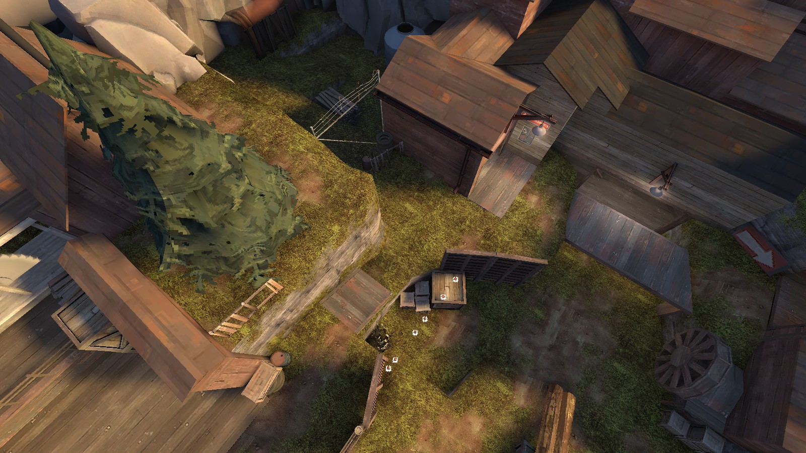
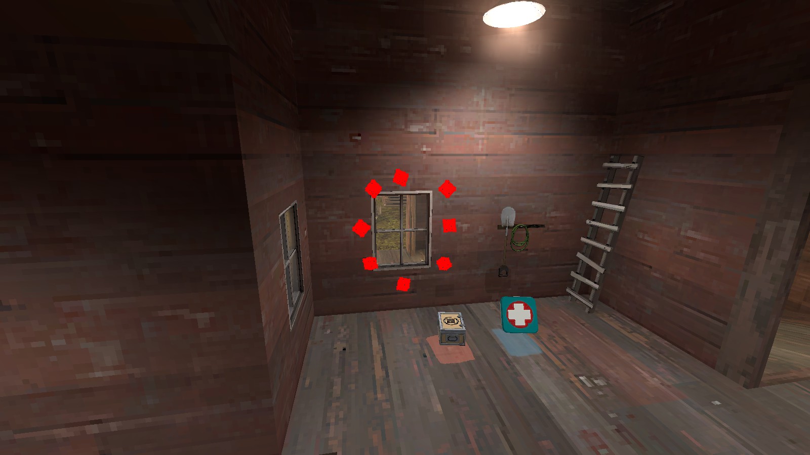
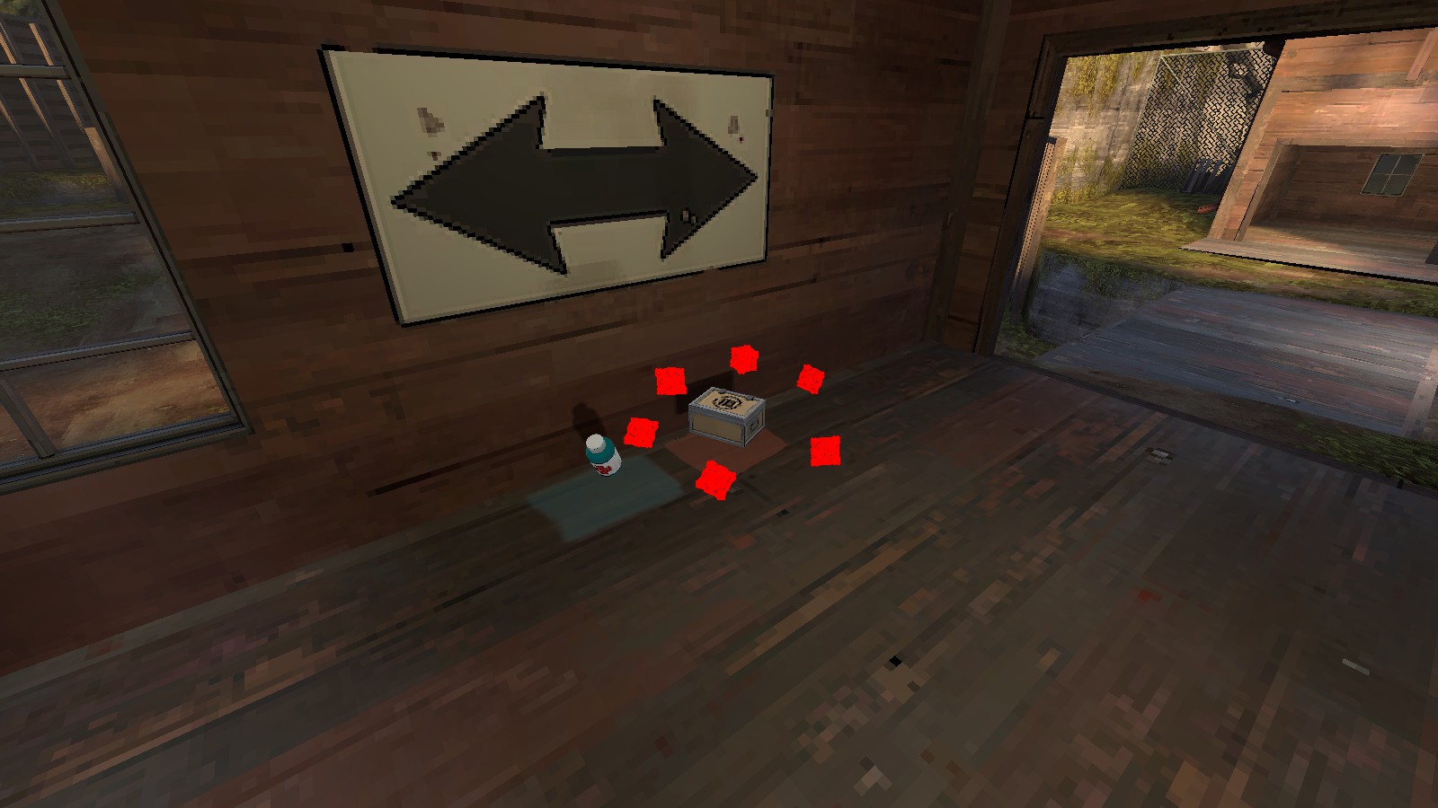
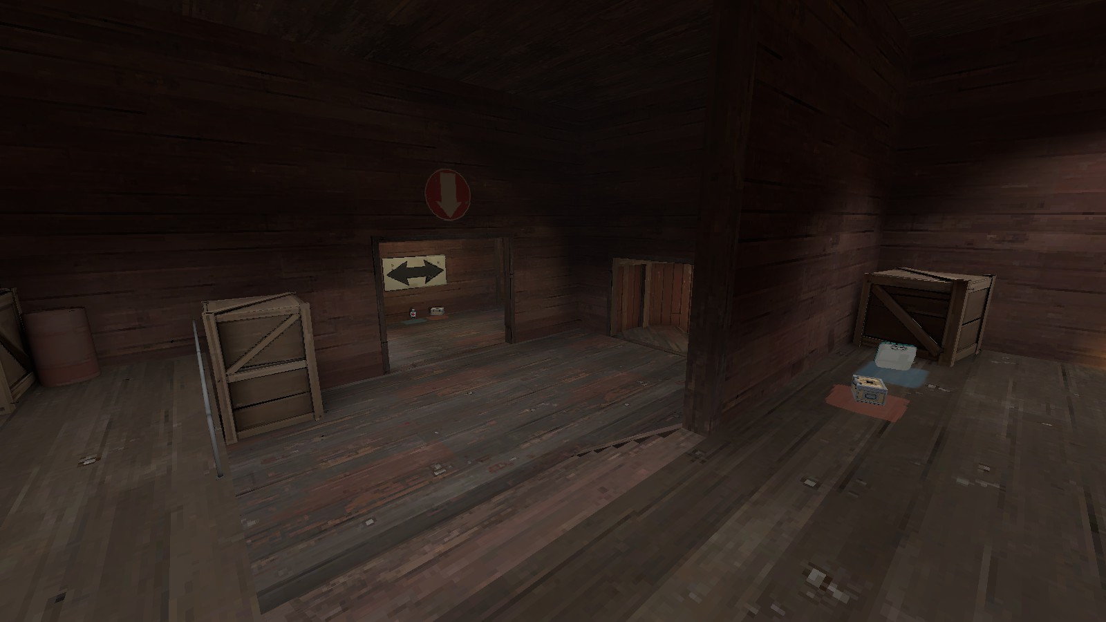
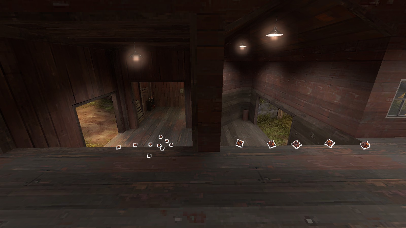
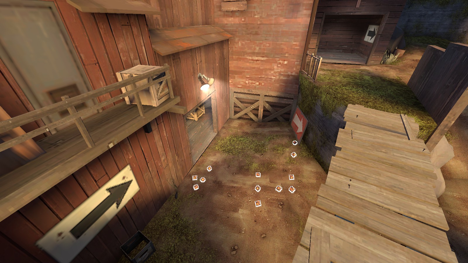
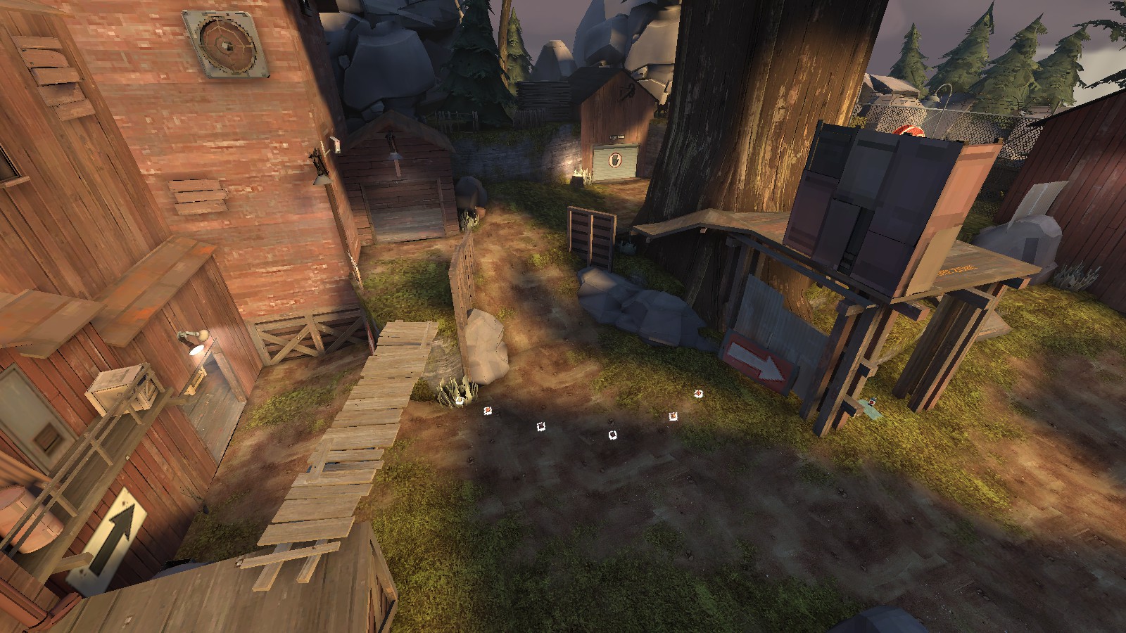
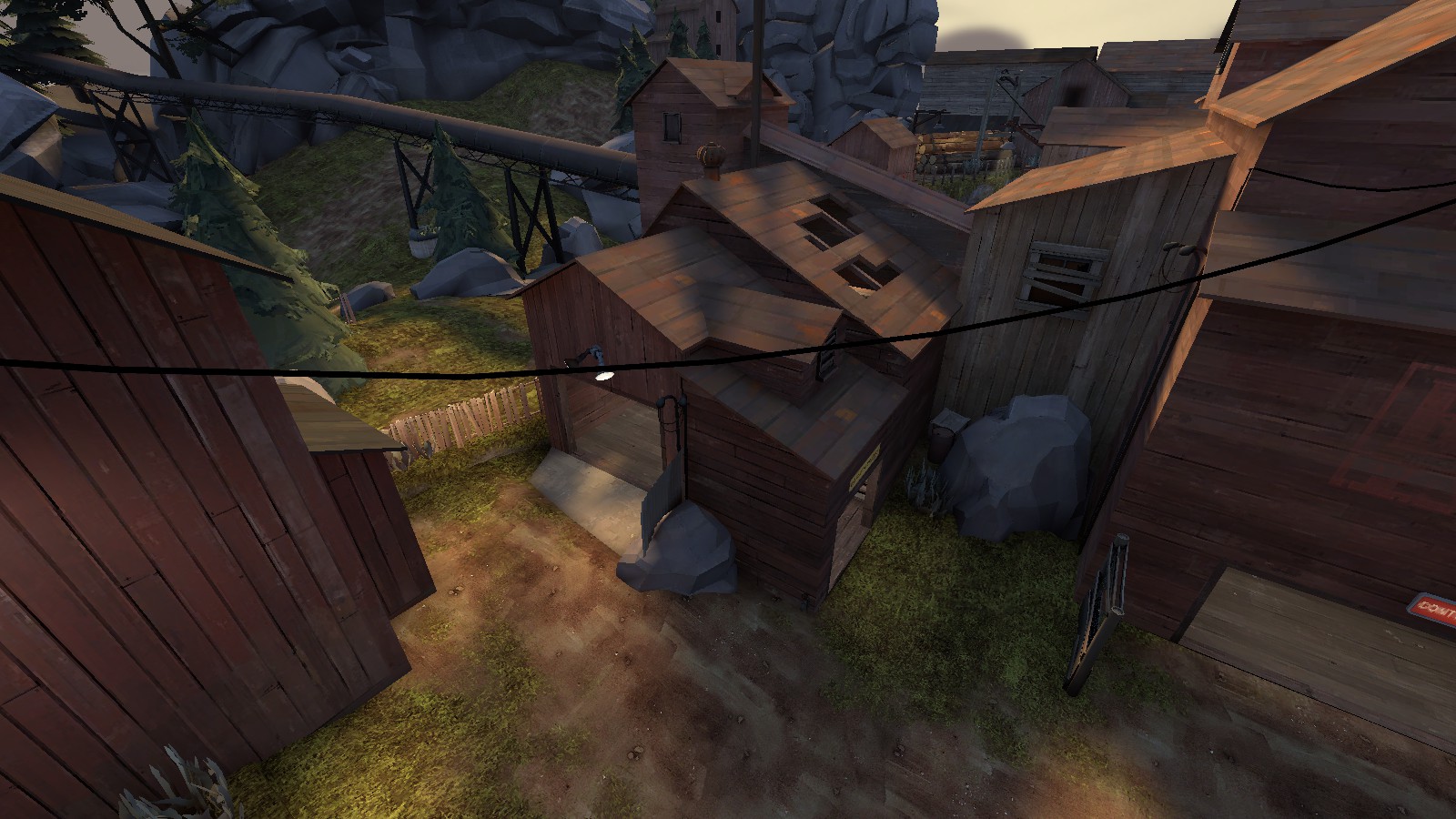
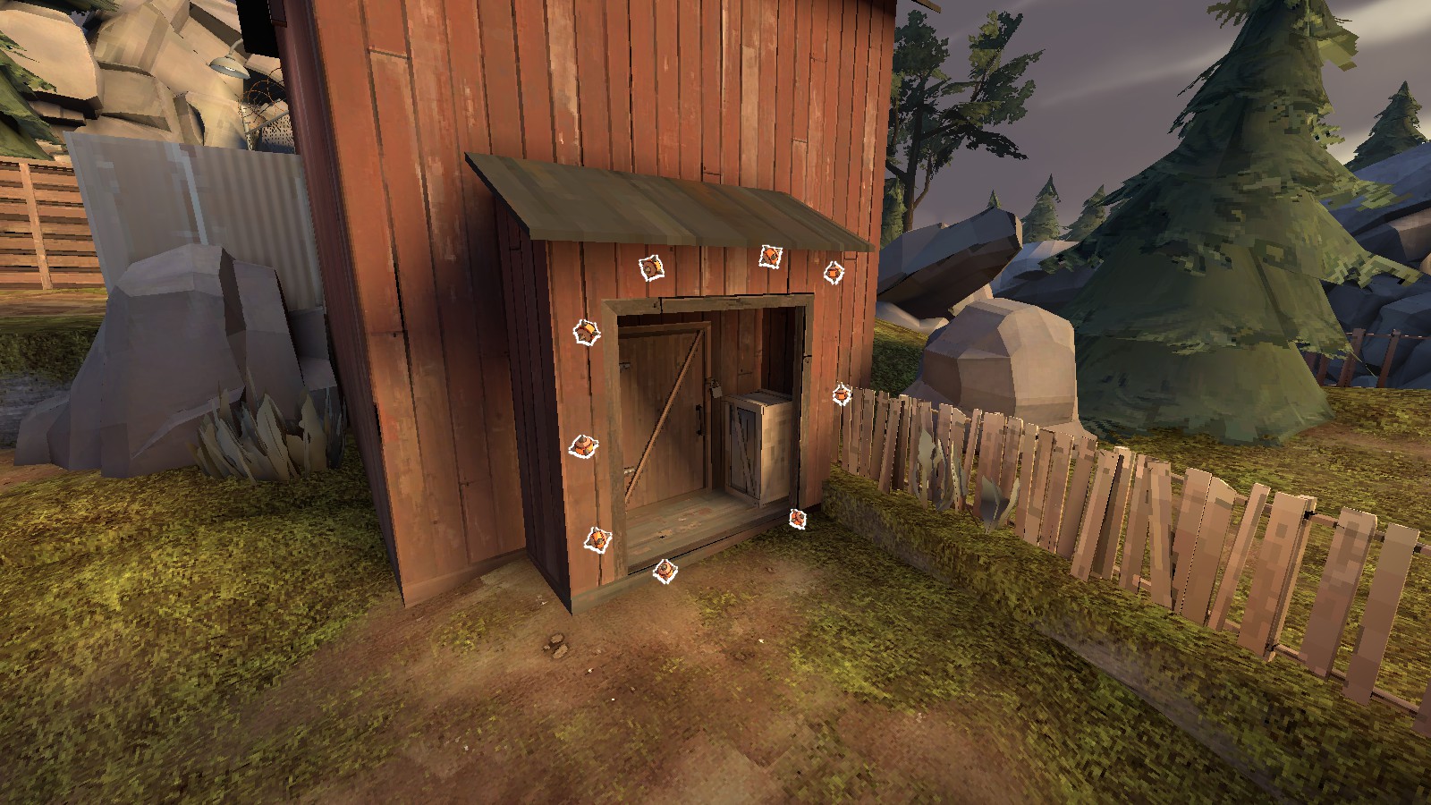
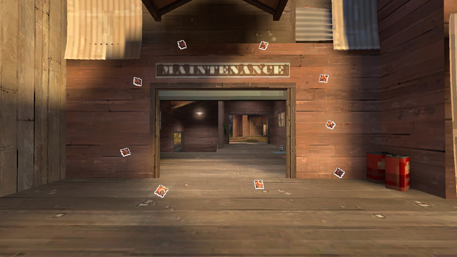
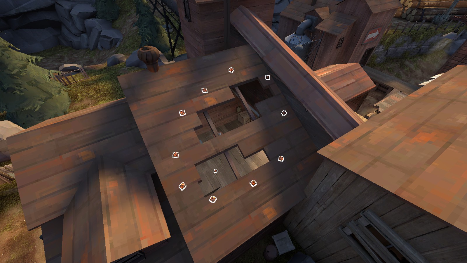
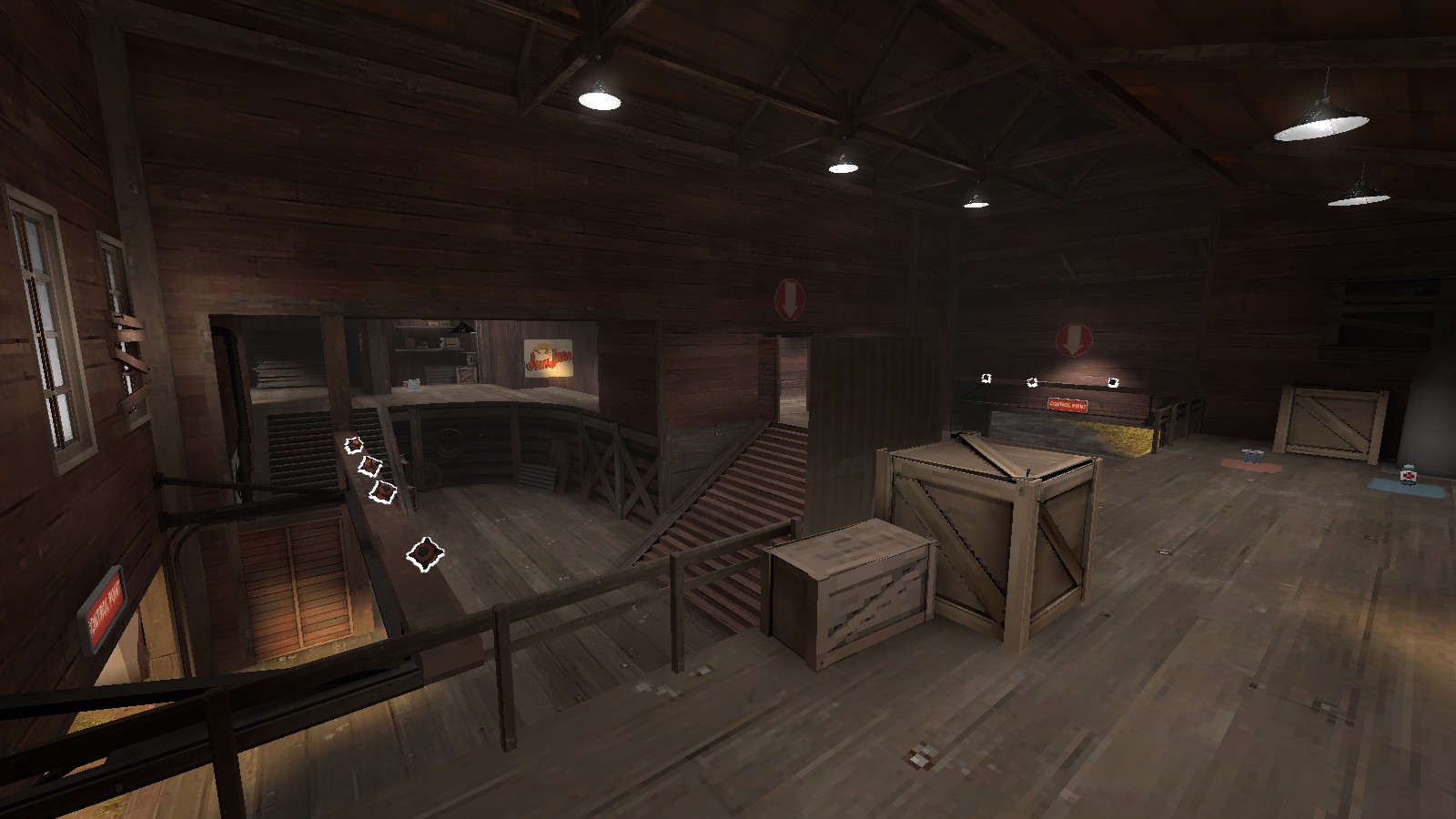
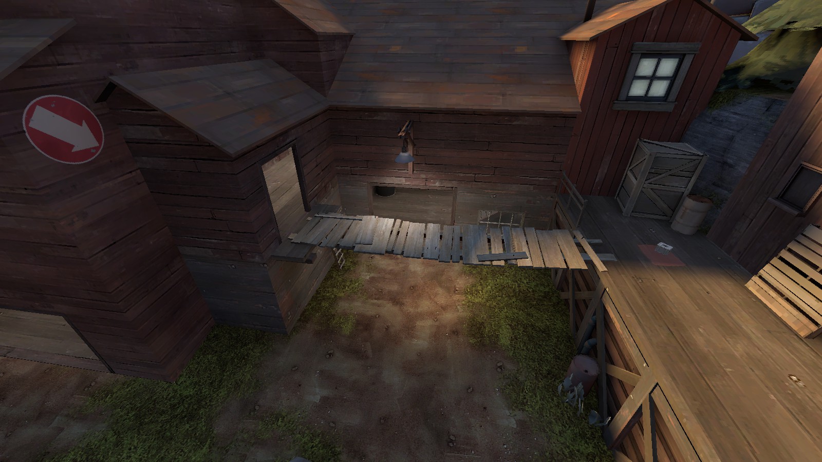
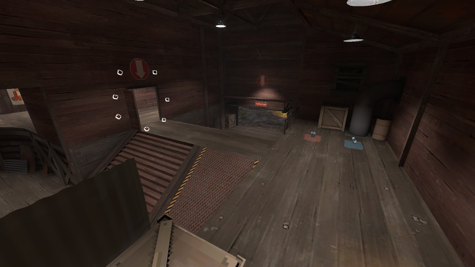

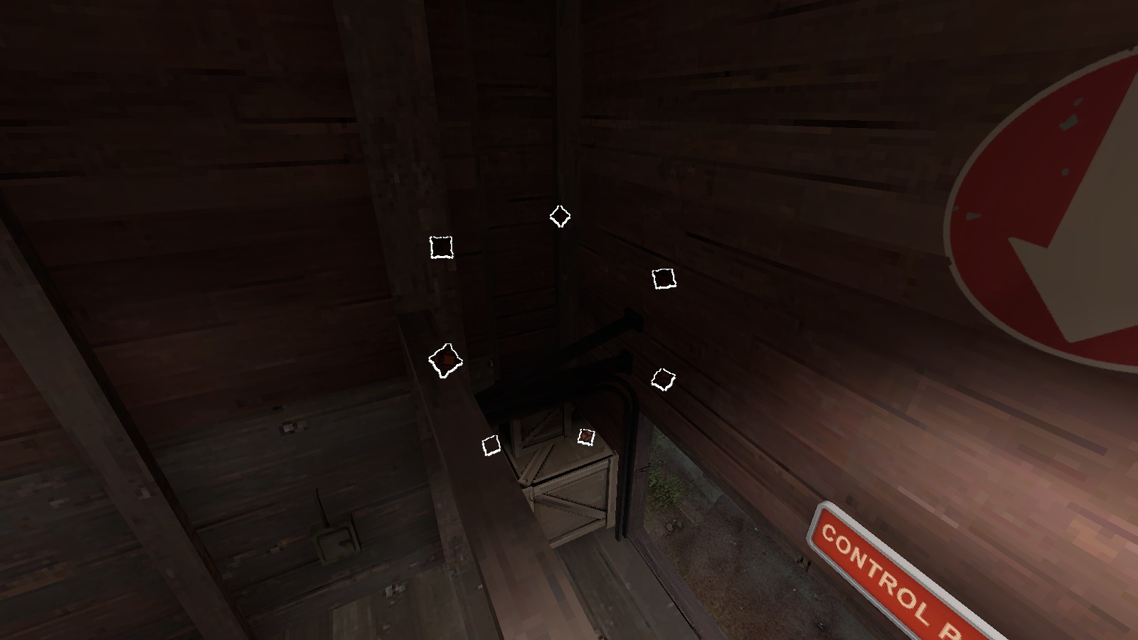
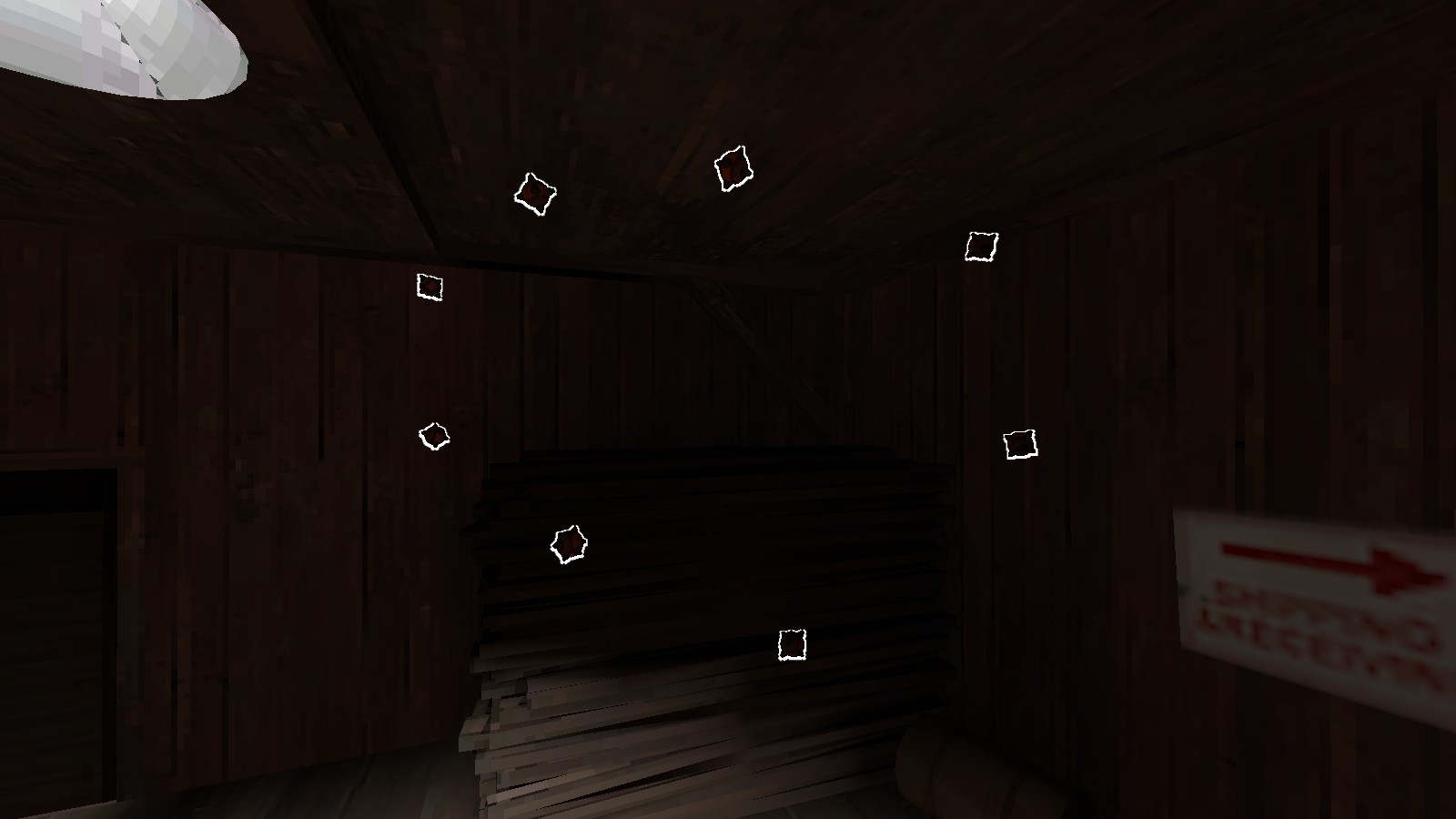

- fixed occasional wrong prop skins
- rotated metal roof plating 90°
- swapped a certain metal sheet that was stuck in a boulder on second for a better wood barrier
- fixed some errant texture placements (red wood on blu side, etc)
- removed small health and small ammo on leftmost approach to last
- added small ammo kit closer to bridge on last
- removed small railing on left approach from mid to second
- removed small box in tiny corner in ramp room facing second
- added...
