Tikal

KotH Tikal v1

Quantum

L3: Member
Mar 31, 2016
119
99
KotH Tikal - A mayan themed king of the hill map for the 'Mayann Community Project'

Previously called 'Ruins'
 
Last edited:

OctoBlitz

Sabotage related, and Tak approved!
aa
Jan 15, 2016
357
194
Very interesting, cannot wait to test it out...
 

Quantum

L3: Member
Mar 31, 2016
119
99
Can't tell you how many maps there are out there with the name 'ruins'
I'm willing to change the name, but a google search for "tf2 map ruins" didn't turn up any useful results, so I assumed it was open to use. I'm very new to this so I'm not sure how naming is supposed to be handled.
 

Jekyllson

L3: Member
Jun 20, 2015
115
67
This doesn't involve gameplay, but are you sure about the columns in your map? I can't find anything that says that support columns were used in Mesoamerican architecture. I know that sounds like a nitpick, but if they didn't, then that would place these ruins east of the Atlantic instead of west.

Again, I might be completely wrong about this, and I apologize if I am, but for the sake of a less generic "ruins" feel, I would make sure the architecture of your ruins is consistently Mesoamerican (if not specifically based on Mayan ruins; Aztec and even Incan architecture are probably fine to draw inspiration from).
 

YM

LVL100 YM
aa
Dec 5, 2007
7,158
6,079
They were, but they were simpler and stockier. Not at all similar to greek or roman columns that these ones look like. Alternatively they were squarer and ornately carved.

most of the results in that image search were free standing, and they used wooden and thatched rooves above them, rather than supporting more stone architecture.

I can definitely say that there were no obelisks though, that giant slightly tapered obelisk is way off.
 

Quantum

L3: Member
Mar 31, 2016
119
99
You two appear to be correct. I couldn't think of a way to add detail without adding pillars. I suppose I could make things much more broken to add detail. I was also worried about the obelisks. I suppose I could turn them into pillars that don't support anything similar to the ones linked.
 

IrishTaxIDriver

L6: Sharp Member
Sep 27, 2008
271
150
There are two huge things that stand out to me from your screenshots and some smaller things as well.

1. Symmetric detailing. Break up your non-playspace areas with some asymmetric detailing. Pillars are fallen over at the exact same mirrored angle. Trees are in the same mirrored spot. Do something different. Some more crumbly ruins on one side of the waterfall, maybe one of those pillars is a tree on one side, etc. Symmetric details feel designed and unnatural, which makes natural spaces feel wrong.

2. For me the best gameplay revolves around art and design working hand in hand, and because of that I think your koth point is really boring. Its right next to that cool ramp! Put it ontop of the ramp! Change the design to make that work! Its way more interesting than flat ground outside of a cool structure. Half indoors half outdoors creates cool emergent gameplay options.

Small things (you're in beta so I feel like this stuff matters):

-The crumbly hole in the wall detail isn't working for me because the textures aren't lining up correctly and you've got stone blocks sitting on a weak wooden structure, it feels like it would collapse to me.

-Your rooftops need trims and raised elements to prevent them from feeling so flat. Its most appearant on the angled stone roof on the center structure, where the bricks don't go with the roof angle.

-For ruins your structures feel pretty intact. Some more overgrown elements creeping into your interior spaces, sunlight gaps, and crumblyness would go a long way.
 

Quantum

L3: Member
Mar 31, 2016
119
99
There are two huge things that stand out to me from your screenshots and some smaller things as well.

1. Symmetric detailing. Break up your non-playspace areas with some asymmetric detailing. Pillars are fallen over at the exact same mirrored angle. Trees are in the same mirrored spot. Do something different. Some more crumbly ruins on one side of the waterfall, maybe one of those pillars is a tree on one side, etc. Symmetric details feel designed and unnatural, which makes natural spaces feel wrong.

2. For me the best gameplay revolves around art and design working hand in hand, and because of that I think your koth point is really boring. Its right next to that cool ramp! Put it ontop of the ramp! Change the design to make that work! Its way more interesting than flat ground outside of a cool structure. Half indoors half outdoors creates cool emergent gameplay options.

Small things (you're in beta so I feel like this stuff matters):

-The crumbly hole in the wall detail isn't working for me because the textures aren't lining up correctly and you've got stone blocks sitting on a weak wooden structure, it feels like it would collapse to me.

-Your rooftops need trims and raised elements to prevent them from feeling so flat. Its most appearant on the angled stone roof on the center structure, where the bricks don't go with the roof angle.

-For ruins your structures feel pretty intact. Some more overgrown elements creeping into your interior spaces, sunlight gaps, and crumblyness would go a long way.

Thanks for the feedback. I agree with most of these, and I plan on fixing them. I feel that I may have messed up by changing the naming over to beta instead of alpha. This is my first map and I am not knowledgeable on versioning conventions. I haven't been working on getting a lot of the texture exactly how I want them, because I'm waiting on the mayann pack to come out to see if there is anything there that I want to use.
 

IrishTaxIDriver

L6: Sharp Member
Sep 27, 2008
271
150
I feel that I may have messed up by changing the naming over to beta instead of alpha. This is my first map and I am not knowledgeable on versioning conventions. I haven't been working on getting a lot of the texture exactly how I want them, because I'm waiting on the mayann pack to come out to see if there is anything there that I want to use.

In software terms alpha is usually when the first pass is complete and outside individuals can start testing it and providing valuable feedback. Beta is when the product is feature complete and tuning ensues. If you're okay with your layout and are only moving small elements, I'd say you're in beta. If you're still doing large scale tweaks and changing major elements, I'd say alpha.

For your first map it doesn't look too bad. Your scale looks a little off but you've got good instincts on design. I'll download it tonight and get you some concrete notes on the layout.
 

Quantum

L3: Member
Mar 31, 2016
119
99
In software terms alpha is usually when the first pass is complete and outside individuals can start testing it and providing valuable feedback. Beta is when the product is feature complete and tuning ensues. If you're okay with your layout and are only moving small elements, I'd say you're in beta. If you're still doing large scale tweaks and changing major elements, I'd say alpha.

For your first map it doesn't look too bad. Your scale looks a little off but you've got good instincts on design. I'll download it tonight and get you some concrete notes on the layout.

Ah, I guess I would consider it to be in alpha then. Would it be feasible to change the naming back to alpha or would it be better to just let people know I still consider it to be in the alpha stages?
 

IrishTaxIDriver

L6: Sharp Member
Sep 27, 2008
271
150
Keep going. Renaming it back down would be confusing. Theres no hard rule on naming schemes, just generally agreed upon conventions. Go up to _b1000000 if you have to.
 

Quantum

L3: Member
Mar 31, 2016
119
99
They were, but they were simpler and stockier. Not at all similar to greek or roman columns that these ones look like. Alternatively they were squarer and ornately carved.

most of the results in that image search were free standing, and they used wooden and thatched rooves above them, rather than supporting more stone architecture.

I can definitely say that there were no obelisks though, that giant slightly tapered obelisk is way off.

Does something like this seem to fit better than an obelisk? http://i.imgur.com/APY72Am.jpg
 

Jekyllson

L3: Member
Jun 20, 2015
115
67
Does something like this seem to fit better than an obelisk? http://i.imgur.com/APY72Am.jpg
It does, I'd say, although it would look much better if it looked older and more "ruined", with bits missing and cracks in it. That said, I wouldn't necessarily worry about the obelisk models too much just yet, since you can just use the obelisks that you have for now until you until your final art pass. I think the problem with the columns is more important, though.
 

Quantum

L3: Member
Mar 31, 2016
119
99
It does, I'd say, although it would look much better if it looked older and more "ruined", with bits missing and cracks in it. That said, I wouldn't necessarily worry about the obelisk models too much just yet, since you can just use the obelisks that you have for now until you until your final art pass. I think the problem with the columns is more important, though.

Yes, I definitely plan on adding wear to them.

So what would y'all suggest I do about the columns? After doing some more searching it seems that some pillars are used for support. Shown here and here. (sorry for the tiny image) So, if I'm not mistaken they seem to fit the theme. Maybe just use them more sparingly?
 

IrishTaxIDriver

L6: Sharp Member
Sep 27, 2008
271
150
Ok I got some layout feedback for you. Definately not a "do all or none of it" situation. Its your level and only you know how it'll be:

Overall, definately some good instincts, just needs iteration. I see some cool opportunities that could create some unique gameplay, but will require some restructuring.

The big picture of the level, you're allocating space a little incorrectly. KOTH levels tend to be

(Team Spawn) -> (Team Yard) -> (Cap Area) <- (Team Yard) <- (Team Spawn)

Right now you've got the spawn slamming into the cap area, and that creates a bad read here:

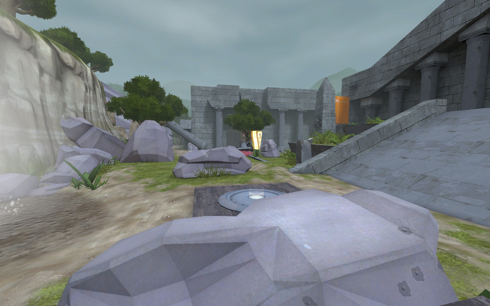
4X6DptH.jpg

Where an enterprising sniper gets a sightline directly into the enemy team's spawn, before those players have a chance to engage in the combat area. If you compare that to Viaduct (or Harvest or Lakeside), you'll see that the first yard that people run into after spawn has a few options on how they can approach the cap area, and the sniper overlooks can't cover them very well. From this vantage point here I can get a read on two thirds of the spawn exits. You have the orange case block which prevents sight on the building side spawn, which is a good idea (but there is also something about that, but I'll talk about it later).

I think your starting area is a little messy and could be condensed. Its a little overscaled and flat. Some slight elevation changes would make the area feel more interesting. Look at Upward's spawns for example. Theres no reason for most of the little elevation changes in them, but they provide a visual breakup and create more interesting spaces.

You've got four exits at cardinal directions, which is a little much, especially here:

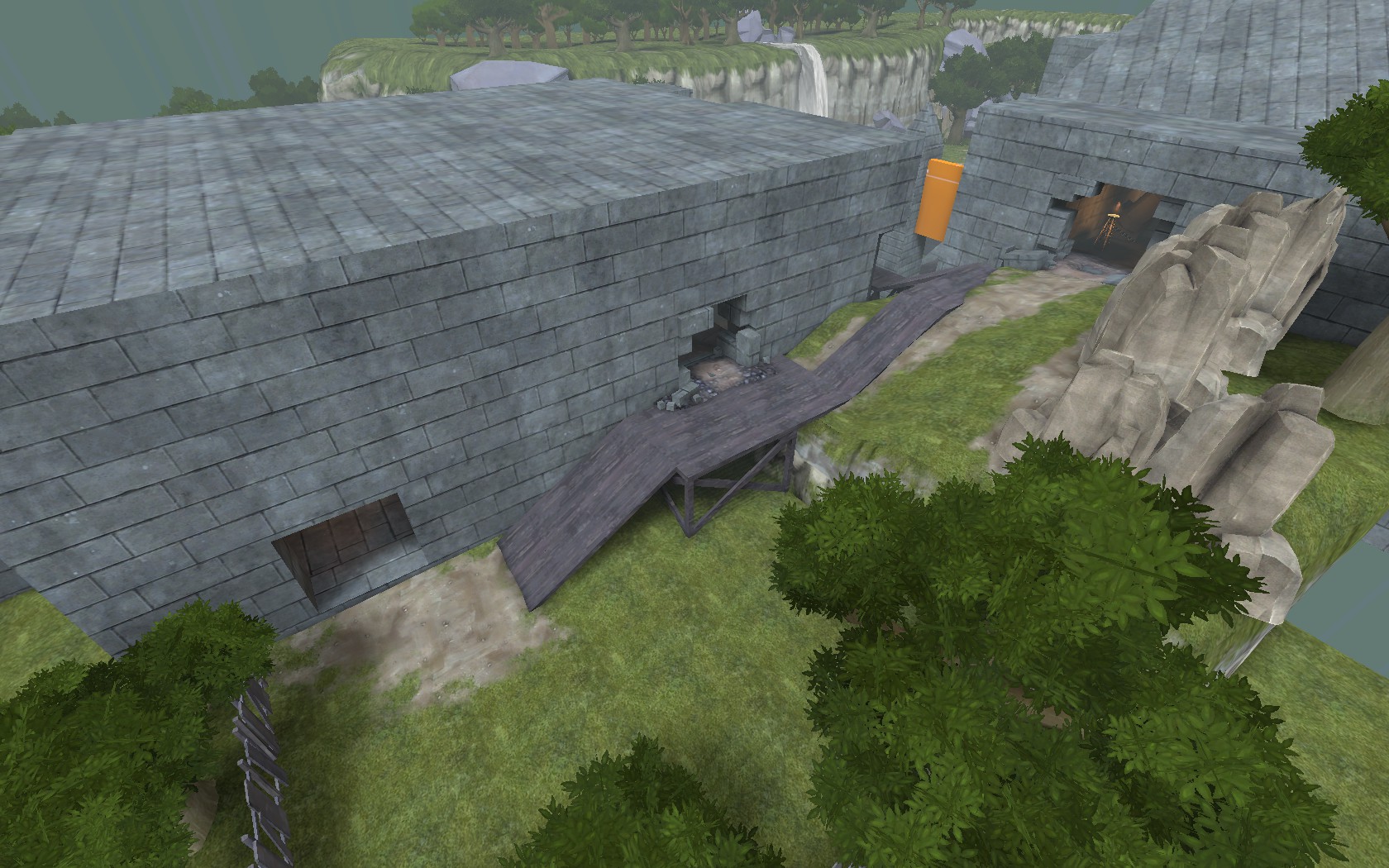
Iyaexfb.jpg


Where you have two parallel exits, with one being at a disadvantage due to height. Spawns in KOTH maps should have the advantage over the yards they reign over. I'd remove the lower exit here and streamline the spawn to direct towards the upper one. I'd also remove the lower area here. The stairs up are really close to the door and easily missable, which isn't a big deal to explosive classes and scouts, but it'll create a dead flow section where the other lesser classes have to turn around completely. Its excess space in the opposite direction from the action. This could be your team yard thats missing from the overall picture if you re-allocate this space. I get that it could be a safe space for engineers to place teleporters and such, but it'd serve you better in front of the spawn, rather than the side.
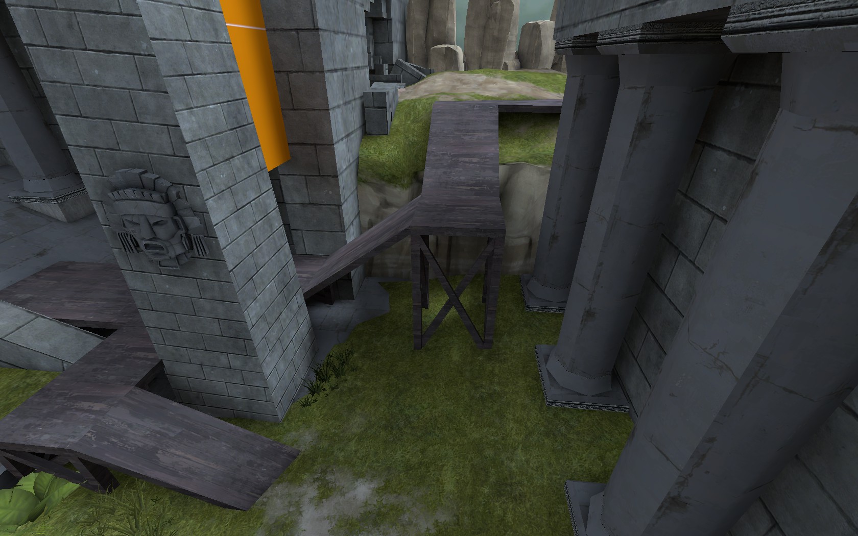
xkAzF9Z.jpg


I think this could just be a one way dropdown that favors the spawn. The stair structure here creates wonky spaces and gaps that are hard to explain and easy to get trapped in, like a bird and those plastic things they use to hold soda in six packs. It also gives enemy players a read on your feet before you can see them. I'd remove this whole structure and simplify the space. Quick reads on areas give players more time to focus on what enemy players are doing.
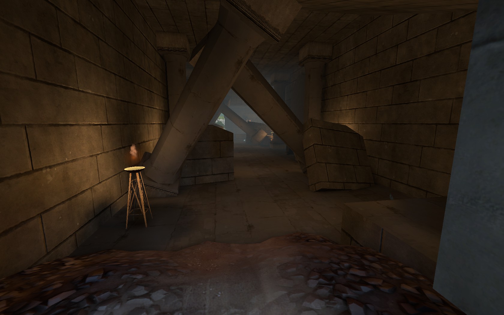
J0Fl9yr.jpg


I like the idea here, its a crumbly interior and you've used the debris to explain some gameplay choices. I think you could move all the cover to the left side of the screenshot and move the health and ammo into the new nook. I suggest that because you've got a nook on the right that players aren't looking at when turning towards the cap, which could be a little frustrating if a spy is sitting there. Also think of some asymmetric detailing that could break up the symmetry. I hope those pillars are instances!

Some radical ideas, definately don't do all of these:

-Move the cap to the top of the ramp. Its the most interesting area in the level and you're only using it as elevation. It'd be a cool cap, but might be too close to the upper exits of the spawn. If you wanted to do this, I'd move the lower space on the side of the spawn to infront of it to space the level out a bit more and work on some gameplay elements to keep sightlines sane.

-If you want to leave the cap where it is, you should have a second path that the raised platforms by the cap can't cover. My idea is to put in a water path that pops up under the waterfall, or even a walking path that comes out from behind the waterfall would work (Sentries will probably ruin a walking path though). Hollow out a cave section on both sides and you've got some extra space that works for the gameplay, and a little holdout room that engineers could build a base in.

-Don't be afraid of some asymmetric spaces back by the spawns where it doesn't matter for gameplay. I'm sure some people are gasping at this suggestion, but symmetry / mirroring is only really important once you get to the cap area, and even then a little difference won't make or break a team's chance at winning.

So, like I said, really good instincts for your second level. It just needs some iteration and you'll have a winner on your hands.

EDIT: Also I agree with this:

Can't tell you how many maps there are out there with the name 'ruins'

Namechange later would hurt the map identity, right now you could probably get away with it.
 
Last edited:

Quantum

L3: Member
Mar 31, 2016
119
99
Ok I got some layout feedback for you. Definately not a "do all or none of it" situation. Its your level and only you know how it'll be:

Overall, definately some good instincts, just needs iteration. I see some cool opportunities that could create some unique gameplay, but will require some restructuring.

The big picture of the level, you're allocating space a little incorrectly. KOTH levels tend to be

(Team Spawn) -> (Team Yard) -> (Cap Area) <- (Team Yard) <- (Team Spawn)

Right now you've got the spawn slamming into the cap area, and that creates a bad read here:

4X6DptH.jpg

Where an enterprising sniper gets a sightline directly into the enemy team's spawn, before those players have a chance to engage in the combat area. If you compare that to Viaduct (or Harvest or Lakeside), you'll see that the first yard that people run into after spawn has a few options on how they can approach the cap area, and the sniper overlooks can't cover them very well. From this vantage point here I can get a read on two thirds of the spawn exits. You have the orange case block which prevents sight on the building side spawn, which is a good idea (but there is also something about that, but I'll talk about it later).

I think your starting area is a little messy and could be condensed. Its a little overscaled and flat. Some slight elevation changes would make the area feel more interesting. Look at Upward's spawns for example. Theres no reason for most of the little elevation changes in them, but they provide a visual breakup and create more interesting spaces.

You've got four exits at cardinal directions, which is a little much, especially here:

Iyaexfb.jpg


Where you have two parallel exits, with one being at a disadvantage due to height. Spawns in KOTH maps should have the advantage over the yards they reign over. I'd remove the lower exit here and streamline the spawn to direct towards the upper one. I'd also remove the lower area here. The stairs up are really close to the door and easily missable, which isn't a big deal to explosive classes and scouts, but it'll create a dead flow section where the other lesser classes have to turn around completely. Its excess space in the opposite direction from the action. This could be your team yard thats missing from the overall picture if you re-allocate this space. I get that it could be a safe space for engineers to place teleporters and such, but it'd serve you better in front of the spawn, rather than the side.

xkAzF9Z.jpg


I think this could just be a one way dropdown that favors the spawn. The stair structure here creates wonky spaces and gaps that are hard to explain and easy to get trapped in, like a bird and those plastic things they use to hold soda in six packs. It also gives enemy players a read on your feet before you can see them. I'd remove this whole structure and simplify the space. Quick reads on areas give players more time to focus on what enemy players are doing.

J0Fl9yr.jpg


I like the idea here, its a crumbly interior and you've used the debris to explain some gameplay choices. I think you could move all the cover to the left side of the screenshot and move the health and ammo into the new nook. I suggest that because you've got a nook on the right that players aren't looking at when turning towards the cap, which could be a little frustrating if a spy is sitting there. Also think of some asymmetric detailing that could break up the symmetry. I hope those pillars are instances!

Some radical ideas, definately don't do all of these:

-Move the cap to the top of the ramp. Its the most interesting area in the level and you're only using it as elevation. It'd be a cool cap, but might be too close to the upper exits of the spawn. If you wanted to do this, I'd move the lower space on the side of the spawn to infront of it to space the level out a bit more and work on some gameplay elements to keep sightlines sane.

-If you want to leave the cap where it is, you should have a second path that the raised platforms by the cap can't cover. My idea is to put in a water path that pops up under the waterfall, or even a walking path that comes out from behind the waterfall would work (Sentries will probably ruin a walking path though). Hollow out a cave section on both sides and you've got some extra space that works for the gameplay, and a little holdout room that engineers could build a base in.

-Don't be afraid of some asymmetric spaces back by the spawns where it doesn't matter for gameplay. I'm sure some people are gasping at this suggestion, but symmetry / mirroring is only really important once you get to the cap area, and even then a little difference won't make or break a team's chance at winning.

So, like I said, really good instincts for your second level. It just needs some iteration and you'll have a winner on your hands.

EDIT: Also I agree with this:


Namechange later would hurt the map identity, right now you could probably get away with it.

This feedback is awesome, exactly what I was looking for. :D As for mid, I opted to put a raised platform.
20160413214901_1.jpg


I think it looks nice, while making things more interesting and fixing some of the sniper sightlines.
I really like a lot of your ideas, and will probably implement most of them.
 

IrishTaxIDriver

L6: Sharp Member
Sep 27, 2008
271
150
Interesting! You might still have the sniper issue, they'll just be standing on the cap this time.

Keep an eye on wonky spaces, like under the cap there. Getting stuck in those areas is No Good.