KotH Synthetic rc6a
- Thread starter MegapiemanPHD
- Start date
-
This map is featured! Our best maps, all together in one place for your viewing pleasure.
You are using an out of date browser. It may not display this or other websites correctly.
You should upgrade or use an alternative browser.
You should upgrade or use an alternative browser.
That's pretty cool. I got a new version coming out soon that may change this a bit. This map was made with comp in mind and since comp focuses on soldier and demo I tried to give both classes some fun roll outs.hey, I'm just messing around on your map, and made this Soldier rollout (don't know if it's already exist)
View: https://www.youtube.com/watch?v=yya1OMvKLMw
Shit seem like i got the old version of the map, still can go the same route though, except the mid ramp is much harder to surf, you'll have to go right to ludicrous speed
-pushed back angled stairs by second transitional building
-opened up walls inside 2nd transitional building to make it feel less cluttered and awkward
-changed 1 way windows at 2nd transitional building to see through glass so people can see the med health and ammo in that building from the point area
-changed stairs on the right side of 1st transitional building coming from spawn
-simplified 1st transitional building in hopes of making it feel less cluttered
-simplified left exit of 1st transitional building from spawn to make it less cluttered
-some in depth detailing of spawn areas and 1st transitional building
-removed sign on second transitional building since the sightline it was blocking no longer exists
-
Read the rest of this update entry...
G.bo
L4: Comfortable Member
- Sep 24, 2017
- 180
- 195
My opinion on the subject of the Asymmetric Details is yes. So far, what you've done with details looks great, and I have no doubts in my mind that you wouldn't intentionally do something stupid detail wise to make it completely broken for one side. Keep doin' what you're doin', and I'll keep chewin' what I'm chewin'.
...Mmmm...tastes kinda yummy...
...Mmmm...tastes kinda yummy...
-fixed missing ammo and health pickups on red side of the map >__>
Read the rest of this update entry...
Read the rest of this update entry...
Beater
L1: Registered
- Nov 25, 2017
- 31
- 174
Congratulation, your map has been chosen as one out of three maps which will have the chance of winning the 130€ first prize in the Meet Your Map map making contest. See the main competition thread for the official announcement and make sure to ask about anything you might feel unsure about.
Congratulations once again!
Congratulations once again!
Sweet! I'll see if I can get another version out before the final final deadline.Congratulation, your map has been chosen as one out of three maps which will have the chance of winning the 130€ first prize in the Meet Your Map map making contest. See the main competition thread for the official announcement and make sure to ask about anything you might feel unsure about.
Congratulations once again!
Not of fan of the detailing for this map so far, mainly the lighting.
Your environmental lighting is very very bland right now. The shadows and sunlight are both boring, and they even are washing out the colors on the map, making everything look really drab for whats supposed to be a very sunny day. Your interior lighting in Spawn is also pretty bleh. It's very dark and rather boring as well. Try brightening the light value and increase the light's radius so it lights more of the room. Also try coloring the lights bit, give the interior lights a soft blue glow and the sunlight a nice orange-yellow tinge to it. Even a bit of color goes a long way in changing the mood of the map.
Your environmental lighting is very very bland right now. The shadows and sunlight are both boring, and they even are washing out the colors on the map, making everything look really drab for whats supposed to be a very sunny day. Your interior lighting in Spawn is also pretty bleh. It's very dark and rather boring as well. Try brightening the light value and increase the light's radius so it lights more of the room. Also try coloring the lights bit, give the interior lights a soft blue glow and the sunlight a nice orange-yellow tinge to it. Even a bit of color goes a long way in changing the mood of the map.
i got the same problem with the health & ammo packs on my map, there're 2 small + 2 medium for each side and somehow the players still can't find them
don't know why, it's not like i hide them packs in a secret room or something
don't know why, it's not like i hide them packs in a secret room or something
Last edited:
Some of it has to do with map familiarity while another part of it is flow. Trying to figure out where players group up at as well as where they look while standing in specific positions, like a point, is the thing to figure out. It's hard to guess and really needs testing to get correct for any map.i got the same problem with the health & ammo packs on my map, there're 2 small + 2 medium for each side and somehow the players still can find them
don't know why, it's not like i hide them packs in a secret room or something
-detailing
-more detailing
-did I mention detailing
-optimization
-lighting pass
-added arrow billboards to upper areas by point to block a nasty sightline from the window up there to 1st transitional building
-changed stair setup for stairs to lower area in buildings next to point so they are less steep
-added soundscapes
-still haven't done a 3D skybox
-other stuff I don't remember
Read the rest of this update entry...
I think you managed to capture the cartoonic style very well, by mainly maintaining same texture on a large surface without necessarily making it look boring. The lighting is much better than your previous versoon. Detailwise it almost feels like one of those old maps, before frontline pack, before most of today’s custom contents. Good work
new version, new rollout, this time from the left spawndoor
View: https://www.youtube.com/watch?v=9AdKQp_t37g
and some feedbacks
and some feedbacks
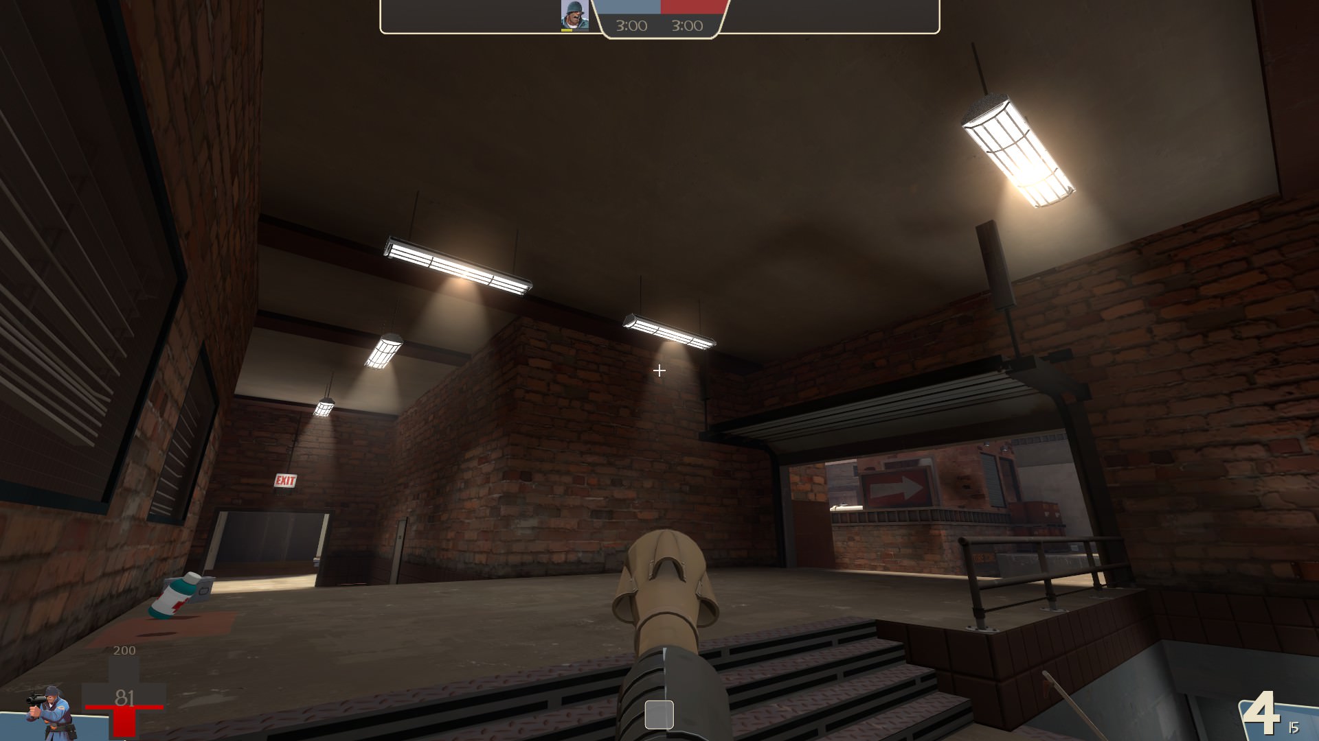
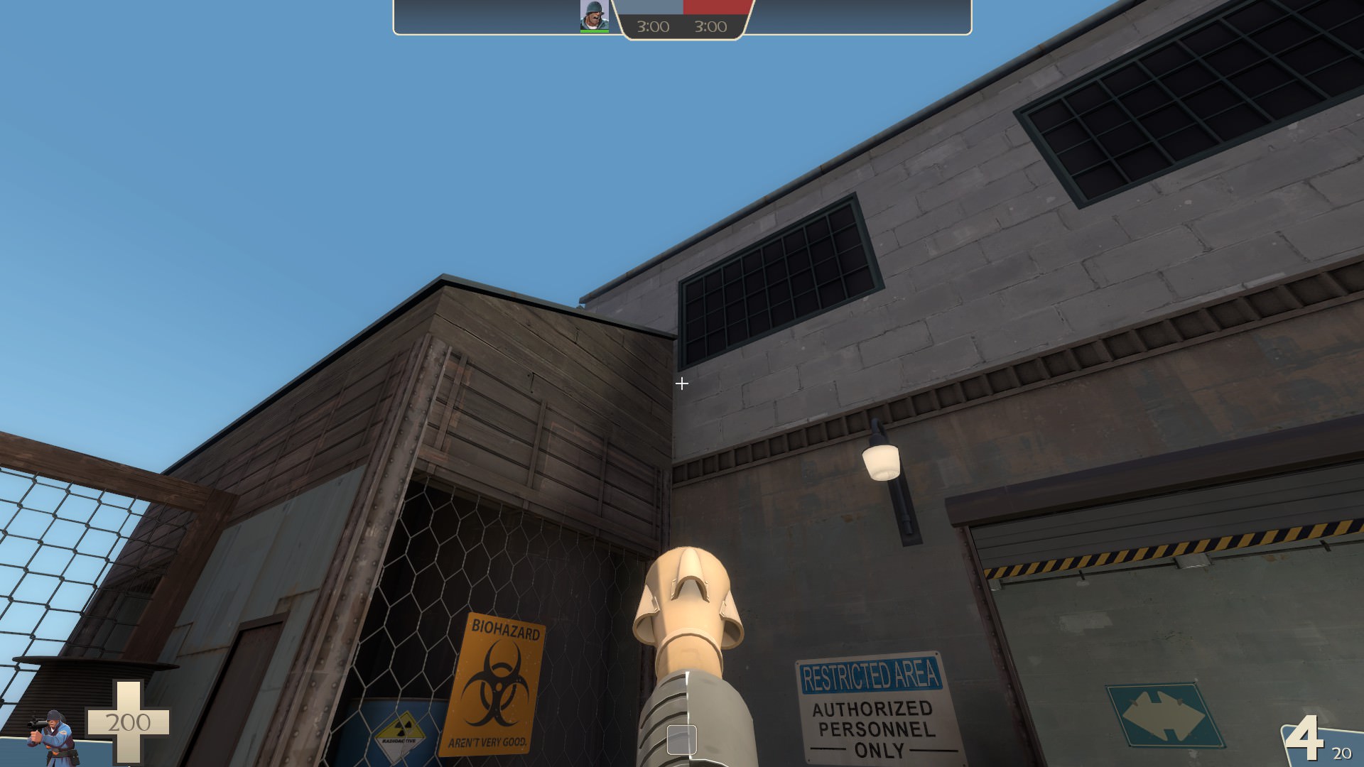
There're many static props with no vphysics, you should check around, they could affect the gameplay, like this one
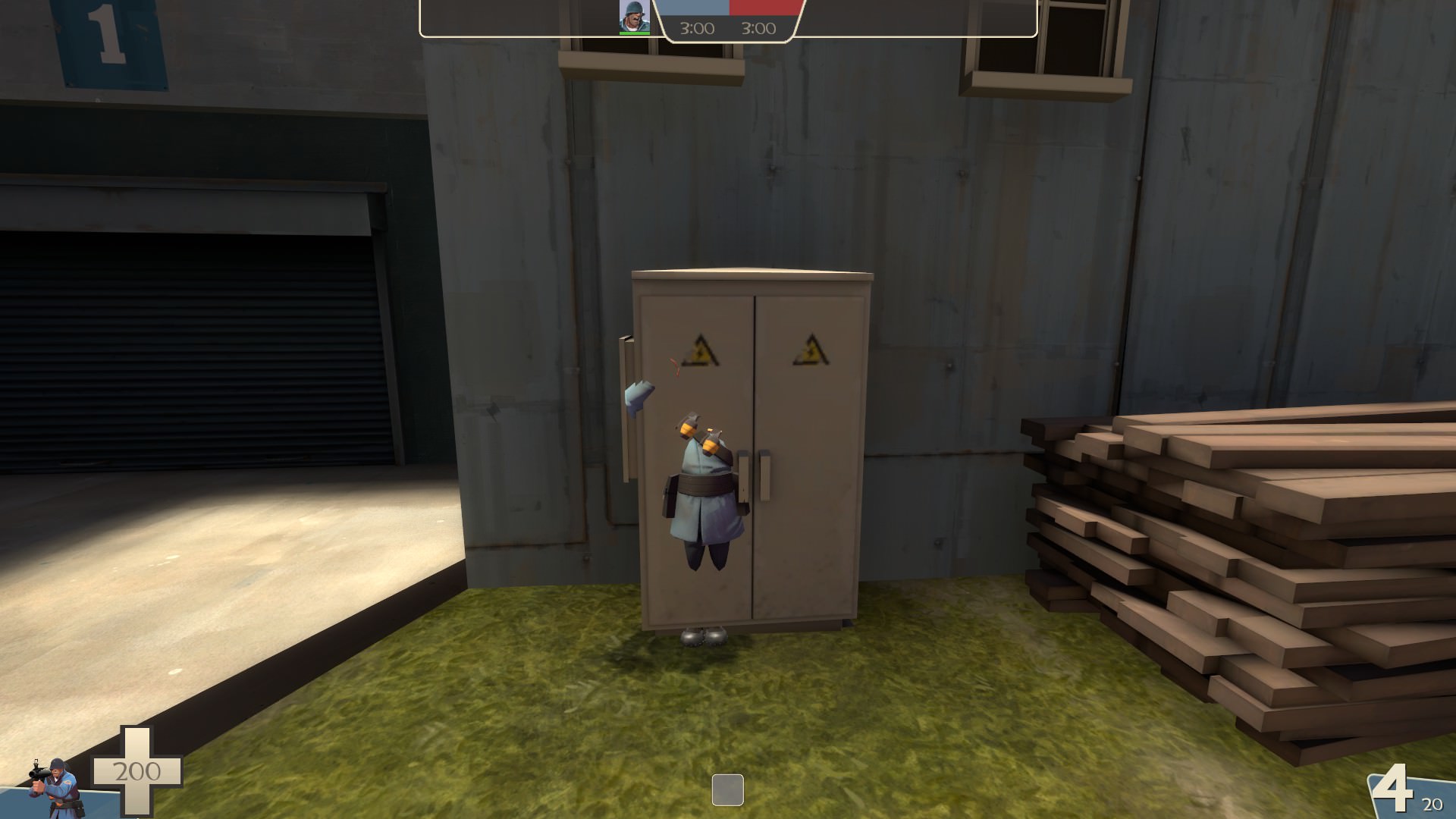
These lights are solid
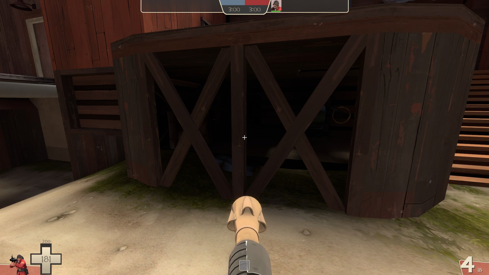
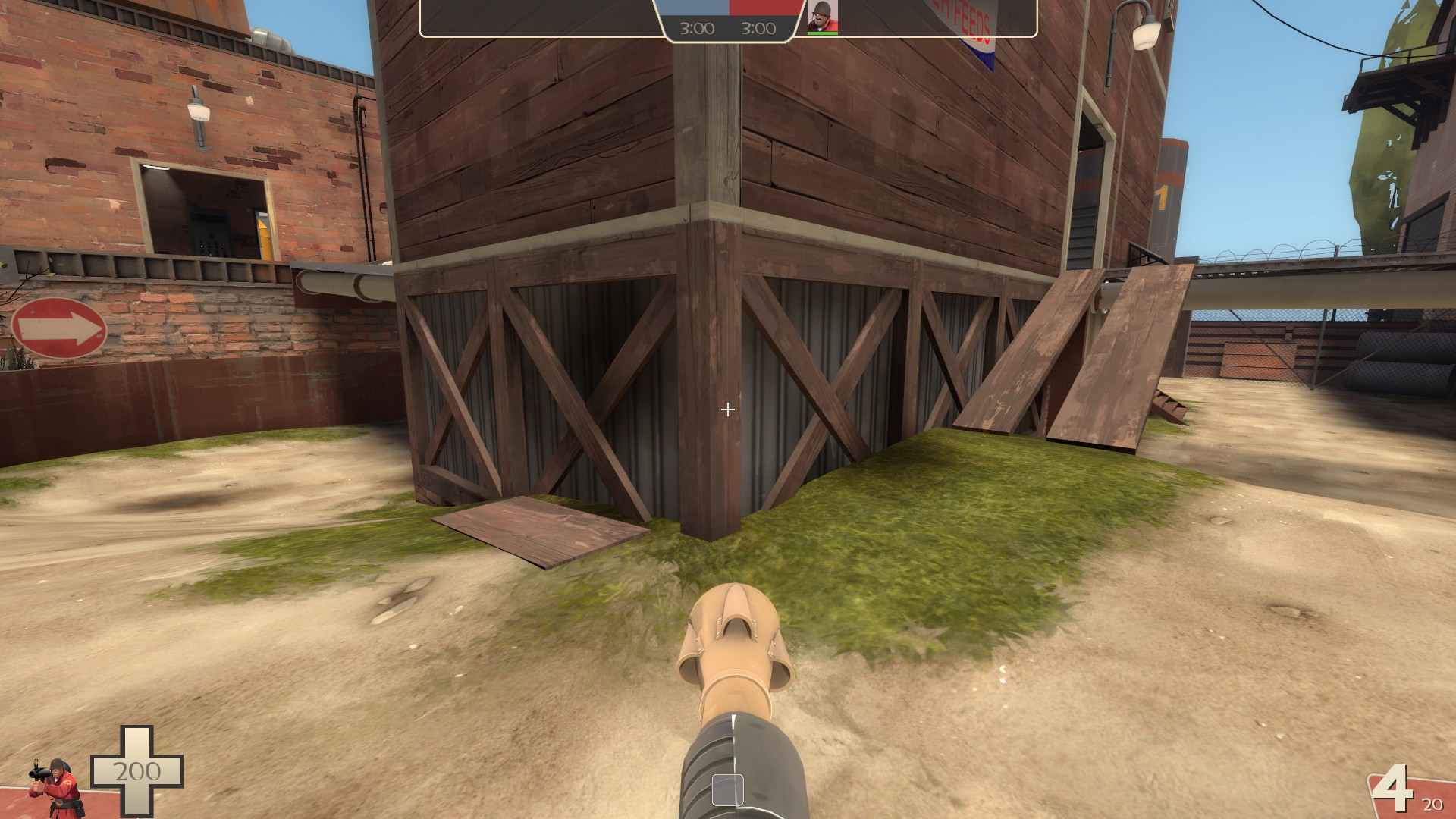
I think you should add bulletblock in these areas
Not so good with detailing, but the window and the roof look kinda odd, move it a bit to the right maybe?
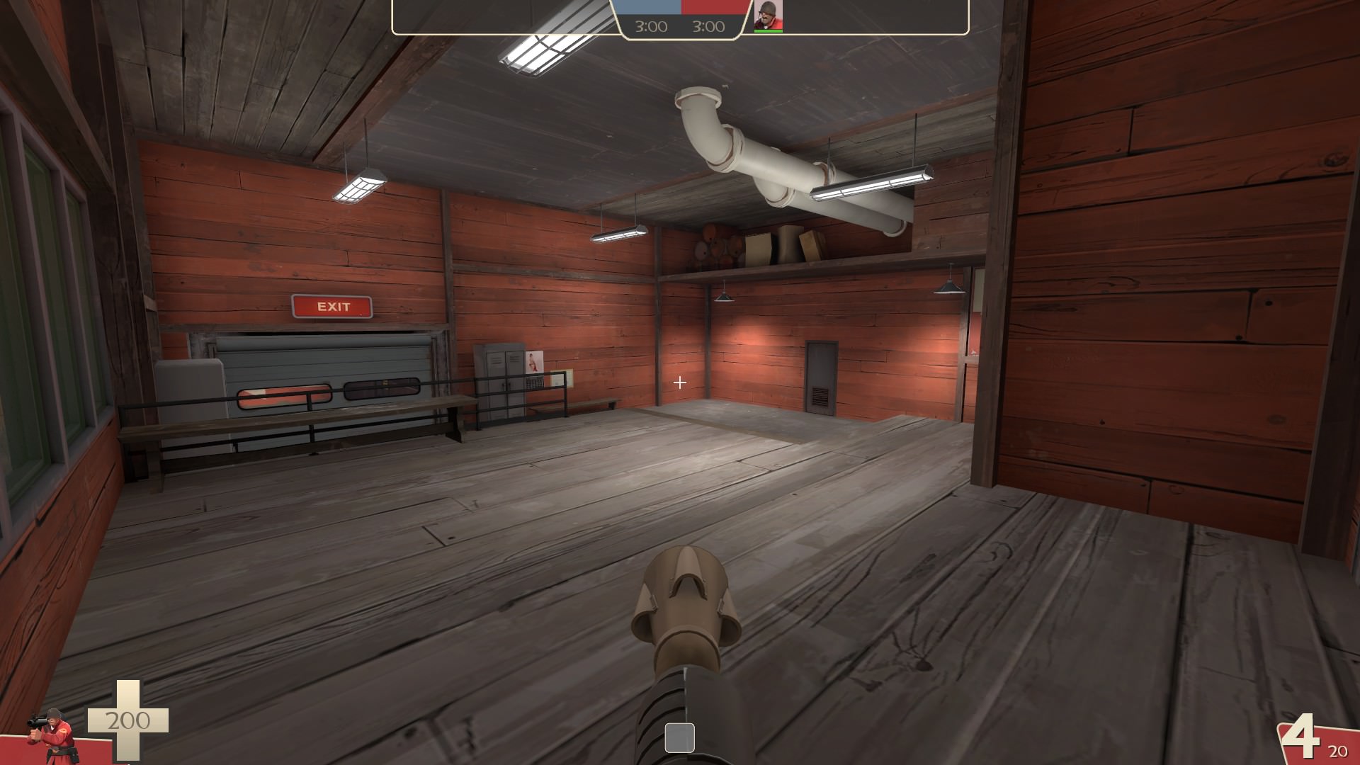
The white lighting in the Red spawn make it looks weird, maybe that's just me
[\spoiler]

These lights are solid

I think you should add bulletblock in these areas


Not so good with detailing, but the window and the roof look kinda odd, move it a bit to the right maybe?

The white lighting in the Red spawn make it looks weird, maybe that's just me

[\spoiler]
Last edited:
-snip-[/MEDIA]
View: https://www.youtube.com/watch?v=9AdKQp_t37g
Thanks for the feedback. There are a lot of unsolid props within the map so I could do asymetrical detailing while not affecting gameplay BUT things like the one you posted in that image are supposed to be solid. I'll get that fixed up right away.
-fixed unsolid props that should be solid
-changed lighting in red spawn to be more yellow-orangy instead of white
-change some other lighting as well
-added bullet blocks to wooden struts under 2nd transitional building
-did the same for the rounded area coming out of the left side of red's 1st transitional buildings while also adding some wire. This should make it the same as blu side now
-moved window on blu's 1st transitional building's upper left side to be farther away from the angled roof there
-removed collisions on light props in buildings by point
Read the rest of this update entry...
-detailing
-big thanks to Huddy for the custom silo prop
-added 3D Skybox
-fixed asymmetrical detailing that effected the layout
-got the map all nice n ready for the meet your map copetition
-split spawn room floor so now there are stairs up and stairs down. This is done in hopes of making both spawn exits look just as useful and making players use both instead of favoring one over the other.
-attempts to optimize the map
Read the rest of this update entry...


