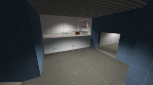
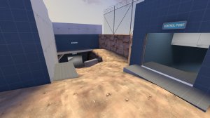
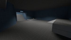
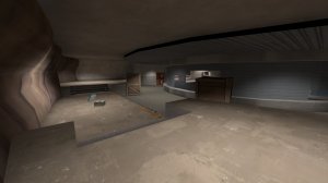
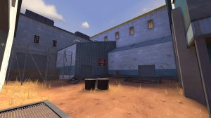
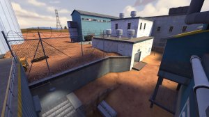
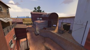
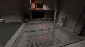
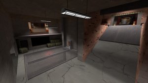
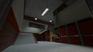
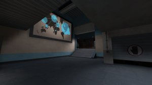
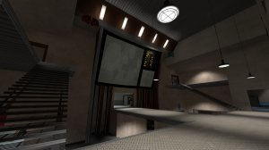
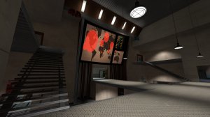
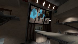
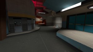
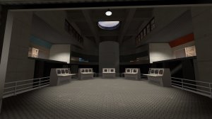
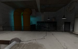
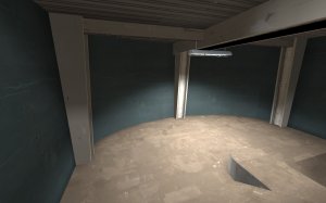
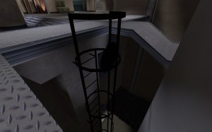
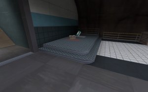
Took a look around and got some feedback for ya:

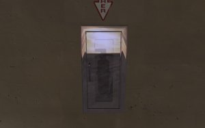
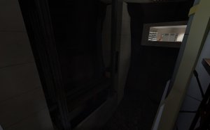
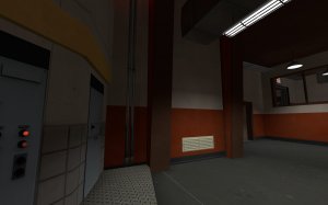
-cabinet in wall

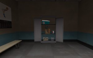
-prop uses the wrong cubemap

-misaligned texture behind door

-these railings don't have any collision and I can get on the angled wall behind them

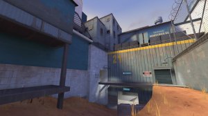
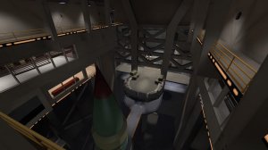
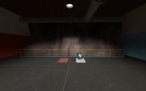
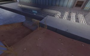
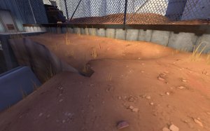
-shadows in this pit are really odd

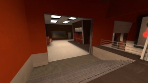
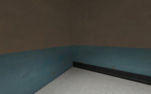
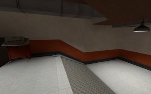
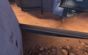
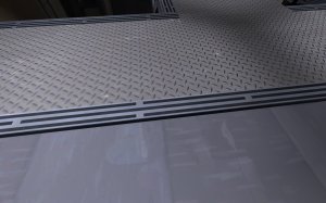
-strange how the rubber thing on the bottom of the wall just stops here while on the red side it goes all the way around the area

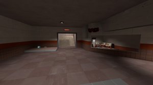
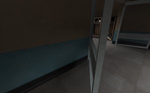
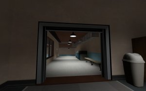
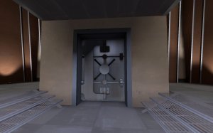
-the way this doorframe is inset in the wall is kinda strange. Also strange that the wall being shown on the faces that touch the frame are all black

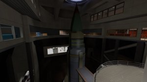
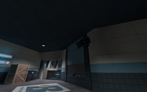
-this prop looks a bit too.....bulbous for where it's being used.

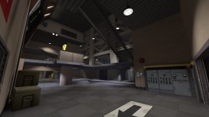
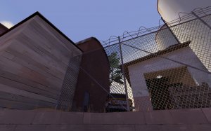
-clip these pillars

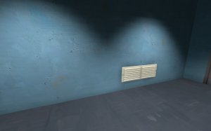
-remove collision from small things like these vents

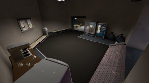
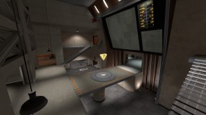
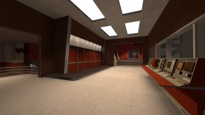
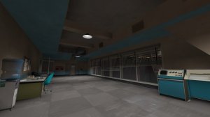
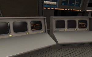
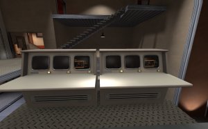
-you use this computer prop alot and ALL of them have the exact same screen texture. I'd recommend either skinning it to NOT do that or using different ones to change things up

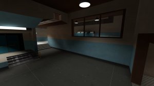
-there's an overlay of this rubber texture on the bottom of the wall here which could help with these misaligned textures. If that doesn't work, you could always hide the transition with some beam work

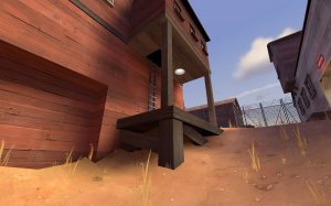
-this area looks accessible since it's only blocked off by a low railing. Also you can jump ON the railing which doesn't help.

-Nice work on the curves but you should clip the pillars

-this prop is fully black. You may have to use some info lighting on it.

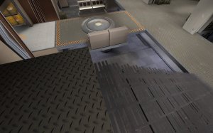
-clip the stairs

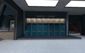
-something is just...off about these numbers. Not only do they count down from 7 to 1 when it would make more sense to go up from 1 to 7 but they also don't have the same spacing between them.

-clip the door smooth

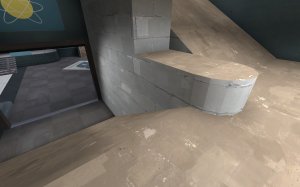
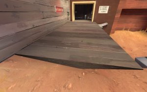
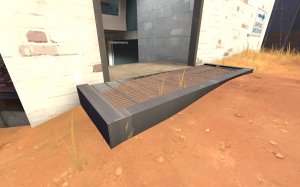
-clip the lip

-more of these same computers again -__-

-looks like some misaligned textures

-clip it flat

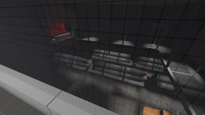
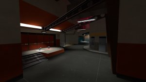
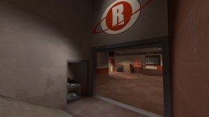
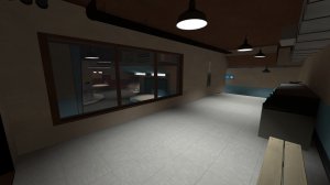
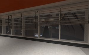
-I like being able to see mid from spawn but I don't think being able to see the other teams spawn is a good idea. Not only does it let players see all of the classes on the other team, it also messes with optimization.

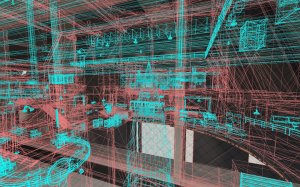
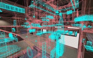
-as you can see, stuff on red side is rendering even though you can't really see it due to these windows. I'd suggest keeping it so players can see the point but make the ones into the other spawn opaque, then use an occluder, hint brush, or something similar to break the vis leafs so all that red stuff doesn't render. It will be much worse when players are there and being rendered along with everything else.

-clip the lip

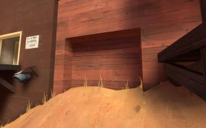
-why is this indent here? Maybe put a door or some shelves or something to give it a reason to exist

-clip it smooth

-clip it smooth

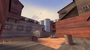
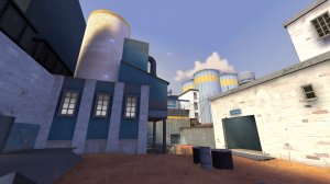
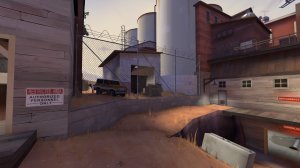
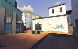
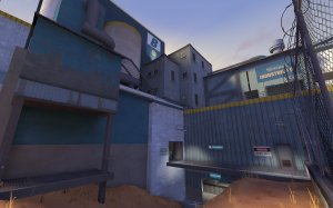
-the trees don't really fit the maps setting

-the white wall here with the angle of the sun is really, really bright

-thin these beams, they'll look better.

-the stairs by the point end into nothing even though they have textures on the side. Other stairs like this in the map don't do that.

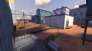
-get these displacements to sew so they don't look so weird


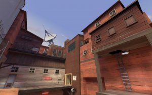
-I've been accused of doing this in the past so I know how easy it is for it to happen, but you use a lot of different kinds of textures and building structures in the same area. Simplify and consolidate to make things more consise.

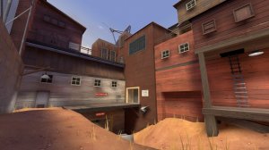
-idk if you are using prop fades but it doesn't really look like it from here. Things are rendering while I'm in the point area that I can't see at all.
Overall while I haven't had the chance to play the map in a lobby, it's got some interesting ideas. The spytech theme is pretty well done here and I hope some of this feedback helps.


