Howdy folks.
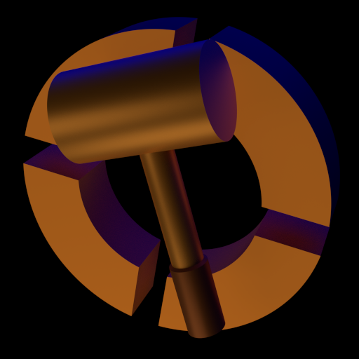
The Hammer icon and TF2 icon look pants on my task bar and start menu and all that jazz. I think we have some good artist people here, so I think it would be awesome of them to make new, lovely-looking icons for our most-used mapping tool.
The icon would be drawn at a high resolution and scaled down to common values like 64x64, 48x48, 32x32 and 16x16. I haven't used an icon editing program for a long time but I think those are the correct dimensions. Feel free to correct me.
They should fit in with modern operating system icons, which means they should look visually pleasing and use more than 16 colours. I think Windows uses .ico files but Mac uses PNGs. Maybe Linux uses the same. .ico files contain a different scale of each icon in one file so they should adopt the correct scale when they are displayed in each size.
Some of you might think "Oh, what a silly post. How pointless. The icons we have are perfectly fine." But it's not pointless or silly. The Hammer icon is pretty straight forward and I'm sure there are people who would like the thought of putting one together in their own style. There are likely people like me, who want a clean and modern UI for their OS but feel that is hampered somewhat by ugly icons. User interface is important, aesthetically pleasing things make us feel happier.
Also consider that the art can be used elsewhere! Maybe in the site heading on special occasions or perhaps on a rotation.
So go forth and create. In return I will post :B1:s


