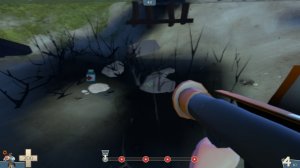
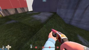
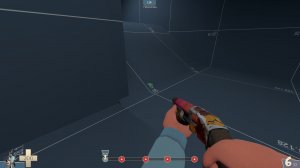
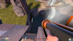
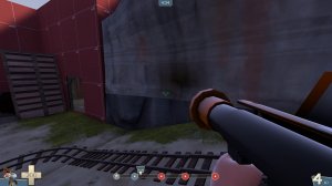
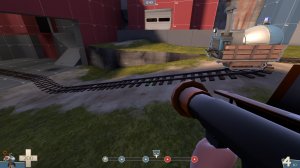
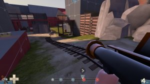
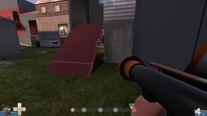
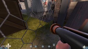
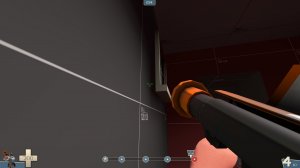
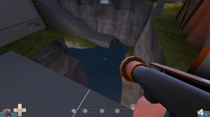
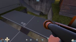
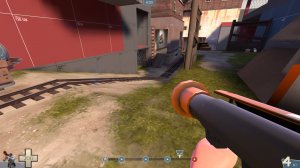
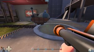
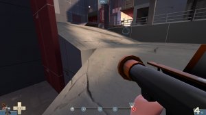
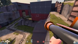
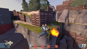
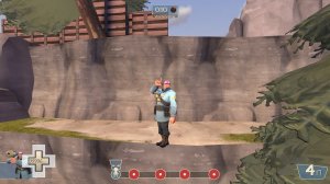
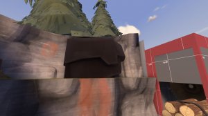
you can stand here

and on the cliff in the back as well

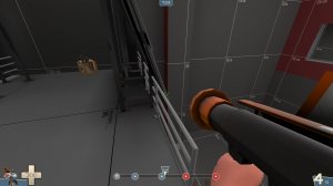
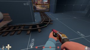
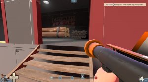
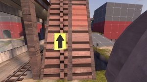
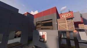
Lots of textures are misaligned, here are some examples:

those wood textures should be vertical instead of horizontal
heres a nice tutorial on how to do that:
View: https://www.youtube.com/watch?v=Rzz14Fu_lGc&list=PL2KT0JL74QfcI2FSN_MdQ7agYL4DmP7hZ&index=8
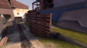
something else about those boards/brushfences, those woodtrims arent clipped that well on some of them, like this one for instance:

Some props have weird shadows on them, compiling with staticproplightning should fix that

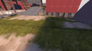
these displacements arent sewn

having this fence over there, doesnt make that much sense imo.

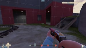
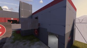
Something else i did notice through the whole map, you use a lot of dev textures on the same building (the outside). And most times they dont align as well. I recommend to stick to like one/two dev textures per building and to use other textures for details like doors or trims. In this example you used three different dev textures for one building while i feel like the red part didnt add that much:

About gameplay: with some buildings i felt they were kinda looking like a route, while it was only a death end with a health/ammopack. For instance that health/ammopack on the groundlevel of last. But i will leave it with that cus ive only played the map with 6 people on the server xD
I hope this will help


